
Advance UI Elements
Scrollable Offical link Preview link

npm i react-perfect-scrollbar<!-- ScrollBar css -->
import "react-perfect-scrollbar/dist/css/styles.css";
import ScrollBar from "react-perfect-scrollbar";
const CustomScrollbar = () => {
return (
<ScrollBar style={{ width: "100%", height: "300px" }} className="scroll-demo">
<h5 className="pb-2">{CustomScrollbars}</h5>
<p>I'm quite interested in learning more about <em className="txt-danger">custom scrollbars</em> because they are becoming more and more common.</p>
<div className="scrollbar-images">
<Image width={722} height={479} className="img-fluid" src={`${ImagePath}/banner/1.jpg`} alt="banner" />
</div>
<p>There are various justifications for customizing a scrollbar. For instance, the default scrollbar can cause an app's user interface to look inconsistent across various operating systems. In this case, having a single style is helpful.</p>
<p>I never had the opportunity to learn about CSS scrollbar customization, but I have always been interested in doing so. I'll take the chance to learn more about them and share my trip in this essay.</p>
<p>One crucial point to remember is that, depending on the design, a scrollbar may operate either <em className="txt-danger">horizontally or vertically</em> . Additionally, it might alter when you work on a website that is global and operates in both left-to-right and right-to-left orientations.</p>
</ScrollBar>
)}
Remove package from project
npm i remove react-perfect-scrollbarTree Offical link Preview link
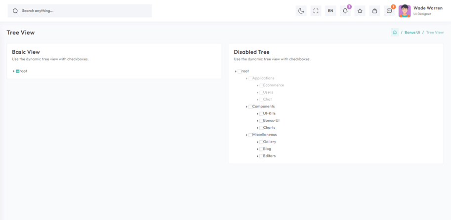
npm i react-accessible-treeviewimport React from 'react'
import { Card, CardBody } from 'reactstrap';
import { BasicTree } from '@/Constant';
import TreeView, { flattenTree } from 'react-accessible-treeview';
import { FaCheckSquare, FaMinusSquare, FaSquare } from "react-icons/fa";
import { IoMdArrowDropright } from "react-icons/io";
import cx from "classnames";
import { basicTreeData, treeViewList } from '@/Data/BonusUi/TreeView/TreeView';
import { BasicTreesProp } from '@/Type/BonusUi/TreeView';
import CardHeaderCommon from '@/CommonComponent/CommonCardHeader/CardHeaderCommon';
export const ArrowIcon:React.FC<BasicTreesProp> = ({ isOpen, className }) => {
const baseClass = "arrow";
const classes = cx(baseClass, { [`${baseClass}--closed`]: !isOpen }, { [`${baseClass}--open`]: isOpen }, className);
return <IoMdArrowDropright className={classes} />;
};
export const CheckBoxIcon = ({ variant, ...rest }: BasicTreesProp) => {
switch (variant) {
case "all": return <FaCheckSquare color="#4AAD8A" {...rest} />;
case "none": return <FaSquare color="white" {...rest} style={{ border: "1px solid #80808069" }} />;
case "some": return <FaMinusSquare {...rest} color="var(--theme-default)" />;
default: return null;
}
};
const BasicTrees = () => {
const treeData = flattenTree(treeViewList);
return (
<Card>
<CardHeaderCommon title={BasicTree} span={basicTreeData} headClass="pb-0" />
<CardBody>
<div className="tree-container">
<div className="checkbox">
<TreeView data={treeData} aria-label="Checkbox tree" multiSelect propagateSelect propagateSelectUpwards togglableSelect defaultSelectedIds={[4,9]} expandedIds={[1,2,6,10,14,27]} nodeRenderer={({ element, isBranch, isExpanded, isSelected, isHalfSelected, getNodeProps, level, handleSelect, handleExpand }) => {
return (
<div {...getNodeProps({ onClick: handleExpand })} style={{ marginLeft: 40 * (level - 1),marginTop:5 }} className="d-flex align-items-center">
{isBranch && <ArrowIcon isOpen={isExpanded} >}
<CheckBoxIcon className="checkbox-icon " onClick={(e: any) => { handleSelect(e); e.stopPropagation(); }} variant={isHalfSelected ? "some" : isSelected ? "all" : "none"} /><span> className="name">{element.name}</span></div>
);
}}
/>
</div>
</div>
</CardBody>
</Card>
)
}
export default BasicTreesRemove package from project
npm remove react-accessible-treeviewToaster Offical link Preview link

import { Button, Toast, ToastBody, ToastHeader } from 'reactstrap';

const TopRightToast = () => {
  const [open, setOpen] = useState(false);
  const toggle = () => {
    setOpen(true);
    setTimeout(() => {
      setOpen(false);
    }, 3000);
  };
  return (
    <>
      <Button color="primary" onClick={toggle}>{TopRightToasts}</Button>
      <div className="toast-container position-fixed top-0 end-0 p-3 toast-index toast-rtl">
        <Toast fade isOpen={open}>
          <ToastHeader className="toast-img">
            <Image width={30} height={30}  className="rounded me-2" src={`${ImagePath}/avatar/9.jpg`} alt="profile" />
            <strong className="me-auto">Edmin theme</strong>
            <small>5 min ago</small>
            <Button close onClick={() => setOpen(false)}></Button>
          </ToastHeader>
          <ToastBody className="toast-dark">Hello, I'm a web-designer.</ToastBody>
        </Toast>
      </div>
    </>
  )
}
Rating Offical link Preview link

npm i react-ratingimport Rating from "react-rating";
const SimpleRatingBar = () => {
const [rating, setRating] = useState<number>(8);
return (
<Col xxl="4" md="6">
<Card>
<CardHeaderCommon title={RatingBars} span={barRatingData} headClass='pb-0' />
<CardBody>
<div className="rating">
<Rating stop={10} initialRating={rating} emptySymbol="br-selected" fullSymbol="br-selected br-current" onChange={(rate) => setRating(rate)} />
<span className="current-rating">{rating}</span>
</div>
</CardBody>
</Card>
</Col>
);
}Remove package from project
npm remove react-ratingDropzone Offical link Preview link

npm i react-filepond<!-- Dropzone css -->
import 'react-dropzone-uploader/dist/styles.css';
import { useState } from 'react'
import { Card, CardBody, Col } from 'reactstrap';
import { DefaultFileUploads } from '@/Constant';
import { defaultFileUpload } from '@/Data/BonusUi/Dropzone/Dropzone';
import { FilePond } from 'react-filepond';
import CardHeaderCommon from '@/CommonComponent/CommonCardHeader/CardHeaderCommon';
const DefaultDropzone = () => {
const [files, setFiles] = useState([]);
return (
<Col lg="6">
<Card>
<CardHeaderCommon title={DefaultFileUploads} span={defaultFileUpload} headClass='pb-0' />
<CardBody>
<FilePond files={files} onupdatefiles={() => setFiles} allowMultiple={true} maxFiles={1} labelIdle={'Drag & Drop your files or <span class="filepond--label-action text-danger text-decoration-none">Browse</span>'} />
</CardBody>
</Card>
</Col>
);
}Remove package from project
npm remove react-filepondTour Offical link Preview link

npm i @sjmc11/tourguidejs'use client'
import { TourGuideClient } from "@sjmc11/tourguidejs";
import { tourSteps } from "@/Data/BonusUi/Tour/Tour";
import TourMain from "./TourMain";
import { useEffect, useRef, useState } from "react";
import { toast } from "react-toastify";
const TourContainer = () => {
const tourRef = useRef<any | null>(null);
const [isTourOpen, setIsTourOpen] = useState(false);
useEffect(() => {
try {
tourRef.current = new TourGuideClient({ steps: tourSteps });
} catch (error) {
toast.error("Error initializing TourGuideClient:" + error);
}
return () => tourRef.current?.destroy?.();
}, []);
useEffect(() => {
const timer = setTimeout(() => setIsTourOpen(true), 1000);
return () => clearTimeout(timer);
}, []);
useEffect(() => {
if (isTourOpen) tourRef.current?.start?.();
}, [isTourOpen]);
return (
<>
<TourMain />
</>
);
};
export default TourContainer;
Remove package from project
npm remove @sjmc11/tourguidejsSweetalert Offical link Preview link

npm i sweetalert2import SweetAlert from "sweetalert2";
const BasicExample = () => {
const displayAlert = () => {
SweetAlert.fire({ title: "Welcome! to the Riho theme",confirmButtonColor:"#33BFBF" });
};
return (
<Card className="height-equal">
<CardBody className="btn-showcase">
<Button color="primary" className="sweet-1" onClick={displayAlert}>{ClickIt}</Button>
</CardBody>
</Card>
);
};Remove package from project
npm remove sweetalert2Carousel Offical link Preview link

npm install swiperimport { Card, CardBody, Col } from 'reactstrap'
import { DefaultSwiperSlider, ImagePath } from '@/Constant'
import { sliesOnlyData, sliesOnlyDataList } from '@/Data/BonusUi/ReactstrapCarousel/ReactstrapCarousel'
import CardHeaderCommon from '@/CommonComponent/CommonCardHeader/CardHeaderCommon'
import { Autoplay } from "swiper/modules";
import { Swiper, SwiperSlide } from "swiper/react";
import RatioImage from '@/CommonComponent/RatioImage'
const SlidesOnly = () => {
return (
<Col xl="6" xs="12">
<Card>
<CardHeaderCommon title={DefaultSwiperSlider} span={sliesOnlyData} headClass="pb-0" >
<CardBody>
<Swiper modules={[Autoplay]} spaceBetween={10} slidesPerView={1} loop={true} autoplay={{ delay: 2000 }}>
{sliesOnlyDataList?.map((item, index) => (
<SwiperSlide key={index}>
<RatioImage className="d-block w-100" src={`${ImagePath}/${item.image}`} alt="drawing-room" />
</SwiperSlide>
))}
</Swiper>
</CardBody>
</Card>
</Col>
);
}
export default SlidesOnlyRemove package from project
npm remove swiperRange slider Offical link Preview link

npm i react-rangeimport { Range, getTrackBackground } from "react-range";
export const DefaultRangeSliderForm = () => {
const [values, setValues] = useState([550]);
return (
<Form className="theme-form form-label-align-right range-slider">
<Row className="form-group py-1">
<Col md="10">
<div style={{ color: "#33BFBF" }} className="d-flex justify-content-center flex-wrap m-3">
<Range values={values} step={1} min={100} max={1000} onChange={(values) => setValues(values)} renderTrack={({ props, children }) => (
<div onMouseDown={props.onMouseDown} onTouchStart={props.onTouchStart} style={{ ...props.style, height: "36px" }} className="d-flex w-100">
<output className="mt-2 me-2">100</output>
<div ref={props.ref} className="rounded-2 w-100" style={{ height: "10px", background: getTrackBackground({ values: values, colors: ["#33BFBF", "#ccc"], min: 100, max: 1000 }), alignSelf: "center" }}>
{children}
</div>
<output className="mt-2 ms-2">1000</output>
</div>
)}
renderThumb={({ props }) => (
<div {...props} className="d-flex justify-content-center align-items-center" style={{ ...props.style, height: "3px", width: "3px", backgroundColor: "#FFF", boxShadow: "0px 2px 6px #AAA" }}>
<div style={{ height: "20px", width: "5px", backgroundColor: "#33BFBF" }} />
</div>
)}
/>
<output id="output" className="mt-3">{values[0]}</output>
</div>
</Col>
</Row>
</Form>
);
};Remove package from project
npm remove react-rangeImage cropper Offical link Preview link

npm i react-image-crop<!--Image cropper css-->
import 'react-image-crop/dist/ReactCrop.css';
import ReactCrop, { centerCrop, makeAspectCrop, Crop, PixelCrop } from "react-image-crop";
const centerAspectCrop = (mediaWidth: number, mediaHeight: number, aspect: number) => {
return centerCrop(makeAspectCrop({ unit: "%", width: 90 }, aspect, mediaWidth, mediaHeight), mediaWidth, mediaHeight);
};
const ImageCropperBody = () => {
const [imgSrc, setImgSrc] = useState("");
const previewCanvasRef = useRef<HTMLCanvasElement>(null);
const imgRef = useRef<HTMLImageElement>(null);
const hiddenAnchorRef = useRef<HTMLAnchorElement>(null);
const blobUrlRef = useRef("");
const [crop, setCrop] = useState<Crop>();
const [completedCrop, setCompletedCrop] = useState<PixelCrop>();
const [scale, setScale] = useState(1);
const [rotate, setRotate] = useState(0);
const [aspect, setAspect] = useState<number | undefined>(16 / 9);
const onSelectFile = (e: React.ChangeEvent<HTMLInputElement>) => <
if (e.target.files && e.target.files.length > 0) {
setCrop(undefined); // Makes crop preview update between images.
const reader = new FileReader();
reader.addEventListener("load", () => setImgSrc(reader.result?.toString() || ""));
reader.readAsDataURL(e.target.files[0]);
}
};
const onImageLoad = (e: React.SyntheticEvent<HTMLImageElement>) => {
if (aspect) {
const { width, height } = e.currentTarget;
setCrop(centerAspectCrop(width, height, aspect));
}
};
const onDownloadCropClick = () => {
if (!previewCanvasRef.current) throw new Error("Crop canvas does not exist");
previewCanvasRef.current.toBlob((blob) => {
if (!blob) throw new Error("Failed to create blob");
if (blobUrlRef.current) URL.revokeObjectURL(blobUrlRef.current);
blobUrlRef.current = URL.createObjectURL(blob);
hiddenAnchorRef.current!.href = blobUrlRef.current;
hiddenAnchorRef.current!.click();
});
};
useDebounceEffect(
async () => {
if (completedCrop?.width && completedCrop?.height && imgRef.current && previewCanvasRef.current)
// We use canvasPreview as it's much faster than imgPreview.
canvasPreview(imgRef.current, previewCanvasRef.current, completedCrop, scale, rotate);
},
100,
[completedCrop, scale, rotate]
);
const handleToggleAspectClick = () => {
if (aspect) {
setAspect(undefined);
} else if (imgRef.current) {
const { width, height } = imgRef.current;
setAspect(16 / 9);
setCrop(centerAspectCrop(width, height, 16 / 9));
}
};
const imgStyle = { transform: `scale(${scale}) rotate(${rotate}deg)` };
return (
<div className="App">
<CropControl imgSrc={imgSrc} scale={scale} setScale={setScale} rotate={rotate} setRotate={setRotate} aspect={aspect} onSelectFile={onSelectFile} handleToggleAspectClick={handleToggleAspectClick} />
{!!imgSrc && (
<ReactCrop crop={crop} onChange={(_, percentCrop) => setCrop(percentCrop)} onComplete={(c) => setCompletedCrop(c)} aspect={aspect}>
<img ref={imgRef} alt="Crop me" src={imgSrc} style={imgStyle} onLoad={onImageLoad} />
</ReactCrop>
)}
{!!completedCrop && (
<>
<div>
<canvas ref={previewCanvasRef} style={{ border: "1px solid black", objectFit: "contain", width: completedCrop.width, height: completedCrop.height }} />
</div>
<div>
<Button color="success" className="mt-2" onClick={onDownloadCropClick}>
{DownloadCrop}
</Button>
<a ref={hiddenAnchorRef} download className="position-absolute top-100 d-none">
{HiddenDownload}
</a>
<div>
</>
)}
</div>
);
};Remove package from project
npm remove react-image-crop