
Advance UI Elements
Scrollable Offical link Preview link

npm i react-perfect-scrollbar<!-- ScrollBar css -->
import "react-perfect-scrollbar/dist/css/styles.css";
import ScrollBar from "react-perfect-scrollbar";
const CustomScrollbar = () => {
return (
<Card>
<CardBody>
<ScrollBar style={{ width: "100%", height: "300px" }} className="scroll-demo">
<h5>Custom Scrollbar</h5>
<p>Custom Scrollbar</p>
</ScrollBar>
</CardBody>
</Card>
)}
Remove package from project
npm remove react-perfect-scrollbarTree Offical link Preview link

npm i react-accessible-treeviewimport TreeView, { flattenTree } from "react-accessible-treeview";
import { IoMdArrowDropright } from "react-icons/io";
import { FaSquare, FaCheckSquare, FaMinusSquare } from "react-icons/fa";
export const ArrowIcon = ({ isOpen, className }: BasicTreesProp) => {
const baseClass = "arrow";
const classes = cx(baseClass, { [`${baseClass}--closed`]: !isOpen }, { [`${baseClass}--open`]: isOpen }, className);
return <IoMdArrowDropright className={classes} />;
};
export const CheckBoxIcon = ({ variant, ...rest }: BasicTreesProp) => {
switch (variant) {
case "all": return <FaCheckSquare color="#4AAD8A" {...rest} />;
case "none": return <FaSquare color="white" {...rest} style={{ border: "1px solid #80808069" }} />;
case "some": return <FaMinusSquare {...rest} color="#33BFBF" />;
default: return null;
}
};
const BasicTrees = () => {
const treeData = flattenTree(<!-- Your JSON Data -->);
return (
<Card>
<CardBody>
<TreeView data={treeData} aria-label="Checkbox tree" multiSelect propagateSelect propagateSelectUpwards togglableSelect expandedIds={[1,2,6,10]}
nodeRenderer={({ element, isBranch, isExpanded, isSelected, isHalfSelected, getNodeProps, level, handleSelect, handleExpand }) => {
return (
<div {...getNodeProps({ onClick: handleExpand })} style={{ marginLeft: 40 * (level - 1),marginTop:5 }} className="d-flex align-items-center">
{isBranch && <ArrowIcon isOpen={isExpanded} />}
<CheckBoxIcon className="checkbox-icon" onClick={(e) => { handleSelect(e); e.stopPropagation(); }} variant={isHalfSelected ? "some" : isSelected ? "all" : "none"} />
<span className="name">{element.name}</span></div>
);
}}/>
</CardBody>
</Card>
)}
Remove package from project
npm remove react-accessible-treeviewToaster Offical link Preview link
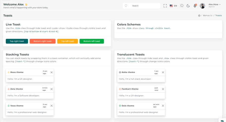
import { Toast, ToastBody } from "reactstrap";

const TopRightToast = () => {
  const [open, setOpen] = useState(false);
  const toggle = () => {
    setOpen(true);
    setTimeout(() => {
      setOpen(false);
    }, 3000);
  };

 return (
   <>
      <Button color="primary" onClick={toggle}>{TopRightToasts}</Button>
      <div className="toast-container position-fixed top-0 end-0 p-3 toast-index toast-rtl">
        <Toast fade isOpen={open}>
          <div className="toast-header toast-img">
            <strong className="me-auto">Riho theme</strong>
            <small>5 min ago</small>
            <Button close onClick={() => setOpen(false)}></Button>
          </div>
          <ToastBody className="toast-dark">Hello, I'm a web-designer.</ToastBody>
        </Toast>
      </div>
    </>
)}
Dropzone Offical link Preview link

npm i react-filepond<!-- Dropzone css -->
import 'react-dropzone-uploader/dist/styles.css';
import CommonCardHeader from "@/CommonComponent/CommonCardHeader";
import { DefaultFileUploads } from "@/Constant";
import { DefaultFileUpload } from "@/Data/BonusUi/Dropzone";
import React, { useState } from "react";
import { FilePond } from "react-filepond";
import { Card, CardBody, Col } from "reactstrap";
const DefaultDropzone = () => {
const [files, setFiles] = useState([]);
return (
<Col lg="6">
<Card>
<CommonCardHeader title={DefaultFileUploads} span={DefaultFileUpload} />
<CardBody>
<FilePond files={files} onupdatefiles={() => setFiles} allowMultiple={true} maxFiles={1} labelIdle={'Drag & Drop your files or Browse'} />
</CardBody>
</Card>
</Col>
);
};
export default DefaultDropzone;
Remove package from project
npm remove react-filepondTour Offical link Preview link

npm i @reactour/tourimport { TourProvider, useTour } from "@reactour/tour";
const STEPS = [
{
selector: ".step1",
content: "This is Riho profile",
},
];
const TourContainer = () => {
const { setIsOpen } = useTour();
useEffect(() => {
var timer = setTimeout(() => {
setIsOpen(true);
}, 3000);
return () => {
clearTimeout(timer);
};
}, [setIsOpen]);
return (
<TourProvider steps={STEPS} disableInteraction={false} disableKeyboardNavigation={false}>
<Card className="hovercard text-center">
<div className="cardheader rounded-3"></div>
<div className="user-image">
<div className="icon-wrapper">
<i className="icofont icofont-pencil-alt-5 step1"></i>
</div>
</div>
</Card>
</TourProvider>
);
};
Remove package from project
npm remove @reactour/tourSweetalert Offical link Preview link
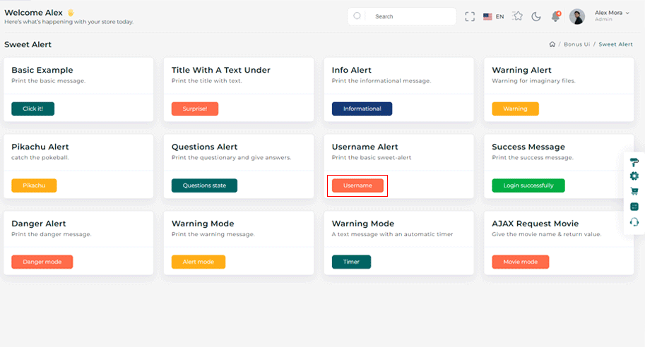
npm i sweetalert2import SweetAlert from "sweetalert2";
const BasicExample = () => {
const displayAlert = () => {
SweetAlert.fire({ title: "Welcome! to the Riho theme",confirmButtonColor:"#33BFBF" });
};
return (
<Card className="height-equal">
<CardBody className="btn-showcase">
<Button color="primary" className="sweet-1" onClick={displayAlert}>{ClickIt}</Button>
</CardBody>
</Card>
);
};
Remove package from project
npm remove sweetalert2Range slider Offical link Preview link
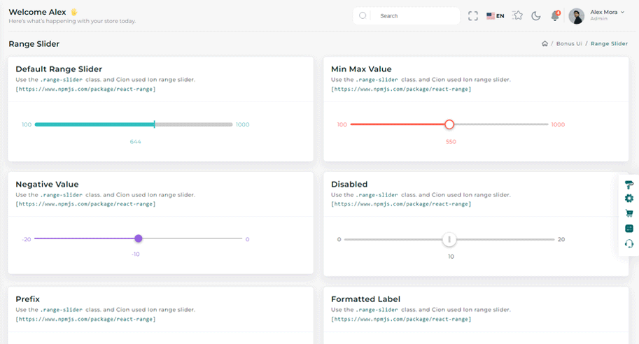
npm i react-rangeimport { Range, getTrackBackground } from "react-range";
export const DefaultRangeSliderForm = () => {
const [values, setValues] = useState([550]);
return (
<Form className="theme-form form-label-align-right range-slider">
<Row className="form-group py-1">
<Col md="10">
<div style={{ color: "#33BFBF" }} className="d-flex justify-content-center flex-wrap m-3">
<Range values={values} step={1} min={100} max={1000} onChange={(values) => setValues(values)} renderTrack={({ props, children }) => (
<div onMouseDown={props.onMouseDown} onTouchStart={props.onTouchStart} style={{ ...props.style, height: "36px" }} className="d-flex w-100">
<output className="mt-2 me-2">100</output>
<div ref={props.ref} className="rounded-2 w-100" style={{ height: "10px", background: getTrackBackground({ values: values, colors: ["#33BFBF", "#ccc"], min: 100, max: 1000 }), alignSelf: "center" }}>
{children}
</div>
<output className="mt-2 ms-2">1000</output>
</div>
)}
renderThumb={({ props }) => (
<div {...props} className="d-flex justify-content-center align-items-center" style={{ ...props.style, height: "3px", width: "3px", backgroundColor: "#FFF", boxShadow: "0px 2px 6px #AAA" }}>
<div style={{ height: "20px", width: "5px", backgroundColor: "#33BFBF" }} />
</div>
)}
/>
<output id="output" className="mt-3">{values[0]}</output>
</div>
</Col>
</Row>
</Form>
);
};
Remove package from project
npm remove react-rangeImage cropper Offical link Preview link

npm i react-image-crop<!--Image cropper css-->
import 'react-image-crop/dist/ReactCrop.css';
import ReactCrop, { centerCrop, makeAspectCrop, Crop, PixelCrop } from "react-image-crop";
const centerAspectCrop = (mediaWidth: number, mediaHeight: number, aspect: number) => {
return centerCrop(makeAspectCrop({ unit: "%", width: 90 }, aspect, mediaWidth, mediaHeight), mediaWidth, mediaHeight);
};
const ImageCropperBody = () => {
const [imgSrc, setImgSrc] = useState("");
const previewCanvasRef = useRef<HTMLCanvasElement>(null);
const imgRef = useRef<HTMLImageElement>(null);
const hiddenAnchorRef = useRef<HTMLAnchorElement>(null);
const blobUrlRef = useRef("");
const [crop, setCrop] = useState<Crop>();
const [completedCrop, setCompletedCrop] = useState<PixelCrop>();
const [scale, setScale] = useState(1);
const [rotate, setRotate] = useState(0);
const [aspect, setAspect] = useState<number | undefined>(16 / 9);
const onSelectFile = (e: React.ChangeEvent<HTMLInputElement>) => {
if (e.target.files && e.target.files.length > 0) {
setCrop(undefined); // Makes crop preview update between images.
const reader = new FileReader();
reader.addEventListener("load", () => setImgSrc(reader.result?.toString() || ""));
reader.readAsDataURL(e.target.files[0]);
}
};
const onImageLoad = (e: React.SyntheticEvent<HTMLImageElement>) => {
if (aspect) {
const { width, height } = e.currentTarget;
setCrop(centerAspectCrop(width, height, aspect));
}
};
const onDownloadCropClick = () => {
if (!previewCanvasRef.current) throw new Error("Crop canvas does not exist");
previewCanvasRef.current.toBlob((blob) => {
if (!blob) throw new Error("Failed to create blob");
if (blobUrlRef.current) URL.revokeObjectURL(blobUrlRef.current);
blobUrlRef.current = URL.createObjectURL(blob);
hiddenAnchorRef.current!.href = blobUrlRef.current;
hiddenAnchorRef.current!.click();
});
};
useDebounceEffect(
async () => {
if (completedCrop?.width && completedCrop?.height && imgRef.current && previewCanvasRef.current)
// We use canvasPreview as it's much faster than imgPreview.
canvasPreview(imgRef.current, previewCanvasRef.current, completedCrop, scale, rotate);
},
100,
[completedCrop, scale, rotate]
);
const handleToggleAspectClick = () => {
if (aspect) {
setAspect(undefined);
} else if (imgRef.current) {
const { width, height } = imgRef.current;
setAspect(16 / 9);
setCrop(centerAspectCrop(width, height, 16 / 9));
}
};
const imgStyle = { transform: `scale(${scale}) rotate(${rotate}deg)` };
return (
<div className="App">
<CropControl imgSrc={imgSrc} scale={scale} setScale={setScale} rotate={rotate} setRotate={setRotate} aspect={aspect} onSelectFile={onSelectFile} handleToggleAspectClick={handleToggleAspectClick} />
{!!imgSrc && (
<ReactCrop crop={crop} onChange={(_, percentCrop) => setCrop(percentCrop)} onComplete={(c) => setCompletedCrop(c)} aspect={aspect}>
<img ref={imgRef} alt="Crop me" src={imgSrc} style={imgStyle} onLoad={onImageLoad} />
</ReactCrop>
)}
{!!completedCrop && (
<>
<div>
<canvas ref={previewCanvasRef} style={{ border: "1px solid black", objectFit: "contain", width: completedCrop.width, height: completedCrop.height }} />
</div>
<div>
<Button color="success" className="mt-2" onClick={onDownloadCropClick}>
{DownloadCrop}
</Button>
<a ref={hiddenAnchorRef} download className="position-absolute top-100 d-none">
{HiddenDownload}
</a>
<div>
</>
)}
</div>
);
};
Remove package from project
npm remove react-image-cropTimeline Offical link Preview link
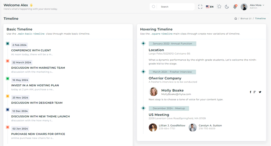
npm i react-vertical-timeline-componentimport { VerticalTimeline } from "react-vertical-timeline-component";
const Timelines = () => {
return (
<Card>
<CardBody>
<VerticalTimeline animate>
<VerticalTimelineElement className='vertical-timeline-element--work' date='February 02 2022' icon={<i className="icon-pencil-alt"></i>} iconClassName='cd-timeline-img bg-primary'>
<div className='timeline-wrapper'>
<Badge color='warning'>{AppIdeas}</Badge>
</div>
<h5 className='m-0 vertical-timeline-element-subtitle'>{EstablishedNewTheAppIdeaRepository}</h5>
<p className='mb-0'>{AppIdeaText}</p>
<div className='time-content pt-2'>
<i className='icon-github'></i>
<h6>{ViewItOnGithub}</h6>
</div>
</VerticalTimelineElement>
</VerticalTimeline>
</CardBody>
</Card>
);
};
Remove package from project
npm remove react-vertical-timeline-component