
Advance UI Elements
Scrollable Offical link Preview link
Inside Your template tags add
<div class="vertical-scroll scroll-demo custom-scrollbar ps-container ps-theme-default ps-active-y">
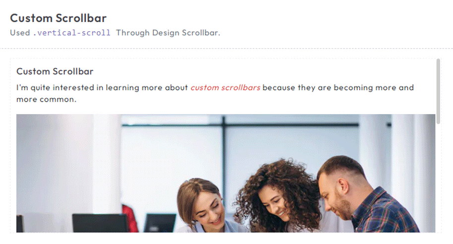
<h5 class="pb-2">Custom Scrollbar </h5>
<p>I'm quite interested in learning more about <em class="txt-danger">custom scrollbars</em> because they are
becoming more and more common.</p>
<div class="scrollbar-images"><img class="img-fluid" src="/images/banner/1.jpg" alt="banner"></div>
<p>
There are various justifications for customizing a scrollbar. For instance, the default scrollbar can cause
an app's user interface to look inconsistent across various operating systems. In this case, having a single
style is helpful.</p>
<p>
I never had the opportunity to learn about CSS scrollbar customization, but I have always been interested in
doing so. I'll take the chance to learn more about them and share my trip in this essay.</p>
<p>
One crucial point to remember is that, depending on the design, a scrollbar may operate either <em
class="txt-danger">horizontally or vertically</em> . Additionally, it might alter when you work on a
website that is global and operates in both left-to-right and right-to-left orientations.</p>
</div>Tree Offical link Preview link
npm i vue3-treeInside Your template tags add
<Tree :nodes="menu" :use-icon="true"/>
Inside Your script tags add
import Tree from "vue3-tree";
                  import "vue3-tree/dist/style.css";
                  import { menu, tree } from '~/core/data/tree'
Inside ts add
interface tree {
id: number;
label: string;
nodes?: Node[];
}
interface Node {
id: number;
label: string;
nodes?: Node[];
}
export const menu = ref([
{
id: 1,
label: "Applications",
nodes: [
{
id: 1,
label: "Ecommerce",
nodes: [
{
id: 1,
label: "Product"
},
{
id: 2,
label: "Cart"
},
{
id: 3,
label: "Invoice"
}
],
},
{
id: 2,
label: "Default",
nodes: [
{
id: 1,
label: "Users-profile",
},
{
id: 2,
label: "Users-edit",
},
{
id: 3,
label: "Users-cards",
},
],
},
{
id: 3,
label: "Default",
nodes: [
{
id: 1,
label: "Chat-app",
},
{
id: 2,
label: "Video-chat",
}
],
},
],
},
{
id: 2,
label: "Components",
nodes: [
{
id: 1,
label: "UI-Kits",
nodes: [
{
id: 1,
label: "Typography"
},
{
id: 2,
label: "Avatars"
},
{
id: 3,
label: "Grid"
}
],
},
{
id: 2,
label: "Bonus-UI",
nodes: [
{
id: 1,
label: "Toasts",
},
{
id: 2,
label: "Rating",
},
{
id: 3,
label: "Pagination",
},
],
},
{
id: 3,
label: "Charts",
nodes: [
{
id: 1,
label: "Apex-chart",
},
{
id: 2,
label: "Google-chart",
},
{
id: 3,
label: "Echarts",
}
],
},
],
},
{
id: 3,
label: "Miscellaneous",
nodes: [
{
id: 1,
label: "Gallery",
nodes: [
{
id: 1,
label: "Gallery-grid"
},
{
id: 2,
label: "Gallery-grid-desc"
},
{
id: 3,
label: "Masonry-gallery"
}
],
},
{
id: 2,
label: "Blog",
nodes: [
{
id: 1,
label: "Blog-details",
},
{
id: 2,
label: "Blog-single",
},
{
id: 3,
label: "Add-post",
},
],
},
{
id: 3,
label: "Editors",
nodes: [
{
id: 1,
label: "Summer-note",
},
{
id: 2,
label: "CK-editor",
},
{
id: 3,
label: "MDE-editor",
}
],
},
],
}
]) Toast Offical link Preview link
npm i vue3-toastifyInside Your template tags add
<class="btn btn-success " type="button" @click="success" variant="success">Success</Button>
Inside Your script tags add
import type { ToastPosition } from 'vue3-toastify';
                  import { toast } from 'vue3-toastify';
                  import 'vue3-toastify/dist/index.css';
 function success() {
  toast.success(' New order has been placed ', {
      hideProgressBar: true, autoClose: 2000, theme: 'colored', position: 'top-right'
  });
}
Dropzone Offical link Preview link
npm i dropzone-vueInside Your template tags add
                <ClientOnly>
                  <DropZone
:maxFileSize="Number(60000000)"
:uploadOnDrop="true"
:dropzoneMessageClassName="customClass" :maxFiles="1">
</DropZone></ClientOnly>
Inside Your script tags add
import DropZone from "dropzone-vue";
Inside Your style tags add
@import 'dropzone-vue/dist/dropzone-vue.common.css';
Tour Offical link Preview link
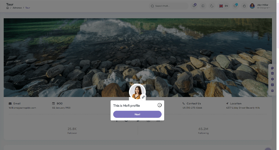
npm i v-onboardingInside Your template tags add
<img img class="img-fluid" alt="" src="/images/user/7.jpg" data-intro="This is Profile image">
<router-link class="icon-wrapper" id="update-profile-tour" to="/users/edit">
<i class="icofont icofont-pencil-alt-5" data-intro="Change Profile image here"  id="update-profile-tour" ></i>
</router-link>
<VOnboardingWrapper ref="wrapper" :steps="steps" class="tour-visit"/>
Inside Your script tags add
import { VOnboardingWrapper, useVOnboarding } from 'v-onboarding'
 import 'v-onboarding/dist/style.css'
 const { start, goToStep, finish } = useVOnboarding(wrapper)
 let steps = [
     {
         attachTo: { element: '#profiletour' }, content: { title: "This is Mofi profile" }
     },
     {
         attachTo: { element: '#update-profile-tour' }, content: { title: "Change Mofi profile image here" }
     }
 ]

 onMounted(() => {
     start()
 });
Sweetalert Offical link Preview link
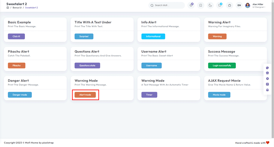
npm i sweetalert2Inside Your template tags add
<button class="btn btn-danger sweet-5" type="button" v-on:click="basic_warning_alert" >Warning alert</button>Inside Your script tags add
import Swal from 'sweetalert2'
function basic_warning_alert() {
Swal.fire({
icon: 'warning',
title: "Are you sure?",
text: 'Once deleted, you will not be able to recover this imaginary file!',
showCancelButton: true,
confirmButtonText: 'Ok',
confirmButtonColor: '#3e5fce',
cancelButtonText: 'Cancel',
cancelButtonColor: '#efefef',
}).then((result) => {
if (result.value) {
Swal.fire({
icon: 'success',
text: 'Poof! Your imaginary file has been deleted!',
confirmButtonColor: '#3e5fce',
});
} else {
Swal.fire({
text: 'Your imaginary file is safe!',
confirmButtonColor: '#3e5fce',
});
}
});
}
Range slider Offical link Preview link
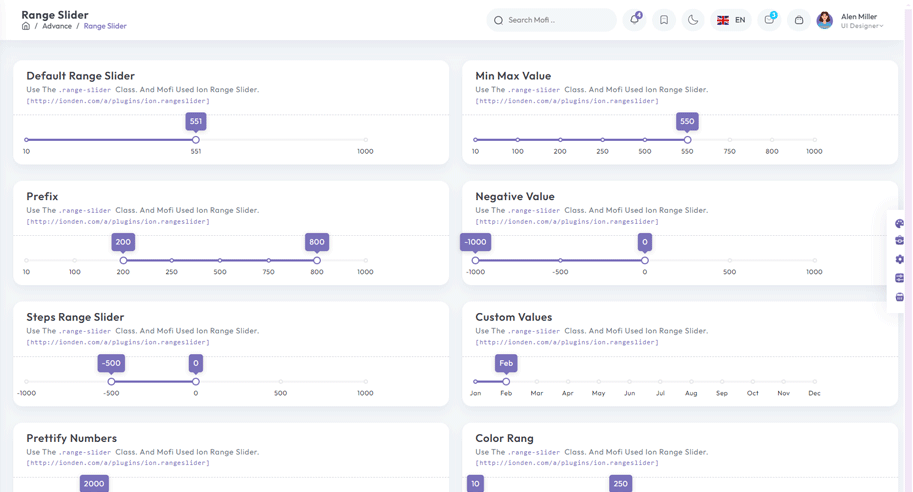
npm i vue-simple-range-sliderInside Your template tags add
<ClientOnly>
                  <VueSimpleRangeSlider :min="100" :max="1000"  :exponential="true"  bar-color="#e1e4e9" active-bar-color="#33BFBF" :popover-content-editable="true"  v-model="state.range" >
                    </VueSimpleRangeSlider>
                    </ClientOnly>
Inside Your script tags add
import VueSimpleRangeSlider from "vue-simple-range-slider";
                  import "vue-simple-range-slider/css";
                      const state = ref({ range: [100, 885], number: 10 });
Image cropper Offical link Preview link
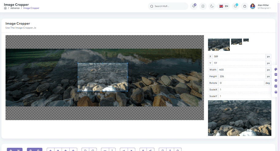
npm i vue-cropperjsInside Your template tags add
<vue-cropper
vue-cropper ref="cropper"
:guides="true"
:view-mode="viewmodeselected"
drag-mode="crop"
:aspectRatio="aspectRatioselected"
:auto-crop-area="0.5"
:min-container-width="250"
:min-container-height="180"
:background="true"
:rotatable="true"
:movable="true"
:src="getImgUrl(myimgSrc)"
alt="Source Image"
:ready="ready"
:crop="cropImage"
img-preview=".img-preview"
:img-style="{ width: '800px', height: '500px' }">
</vue-cropper>
Inside Your script tags add
import VueCropper from 'vue-cropperjs';
import 'cropperjs/dist/cropper.css';
import { Tooltip } from "bootstrap";
import { getImgUrl } from "@/composables/commen/imgMixin"
import { ref, onMounted } from "vue"
let myimgSrc = ref<string>('other-images/img-cropper.jpg')
let imageData = ref<any>({})
let containerData = ref<string>('')
let putData = ref<string>('')
let viewmodeselected = ref<number>(0)
let cropImg = ref<string>('')
let aspectRatioselected = ref<number>(1.7777777777777777)
let cropper = ref()
let convertNumber = (num?: number) => num != null ? Math.round(num) : undefined
function ready() {
containerData.value = cropper.value.getContainerData();
}
function cropImage() {

cropImg.value = cropper.value.getCroppedCanvas().toDataURL();
}
onMounted(() => {
new Tooltip(document.body, {
selector: "[data-bs-toggle='tooltip']",
})
})
Timeline Preview link
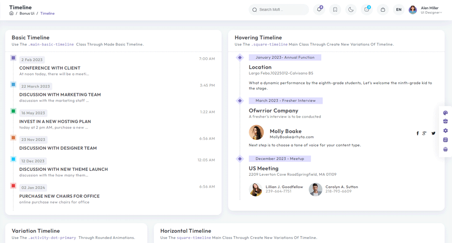
Inside Your template tags add
<div class="cd-timeline-block">
  <div class="cd-timeline-img cd-picture bg-success"><i class="icon-image"></i></div>
  <div class="cd-timeline-content">
      <div class="timeline-wrapper">
          <div class="badge bg-info">Designer</div>
      </div>
      <h3 class="m-0">Research about most recent design trends.</h3>
      <p class="mb-0">
          Spend some time looking up current design trend. </p>
      <div class="carousel slide" id="carouselExampleIndicators" data-bs-ride="true">
          <div class="carousel-indicators">
              <button class="active" type="button" data-bs-target="#carouselExampleIndicators" data-bs-slide-to="0"
                  aria-current="true" aria-label="Slide 1"></button>
              <button type="button" data-bs-target="#carouselExampleIndicators" data-bs-slide-to="1"
                  aria-label="Slide 2"></button>
              <button type="button" data-bs-target="#carouselExampleIndicators" data-bs-slide-to="2"
                  aria-label="Slide 3"></button>
          </div>
          <div class="carousel-inner">
              <div class="carousel-item active"><img class="d-block w-100" src="@/assets/images/banner/2.jpg"
                      alt="office-work"></div>
              <div class="carousel-item"><img class="d-block w-100" src="@/assets/images/banner/1.jpg"
                      alt="office-work"></div>
              <div class="carousel-item"><img class="d-block w-100" src="@/assets/images/banner/3.jpg"
                      alt="office-work"></div>
          </div>
          <button class="carousel-control-prev" type="button" data-bs-target="#carouselExampleIndicators"
              data-bs-slide="prev"><span class="carousel-control-prev-icon" aria-hidden="true"></span><span
                  class="visually-hidden">Previous</span></button>
          <button class="carousel-control-next" type="button" data-bs-target="#carouselExampleIndicators"
              data-bs-slide="next"><span class="carousel-control-next-icon" aria-hidden="true"></span><span
                  class="visually-hidden">Next</span></button>
      </div><span class="cd-date">April 23 2024</span>
  </div>
</div>