
Advance UI Elements
Scrollable Offical link Preview link

npm i react-perfect-scrollbarimport Scrollbar from "react-perfect-scrollbar";
const CustomScroll = () => {
return (
<Card>
<CardBody>
<Scrollbar className="vertical-scroll scroll-demo" style={{ width: "100%", height: 300 }}>
<H5>Custom Scrollbar</H5>
<P>Custom Scrollbar</P>
</ScrollBar>
</CardBody>
</Card>
)}
Remove package from project
npm uninstall react-perfect-scrollbarTree Offical link Preview link
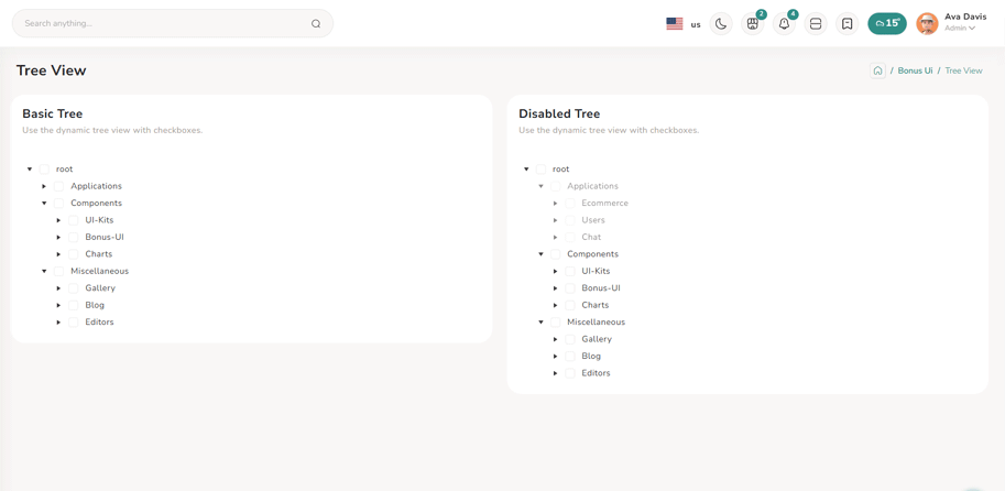
npm i @progress/kendo-react-treeviewconst checkField = "checked";
type TreeState = {
check: TreeViewCheckDescriptor;
items: typeof simpleTreeviewData;
};
const [treeState, setTreeState] = useState<TreeState>({
check: { idField: "text", applyCheckIndeterminate: true, ids: [] },
items: simpleTreeviewData,
});
const onCheckChange = (event: any) => {
const settings = { checkChildren: true, checkParents: true };
const newCheck = handleTreeViewCheckChange(event, treeState.check, treeState.items, settings) as TreeViewCheckDescriptor;
setTreeState((prevState) => ({
...prevState,
check: { ...prevState.check, ...newCheck },
}));
};
const onExpandChange = (event: TreeViewExpandChangeEvent) => {
event.item.expanded = !event.item.expanded;
setTreeState((prevState) => ({
...prevState,
items: [...prevState.items],
}));
};
return (
<Col sm={6}>
<Card>
<CommonCardHeader title={BasicTreeTitle} subTitle={basicTreeSubTitle} />
<CardBody>
<TreeView
data={processTreeViewItems(treeState.items, {
check: treeState.check,
})}
checkField={checkField}
checkboxes={true}
onCheckChange={onCheckChange}
expandIcons={true}
onExpandChange={onExpandChange}
/>
</CardBody>
</Card>
</Col>
);Remove package from project
npm uninstall @progress/kendo-react-treeviewToast Offical link Preview link
import { Toast, ToastBody, ToastHeader } from "reactstrap";
import { Btn } from '../../../../../AbstractElements';
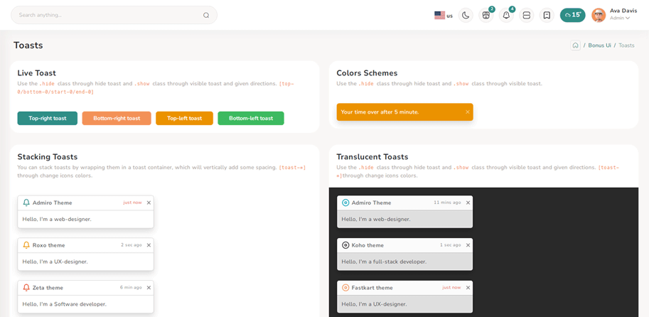
const TopRightToast = () => {
const [open, setOpen] = useState(false);
const toggle = () => {
setOpen(true);
setTimeout(() => {
setOpen(false);
}, 3000);
};
return (
<>
<Btn color="primary" onClick={toggle}>{TopRightToasts}</Btn>
<div className="toast-container position-fixed top-0 end-0 p-3 toast-index toast-rtl">
<Toast fade isOpen={open}>
<ToastHeader className="toast-img">
<strong className="me-auto">Riho theme</strong>
<small>5 min ago</small>
<Btn className="btn-close" onClick={() => setOpen(false)}></Btn>
</ToastHeader>
<ToastBody className="toast-dark">Hello, I'm a web-designer.</ToastBody>
</Toast>
</div>
</>
)}
Dropzone Offical link Preview link

npm i react-filepond<!-- Dropzone css -->
@import '~react-dropzone-uploader/dist/styles.css';
@import 'filepond/dist/filepond.min.css';
import { FilePond } from "react-filepond";
const DefaultFileUpload = () => {
const [files, setFiles] = useState<ExtFile[]>([]);
return (
<Card>
<CardBody className="mt-3 mb-3">
<FilePond files={files} onupdatefiles={() => setFiles} allowMultiple={true} maxFiles={1}
labelIdle={
'Drag & Drop your files or <span className="filepond--label-action text-danger text-decoration-none">Browse</span>'
}
/>
</CardBody>
</Card>
);
};
Remove package from project
npm uninstall react-filepondTour Offical link Preview link

npm i @sjmc11/tourguidejsconst tourRef = useRef<any | null>(null);
const [isTourOpen, setIsTourOpen] = useState(false);
useEffect(() => {
try {
tourRef.current = new TourGuideClient({ steps: toursteps });
} catch (error) {
toast.error("Error initializing TourGuideClient:" + error);
}
return () => tourRef.current?.destroy?.();
}, []);
useEffect(() => {
const timer = setTimeout(() => setIsTourOpen(true), 1000);
return () => clearTimeout(timer);
}, []);
useEffect(() => {
if (isTourOpen) tourRef.current?.start?.();
}, [isTourOpen]);
return (
<>
<Breadcrumbs pageTitle={TourTitle} parent={BonusUi} title={TourTitle} />
<Container fluid>
<div className="user-profile">
<Row>
<TourMain />
</Row>
</div>
</Container>
</>
);Remove package from project
npm uninstall @sjmc11/tourguidejsSweetalert Offical link Preview link
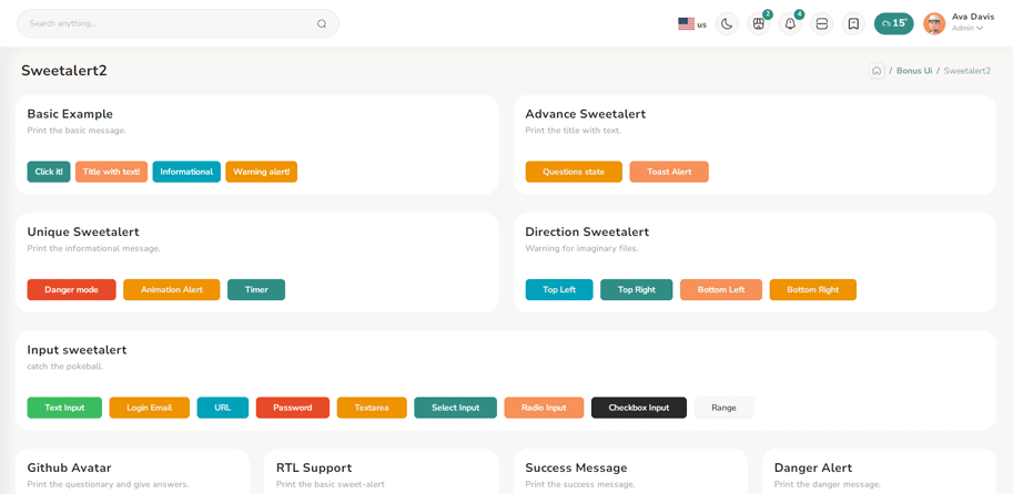
npm i sweetalert2import Swal from "sweetalert2";
import { Btn } from '../../../../AbstractElements';
const BasicExample = () => {
const displayAlert = () => {
SweetAlert.fire({ title: "Welcome! to the Riho theme",confirmButtonColor:"var(--theme-deafult)" });
};
return (
<Card className="height-equal">
<CardBody className="btn-showcase">
<Btn color="primary" className="sweet-1" onClick={displayAlert}>{ClickIt}</Btn>
</CardBody>
</Card>
);
};
Remove package from project
npm uninstall sweetalert2Range slider Offical link Preview link

npm i react-rangeimport { Range, getTrackBackground } from "react-range";
export const BasicRangeDemo = () => {
const [values, setValues] = useState([550]);
return (
<Form className="theme-form form-label-align-right range-slider">
<Row className="form-group py-1">
<Col md="10">
<div style={{ color: "#7A70BA" }} className="d-flex justify-content-center flex-wrap m-3">
<Range values={values} step={1} min={100} max={1000} onChange={(values) => setValues(values)} renderTrack={({ props, children }) => (
<div onMouseDown={props.onMouseDown} onTouchStart={props.onTouchStart} style={{ ...props.style, height: "36px" }} className="d-flex w-100">
<output className="mt-2 me-2">100</output>
<div ref={props.ref} className="rounded-2 w-100" style={{ height: "10px", background: getTrackBackground({ values: values, colors: ["#7A70BA", "#ccc"], min: 100, max: 1000 }), alignSelf: "center" }}>
{children}
</div>
<output className="mt-2 ms-2">1000</output>
</div>
)}
renderThumb={({ props }) => (
<div {...props} className="d-flex justify-content-center align-items-center" style={{ ...props.style, height: "3px", width: "3px", backgroundColor: "#FFF", boxShadow: "0px 2px 6px #AAA" }}>
<div style={{ height: "20px", width: "5px", backgroundColor: "#7A70BA" }} />
</div>
)}
/>
<output id="output" className="mt-3">{values[0]}</output>
</div>
</Col>
</Row>
</Form>
);
};
Remove package from project
npm uninstall react-rangePagination Preview link
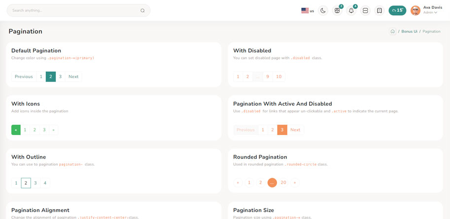
import { Nav, Pagination, PaginationItem, PaginationLink } from "reactstrap";
export const DefaultList = () => {

  return (
    <Nav>
      <Pagination className="pagin-border-primary pagination-primary">
        {defaultPagiData &&
          defaultPagiData.map((item, index) => (
            <PaginationItem className="pointer" key={index}>
              <PaginationLink href={Href}>
                {item.text}
                {item.text === "2" ? <span className="sr-only">(current)</span> : ""}
              </PaginationLink>
            </PaginationItem>
          ))}
      </Pagination>
    </Nav>
  );
};
Breadcrumb Preview link

import { Breadcrumb, BreadcrumbItem, Card, CardBody, Col } from "reactstrap";
import CardHeaderCommon from '../../../../CommonElements/CardHeaderCommon/CardHeaderCommon';

export const DefaultBreadcrumb = () => {

  return (
    <Col sm={6}>
      <Card className="height-equal">
        <CardHeaderCommon title={DefaultBreadcrumbs} subTitle={subMenu} headClass="pb-0" />
        <CardBody>
          <Breadcrumb>
            <BreadcrumbItem>
              <Link to={Href}>{Home}</Link>
            </BreadcrumbItem>
            <BreadcrumbItem active>{UIKits}</BreadcrumbItem>
          </Breadcrumb>
          <Breadcrumb>
            <BreadcrumbItem>
              <Link to={Href}>{Home}</Link>
            </BreadcrumbItem>
            <BreadcrumbItem>
              <Link to={Href}>{UIKits}</Link>
            </BreadcrumbItem>
            <BreadcrumbItem active>{Alert}</BreadcrumbItem>
          </Breadcrumb>
        </CardBody>
      </Card>
    </Col>
  );
};
Image cropper Offical link Preview link

npm i react-image-crop<!--Image cropper css-->
import 'react-image-crop/dist/ReactCrop.css';
import ReactCrop, { centerCrop, makeAspectCrop, Crop, PixelCrop } from "react-image-crop";
const centerAspectCrop = (mediaWidth: number, mediaHeight: number, aspect: number) => {
return centerCrop(makeAspectCrop({ unit: "%", width: 90 }, aspect, mediaWidth, mediaHeight), mediaWidth, mediaHeight);
};
const ImageCropperBody = () => {
const [imgSrc, setImgSrc] = useState("");
const previewCanvasRef = useRef<HTMLCanvasElement>(null);
const imgRef = useRef<HTMLImageElement>(null);
const hiddenAnchorRef = useRef<HTMLAnchorElement>(null);
const blobUrlRef = useRef("");
const [crop, setCrop] = useState<Crop>();
const [completedCrop, setCompletedCrop] = useState<PixelCrop>();
const [scale, setScale] = useState(1);
const [rotate, setRotate] = useState(0);
const [aspect, setAspect] = useState<number | undefined>(16 / 9);
const onSelectFile = (e: React.ChangeEvent<HTMLInputElement>) => {
if (e.target.files && e.target.files.length > 0) {
setCrop(undefined); // Makes crop preview update between images.
const reader = new FileReader();
reader.addEventListener("load", () => setImgSrc(reader.result?.toString() || ""));
reader.readAsDataURL(e.target.files[0]);
}
};
const onImageLoad = (e: React.SyntheticEvent<HTMLImageElement>) => {
if (aspect) {
const { width, height } = e.currentTarget;
setCrop(centerAspectCrop(width, height, aspect));
}
};
const onDownloadCropClick = () => {
if (!previewCanvasRef.current) throw new Error("Crop canvas does not exist");
previewCanvasRef.current.toBlob((blob) => {
if (!blob) throw new Error("Failed to create blob");
if (blobUrlRef.current) URL.revokeObjectURL(blobUrlRef.current);
blobUrlRef.current = URL.createObjectURL(blob);
hiddenAnchorRef.current!.href = blobUrlRef.current;
hiddenAnchorRef.current!.click();
});
};
useDebounceEffect(
async () => {
if (completedCrop?.width && completedCrop?.height && imgRef.current && previewCanvasRef.current)
// We use canvasPreview as it's much faster than imgPreview.
canvasPreview(imgRef.current, previewCanvasRef.current, completedCrop, scale, rotate);
},
100,
[completedCrop, scale, rotate]
);
const handleToggleAspectClick = () => {
if (aspect) {
setAspect(undefined);
} else if (imgRef.current) {
const { width, height } = imgRef.current;
setAspect(16 / 9);
setCrop(centerAspectCrop(width, height, 16 / 9));
}
};
const imgStyle = { transform: `scale(${scale}) rotate(${rotate}deg)` };
return (
<div className="App">
<CropControl imgSrc={imgSrc} scale={scale} setScale={setScale} rotate={rotate} setRotate={setRotate} aspect={aspect} onSelectFile={onSelectFile} handleToggleAspectClick={handleToggleAspectClick} />
{!!imgSrc && (
<ReactCrop crop={crop} onChange={(_, percentCrop) => setCrop(percentCrop)} onComplete={(c) => setCompletedCrop(c)} aspect={aspect}>
<img ref={imgRef} alt="Crop me" src={imgSrc} style={imgStyle} onLoad={onImageLoad} />
</ReactCrop>
)}
{!!completedCrop && (
<>
<div>
<canvas ref={previewCanvasRef} style={{ border: "1px solid black", objectFit: "contain", width: completedCrop.width, height: completedCrop.height }} />
</div>
<div>
<Btn color="success" className="mt-2" onClick={onDownloadCropClick}>
{DownloadCrop}
</Btn>
<a ref={hiddenAnchorRef} download className="position-absolute top-100 d-none">
{HiddenDownload}
</a>
<div>
</>
)}
</div>
);
};
Remove package from project
npm uninstall react-image-crop