Getting Started
1Introduction
Welcome to the official documentation for the Modora Shopify theme. Modora is a premium, high-performance theme designed for modern e-commerce stores. Whether you're building a fashion boutique, a tech outlet, or a general lifestyle brand, Modora provides the tools and flexibility you need to succeed.
This guide will help you through every step of setting up your store, from the initial installation to advanced customization. We've designed Modora to be intuitive, but this documentation is here to ensure you can maximize its potential.
2Features
Blazing Fast
Optimized for Google Lighthouse and Core Web Vitals to ensure the best possible SEO.
Mobile First
A seamless shopping experience across all mobile devices and screen sizes.
3Shopify Manual
Before diving deep into theme-specific settings, we recommend familiarizing yourself with the standard Shopify admin interface. Modora integrates deeply with the Shopify Online Store 2.0 architecture, which means you can use the built-in sections and blocks feature to build your pages.
Note for beginners
If you are new to Shopify, check out the official Shopify Help Center for basic store management tasks like inventory and shipping.
4What You Get
- High-conversion product page templates
- Advanced filtering for collections
- Interactive mega-menu builder
- Optimized checkout styling
- Free lifetime updates and professional support
5Useful Resources
- Getting to know Shopify: https://shopify.pxf.io/doxgxq
- Shopify Apps: https://shopify.pxf.io/KeVmox
- Free tools to run your business: https://shopify.pxf.io/oqaVDe
- Free stock photos and images: https://shopify.pxf.io/GjaNAn
Theme Install
1Download The Theme Package
- Download the package from themeforest.net (the package is in zip format).
- Unzip the package you've just downloaded.
- Find this file, then you just need to upload .zip file to your Shopify store.
2Upload The Theme
- Please log in to your Shopify store, click Online Store -> Themes.
- At Themes , click Import theme.
- choose Upload zip file.
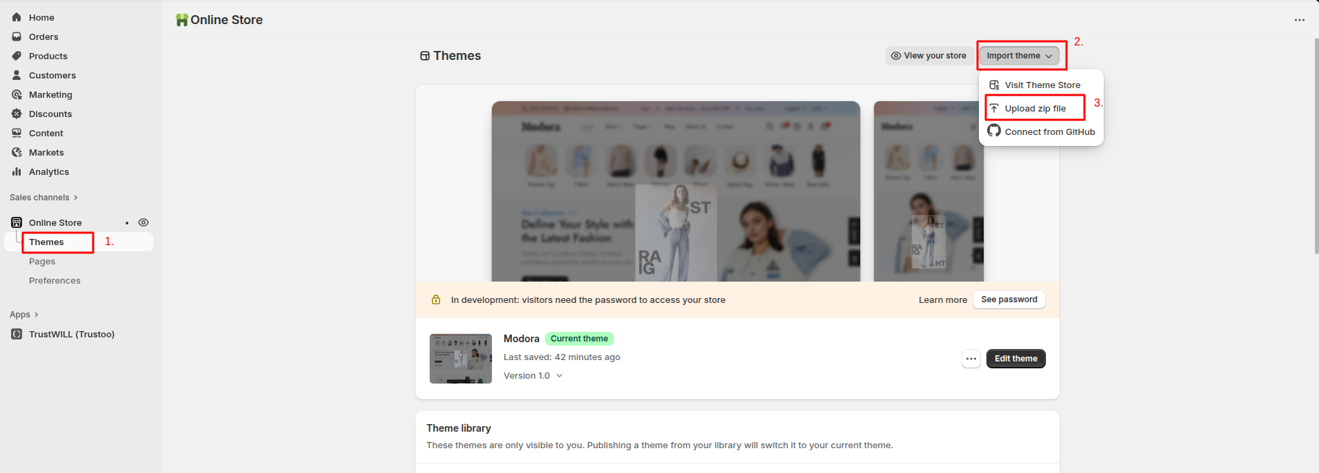
- The Upload Themes dialog displays. Click Add file or drop file to upload to select the .zip file you just downloaded.

- Click Upload file.
- Wait until the uploading process finishes.
3Publish The Theme
- After upload, you will see Modora in the Theme Library.
- Click Publish to set Modora as your live theme.
Note: If you are not ready to publish yet, you can keep Modora in the library and preview it first.
4Install App
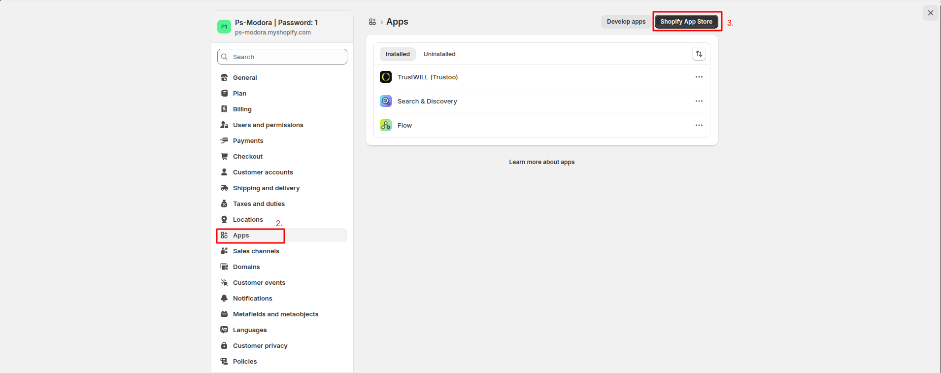
- Go to Admin Panel -> Settings.
- In Settings, Find Apps.
- After that, click Shopify App Store.
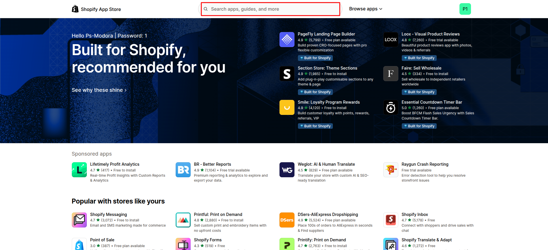
- Search for mentioned app (such as TrustWILL (trustoo)).
- Click Install. for installing the app.
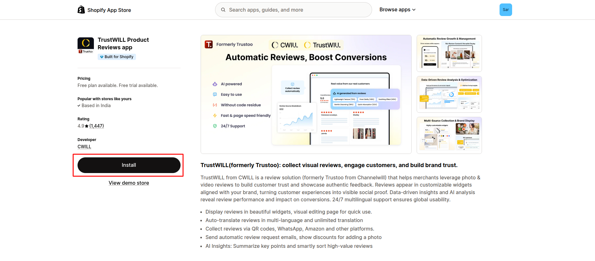
Note: If you are using an app such as TrustWILL (Trustoo), go to Edit theme, open App embeds, and enable the app to display its features on the storefront.
5Add Currency
- Go to Admin Panel -> Markets.
- Click on Create market.
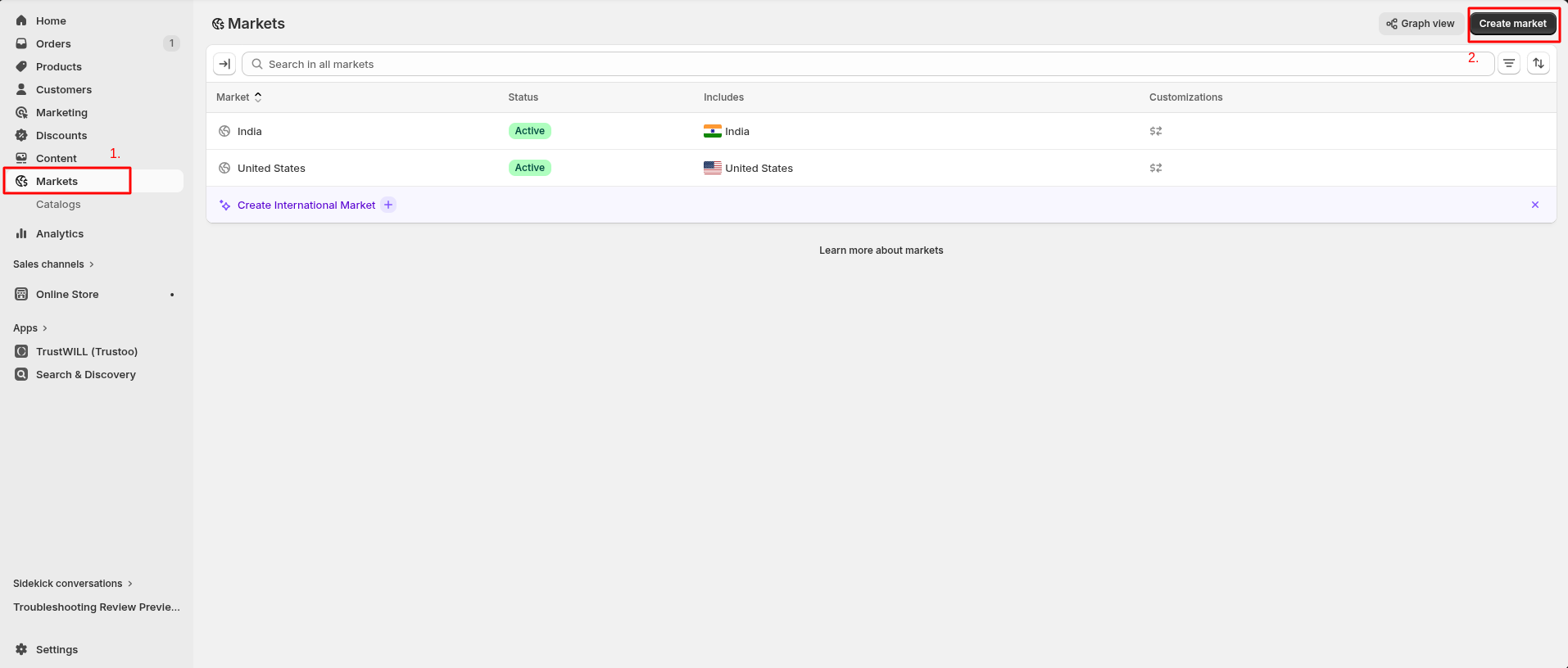
- Open New Market page then add Name of the market.
- After that, Add Condition. In this select region.
- Click on Currency and select the currency.

6Add Language
- Go to Admin Panel -> settings.
- In Settings, Find Languages.
- After that, click on Add Languages.

- Select the language and Publish that language.
Update Theme
Keeping your theme up to date ensures you get the latest features, performance improvements, and bug fixes.
1Before You Update
- Duplicate your current theme as a backup.
- Review any custom code changes you've made.
- Take note of installed apps or third-party scripts.
2Upload New Version
- Download the latest version of the theme.
- Go to Shopify Admin -> Online Store -> Themes.
- Click Add Theme -> Upload ZIP file.
- Upload the new theme file.
- Click Customize and review settings.
- Publish when ready.
3Replace Files
- Open your current theme code.
- Compare with the new version.
- Manually update required files.
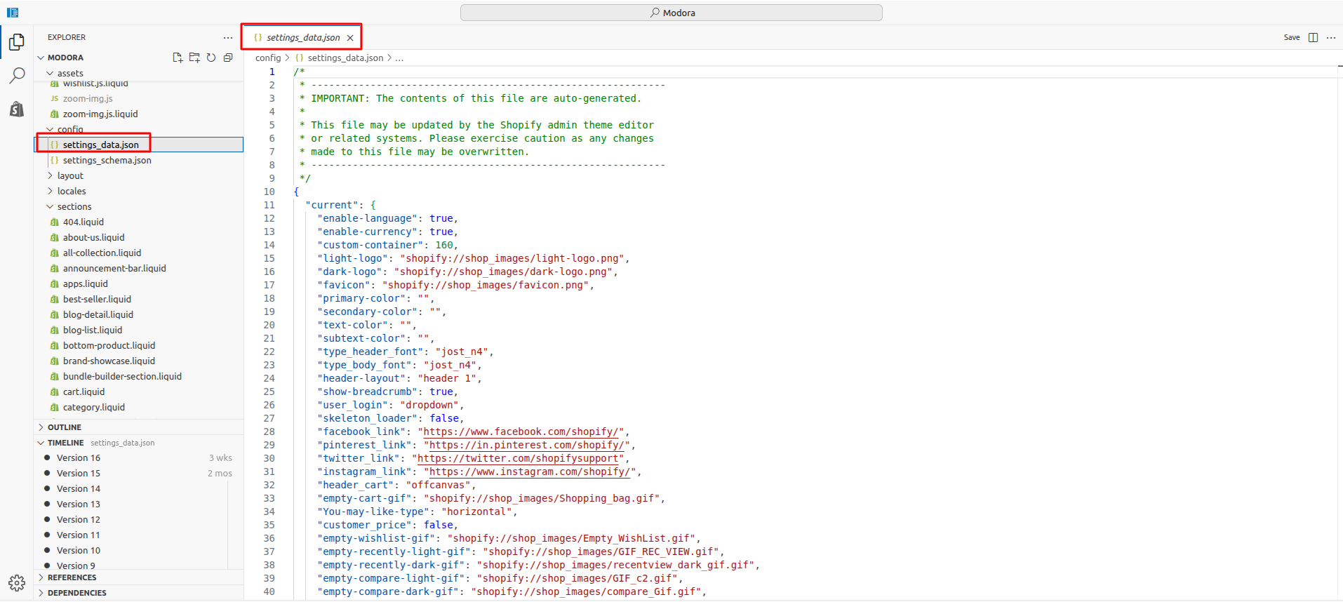
The settings_data.json file stores all your theme customization settings such as colors, layouts, and sections. Copying or reviewing this file helps retain your design when updating the theme.
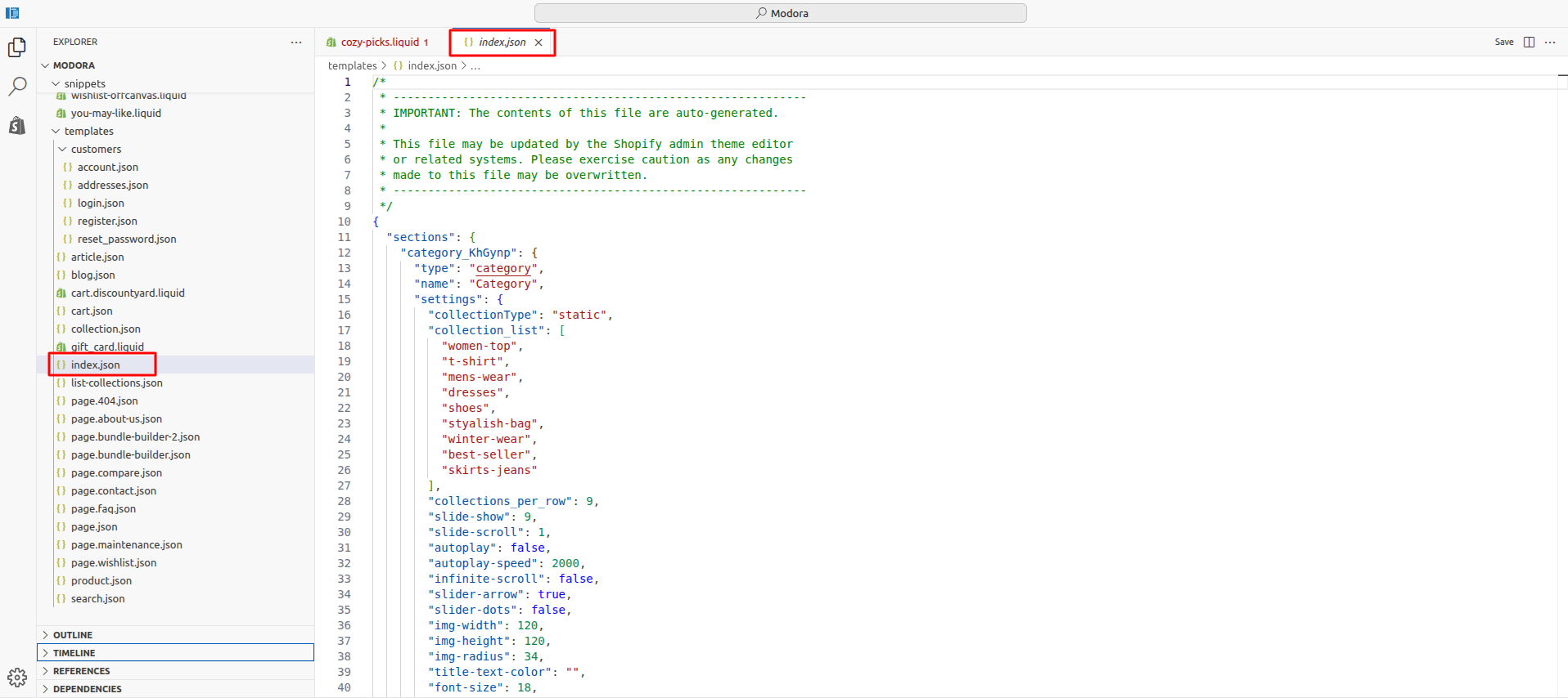
The index.json file controls the homepage structure and section layout. Ensure this file is updated properly to maintain your homepage design.
- Test before publishing.
Important Notes
- Custom code changes are not automatically migrated
- Some settings may need reconfiguration
- Always test before going live
4Reapplying Customizations (if any)
- Re-add custom CSS/JS.
- Reconnect apps if required.
- Verify product, collection, and homepage layouts.
5Testing Checklist
- All pages load correctly.
- Product pages display properly.
- Cart and checkout work as expected.
- Mobile responsiveness is intact.
- Apps and integrations function correctly.
Theme Settings
1Logo And Favicon
- From your Shopify admin, go to Online Store -> Themes.
- Find the theme that you want to edit, and then click Edit Theme.
- Click Theme settings -> Logo and Favicon

Logo and Favicon Settings
| Settings | Type | Default | Description |
|---|---|---|---|
| Light Mode Logo | image_picker | - | Displayed when the theme is in light appearance. |
| Dark Mode color | image_picker | - | Displayed when the theme is in dark appearance. |
| Favicon | image_picker | - | Small icon shown in the browser tab and bookmarks, helping users quickly recognize your store. |
| Logo Width | range | 143px | Controls the width of your store logo. |
| Logo Height | range | 48px | controls the height of your store logo. |
2General
- From your Shopify admin, go to Online Store -> Themes.
- Find the theme that you want to edit, and then click Edit Theme.
- Click Theme settings -> General

General Settings
| Settings | Type | Default | Description |
|---|---|---|---|
| Activate Language Selector | checkbox | true | Allowing customers to switch between available store languages easily. |
| Activate Currency Selector | checkbox | true | Enabling customers to view prices in their preferred currency. |
| Custom Container | range | 160px | Allowing precise control over layout width and content breathing space. |
3Custom Theme Color
- From your Shopify admin, go to Online Store -> Themes.
- Find the theme that you want to edit, and then click Edit Theme.
- Click Theme settings -> Custom Theme Color
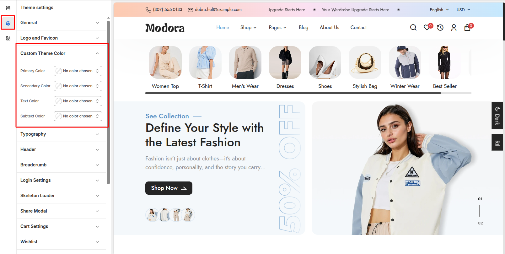
Custom Theme Color Settings
| Settings | Type | Default | Description |
|---|---|---|---|
| Primary Color | color_background | #212121 | Used across key elements like buttons, links, and highlights throughout the theme. |
| Secondary Color | color_background | #5990C4 | Used for accents, backgrounds, and supporting UI elements across the theme. |
| Text Color | color_background | #252525 | Controls the color of headings and body text, ensuring clear readability and visual consistency across the store. |
| Subtext Color | color_background | #8D8D8D | Used for secondary text such as descriptions, labels, and meta information to create visual hierarchy and improve readability. |
4Typography
- From your Shopify admin, go to Online Store -> Themes.
- Find the theme that you want to edit, and then click Edit Theme.
- Click Theme settings -> Typography

Typography Settings
| Settings | Type | Description | Default |
|---|---|---|---|
| Headings Font | select | select the font style used for all headings across the theme. | Jost |
| Body Font | select | select the font used for main content text. | Jost |
5Header
- From your Shopify admin, go to Online Store -> Themes.
- Find the theme that you want to edit, and then click Edit Theme.
- Click Theme settings -> Header

Header & Icon on Mobile Screen Settings
| Settings | Type | Description | Visibility |
|---|---|---|---|
| Header Layout Type | select | Controlling the placement of logo, navigation, and icons across the site. | Always Visible |
| Activate Bottom Header | checkbox | Ensuring a responsive and user-friendly layout on smaller devices. | Always Visible |
| Enable Home Icon | checkbox | Quickly return to the homepage from any page. | Visible when Active Bottom Header is true |
| Enable Wishlist Icon | checkbox | Quickly go to the wishlist from any page. | Visible when Active Bottom Header is true |
| Enable Cart Icon | checkbox | Quickly go to the cart from any page. | Visible when Active Bottom Header is true |
| Enable Search Icon | checkbox | Quickly access the store’s search functionality. | Visible when Active Bottom Header is true |
| Enable User Icon | checkbox | Quick access to login, register, or account pages. | Visible when Active Bottom Header is true |
6Breadcrumb
- From your Shopify admin, go to Online Store -> Themes.
- Find the theme that you want to edit, and then click Edit Theme.
- Click Theme settings -> Breadcrumb
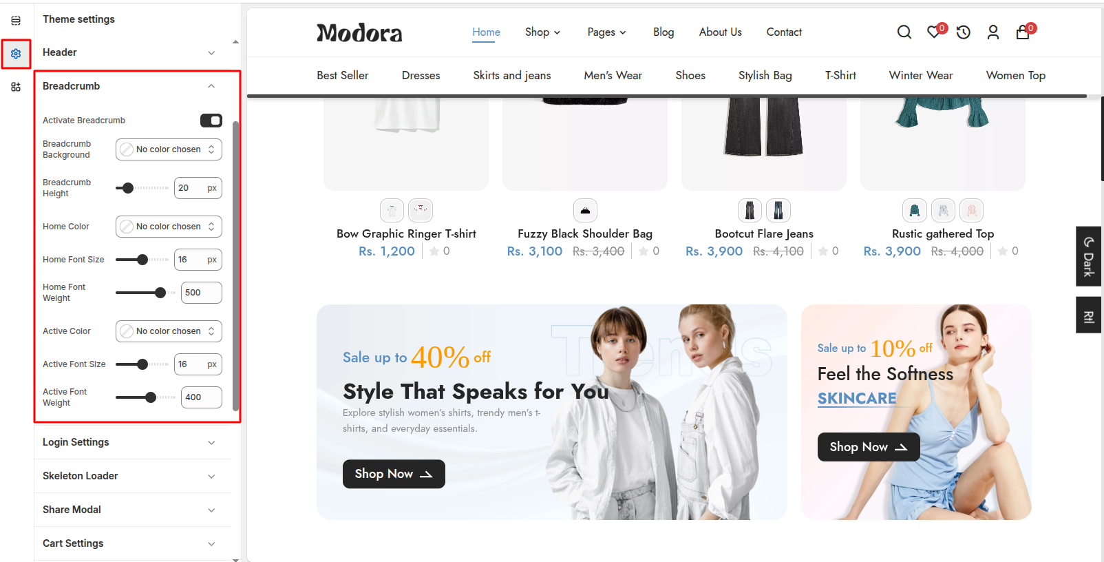
Breadcrumb Settings
| Settings | Type | Description | Visibility |
|---|---|---|---|
| Activate Breadcrumb | checkbox | page hierarchy to help users easily track their location within the store. | Always Visible |
| Breadcrumb Background | color_background | enhancing visibility and matching the store’s overall design. | Visible when Active Breadcrumb is true. |
| Breadcrumb Height | range | adjust the vertical size of the breadcrumb area on the page. | Visible when Active Breadcrumb is true. |
| Home Color | color_background | sets the color of the “Home” link in the breadcrumb. | Visible when Active Breadcrumb is true. |
| Home Font Size | range | controls the text size of the “Home” link. | Visible when Active Breadcrumb is true. |
| Home Font Weight | range | sets the thickness of the the “Home” link. | Visible when Active Breadcrumb is true. |
| Active Color | color_background | sets the color of the currently active page or link in the breadcrumb. | Visible when Active Breadcrumb is true. |
| Active Font Size | range | sets the tet size of the currently active page or link in the breadcrumb. | Visible when Active Breadcrumb is true. |
| Active Font Weight | range | sets the thickness of the currently active page or link in the breadcrumb. | Visible when Active Breadcrumb is true. |
7Skeleton Loader
- From your Shopify admin, go to Online Store -> Themes.
- Find the theme that you want to edit, and then click Edit Theme.
- Click Theme settings -> Skeleton Loader

Skeleton Loader Settings
| Settings | Type | Description | visibility |
|---|---|---|---|
| Enable Loader | checkbox | appears while pages or content are loading, enhancing user experience. | Always Visible |
8Share Modal
- From your Shopify admin, go to Online Store -> Themes.
- Find the theme that you want to edit, and then click Edit Theme.
- Click Theme settings -> Share Modal

Share Modal Settings
| Settings | Type | Description | visibility |
|---|---|---|---|
| Enable Share Modal | checkbox | quickly share products or pages on social media platforms. | Always Visible |
| Modal Title | text | providing context or instructions for the content inside. | Visible when Enable Share Modal is true. |
| Facebook Link | url | Sets the URL for Facebook page. | Visible when Enable Share Modal is true. |
| Pintreset Link | url | Sets the URL for Pintreset page. | Visible when Enable Share Modal is true. |
| Twitter Link | url | Sets the URL for Twitter page. | Visible when Enable Share Modal is true. |
| Instagram Link | url | Sets the URL for Instagram page. | Visible when Enable Share Modal is true. |
9Cart Settings
- From your Shopify admin, go to Online Store -> Themes.
- Find the theme that you want to edit, and then click Edit Theme.
- Click Theme settings -> Cart Settings

Cart Settings
| Settings | Type | Description | visibility |
|---|---|---|---|
| Cart Icon Action | select | choose what happens when the cart icon is clicked. | Always Visible |
| Empty Cart GIF | image_picker | image or GIF displayed when the cart is empty. | Always Visible |
| Enable Cart Timer | checkbox | encouraging customers to complete their purchase faster. | Always Visible |
| Cart Timer Text | text | customize the message displayed when the cart timer is active. | Visible when Enable Cart Timer is true. |
| Cart Expiry Text | text | message shown when the cart timer expires. | Visible when Enable Cart Timer is true. |
| Cart Countdown Time in Seconds | text | defines how long the cart timer runs before expiring. | Visible when Enable Cart Timer is true. |
| You may like Type | select | how recommended products are displayed. | Always Visible |
10Wishlist
- From your Shopify admin, go to Online Store -> Themes.
- Find the theme that you want to edit, and then click Edit Theme.
- Click Theme settings -> Wishlist
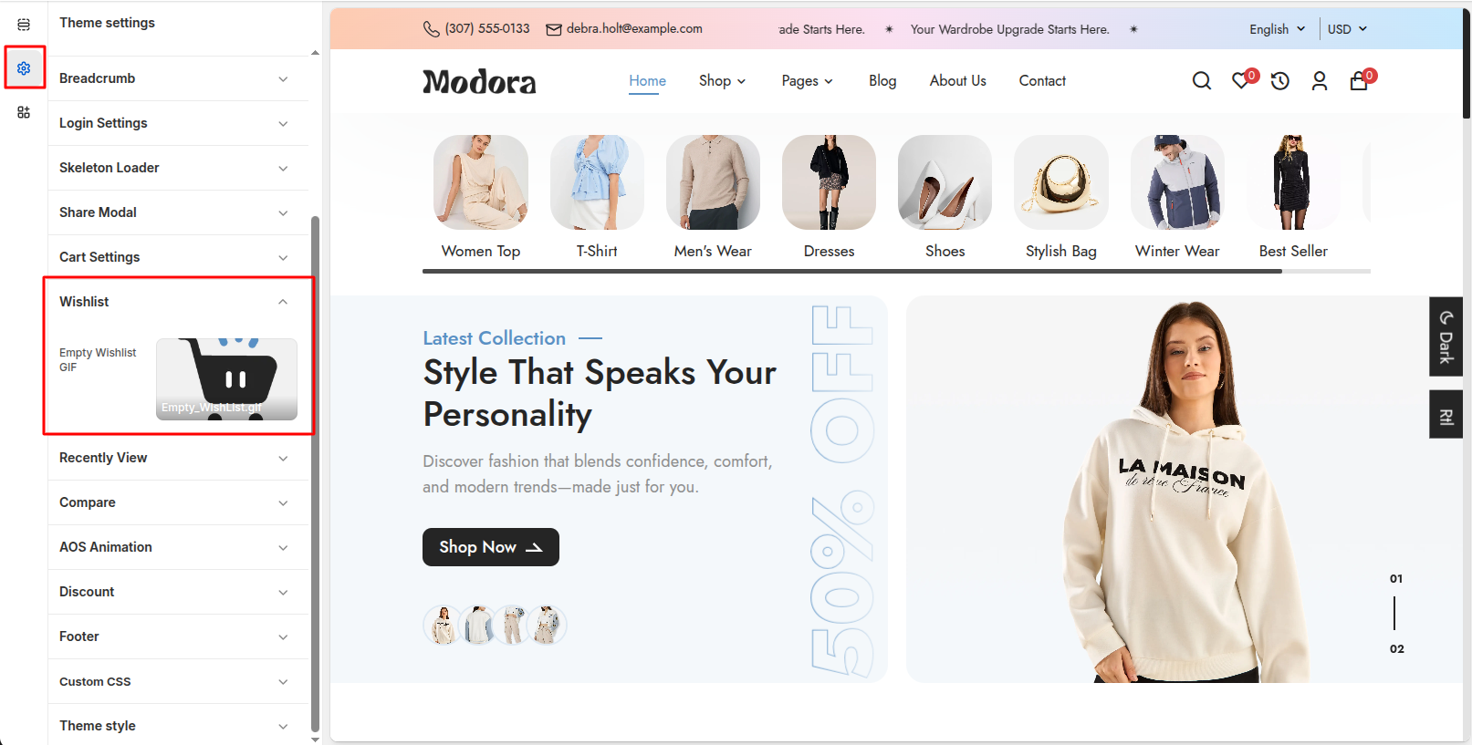
Wishlist Settings
| Settings | Type | Description | visibility |
|---|---|---|---|
| Empty Wishlist GIF | image_picker | GIF displayed when the wishlist is empty. | Always Visible |
11Recently View
- From your Shopify admin, go to Online Store -> Themes.
- Find the theme that you want to edit, and then click Edit Theme.
- Click Theme settings -> Recently View
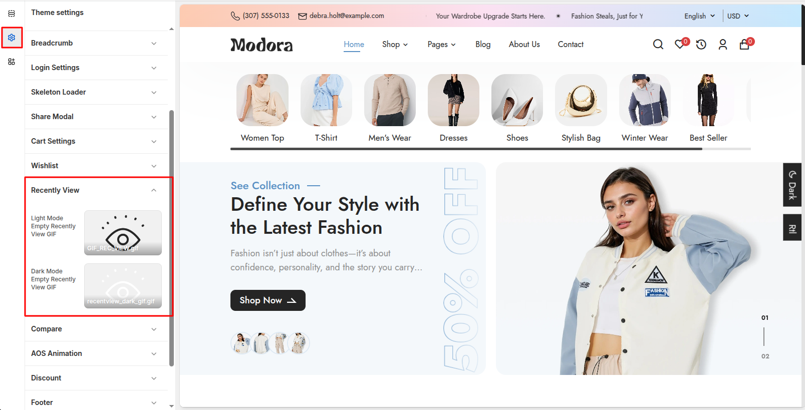
Recently View Settings
| Settings | Type | Description | visibility |
|---|---|---|---|
| Light Mode Empty Recently View GIF | image_picker | GIF displayed when the recently view is empty and light Background | Always Visible |
| Dark Mode Empty Recently View GIF | image_picker | GIF displayed when the recently view is empty and Dark Background | Always Visible |
12Compare
- From your Shopify admin, go to Online Store -> Themes.
- Find the theme that you want to edit, and then click Edit Theme.
- Click Theme settings -> Compare
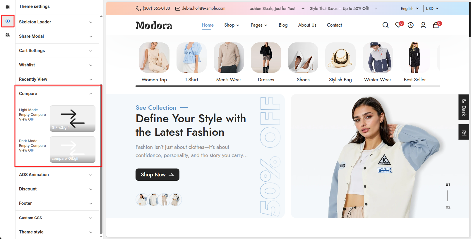
Compare Settings
| Settings | Type | Description | visibility |
|---|---|---|---|
| Light Mode Empty Compare GIF | image_picker | GIF displayed when the Compare is empty and light Background | Always Visible |
| Dark Mode Empty Compare GIF | image_picker | GIF displayed when the Compare is empty and Dark Background | Always Visible |
13AOS Animation
- From your Shopify admin, go to Online Store -> Themes.
- Find the theme that you want to edit, and then click Edit Theme.
- Click Theme settings -> AOS Animation
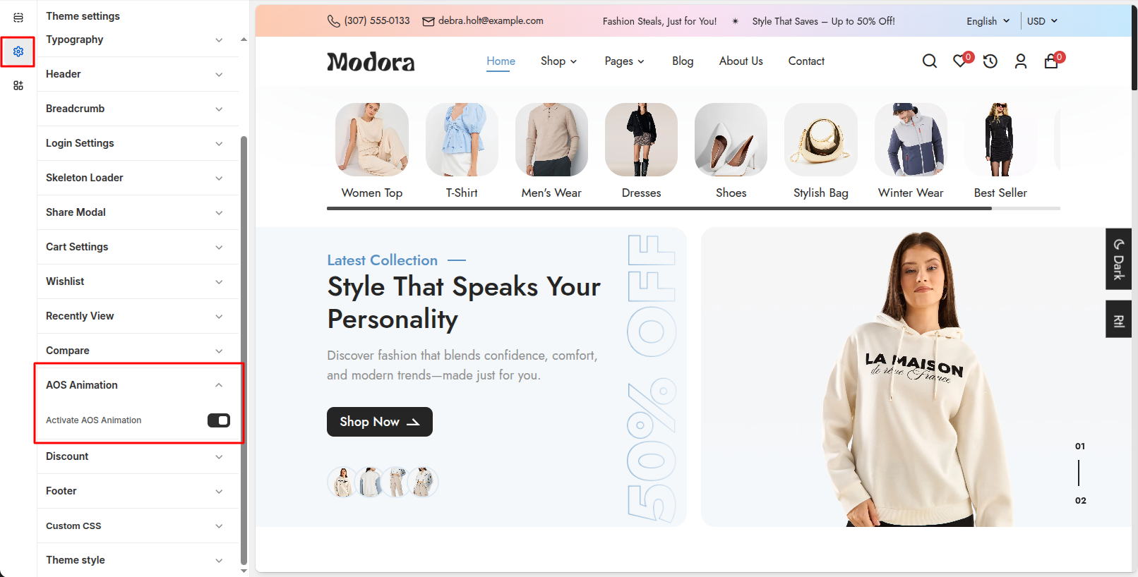
AOS Animation Settings
| Settings | Type | Description | visibility |
|---|---|---|---|
| Activate AOS Animation | checkbox | adding smooth motion effects to elements as they appear while scrolling. | Always Visible |
14Discount
- From your Shopify admin, go to Online Store -> Themes.
- Find the theme that you want to edit, and then click Edit Theme.
- Click Theme settings -> Discount

Discount Settings
| Settings | Type | Description | visibility |
|---|---|---|---|
| No. of Discount | Select | Select how many discount offers you want to display (up to 4). | Always Visible |
| Discount 1 – Quantity | Text | Enter the minimum product quantity required to apply the first discount. | Always Visible |
| Discount 1 – Discount | Text | Set the discount percentage for the first offer. | Always Visible |
| Discount 1 – Code | Text | Enter the discount coupon code for the first offer. | Always Visible |
| Discount 2 – Quantity | Text | Enter the quantity required to unlock the second discount offer. | Visible if No. of Discount > 1 |
| Discount 2 – Discount | Text | Set the discount percentage for the second offer. | Visible if No. of Discount > 1 |
| Discount 2 – Code | Text | Enter the discount coupon code for the second offer. | Visible if No. of Discount > 1 |
| Discount 3 – Quantity | Text | Enter the quantity required to unlock the third discount offer. | Visible if No. of Discount > 2 |
| Discount 3 – Discount | Text | Set the discount percentage for the third offer. | Visible if No. of Discount > 2 |
| Discount 3 – Code | Text | Enter the discount coupon code for the third offer. | Visible if No. of Discount > 2 |
| Discount 4 – Quantity | Text | Enter the quantity required to unlock the fourth discount offer. | Visible if No. of Discount > 3 |
| Discount 4 – Discount | Text | Set the discount percentage for the fourth offer. | Visible if No. of Discount > 3 |
| Discount 4 – Code | Text | Enter the discount coupon code for the fourth offer. | Visible if No. of Discount > 3 |
15Footer
- From your Shopify admin, go to Online Store -> Themes.
- Find the theme that you want to edit, and then click Edit Theme.
- Click Theme settings -> Footer
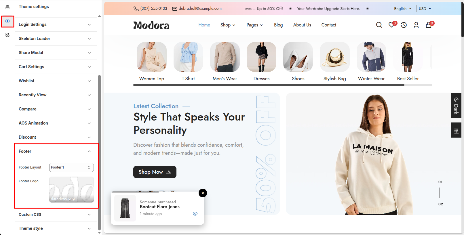
Footer Settings
| Settings | Type | Description | visibility |
|---|---|---|---|
| Footer Layout | select | select different footer structures, controlling the arrangement of content and menus in the footer area. | Always Visible |
| Footer Logo | image_picker | Upload an image to display brand logo in the footer. | Always Visible |
Setup Pages
1Create Custom Page
- Go to Admin Panel -> Online Store.
- Find and Select Pages.
- Click Add Page.

- After that, Enter title for the page.
- Set the page Visibility.
- Select template for which page you want to create.
- Click Save.

2About Us

Create About Us Page
- Go to Admin Panel -> Online Store.
- Find and Select Pages -> Add Page.
- After that, Enter Title (ex. About Us). Set the page Visibility.
- Select template for which page you want to create.
- Click Save.

Install Layout
- Click the file name to open and download the corresponding JSON layout in a new tab.(page.about-us.json)
- SELECT ALL and COPY.
- From your Shopify admin, go to Themes -> Actions -> Edit Code.
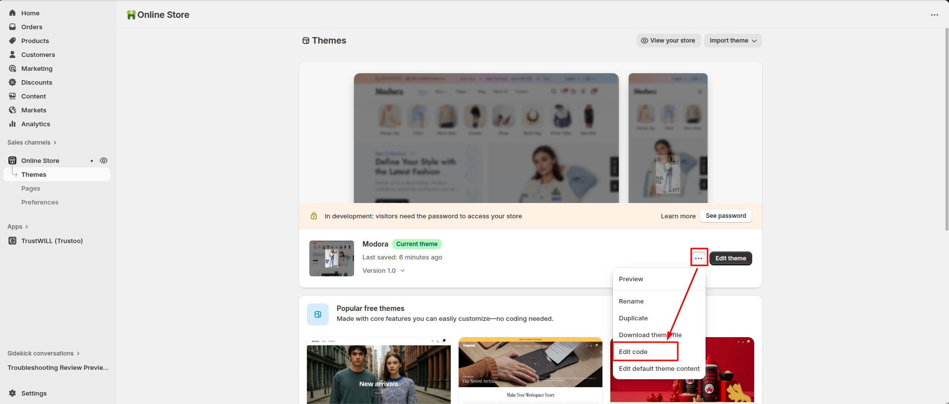
- Find folder templates -> Open file page.about-us.json -> SELECT ALL and DELETE. PASTE the copied preset from the external file.

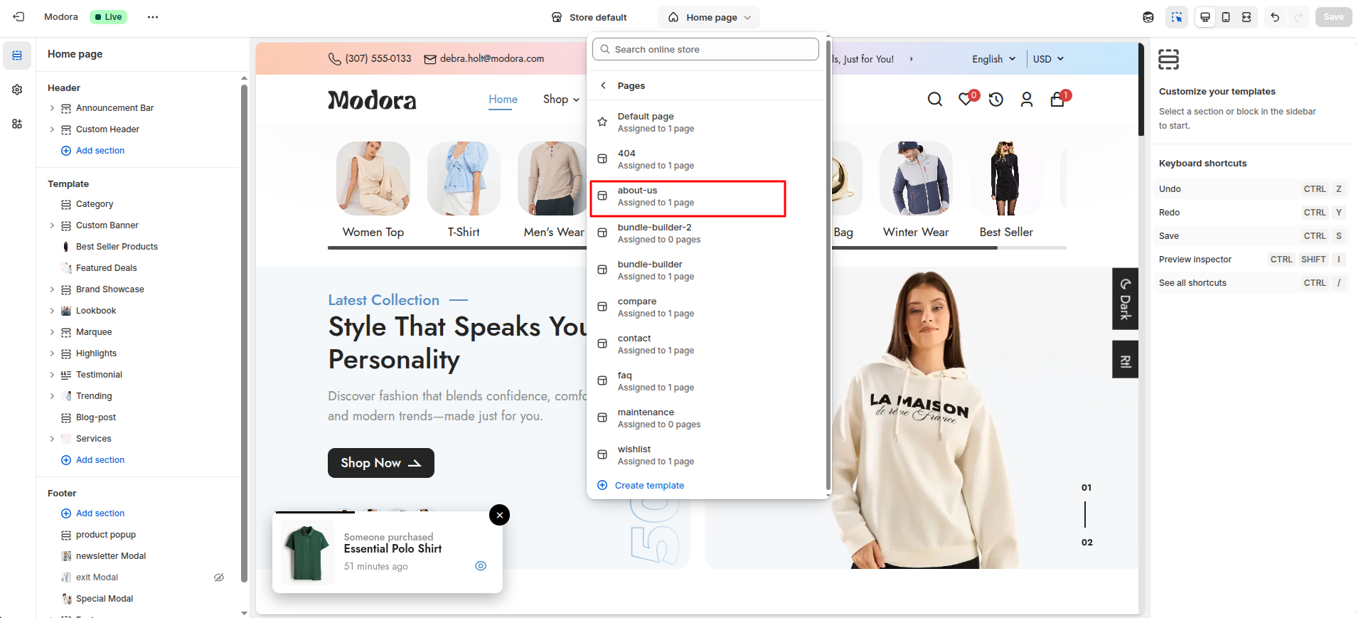
Custom About Us Page
- Go to Admin Panel -> Online Store.
- Find and Select themes -> Edit Theme.
- Choose Pages from the dropdown window.
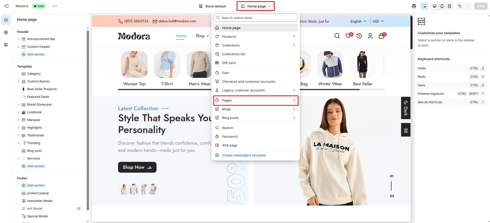
- After that, Choose template about-us.
3Contact

Create Contact Page
- Go to Admin Panel -> Online Store.
- Find and Select Pages -> Add Page.
- After that, Enter Title (ex. Contact). Set the page Visibility.
- Select template for which page you want to create.
- Click Save.

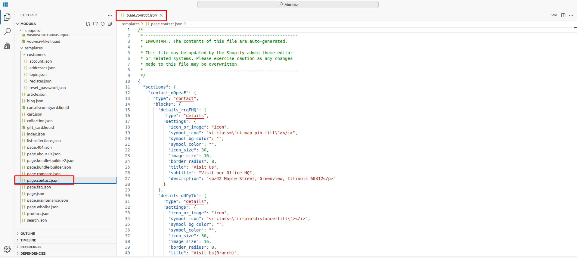
Install Layout
- Click the file name to open and download the corresponding JSON layout in a new tab.(page.contact.json)
- SELECT ALL and COPY.
- From your Shopify admin, go to Themes -> Actions -> Edit Code.
- Find folder templates -> Open file page.contact.json -> SELECT ALL and DELETE. PASTE the copied preset from the external file.
Custom Contact Page
- Go to Admin Panel -> Online Store.
- Find and Select themes -> Edit Theme.
- Choose Pages from the dropdown window.
- After that, Choose template contact.

4Bundle Builder
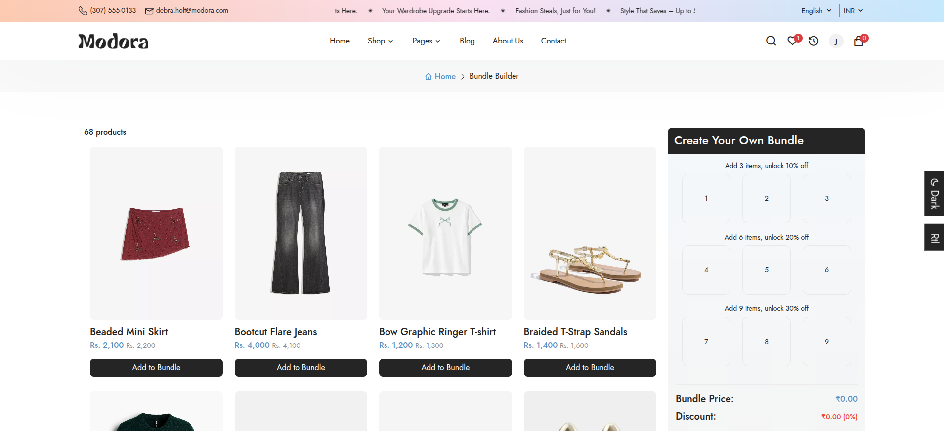
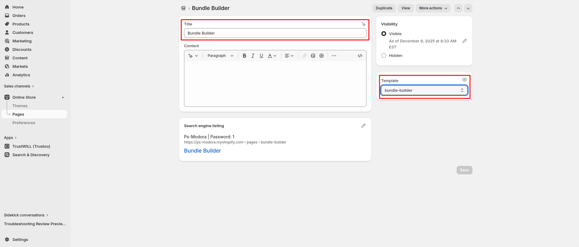
Create Bundle Builder Page
- Go to Admin Panel -> Online Store.
- Find and Select Pages -> Add Page.
- After that, Enter Title (ex. Bundle Builder). Set the page Visibility.
- Select template for which page you want to create.
- Click Save.
Install Layout
- Click the file name to open and download the corresponding JSON layout in a new tab.(page.bundle-builder.json)
- SELECT ALL and COPY.
- From your Shopify admin, go to Themes -> Actions -> Edit Code.
- Find folder templates -> Open file page.bundle-builder.json -> SELECT ALL and DELETE. PASTE the copied preset from the external file.

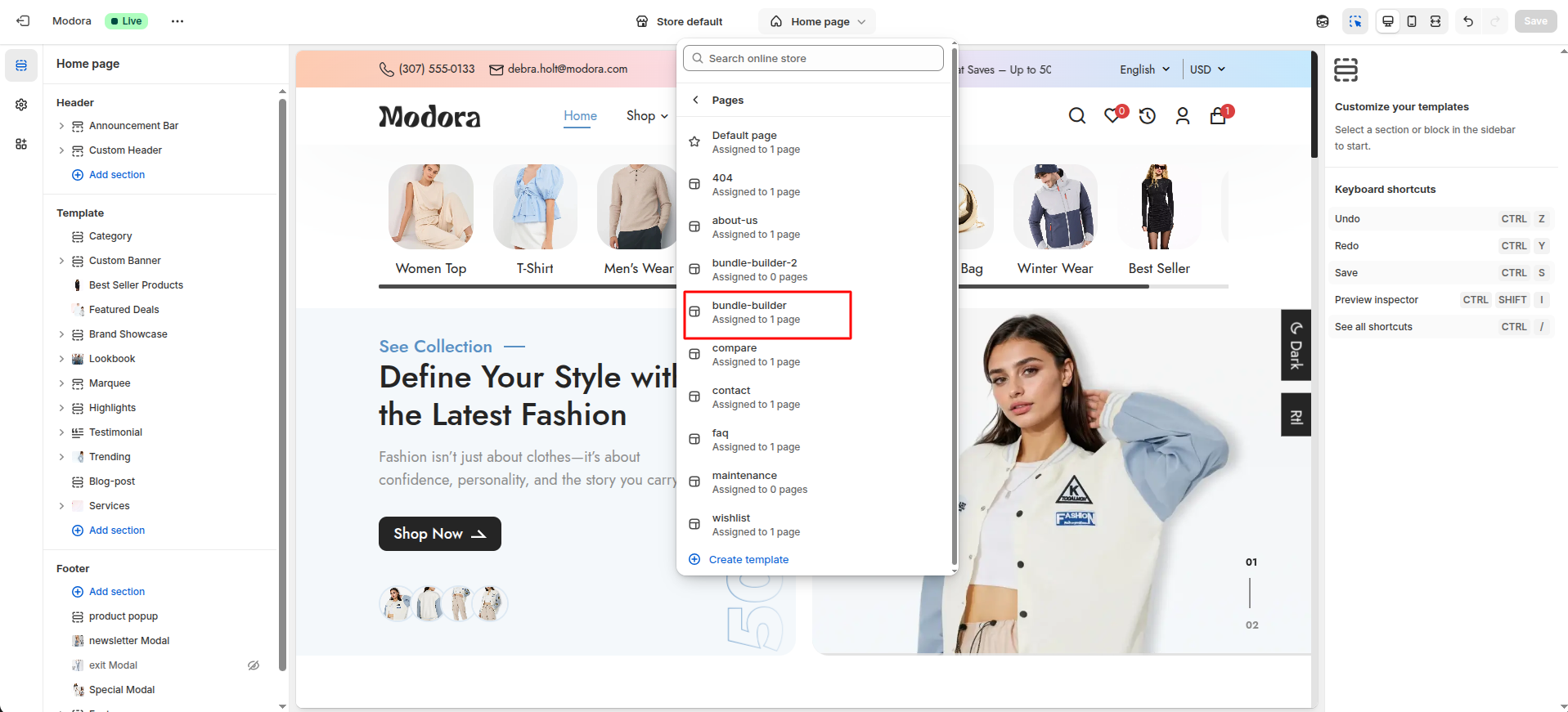
Custom Bundle Builder Page
- Go to Admin Panel -> Online Store.
- Find and Select themes -> Edit Theme.
- Choose Pages from the dropdown window.
- After that, Choose template bundle-builder.
5Wishlist

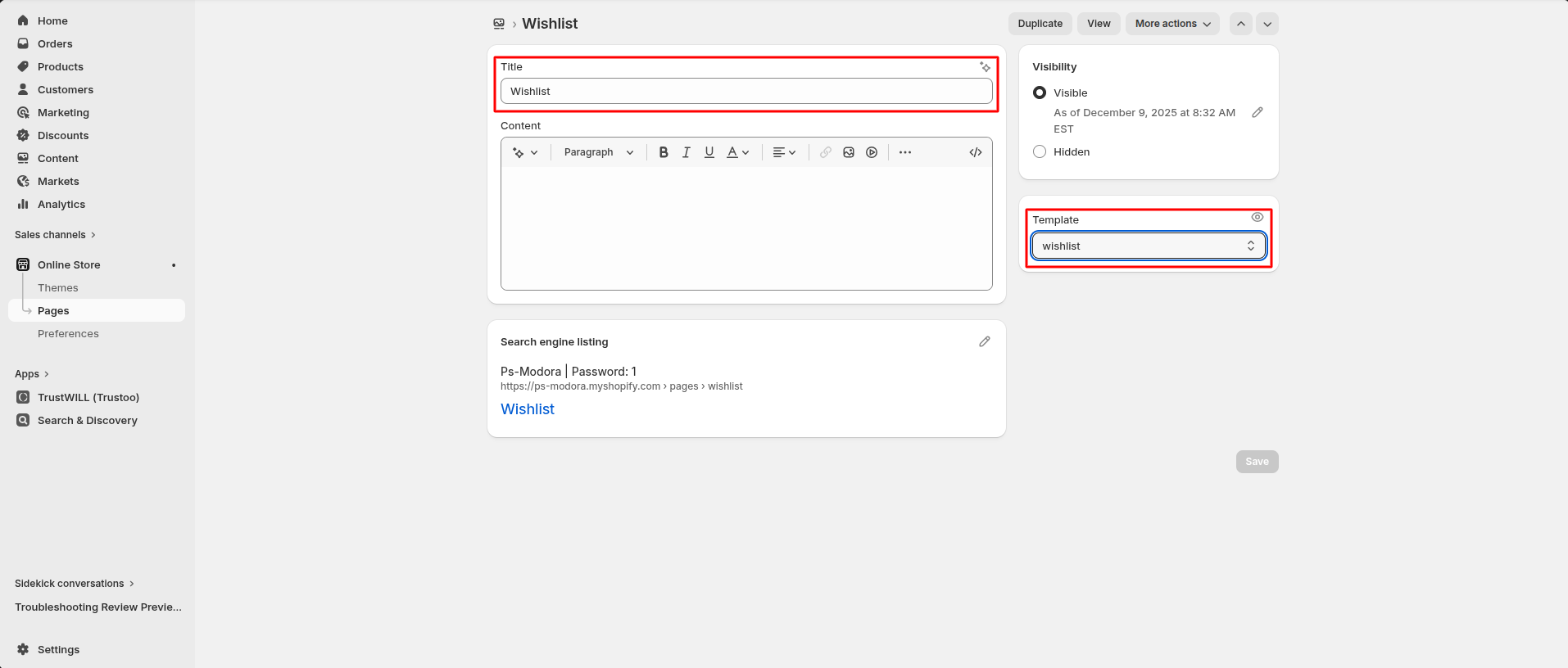
Create Wishlist Page
- Go to Admin Panel -> Online Store.
- Find and Select Pages -> Add Page.
- After that, Enter Title (ex. Wishlist). Set the page Visibility.
- Select template for which page you want to create.
- Click Save.
Install Layout
- Click the file name to open and download the corresponding JSON layout in a new tab.(page.wishlist.json)
- SELECT ALL and COPY.
- From your Shopify admin, go to Themes -> Actions -> Edit Code.
- Find folder templates -> Open file page.wishlist.json -> SELECT ALL and DELETE. PASTE the copied preset from the external file.

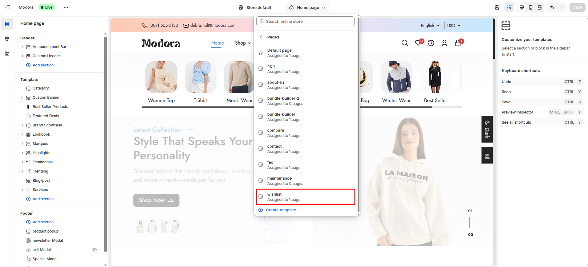
Custom Wishlist Page
- Go to Admin Panel -> Online Store.
- Find and Select themes -> Edit Theme.
- Choose Pages from the dropdown window.
- After that, Choose template wishlist.
6Compare

Create Compare Page
- Go to Admin Panel -> Online Store.
- Find and Select Pages -> Add Page.
- After that, Enter Title (ex. Compare). Set the page Visibility.
- Select template for which page you want to create.
- Click Save.

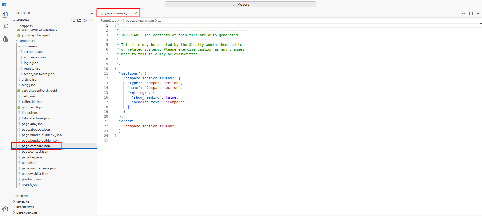
Install Layout
- Click the file name to open and download the corresponding JSON layout in a new tab.(page.compare.json)
- SELECT ALL and COPY.
- From your Shopify admin, go to Themes -> Actions -> Edit Code.
- Find folder templates -> Open file page.compare.json -> SELECT ALL and DELETE. PASTE the copied preset from the external file.
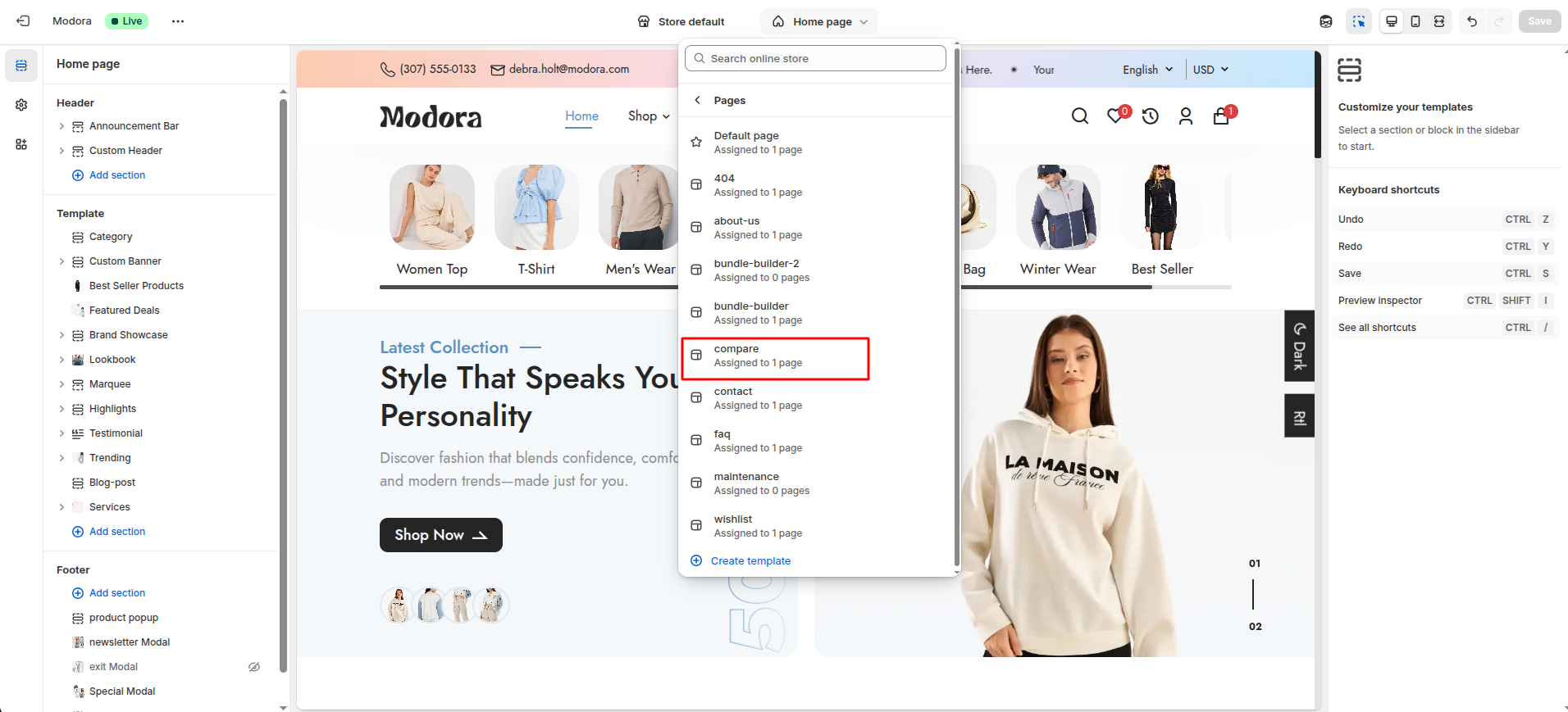
Custom Compare Page
- Go to Admin Panel -> Online Store.
- Find and Select themes -> Edit Theme.
- Choose Pages from the dropdown window.
- After that, Choose template compare.
7FAQ
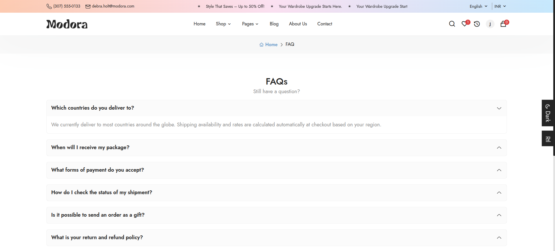
Create FAQ Page
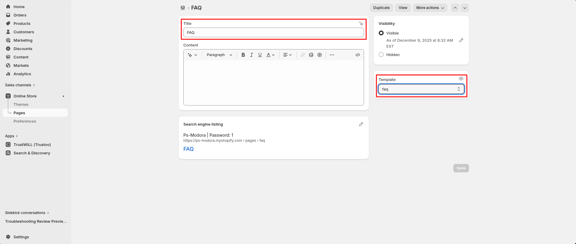
- Go to Admin Panel -> Online Store.
- Find and Select Pages -> Add Page.
- After that, Enter Title (ex. FAQ). Set the page Visibility.
- Select template for which page you want to create.
- Click Save.
Install Layout
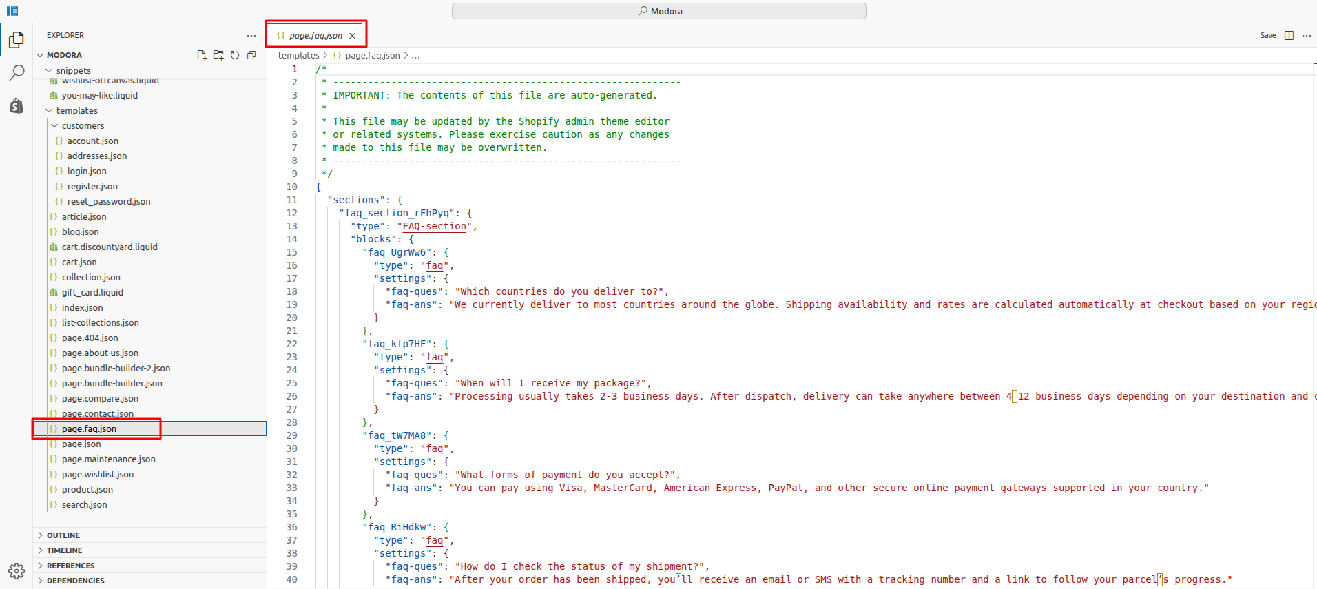
- Click the file name to open and download the corresponding JSON layout in a new tab.(page.faq.json)
- SELECT ALL and COPY.
- From your Shopify admin, go to Themes -> Actions -> Edit Code.
- Find folder templates -> Open file page.faq.json -> SELECT ALL and DELETE. PASTE the copied preset from the external file.
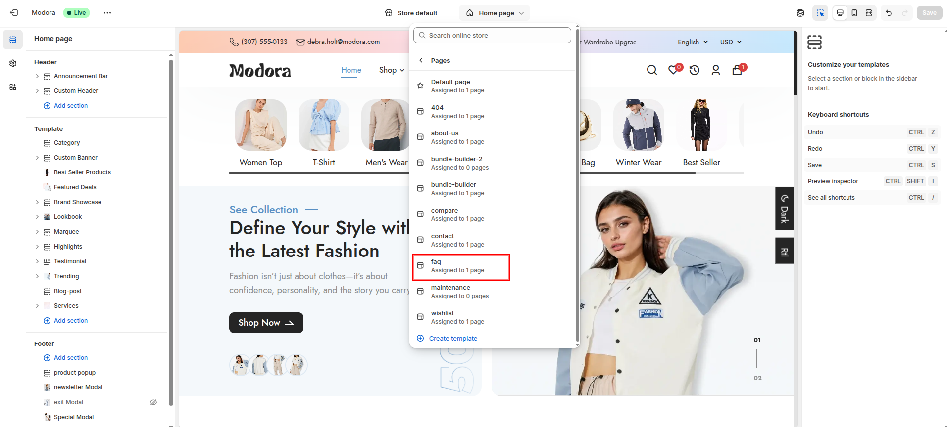
Custom FAQ Page
- Go to Admin Panel -> Online Store.
- Find and Select themes -> Edit Theme.
- Choose Pages from the dropdown window.
- After that, Choose template faq.
8404
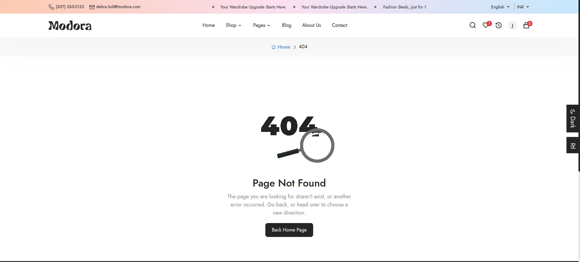
Create 404 Page
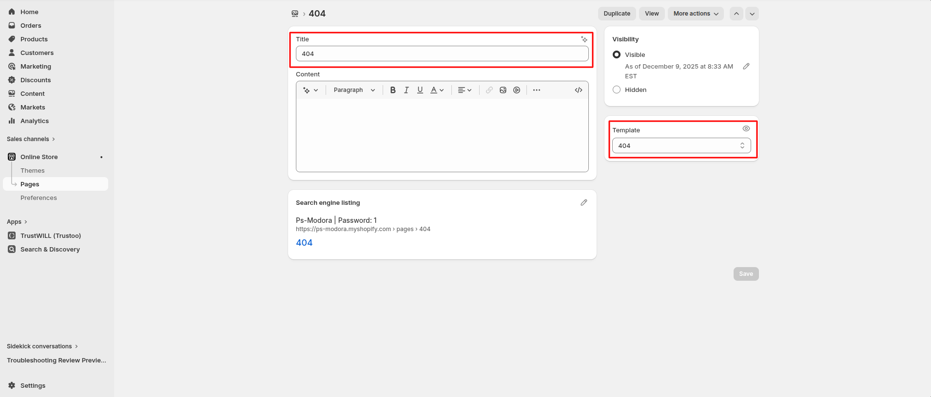
- Go to Admin Panel -> Online Store.
- Find and Select Pages -> Add Page.
- After that, Enter Title (ex. 404). Set the page Visibility.
- Select template for which page you want to create.
- Click Save.
Install Layout
- Click the file name to open and download the corresponding JSON layout in a new tab.(page.404.json)
- SELECT ALL and COPY.
- From your Shopify admin, go to Themes -> Actions -> Edit Code.
- Find folder templates -> Open file page.404.json -> SELECT ALL and DELETE. PASTE the copied preset from the external file.

Custom 404 Page
- Go to Admin Panel -> Online Store.
- Find and Select themes -> Edit Theme.
- Choose Pages from the dropdown window.
- After that, Choose template 404.

9Search

Install Layout
- Click the file name to open and download the corresponding JSON layout in a new tab.(search.json)
- SELECT ALL and COPY.
- From your Shopify admin, go to Themes -> Actions -> Edit Code.
- Find folder templates -> Open file search.json -> SELECT ALL and DELETE. PASTE the copied preset from the external file.

Custom search Page
- Go to Admin Panel -> Online Store.
- Find and Select themes -> Edit Theme.
- Choose search from the dropdown window.

Header Section
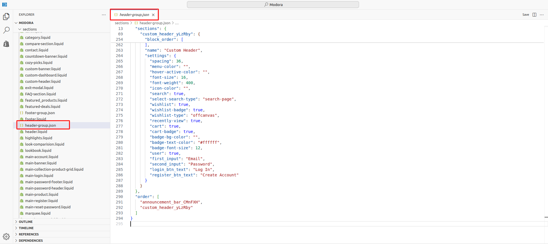
1Install Layout
- Click the file name to open and download the corresponding JSON layout in a new tab.(header-group.json)
- SELECT ALL and COPY.
- From your Shopify admin, go to Themes -> Actions -> Edit Code.
- Find folder section -> Open file header-group.json -> SELECT ALL and DELETE. PASTE the copied preset from the external file.
2Announcement Bar
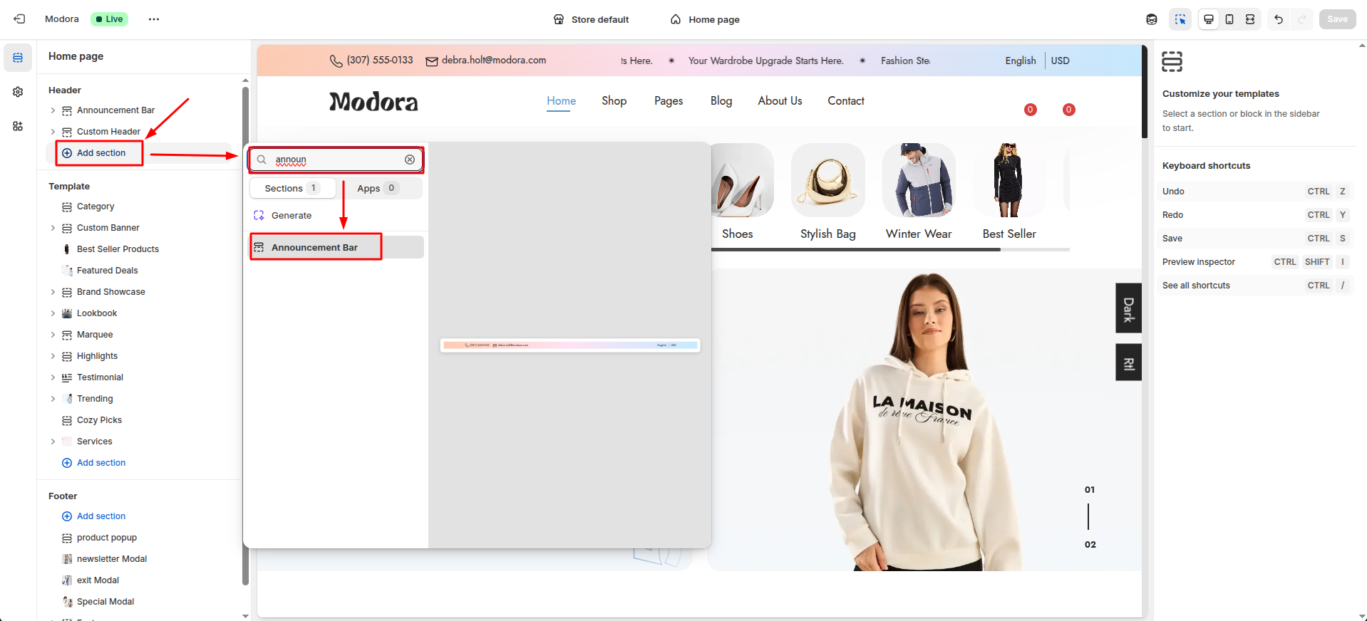
- From your Shopify admin, go to Themes -> Edit Theme.
- Click Add section and choose "Announcement bar".
Supported Blocks
- Click Add block and choose "Slider Title/ Static Title" according to your requirement.
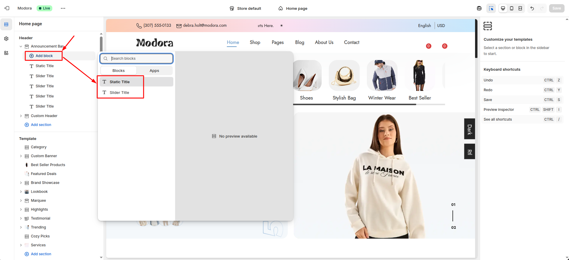
| Block Type | Setting Type | Description |
|---|---|---|
| Slider Title | text | Select Slider Text for scrolling text. |
| Static Title | text | Select Static Text for a fixed display. |
Section settings
Section settings make it easy to control how content appears on your store pages. Update text, images, and layout directly from the Theme Editor. Adjust spacing, colors, and alignment to match your brand style. Changes are applied instantly with live preview support.
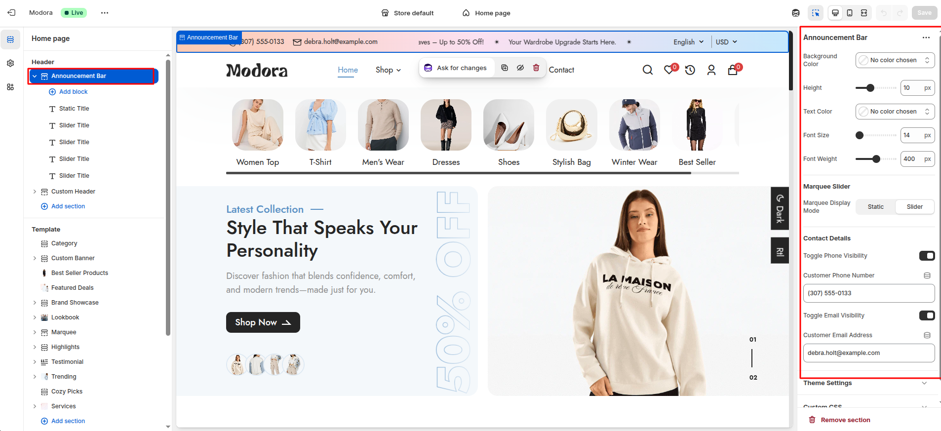
| Settings | Type | Description | visibility |
|---|---|---|---|
| Background Color | color_background | Choose the background color for the announcement bar. | Always Visible |
| Height | range(px) | Set the height of the announcement bar. | Always Visible |
| Text Color | color_background | Set the text color to ensure readability and brand consistency. | Always Visible |
| Font Size | range(px) | Adjust the font size of the announcement text. | Always Visible |
| Font Weight | range | Adjust the font weight of the announcement text. | Always Visible |
| Marquee Display Mode | select | Choose how the announcement text is displayed(Static or Slider). | Always Visible |
| Toggle Phone Visibility | checkbox | option to show or hide the announcement bar on phones. | Always Visible |
| Customer Phone Number | text | Add a phone number that customers can use to contact your store. | Visible When Customer Phone Number is true. |
| Toggle Email Visibility | checkbox | option to show or hide the announcement bar on Email. | Always Visible |
| Customer Email Address | color_background | Add a Email Address that customers can use to contact your store. | Visible When Customer Email Address is true |
3Custom Header
- From your Shopify admin, go to Themes -> Edit Theme.
- Click Add section and choose "Custom Header".
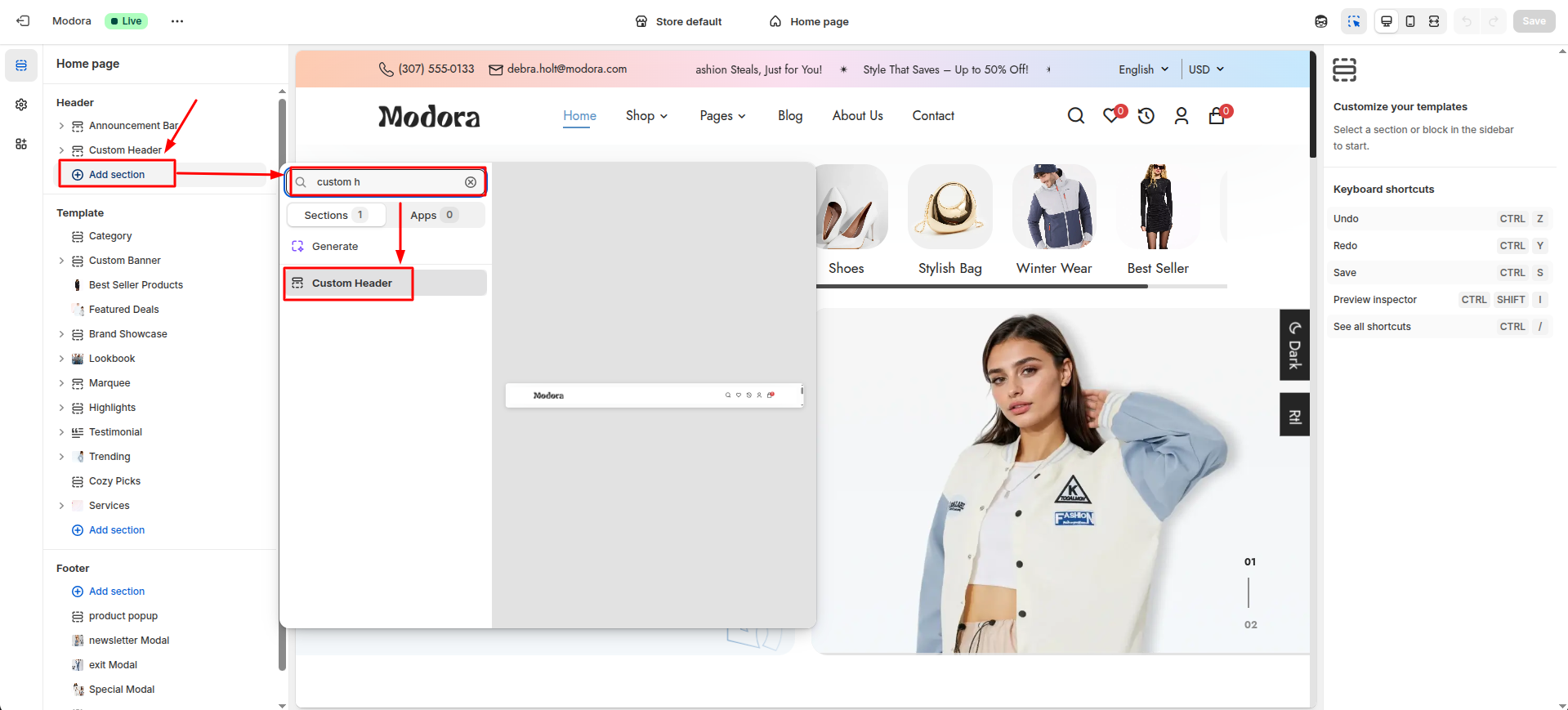
Supported Blocks
- Click Add block and choose "Main Menu" according to your requirement.

Block Settings
Add the Main Menu block to your header section. Using the available settings inside this block, you can create different types of menus such as single links,dropdown menus, and mega menus.
The same Main Menu block can be added multiple times to build a fully customized navigation structure.
| Settings | Type | Description | Visibility |
|---|---|---|---|
| Navigation Menu Title | text | Set the heading or label displayed for this navigation menu. | Always Visible |
| Menu Display Type | select | display style for this menu, such as a single link, dropdown, or mega menu. | Always Visible |
| Navigation Menu Link | url | Select the link for this navigation menu item. | Always Visible |
| Select Submenu | link_list | Select Slider Text for scrolling text. | Pick a submenu that will appear under the main menu item. |
| Select Mega Menu | link_list | Pick a mega menu that displays multiple columns and rich content. | Visible when menu type is mega menu. |
| Mega Menu Image 1 | image_picker | Upload an image for the first mega menu column. | Visible when menu type is mega menu. |
| Image 1 Link | url | Choose a page, collection, or URL to link with the first mega menu image. | Visible when menu type is mega menu. |
| Mega Menu Image 2 | image_picker | Upload an image for the second mega menu column. | Visible when menu type is mega menu. |
| Image 2 Link | url | Choose a page, collection, or URL to link with the second mega menu image. | Visible when menu type is mega menu. |
| Mega Menu Image 3 | image_picker | Upload an image for the third mega menu column. | Visible when menu type is mega menu. |
| Image 3 Link | url | Choose a page, collection, or URL to link with the third mega menu image. | Visible when menu type is mega menu. |
| Show Badge | checkbox | Enable or disable the badge for this menu item. | Always Visible |
| Text | text | Add custom text that will appear on menu item. | Visible when Show Badge is true. |
| Background Color | color_background | Set a background color for the badge. | Visible when Show Badge is true. |
| Color | color_background | Set a text color for the badge. | Visible when Show Badge is true. |
| DropDown Badge | checkbox | Enable or disable the badge for dropdown or mega menu items. | Visible when menu type is dropdown or mega menu. |
| Dropdown Badge Text | text | Add custom text that will appear on dropdown or mega menu item. | Visible when DropDown Badge is true. |
| Number | text | Specify the position where the badge should appear. | Visible when DropDown Badge is true. |
| Background Color | color_background | Set a background color for the dropdown badge. | Visible when DropDown Badge is true. |
| Color | color_background | Set a text color for the dropdown badge. | Visible when DropDown Badge is true. |
| Another Badge | checkbox | Enable a second badge for dropdown or mega menu item. | Visible when menu type is dropdown or mega menu. |
| Dropdown Badge Text | text | Add custom text that will appear on dropdown or mega menu item. | Visible when Another Badge is true. |
| Another Badge Number | text | Specify the position where the badge should appear. | Visible when Another Badge is true. |
| Background Color | color_background | Set a background color for the another badge. | Visible when Another Badge is true. |
| Color | color_background | Set a text color for the another badge. | Visible when Another Badge is true. |
Section settings
Section settings make it easy to control how content appears on your store pages. Update text, images, and layout directly from the Theme Editor. Adjust spacing, colors, and alignment to match your brand style. Changes are applied instantly with live preview support.
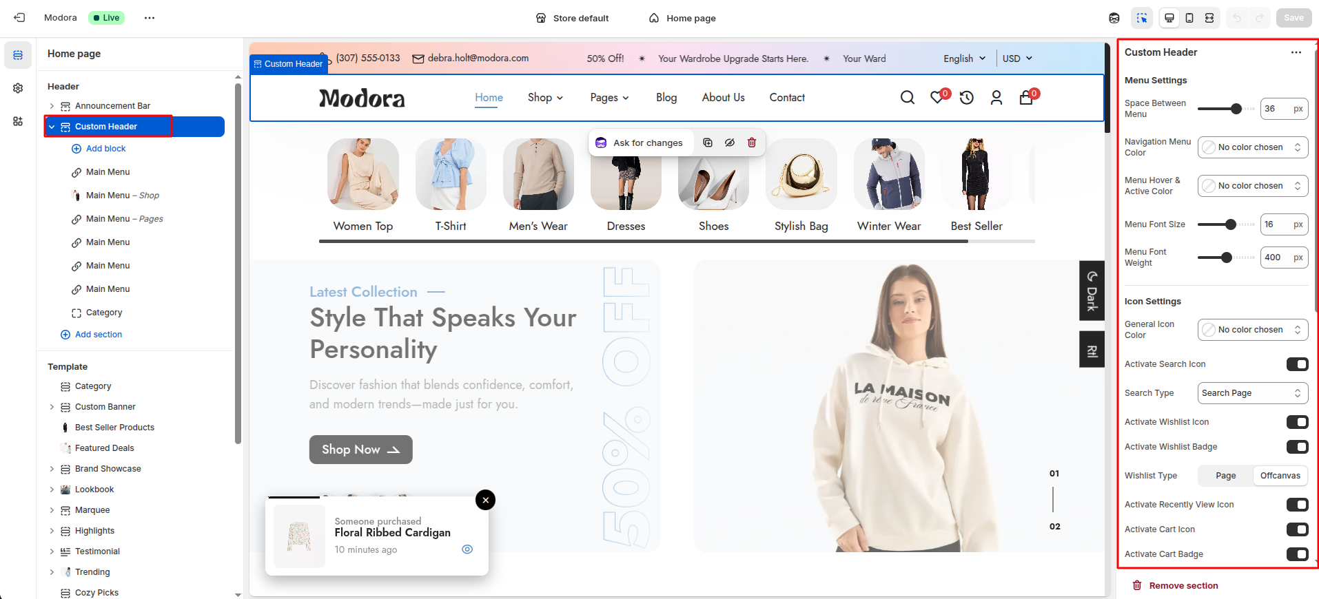
| Settings | Type | Description | visibility |
|---|---|---|---|
| Space Between Menu | range(px) | Adjust the spacing between menu items. | Always Visible |
| Navigation Menu Color | color_background | Set the menu text color to match your header design. | Always Visible |
| Menu Hover & Active Color | color_background | Set the hover and active color to highlight the selected menu item. | Always Visible |
| Menu Font Size | range(px) | Adjust the font size of the menu text. | Always Visible |
| Menu Font Weight | range | Adjust the font weight of the menu text. | Always Visible |
| General Icon Color | color_background | Set a consistent color for all icons to match your store’s design. | Always Visible |
| Activate Search Icon | checkbox | Enable or disable the search icon in the header. | Always Visible |
| Search Type | select | Choose how the search feature is displayed on your store.(modal/page/offcanvas) | Visible When Activate Search Icon is true. |
| Activate Wishlist Icon | checkbox | Enable or disable the wishlist icon in the header. | Always Visible |
| Activate Wishlist Badge | checkbox | Enable or disable the wishlist badge on wishlist Icon. | Visible When Activate Wishlist Icon is true |
| Wishlist Type | select | Choose how the wishlist feature is displayed on your store.(page/offcanvas) | Visible When Activate Wishlist Icon is true |
| Activate Recently View Icon | checkbox | Enable or disable the recently view icon in the header. | Always Visible |
| Activate Cart Icon | checkbox | Enable or disable the cart icon in the header. | Always Visible |
| Activate Cart Badge | checkbox | Enable or disable the cart badge on cart Icon. | Visible When Activate Cart Icon is true |
| Badge Background Color | color_background | Set a color that makes the badge stand out and matches your store design. | Always Visible |
| Badge Text Color | color_background | Set a badge text color that makes the badge stand out. | Always Visible |
| Badge Font Size | ri-price-tag-3-line(px) | Adjust the font size of the badge text. | Always Visible |
| Activate User Icon | checkbox | Enable or disable the user icon in the header. | Always Visible |
| First Input Placeholder Text | text | This text appears inside the first input box as a hint for users. | Visible When Activate User Icon is true |
| Second Input Placeholder Text | text | This text appears inside the Second input box as a hint for users. | Visible When Activate User Icon is true |
| Text | text | Customize the label shown for customer login. | Visible When Activate User Icon is true |
| Text | text | Customize the label shown for customer account registration. | Visible When Activate User Icon is true |
Footer Section
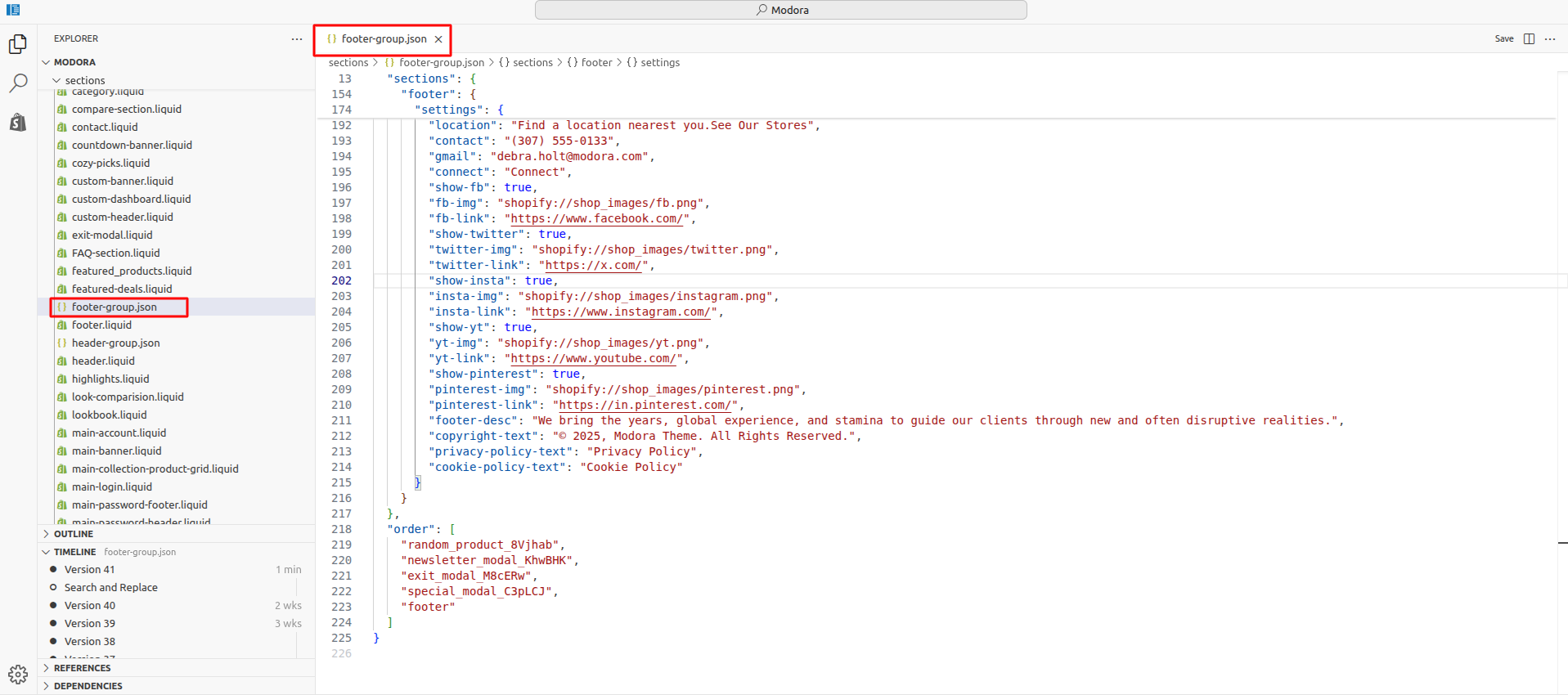
1Install Layout
- Click the file name to open and download the corresponding JSON layout in a new tab.(footer-group.json)
- SELECT ALL and COPY.
- From your Shopify admin, go to Themes -> Actions -> Edit Code.
- Find folder section -> Open file footer-group.json -> SELECT ALL and DELETE. PASTE the copied preset from the external file.
2Footer
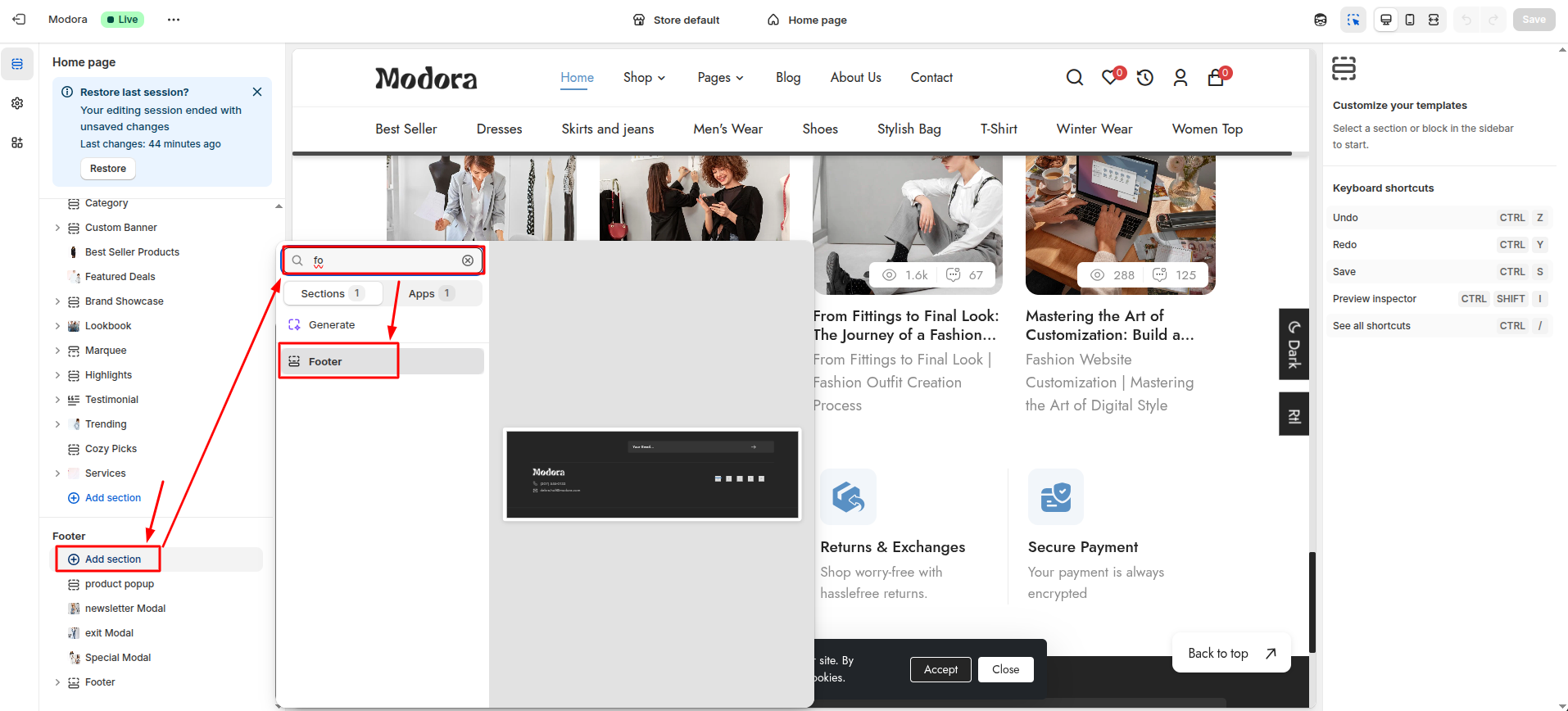
- From your Shopify admin, go to Themes -> Edit Theme.
- Click Add section and choose "Footer".
Supported Blocks
- Click Add block and choose "Footer Navigation" according to your requirement.
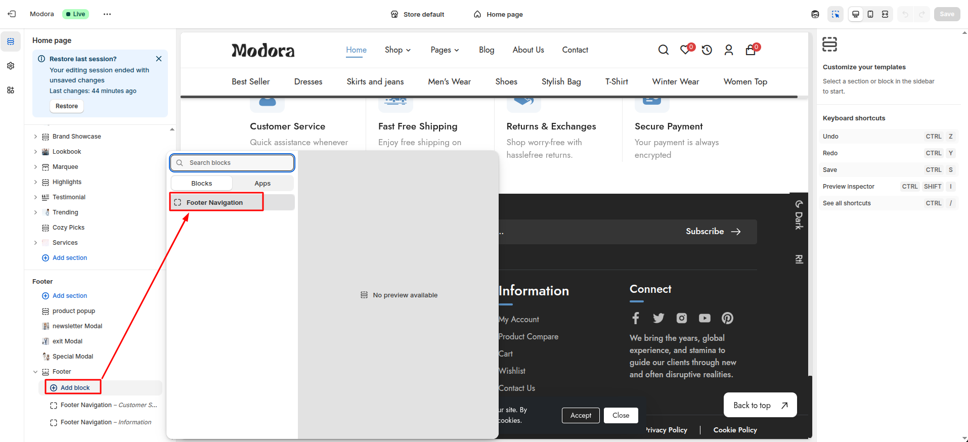
| Block Type | Setting Type | Description |
|---|---|---|
| Footer Navigation | link_list | Choose an existing Shopify menu to show as footer links for quick navigation. |
Section settings
Section settings make it easy to control how content appears on your store pages. Update text, images, and layout directly from the Theme Editor. Adjust spacing, colors, and alignment to match your brand style. Changes are applied instantly with live preview support.

| Settings | Type | Description | visibility |
|---|---|---|---|
| Background Color | color_background | Choose the background color for the footer section. | Always Visible |
| Subscribe Text | text | Customize the message encouraging users to subscribe to your newsletter. | Always Visible |
| Text Underline Color | color_background | Set a color for text underline to match your store’s style or highlight links. | Always Visible |
| Text Font Size | range(px) | Adjust the font size of the subscribe title text. | Always Visible |
| Text Font Weight | range | Adjust the font weight of the subscribe title text. | Always Visible |
| Input Background Color | color_background | Choose the background color for input fields. | Always Visible |
| Input Border Radius | range(px) | Adjust the border radius of input fields. | Always Visible |
| Input Placeholder Color | color_background | Choose the placeholder color for input fields. | Always Visible |
| Input Placeholder Font Size | range(px) | Adjust the font size of the input placeholder. | Always Visible |
| Input Placeholder Font Weight | range | Adjust the font weight of the input placeholder. | Always Visible |
| Input Caret Color | color_background | Choose the caret color for input fields. | Always Visible |
| Subscribe Input Button Text | text | Customize the label for the subscription button to submit their email. | Always Visible |
| Subscribe Button Color | color_background | Choose the background color for the subscribe button. | Always Visible |
| Subscribe Button Font Size | range(px) | Adjust the font size of the subscribe button. | Always Visible |
| Subscribe Button Font Weight | range | Adjust the font weight of the subscribe button. | Always Visible |
| Subscribe Icon Color | color_background | Choose the icon color for the subscribe button. | Always Visible |
| Location | text | Add a store address, office location, or any location text for customers to see. | Always Visible |
| Customer Phone Number | text | Add a contact number that customers can use to reach your store. | Always Visible |
| Customer Email Address | text | Add a contact email that customers can use to reach your store. | Always Visible |
| Connect Text | text | Customize the message that encourages customers to connect via social media or other channels. | Always Visible |
| Activate Facebook | checkbox | Enable or disable the Facebook link or icon. | Always Visible |
| Facebook Icon | image_picker | Upload or select an icon for the Facebook link. | Visible When Activate Facebook is true |
| Facebook Link | url | Add the full link to your Facebook profile so customers can follow or visit your page. | Visible When Activate Facebook is true |
| Activate Twitter | checkbox | Enable or disable the Twitter link or icon. | Always Visible |
| Twitter Icon | image_picker | Upload or select an icon for the Twitter link. | Visible When Activate Twitter is true |
| Twitter Link | url | Add the full link to your Twitter profile so customers can follow or visit your page. | Visible When Activate Twitter is true |
| Activate Instagram | checkbox | Enable or disable the Instagram link or icon. | Always Visible |
| Instgram Icon | image_picker | Upload or select an icon for the Instagram link. | Visible When Activate Twitter is true |
| Instagram Link | url | Add the full link to your Instagram profile so customers can follow or visit your page. | Visible When Activate Twitter is true |
| Activate Youtube | checkbox | Enable or disable the Youtube link or icon. | Always Visible |
| Youtube Icon | image_picker | Upload or select an icon for the Youtube link. | Visible When Activate Youtube is true |
| Youtube Link | url | Add the full link to your Youtube profile so customers can follow or visit your page. | Visible When Activate Twitter is true |
| Activate Pinterest | checkbox | Enable or disable the Pinterest link or icon. | Always Visible |
| Pinterest Icon | image_picker | Upload or select an icon for the Pinterest link. | Visible When Activate Pinterest is true |
| Pinterest Link | url | Add the full link to your Pinterest profile so customers can follow or visit your page. | Visible When Activate Pinterest is true |
| Footer Description | text | Add a short description or message about your store in the footer area. | Always Visible |
| Copyright Text | text | Add copyright information such as © year and store name. | Always Visible |
| Privacy Policy Text | text | Customize the label used for the privacy policy in the footer or menu. | Always Visible |
| Cookie Policy Text | text | Customize the label used for the cookie policy in the footer or menu. | Always Visible |
3Product popup
- From your Shopify admin, go to Themes -> Edit Theme.
- Click Add section and choose "Product Popup".
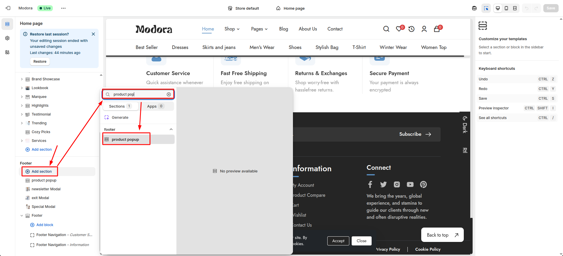
Section settings
Section settings make it easy to control how content appears on your store pages. Update text, images, and layout directly from the Theme Editor. Adjust spacing, colors, and alignment to match your brand style. Changes are applied instantly with live preview support.
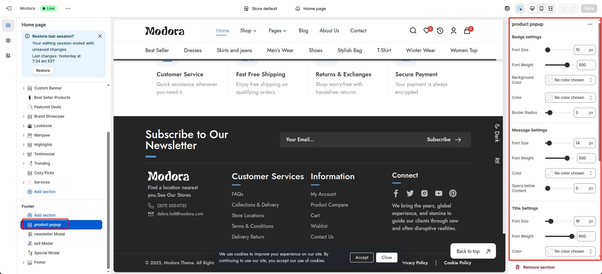
| Settings | Type | Description | visibility |
|---|---|---|---|
| Font Size | range(px) | Adjust the font size of the Badge text. | Always Visible |
| Font Weight | range | Adjust the font weight of the Badge text. | Always Visible |
| Background Color | color_background | Choose the background color for Badge text. | Always Visible |
| Color | color_background | Choose the text color for Badge text. | Always Visible |
| Border Radius | range(px) | Adjust the border radius of the Badge. | Always Visible |
| Font Size | range(px) | Adjust the font size of the message text. | Always Visible |
| Font Weight | range | Adjust the font weight of the message text. | Always Visible |
| Color | color_background | Choose the text color for message text. | Always Visible |
| Space below Content | range(px) | Adjust the spacing below the content of the message. | Always Visible |
| Font Size | range(px) | Adjust the font size of the product title. | Always Visible |
| Font Weight | range | Adjust the font weight of the product title. | Always Visible |
| Color | color_background | Choose the text color for product title. | Always Visible |
| Space below Content | range(px) | Adjust the spacing below the content of the product title. | Always Visible |
| Font Size | range(px) | Adjust the font size of the time text. | Always Visible |
| Font Weight | range | Adjust the font weight of the time text. | Always Visible |
| Color | color_background | Choose the text color for time text. | Always Visible |
| Font Size | range(px) | Adjust the font size of the icon. | Always Visible |
| Font Weight | range | Adjust the font weight of the icon. | Always Visible |
| Color | color_background | Choose the text color for icon. | Always Visible |
4Newsletter Modal
- From your Shopify admin, go to Themes -> Edit Theme.
- Click Add section and choose "Newsletter Modal".
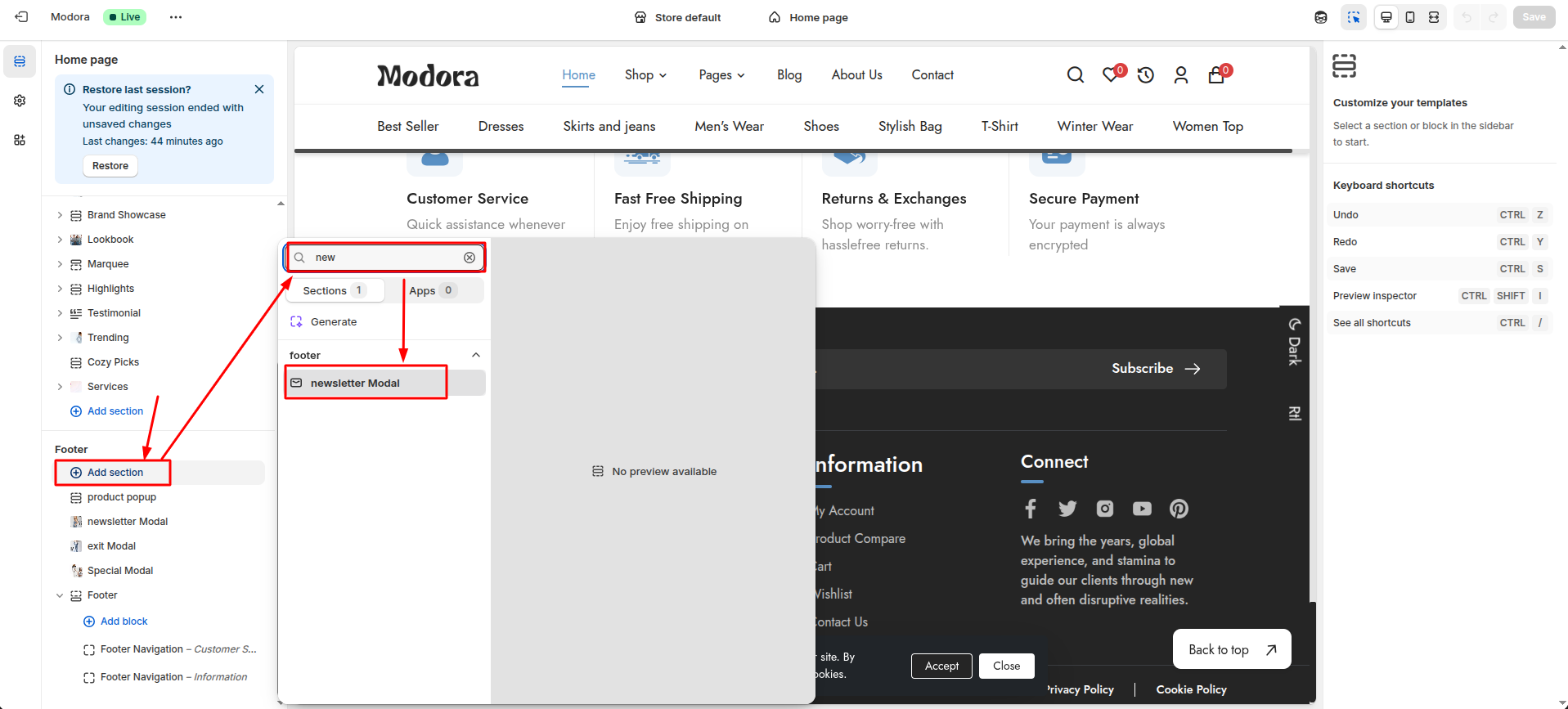
Section settings
Section settings make it easy to control how content appears on your store pages. Update text, images, and layout directly from the Theme Editor. Adjust spacing, colors, and alignment to match your brand style. Changes are applied instantly with live preview support.
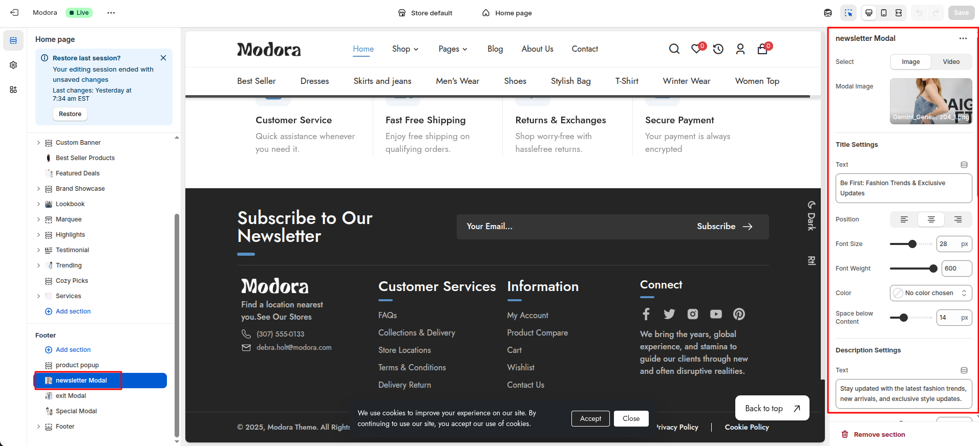
| Settings | Type | Description | visibility |
|---|---|---|---|
| Select | select(Image/Video) | Select image or video for the newsletter modal. | Always Visible |
| Modal Image | image_picker | select image for the newsletter modal. | Visible when image is selected |
| Modal Video | video | select video for the newsletter modal. | Visible when video is selected |
| Text | text | Set the title text displayed in the newsletter modal. | Always Visible |
| Position | text_alignment | Adjust the title position in the newsletter modal. | Always Visible |
| Font Size | range(px) | Adjust the font size of the title text. | Always Visible |
| Font Weight | range | Adjust the font weight of the title text. | Always Visible |
| Color | color_background | Choose the text color for title text. | Always Visible |
| Space below Content | range(px) | Adjust the spacing below the content of the title. | Always Visible |
| Text | text | Set the description text displayed in the newsletter modal. | Always Visible |
| Font Size | range(px) | Adjust the font size of the description. | Always Visible |
| Font Weight | range | Adjust the font weight of the description. | Always Visible |
| Color | color_background | Choose the text color for description. | Always Visible |
| Space below Content | range(px) | Adjust the spacing below the content of the description. | Always Visible |
| Text | text | Set the email text displayed in the newsletter modal. | Always Visible |
| Text Position | text_alignment | Adjust the email box position in the newsletter modal. | Always Visible |
| Color | color_background | Choose the text color for email content. | Always Visible |
| Border Radius | range(px) | Adjust the border radius of the email input. | Always Visible |
| Space below Content | range(px) | Adjust the spacing below the content of the email. | Always Visible |
| Text | text | Set the button text displayed in the newsletter modal. | Always Visible |
| Font Size | range(px) | Adjust the font size of the button text. | Always Visible |
| Font Weight | range | Adjust the font weight of the button text. | Always Visible |
| Background Color | color_background | Choose the background color for button. | Always Visible |
| Color | color_background | Choose the text color for button. | Always Visible |
| Space below Content | range(px) | Adjust the spacing below the content of the button. | Always Visible |
| Checkbox Color | color_background | Choose the background color for the checkbox. | Always Visible |
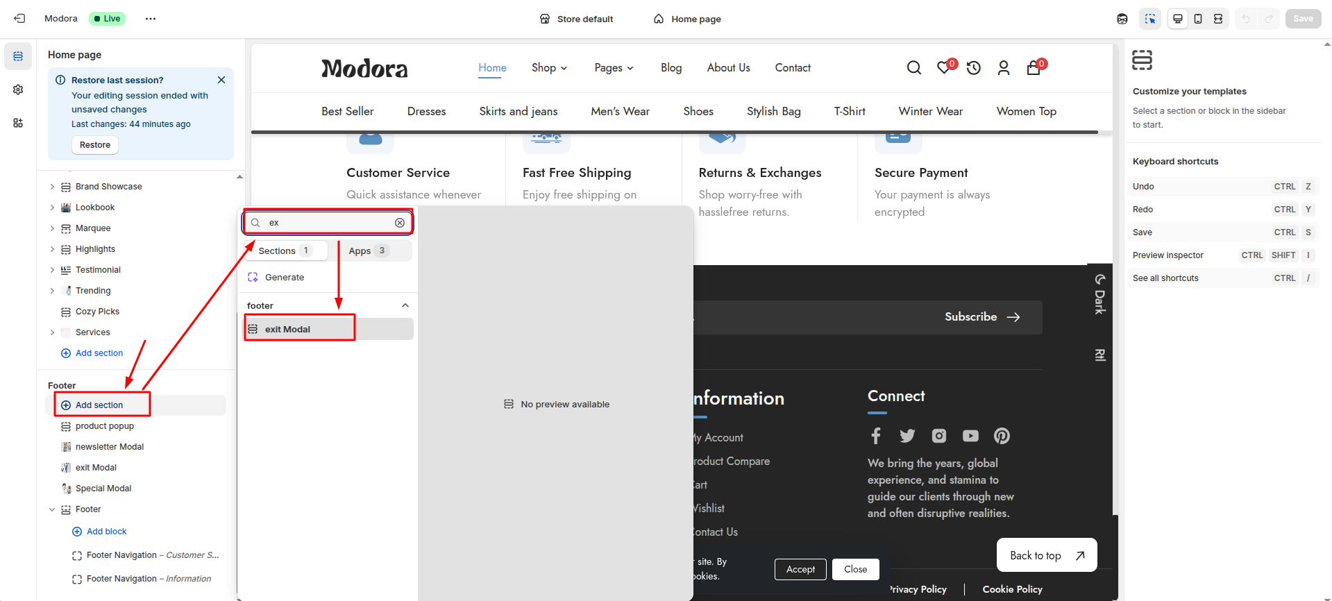
5Exit Modal
- From your Shopify admin, go to Themes -> Edit Theme.
- Click Add section and choose "Exit Modal".
Section settings
Section settings make it easy to control how content appears on your store pages. Update text, images, and layout directly from the Theme Editor. Adjust spacing, colors, and alignment to match your brand style. Changes are applied instantly with live preview support.
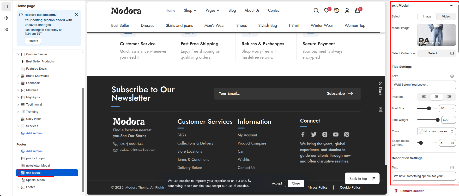
| Settings | Type | Description | visibility |
|---|---|---|---|
| Select | select(Image/Video) | Select image or video for the exit modal. | Always Visible |
| Modal Image | image_picker | select image for the exit modal. | Visible when image is selected |
| Modal Video | video | select video for the exit modal. | Visible when video is selected |
| Select Collection | collection | select collection for the exit modal in show products. | Always Visible |
| Text | text | Set the title text displayed in the exit modal. | Always Visible |
| Position | text_alignment | Adjust the title position in the exit modal. | Always Visible |
| Font Size | range(px) | Adjust the font size of the title text. | Always Visible |
| Font Weight | range | Adjust the font weight of the title text. | Always Visible |
| Color | color_background | Choose the text color for title text. | Always Visible |
| Space below Content | range(px) | Adjust the spacing below the content of the title. | Always Visible |
| Text | text | Set the description text displayed in the exit modal. | Always Visible |
| Font Size | range(px) | Adjust the font size of the description. | Always Visible |
| Font Weight | range | Adjust the font weight of the description. | Always Visible |
| Color | color_background | Choose the text color for description. | Always Visible |
| Space below Content | range(px) | Adjust the spacing below the content of the description. | Always Visible |
| Text | text | Set the code text displayed in the exit modal. | Always Visible |
| Text Position | text_alignment | Adjust the code box position in the exit modal. | Always Visible |
| Color | color_background | Choose the text color for code content. | Always Visible |
| Border Radius | range(px) | Adjust the border radius of the code box. | Always Visible |
| Border Color | color_background | Choose the border color for code content. | Always Visible |
| Space below Content | range(px) | Adjust the spacing below the content of the code. | Always Visible |
| Text | text | Set the Discount Description text displayed in the exit modal. | Always Visible |
| Font Size | range(px) | Adjust the font size of the discount description. | Always Visible |
| Font Weight | range | Adjust the font weight of the discount description. | Always Visible |
| Color | color_background | Choose the text color for discount description content. | Always Visible |
| Space below Content | range(px) | Adjust the spacing below the content of the discount description. | Always Visible |
| Text | text | Set the button text displayed in the exit modal. | Always Visible |
| Font Size | range(px) | Adjust the font size of the button text. | Always Visible |
| Font Weight | range | Adjust the font weight of the button text. | Always Visible |
| Background Color | color_background | Choose the background color for button. | Always Visible |
| Color | color_background | Choose the text color for button. | Always Visible |
| Font Size | range(px) | Adjust the font size of the product title. | Always Visible |
| Font Weight | range | Adjust the font weight of product title. | Always Visible |
| Color | color_background | Choose the text color for product title. | Always Visible |
| Font Size | range(px) | Adjust the font size of the product price. | Always Visible |
| Font Weight | range | Adjust the font weight of product price. | Always Visible |
| Color | color_background | Choose the text color for product price. | Always Visible |
| Color | color_background | Choose the text color for product compare price. | Always Visible |
| Font Size | range(px) | Adjust the font size of the product tag. | Always Visible |
| Font Weight | range | Adjust the font weight of product tag. | Always Visible |
| Color | color_background | Choose the text color for product tag. | Always Visible |
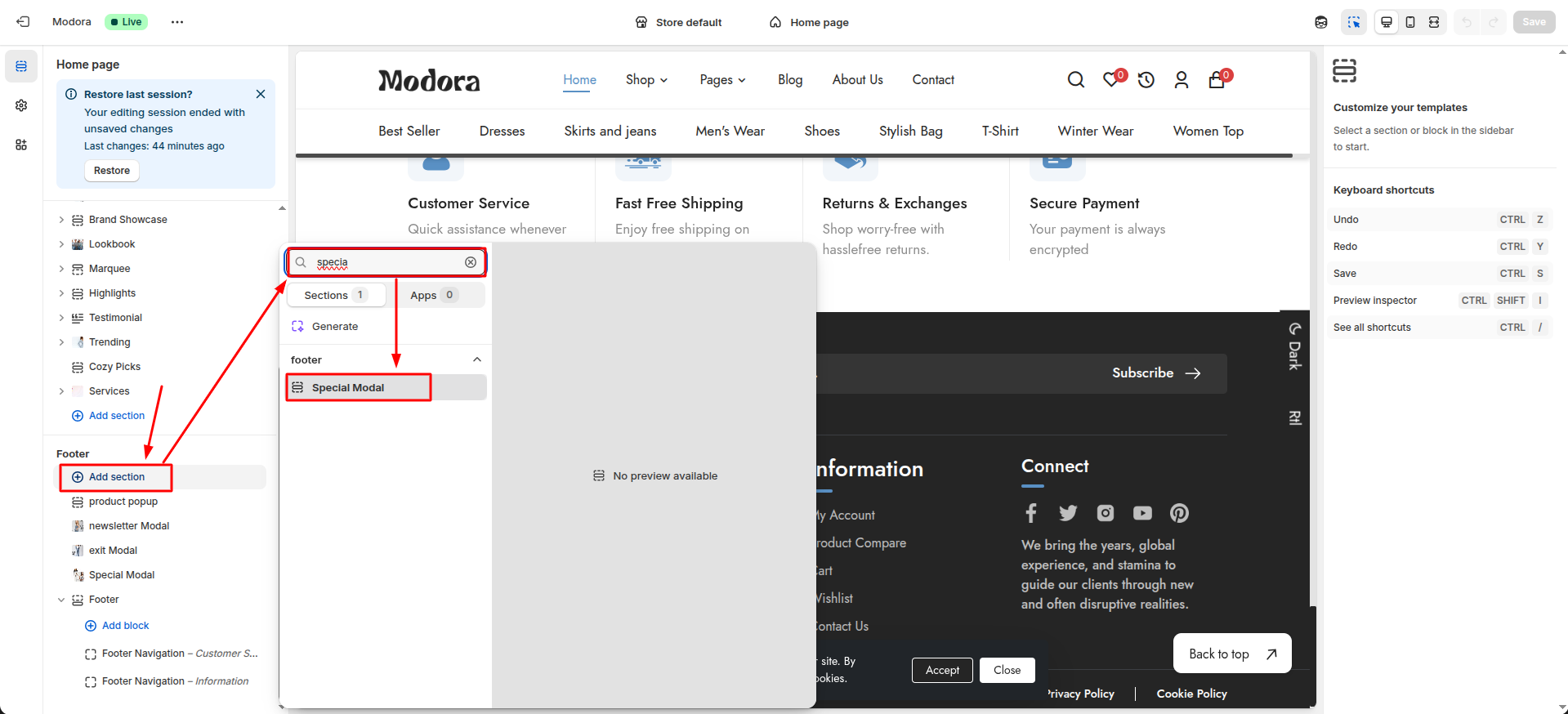
6Special Modal
- From your Shopify admin, go to Themes -> Edit Theme.
- Click Add section and choose "Special Modal".
Section settings
Section settings make it easy to control how content appears on your store pages. Update text, images, and layout directly from the Theme Editor. Adjust spacing, colors, and alignment to match your brand style. Changes are applied instantly with live preview support.
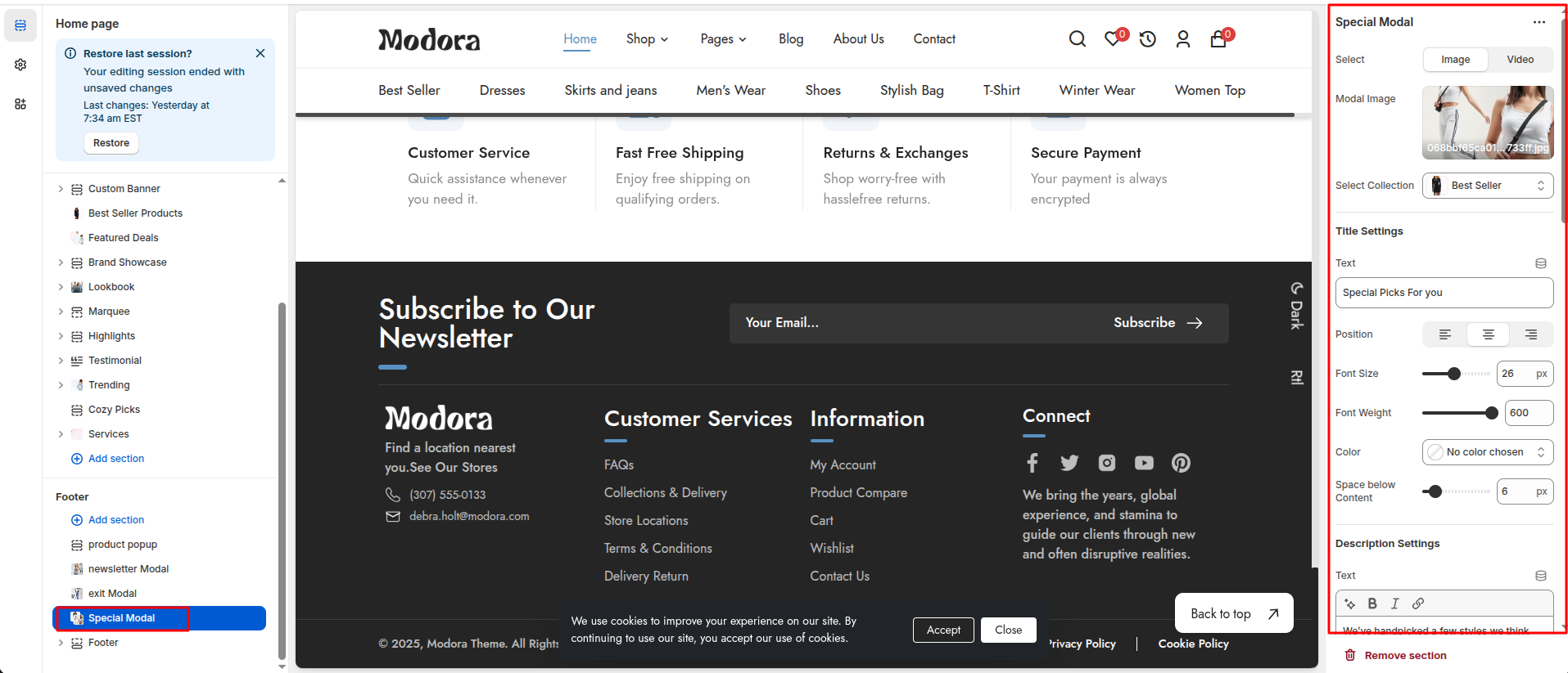
| Settings | Type | Description | visibility |
|---|---|---|---|
| Select | select(Image/Video) | Select image or video for the special modal. | Always Visible |
| Modal Image | image_picker | select image for the special modal. | Visible when image is selected |
| Modal Video | video | select video for the special modal. | Visible when video is selected |
| Select Collection | collection | select collection for the special modal in show products. | Always Visible |
| Text | text | Set the title text displayed in the special modal. | Always Visible |
| Position | text_alignment | Adjust the title position in the special modal. | Always Visible |
| Font Size | range(px) | Adjust the font size of the title text. | Always Visible |
| Font Weight | range | Adjust the font weight of the title text. | Always Visible |
| Color | color_background | Choose the text color for title text. | Always Visible |
| Space below Content | range(px) | Adjust the spacing below the content of the title. | Always Visible |
| Text | text | Set the description text displayed in the special modal. | Always Visible |
| Font Size | range(px) | Adjust the font size of the description. | Always Visible |
| Font Weight | range | Adjust the font weight of the description. | Always Visible |
| Color | color_background | Choose the text color for description. | Always Visible |
| Space below Content | range(px) | Adjust the spacing below the content of the description. | Always Visible |
| Text | text | Set the code text displayed in the special modal. | Always Visible |
| Text Position | text_alignment | Adjust the code box position in the special modal. | Always Visible |
| Color | color_background | Choose the text color for code content. | Always Visible |
| Border Radius | range(px) | Adjust the border radius of the code box. | Always Visible |
| Border Color | color_background | Choose the border color for code content. | Always Visible |
| Space below Content | range(px) | Adjust the spacing below the content of the code. | Always Visible |
| Font Size | range(px) | Adjust the font size of the product title. | Always Visible |
| Font Weight | range | Adjust the font weight of product title. | Always Visible |
| Color | color_background | Choose the text color for product title. | Always Visible |
| Font Size | range(px) | Adjust the font size of the product price. | Always Visible |
| Font Weight | range | Adjust the font weight of product price. | Always Visible |
| Color | color_background | Choose the text color for product price. | Always Visible |
| Space below Content | range(px) | Adjust the spacing below the content of the product. | Always Visible |
| Text | text | Set the button text displayed in the special modal. | Always Visible |
| Font Size | range(px) | Adjust the font size of the button text. | Always Visible |
| Font Weight | range | Adjust the font weight of the button text. | Always Visible |
| Background Color | color_background | Choose the background color for button. | Always Visible |
| Color | color_background | Choose the text color for button. | Always Visible |
Home Section
1Install Layout
- Click the file name to open and download the corresponding JSON layout in a new tab.(index.json)
- SELECT ALL and COPY.
- From your Shopify admin, go to Themes -> Actions -> Edit Code.
- Find folder templates -> Open file index.json -> SELECT ALL and DELETE. PASTE the copied preset from the external file.
2Category
- From your Shopify admin, go to Themes -> Edit Theme.
- Click Add section and choose "Category".

Section settings
Section settings make it easy to control how content appears on your store pages. Update text, images, and layout directly from the Theme Editor. Adjust spacing, colors, and alignment to match your brand style. Changes are applied instantly with live preview support.
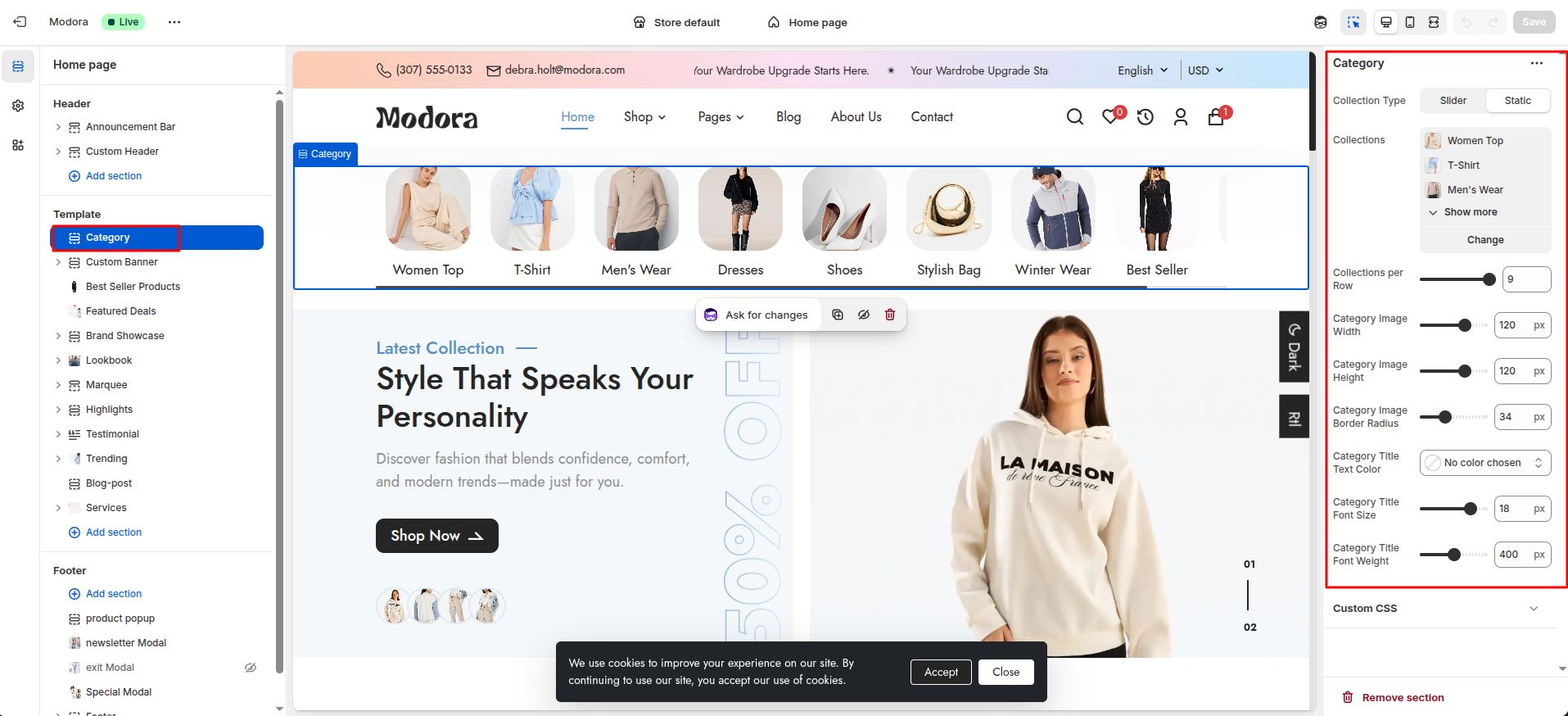
| Settings | Type | Description | visibility |
|---|---|---|---|
| Collection Type | Select | Select whether the collection is displayed as a Slider or Static layout. | Always Visible |
| collections | collection_list | Select the collections you want to display. | Always Visible |
| Collections per Row | range | Adjust the number of collections displayed per row. | Visible when Collection Type is set to static. |
| Slides Visible | range | Adjust the number of slides displayed. | Visible when Collection Type is set to slider. |
| Slides Per Scroll | range | Adjust the number of slides displayed per scroll. | Visible when Collection Type is set to slider. |
| Autoplay Mode | checkbox | When enabled, the collection slider plays automatically. | Visible when Collection Type is set to slider. |
| Autoplay Interval Speed | range | Set the time interval between each slide transition. | Visible when Collection Type is set to slider and Autoplay Mode is true |
| Loop Slides (Infinite Scroll) | checkbox | When enabled, slides restart automatically after the last item. | Visible when Collection Type is set to slider. |
| Activate Slider Arrows | checkbox | When enabled, slider arrows are displayed. | Visible when Collection Type is set to slider. |
| Activate Slider Dots | checkbox | When enabled, slider dots are displayed. | Visible when Collection Type is set to slider. |
| Category Image Width | range(px) | Adjust the width of the category image. | Always Visible |
| Category Image Height | range(px) | Adjust the height of the category image. | Always Visible |
| Category Image Border Radius | range(px) | Adjust the border radius of the category image. | Always Visible |
| Category Title Text Color | color_background | Choose the color of the category title text. | Always Visible |
| Category Title Font Size | range(px) | Adjust the font size of the category title. | Always Visible |
| Category Title Font Weight | range | Adjust the font weight of the category title. | Always Visible |
3Custom Banner
- From your Shopify admin, go to Themes -> Edit Theme.
- Click Add section and choose "Custom Banner".

Supported Blocks
- Click Add block and choose "Banner Slide" according to your requirement.

Block Settings
Use the Banner Slide block to add multiple banners in a single section.Also, for customizing the banner, use the following settings:
| Settings | Type | Description | Visibility |
|---|---|---|---|
| CTA Button Text | text | Enter the text for the CTA button. | Always Visible |
| CTA Button Text Color | color_background | Choose the color of the CTA button text. | Always Visible |
| CTA Button Font Size | range(px) | Adjust the font size of the CTA button text. | Always Visible |
| CTA Button Font Weight | range | Adjust the font weight of the CTA button text. | Always Visible |
| Banner Title | text | Enter the text for the banner title. | Always Visible |
| Banner Title Text Color | color_background | Choose the text color of the banner title. | Always Visible |
| Banner Title Font Size | range(px) | Adjust the font size of the banner title. | Always Visible |
| Banner Title Font Weight | range | Adjust the font weight of the banner title. | Always Visible |
| Banner Subtitle Text | text | Enter the text for the banner subtitle. | Always Visible |
| Banner Subtitle Text Color | color_background | Choose the text color of the banner subtitle. | Always Visible |
| Banner Subtitle Font Size | range(px) | Adjust the font size of the banner subtitle. | Always Visible |
| Banner Subtitle Font Weight | range | Adjust the font weight of the banner subtitle. | Always Visible |
| Banner Sale Text | text | Enter the text for the banner sale. | Always Visible |
| Number of Product Gallery Image | select | Choose the number of images shown in the product gallery. | Always Visible. |
| Upload Gallery Image 1 | image_picker | Select the first image for the product gallery. | Always Visible |
| Upload Gallery Image 2 | image_picker | Select the second image for the product gallery. | Visible when number of product gallery image is more than 1. |
| Upload Gallery Image 3 | image_picker | Select the third image for the product gallery. | Visible when number of product gallery image is more than 2. |
| Upload Gallery Image 4 | image_picker | Select the fourth image for the product gallery.. | Visible when number of product gallery image is more than 3. |
Section settings
Section settings make it easy to control how content appears on your store pages. Update text, images, and layout directly from the Theme Editor. Adjust spacing, colors, and alignment to match your brand style. Changes are applied instantly with live preview support.
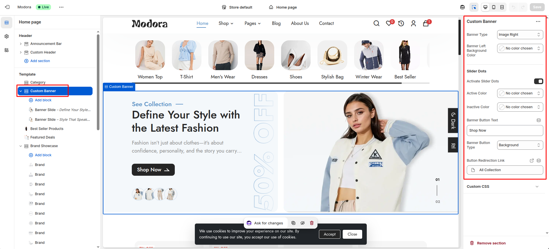
| Settings | Type | Description | visibility |
|---|---|---|---|
| Banner Type | select | Choose the type of banner to display (Image left / Image Right). | Always Visible |
| Banner Left Background Color | color_background | Choose the background color for the left side of the banner. | Always Visible |
| Activate Slider Dots | checkbox | When enabled, the slider dots will be visible. | Always Visible |
| Active Color | color_background | Choose the color of the active slider dot. | Visible when Active Slider Dots is true. |
| Inactive Color | color_background | Choose the color of the inactive slider dot. | Visible when Active Slider Dots is true. |
| Banner Button Text | text | Enter the text for the banner button. | Always Visible |
| Banner Button Type | select | Select the type of banner button (background / border / link). | Always Visible |
| Button Redirection Link | url | Select the URL where the button should redirect users. | Always Visible |
4Best Seller Products
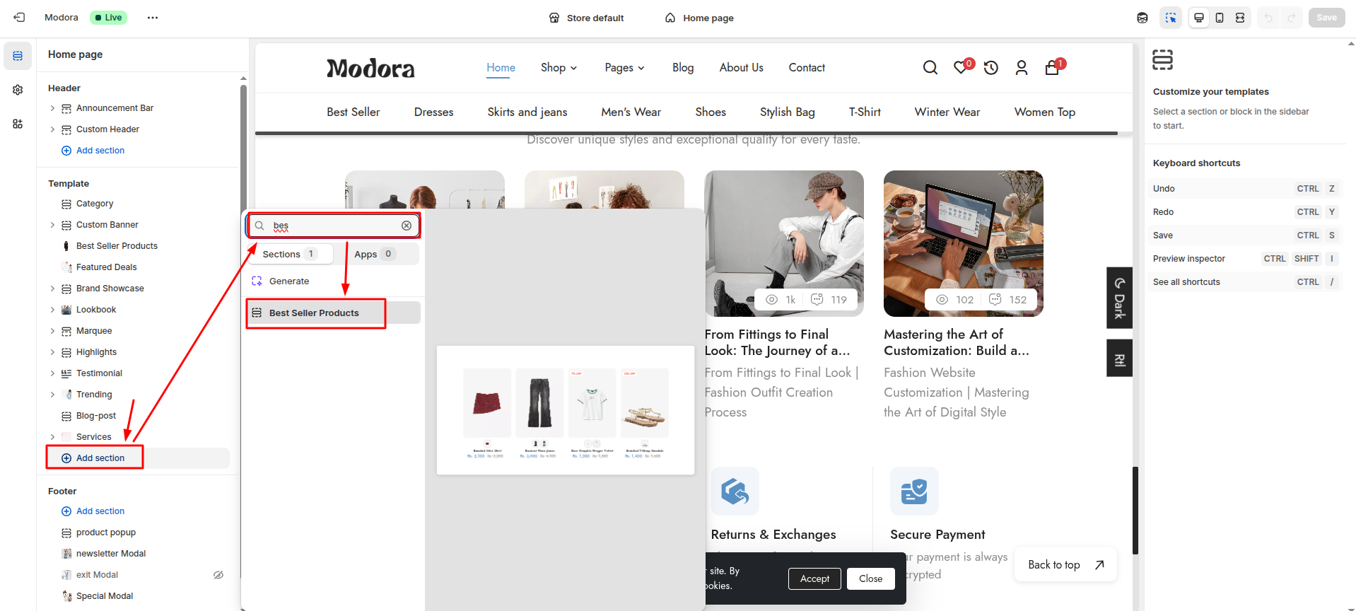
- From your Shopify admin, go to Themes -> Edit Theme.
- Click Add section and choose "Best seller Products".
Section settings
Section settings make it easy to control how content appears on your store pages. Update text, images, and layout directly from the Theme Editor. Adjust spacing, colors, and alignment to match your brand style. Changes are applied instantly with live preview support.
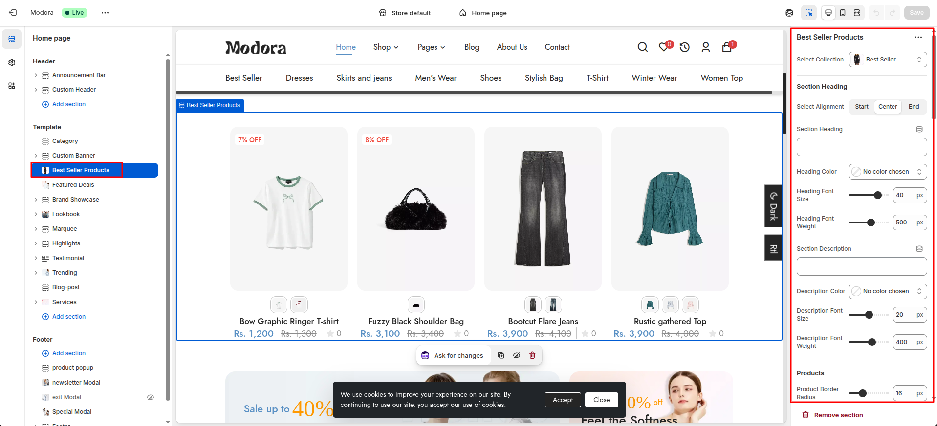
| Settings | Type | Description | visibility |
|---|---|---|---|
| Select Collection | collection | Choose the collection to display the best-selling products. | Always Visible |
| Select Alignment | text_alignment | Set the alignment of the section heading text. | Always Visible |
| Section Heading | text | Enter the text for the section heading. | Always Visible |
| Heading Color | color_background | Choose the color of the section heading. | Always Visible |
| Heading Font Size | range(px) | Adjust the font size of the section heading. | Always Visible |
| Heading Font Weight | range | Adjust the font weight of the section heading. | Always Visible |
| Section Description | text | Enter the text for the section description. | Always Visible |
| Description Color | color_background | Choose the color of the section description. | Always Visible |
| Description Font Size | range(px) | Adjust the font size of the section description. | Always Visible |
| Description Font Weight | range | Adjust the font weight of the section description. | Always Visible |
| Product Border Radius | range(px) | Adjust the border radius of the product box. | Always Visible |
| Enable Product Variants | checkbox | When enabled, the product variants will be displayed. | Always Visible |
| Variant Outline Color | color_background | Choose the color of the product variant outline. | Visible when Enable Product Variants is true. |
| Variant Border Radius | range(px) | Adjust the border radius of the product variant. | Visible when Enable Product Variants is true. |
| Variant Background Color | color_background | Choose the background color of the product variant. | Visible when Enable Product Variants is true. |
| Product Title Color | color_background | Choose the color of the product title. | Always Visible |
| Product Title Font Size | range(px) | Adjust the font size of the product title. | Always Visible |
| Product Title Font Weight | range | Adjust the font weight of the product title. | Always Visible |
| Product Price Color | color_background | Choose the color of the product price. | Always Visible |
| Product Price Font Size | range(px) | Adjust the font size of the product price. | Always Visible |
| Product Price Font Weight | range | Adjust the font weight of the product price. | Always Visible |
| Enable Compare Price | checkbox | When enabled, the compare price will be displayed. | Always Visible |
| Product Compare Price Color | color_background | Choose the color of the product compare price. | Visible when Enable Compare Price is true. |
| Product Compare Price Font Size | range(px) | Adjust the font size of the product compare price. | Visible when Enable Compare Price is true. |
| Product Compare Price Font Weight | range | Adjust the font weight of the product compare price. | Visible when Enable Compare Price is true. |
| Activate Product Review | checkbox | When enabled, the product review will be displayed. | Always Visible |
| Activate Variant Button | checkbox | When enabled, the variant button will be displayed on the product image. | Always Visible |
| Variant Button Text | text | Enter the text for the variant button. | Visible when Activate Variant Button is true. |
| Activate Cart Button | checkbox | When enabled, the cart button will be displayed. | Always Visible |
| Cart Button Text | text | Enter the text for the cart button. | Visible when Activate Cart Button is true. |
| Cart Button Background | color_background | Choose the background color of the cart button. | Visible when Activate Cart Button is true. |
| Cart Button Radius | range(px) | Adjust the border radius of the cart button. | Visible when Activate Cart Button is true. |
| Cart Button Text Color | color_background | Choose the text color of the cart button. | Visible when Activate Cart Button is true. |
| Cart Button Text Font Size | range(px) | Adjust the font size of the cart button text. | Visible when Activate Cart Button is true. |
| Cart Button Text Font Weight | range | Adjust the font weight of the cart button text. | Visible when Activate Cart Button is true. |
| Product Hover Icons Background | color_background | Choose the background color of the product hover icons. | Always Visible |
| Product Hover Icons Border Radius | range(px) | Adjust the border radius of the product hover icons. | Always Visible |
| Product Hover Icons Color | color_background | Choose the text color of the product hover icons. | Always Visible |
| Product Hover Icons Font Size | range(px) | Adjust the font size of the product hover icons. | Always Visible |
| Enable Wishlist | checkbox | When enabled, the wishlist button will be displayed. | Always Visible |
| Enable Compare | checkbox | When enabled, the compare button will be displayed. | Always Visible |
| Enable Quick View | checkbox | When enabled, the quick view button will be displayed. | Always Visible |
| Enable Sale Tag | checkbox | When enabled, the sale tag will be displayed. | Always Visible |
| Badge Text Font Size | range(px) | Adjust the font size of the badge text. | Visible when Enable Sale Tag is true. |
| Badge Text Font Weight | range | Adjust the font weight of the badge text. | Visible when Enable Sale Tag is true. |
| Badge Text Color | color_background | Choose the text color of the badge text. | Visible when Enable Sale Tag is true. |
| Badge Background | color_background | Choose the background color of the badge. | Visible when Enable Sale Tag is true. |
| Enable Timer | checkbox | When enabled, the timer will be displayed. | Always Visible |
| Timer Background | color_background | Choose the background color of the timer. | Visible when Enable Timer is true |
| Timer Text Font Size | range(px) | Adjust the font size of the timer text. | Visible when Enable Timer is true |
| Timer Text Font Weight | range | Adjust the font weight of the timer text. | Visible when Enable Timer is true |
| Badge Text Border Radius | range(px) | Adjust the border radius of the badge text. | Visible when Enable Timer is true |
| Timer Text Color | color_background | Choose the text color of the timer text. | Visible when Enable Timer is true |
5Featured Deals
- From your Shopify admin, go to Themes -> Edit Theme.
- Click Add section and choose "Featured Deals".

Section settings
Section settings make it easy to control how content appears on your store pages. Update text, images, and layout directly from the Theme Editor. Adjust spacing, colors, and alignment to match your brand style. Changes are applied instantly with live preview support.

| Settings | Type | Description | visibility |
|---|---|---|---|
| Select Position | select | Select the position of the Banner (left / right). | Always Visible |
| Button Redirection Link | url | Select the redirection link for the button. | Always Visible |
| Background Left Image | image_picker | Choose the background image for the Left Side banner. | Always Visible |
| Sale Text | text | Enter the text for the left side banner sale. | Always Visible |
| Sale Text Color | color_background | Choose the color of the banner sale text. | Always Visible |
| Sale Text Font Size | range(px) | Adjust the font size of the banner sale text. | Always Visible |
| Sale Text Font Weight | range | Adjust the font weight of the banner sale text. | Always Visible |
| Sale Number | text | Enter the text for the left side banner sale number. | Always Visible |
| Sale Number Color | color_background | Choose the color of the banner sale number. | Always Visible |
| Sale Number Font Size | range(px) | Adjust the font size of the banner sale number. | Always Visible |
| Sale Number Font Weight | range | Adjust the font weight of the banner sale number. | Always Visible |
| Sale Title | text | Enter the text for the left side banner sale title. | Always Visible |
| Sale Title Color | color_background | Choose the color of the banner sale title. | Always Visible |
| Sale Title Font Size | range(px) | Adjust the font size of the banner sale title. | Always Visible |
| Sale Title Font Weight | range | Adjust the font weight of the banner sale title. | Always Visible |
| Sale Description | text | Enter the text for the left side banner sale description. | Always Visible |
| Sale Description Color | color_background | Choose the color for the banner sale description. | Always Visible |
| Sale Description Font Size | range(px) | Adjust the font size of the banner sale description. | Always Visible |
| Sale Description Font Weight | range | Adjust the font weight of the banner sale description. | Always Visible |
| Banner Button Text | text | Enter the text for the left side banner button. | Always Visible |
| Banner Button Type | select | Select the type of the left side banner button (background / border / link). | Always Visible |
| Background Right Image | image_picker | Choose the image for the right side banner. | Always Visible |
| Sale Text | text | Enter the text for the right side banner sale. | Always Visible |
| Sale Text Color | color_background | Choose the color for the banner sale text. | Always Visible |
| Sale Text Font Size | range(px) | Adjust the font size of the banner sale text. | Always Visible |
| Sale Text Font Weight | range | Adjust the font weight of the banner sale text. | Always Visible |
| Sale Number | text | Enter the text for the right side banner sale number. | Always Visible |
| Sale Number Color | color_background | Choose the color for the banner sale number. | Always Visible |
| Sale Number Font Size | range(px) | Adjust the font size of the banner sale number. | Always Visible |
| Sale Number Font Weight | range | Adjust the font weight of the banner sale number. | Always Visible |
| Sale Title | text | Enter the text for the right side banner sale title. | Always Visible |
| Sale Title Color | color_background | Choose the color for the banner sale title. | Always Visible |
| Sale Title Font Size | range(px) | Adjust the font size of the banner sale title. | Always Visible |
| Sale Title Font Weight | range | Adjust the font weight of the banner sale title. | Always Visible |
| Sale Tag | text | Enter the text for the rigth side banner sale tag. | Always Visible |
| Sale tag Color | color_background | Choose the color for the banner sale tag. | Always Visible |
| Sale Tag Font Size | range(px) | Adjust the font size of the banner sale tag. | Always Visible |
| Sale Tag Font Weight | range | Choose the font weight of the banner sale tag. | Always Visible |
| Banner Button Type | select | Select the type of right side banner button (background / border / link). | Always Visible |
6Brand Showcase
- From your Shopify admin, go to Themes -> Edit Theme.
- Click Add section and choose "Brand Showcase".

Supported Blocks
- Click Add block and choose "Brand" according to your requirement.
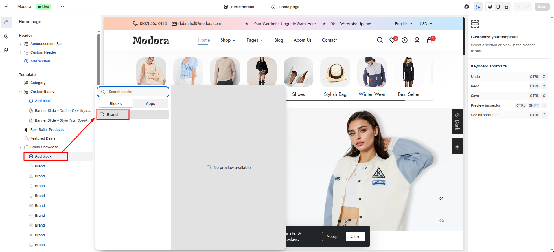
| Block Type | Setting Type | Description |
|---|---|---|
| Brand | image_picker | Upload brand logo image. |
Section settings
Section settings make it easy to control how content appears on your store pages. Update text, images, and layout directly from the Theme Editor. Adjust spacing, colors, and alignment to match your brand style. Changes are applied instantly with live preview support.
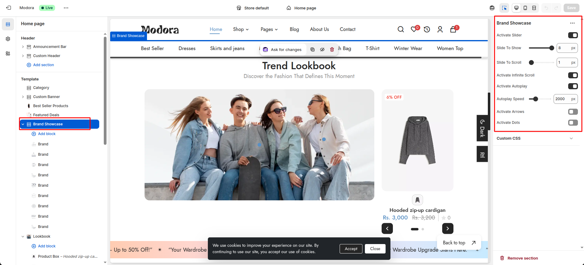
| Settings | Type | Description | visibility |
|---|---|---|---|
| Activate Slider | checkbox | When enabled, the Brand Showcase section will be displayed as a slider. | Always Visible |
| Slide To Show | range | Set the number of brand to display in the slider. | Visible when Activate Slider is true. |
| Slide To Scroll | range | Set the number of brand to scroll in the slider. | Visible when Activate Slider is true. |
| Activate Infinite Scroll | checkbox | When enabled, the slides repeat continuously without stopping. | Visible when Activate Slider is true |
| Activate Autoplay | checkbox | When enabled, the slides will automatically slide. | Visible when Activate Slider is true |
| Autoplay Speed | range | Adjust the speed at which the slides automatically slide. | Visible when Active autoplay is true. |
| Activate Arrows | checkbox | When enabled, the next and previous buttons will be displayed. | Always Visible |
| Arrow Background Color | color_background | Choose the background color of the arrows. | Visible When Active Arrows is true. |
| Arrow Icon Color | color_background | Choose the icon color of the arrows. | Visible when Active Arrows is true. |
| Arrow Disable Background Color | color_background | Choose the background color of the disabled arrows. | Visible When Active Arrows is true. |
| Activate Dots | checkbox | When enabled, the dots will be displayed. | Always Visible |
| Active Dot Color | color_background | Choose the color of the active dot. | Visible When Active Dots is true. |
| Inactive Dot Color | color_background | Choose the color of the inactive dot. | Visible when Active Dots is true. |
| Dots Border Radius | range(px) | Adjust the border radius of the dots. | Visible When Active Dots is true. |
7Lookbook
- From your Shopify admin, go to Themes -> Edit Theme.
- Click Add section and choose "Lookbook".

Supported Blocks
- Click Add block and choose "Product Box" according to your requirement.

Block Settings
| Setting | Type | Description | Visibility |
|---|---|---|---|
| Select Product (optional) | product | Select a product to display in the block. | Always Visible |
| Position Top (%) | text | Set the lookbook image on circle position from the top. | Always Visible |
| Position Left (%) | text | Set the lookbook image on circle position from the left. | Always Visible |
| Enable Sale Tag | checkbox | When enabled, the sale tag will be displayed. | Always Visible |
| Badge Text Font Size | range(px) | Adjust the font size of the badge text. | Visible when Enable Sale Tag is true. |
| Badge Text Font Weight | range | Adjust the font weight of the badge text. | Visible when Enable Sale Tag is true. |
| Badge Text Color | color_background | Choose the color of the badge text. | Visible when Enable Sale Tag is true. |
| Badge Background | color_background | Choose the background color of the badge. | Visible when Enable Sale Tag is true. |
| Enable Timer | checkbox | When enabled, the timer will be displayed. | Always Visible |
| Timer Text Font Size | range(px) | Adjust the font size of the timer text. | Visible when Enable Timer is true. |
| Timer Text Font Weight | range | Adjust the font weight of the timer text. | Visible when Enable Timer is true. |
| Timer Border Radius | range(px) | Adjust the border radius of the timer. | Visible when Enable Timer is true. |
| Timer Background | color_background | Choose the background color of the timer. | Visible when Enable Timer is true. |
| Timer Text Color | color_background | Choose the color of the timer text. | Visible when Enable Timer is true. |
Section settings
Section settings make it easy to control how content appears on your store pages. Update text, images, and layout directly from the Theme Editor. Adjust spacing, colors, and alignment to match your brand style. Changes are applied instantly with live preview support.
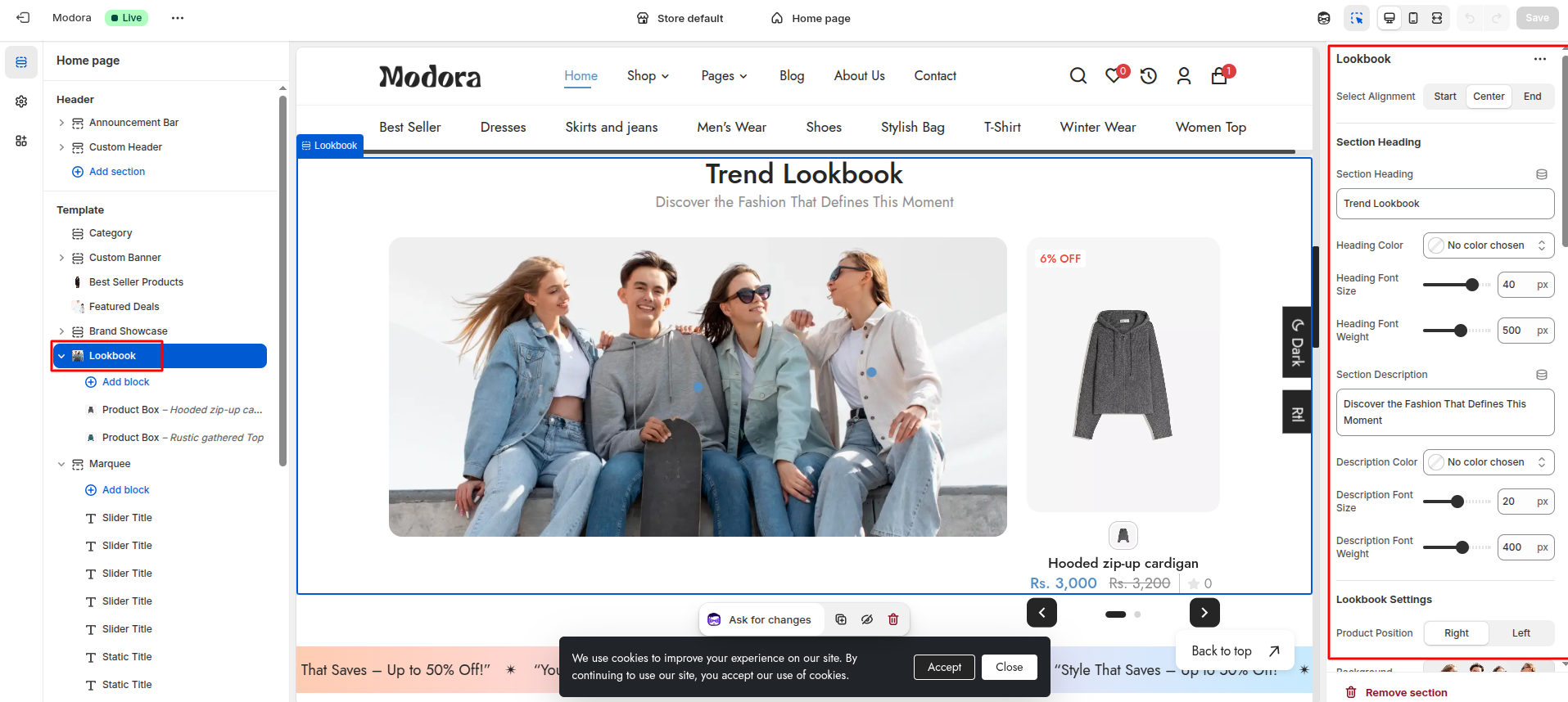
| Settings | Type | Description | visibility |
|---|---|---|---|
| Select Alignment | select | Select the alignment of the section heading. | Always Visible |
| Section Heading | text | Set the text for the section heading. | Always Visible |
| Heading Color | color_background | Choose the color of the section heading. | Always Visible |
| Heading Font Size | range(px) | Adjust the font size of the section heading. | Always Visible |
| Heading Font Weight | range | Adjust the font weight of the section heading. | Always Visible |
| Section Description | text | Set the text for the section description. | Always Visible |
| Description Color | color_background | Choose the color of the section description. | Always Visible |
| Description Font Size | range(px) | Adjust the font size of the section description. | Always Visible |
| Description Font Weight | range | Adjust the font weight of the section description. | Always Visible |
| Product Position | select | Select the position of the product (right / left). | Always Visible |
| Background Image | image_picker | Add a image for the lookbook section banner. | Always Visible |
| Lookbook Point Background | color_background | Choose the background color for the lookbook image on circles. | Always Visible |
| Enable Product Variants | checkbox | When enabled, the product variants will be displayed. | Always Visible |
| Variant Outline Color | color_background | Choose the color of the product variant outline. | Visible when Enable product variants is true. |
| Variant Border Radius | range(px) | Adjust the border radius of the product variant. | Visible when Enable product variants is true. |
| Variant Background Color | color_background | Choose the background color of the product variant. | Visible when Enable product variants is true. |
| Product Title Color | color_background | Choose the color of the product title. | Always Visible |
| Product Title Font Size | range(px) | Adjust the font size of the product title. | Always Visible |
| Product Title Font Weight | range | Adjust the font weight of the product title. | Always Visible |
| Product Price Color | color_background | Choose the color of the product price. | Always Visible |
| Product Price Font Size | range(px) | Adjust the font size of the product price. | Always Visible |
| Product Price Font Weight | range | Adjust the font weight of the product price. | Always Visible |
| Enable Compare Price | checkbox | When enabled, the compare price will be displayed. | Always Visible |
| Product Compare Price Color | color_background | Choose the color of the product compare price. | Visible when Enable Compare price is true. |
| Product Compare Price Font Size | range(px) | Adjust the font size of the product compare price. | Visible when Enable Compare price is true. |
| Product Compare Price Font Weight | range | Adjust the font weight of the product compare price. | Visible when Enable Compare price is true. |
| Activate Product Review | checkbox | When enabled, the product review will be displayed. | Always Visible |
| Activate Arrows | checkbox | When enabled, the slider arrows will be displayed. | Always Visible |
| Arrow Background Color | color_background | Choose the color of the slider arrows. | Visible when Activate Arrows is true. |
| Arrow Icon Color | color_background | Choose the color of the slider arrows icon. | Visible when Activate Arrows is true. |
| Arrow Disable Background Color | color_background | Choose the color of the disabled slider arrows. | Visible when Activate Arrows is true. |
| Activate Dots | checkbox | When enabled, the slider dots will be displayed. | Always Visible |
| Active Dot Color | color_background | Choose the color of the active slider dots. | Visible when Activate Dots is true. |
| Inactive Dot Color | color_background | Choose the color of the inactive slider dots. | Visible when Activate Dots is true. |
| Dots Border Radius | range(px) | Adjust the border radius of the slider dots. | Visible when Activate Dots is true. |
| Activate Variant Button | checkbox | When enabled, the variant button will be displayed. | Always Visible |
| Variant Button Text | text | Set the text of the variant button. | Visible when Activate Variant Button is true. |
8Marquee
- From your Shopify admin, go to Themes -> Edit Theme.
- Click Add section and choose "Marquee".

Supported Blocks
- Click Add block and choose "Slider Title/ Static Title" according to your requirement.011
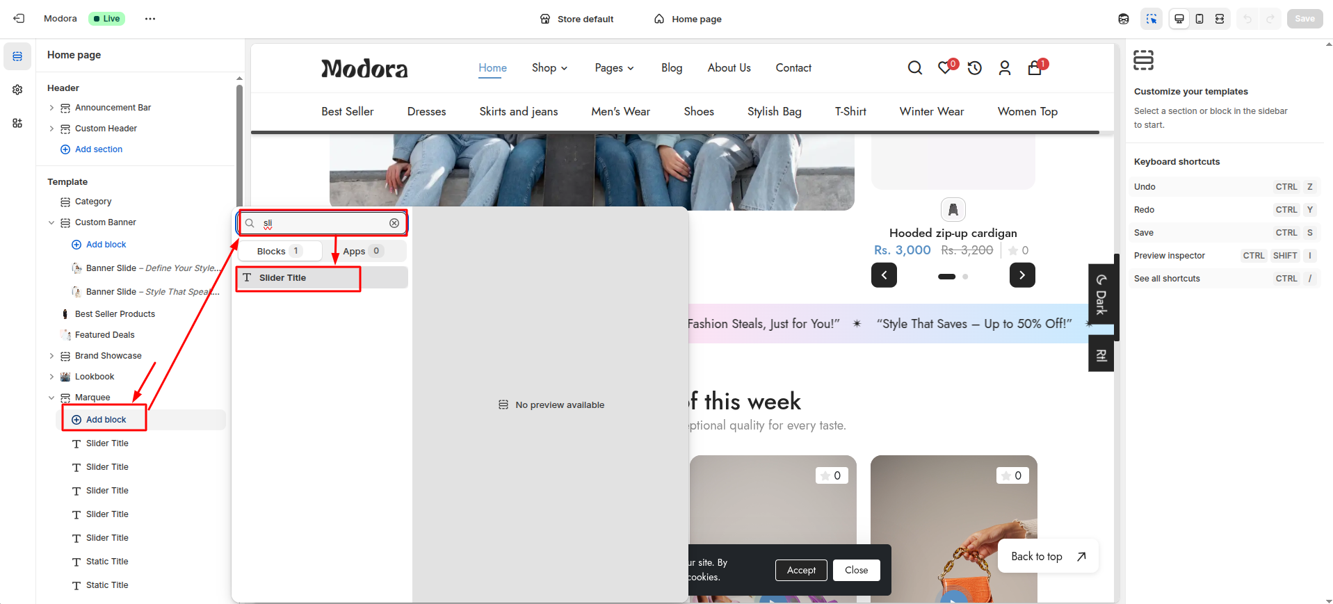
| Block Type | Setting Type | Description |
|---|---|---|
| Slider Title | text | Select Slider Text for scrolling text. |
| Static Title | text | Select Static Text for a fixed display. |
Section settings
Section settings make it easy to control how content appears on your store pages. Update text, images, and layout directly from the Theme Editor. Adjust spacing, colors, and alignment to match your brand style. Changes are applied instantly with live preview support.

| Settings | Type | Description | visibility |
|---|---|---|---|
| Background Color | color_background | Choose the background color for the marquee. | Always Visible |
| Height | range(px) | Set the height of the marquee. | Always Visible |
| Text Color | color_background | Set the text color to ensure readability and brand consistency. | Always Visible |
| Font Size | range(px) | Adjust the font size of the marquee text. | Always Visible |
| Font Weight | range | Adjust the font weight of the marquee text. | Always Visible |
| Marquee Display Mode | select | Choose how the marquee text is displayed (Static or Slider). | Always Visible |
| Marquee Speed | range | Adjust the speed at which the marquee scrolls. | Always Visible |
9Highlights
- From your Shopify admin, go to Themes -> Edit Theme.
- Click Add section and choose "Highlights".
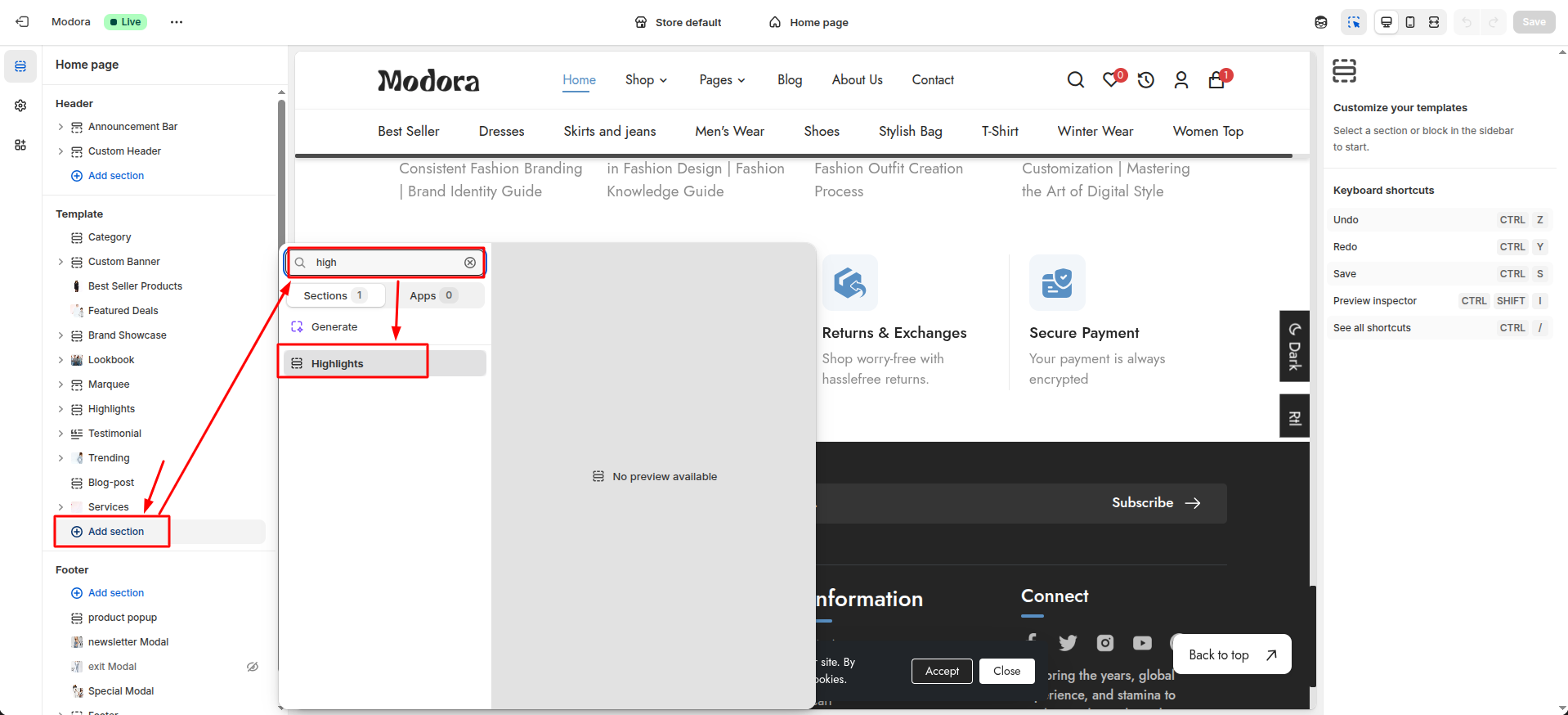
Supported Blocks
- Click Add block and choose "Highlight Product" according to your requirement.
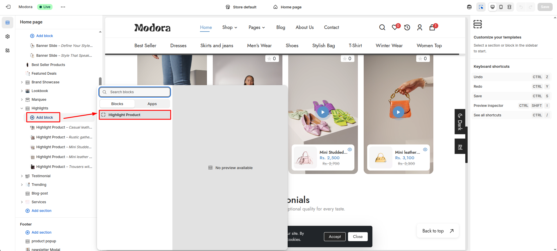
Block Settings
| Setting | Type | Description | Visibility |
|---|---|---|---|
| Video (MP4 format) | video | Select a video to be played. | Always Visible |
| Activate Badge | checkbox | When enabled, the badge will be displayed. | Always Visible |
| Badge Text | text | Set the text to be displayed in the badge. | Always Visible |
| Badge Text Font Size | range(px) | Adjust the font size of the badge text. | Visible when Activate Badge is true. |
| Badge Text Font Weight | range | Adjust the font weight of the badge text. | Visible when Activate Badge is true. |
| Badge Text Color | color_background | Choose the color of the badge text. | Visible when Activate Badge is true. |
| Badge Background | color_background | Choose the background color of the badge. | Visible when Activate Badge is true. |
| Choose Product | product | Select a product to be displayed. | Always Visible |
Section settings
Section settings make it easy to control how content appears on your store pages. Update text, images, and layout directly from the Theme Editor. Adjust spacing, colors, and alignment to match your brand style. Changes are applied instantly with live preview support.
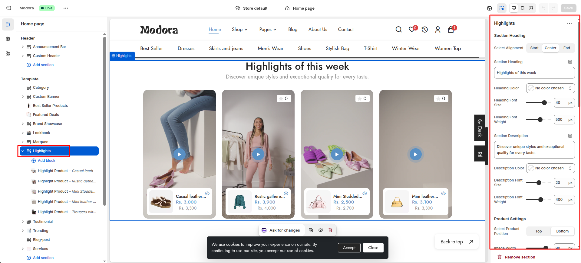
| Settings | Type | Description | visibility |
|---|---|---|---|
| Select Alignment | select | Select the alignment of the section heading. | Always Visible |
| Section Heading | text | Set the text for the section heading. | Always Visible |
| Heading Color | color_background | Choose the color of the section heading. | Always Visible |
| Heading Font Size | range(px) | Adjust the font size of the section heading. | Always Visible |
| Heading Font Weight | range | Adjust the font weight of the section heading. | Always Visible |
| Section Description | text | Set the text for the section description. | Always Visible |
| Description Color | color_background | Choose the color of the section description. | Always Visible |
| Description Font Size | range(px) | Adjust the font size of the section description. | Always Visible |
| Description Font Weight | range | Adjust the font weight of the section description. | Always Visible |
| Product Position | select | Select the position of the product (top / bottom). | Always Visible |
| Image Width | range(px) | Adjust the width of the product image. | Always Visible |
| Image Height | range(px) | Adjust the height of the product image. | Always Visible |
| Tag Color | color_background | Choose the color of the product tag. | Always Visible |
| Tag Font Size | range(px) | Adjust the font size of the product tag. | Always Visible |
| Tag Font Weight | range | Adjust the font weight of the product tag. | Always Visible |
| Title Color | color_background | Choose the color of the product title. | Always Visible |
| Title Font Size | range(px) | Adjust the font size of the product title. | Always Visible |
| Title Font Weight | range | Adjust the font weight of the product title. | Always Visible |
| Price Color | color_background | Choose the color of the product price. | Always Visible |
| Price Font Size | range(px) | Adjust the font size of the product price. | Always Visible |
| Price Font Weight | range | Adjust the font weight of the product price. | Always Visible |
| Quick View Icon Color | color_background | Choose the color of the product quick view icon. | Always Visible |
| Compare Price Color | color_background | Choose the color of the product compare price. | Always Visible |
| Compare Price Font Size | range(px) | Adjust the font size of the product compare price. | Always Visible |
| Compare Price Font Weight | range | Adjust the font weight of the product compare price. | Always Visible |
| Background Color | color_background | Choose the color for the video play button. | Always Visible |
| Width | range(px) | Adjust the width of the video play button. | Always Visible |
| Height | range(px) | Adjust the height of the video play button. | Always Visible. |
| Animation Background Color | color_background | Choose the color for the video play button animation. | Always Visible. |
| Animation Circle Width | range(px) | Adjust the width of the video play button animation. | Always Visible. |
| Animation Circle Height | range(px) | Adjust the height of the video play button animation. | Always Visible |
| Button Icon Color | color_background | Choose the color of the video play button icon. | Always Visible |
10Testimonial
- From your Shopify admin, go to Themes -> Edit Theme.
- Click Add section and choose "Testimonial".

Supported Blocks
- Click Add block and choose "Testimonials" according to your requirement.

Block Settings
| Setting | Type | Description | Visibility |
|---|---|---|---|
| Background Color | color_background | Choose the background color for the testimonial block. | Always Visible |
| Testimonial Image | image_picker | Select the image for the testimonial author. | Always Visible |
| Author Name | text | Set the name of the testimonial author. | Always Visible |
| Author Name Color | color_background | Choose the color for the author name. | Always Visible |
| Author Name Font Size | range(px) | Adjust the font size of the author name. | Always Visible |
| Author Name Font Weight | range | Adjust the font weight of the author name. | Always Visible |
| Author Role | text | Set the role of the testimonial author. | Always Visible |
| Author Role Color | color_background | Choose the color for the author role. | Always Visible |
| Author Role Font Size | range(px) | Adjust the font size of the author role. | Always Visible |
| Author Role Font Weight | range | Adjust the font weight of the author role. | Always Visible |
| Author Description | text | Set the description of the testimonial author. | Always Visible |
| Author Description Color | color_background | Choose the color for the author description. | Always Visible |
| Author Description Font Size | range(px) | Adjust the font size of the author description. | Always Visible |
| Author Description Font Weight | range | Adjust the font weight of the author description. | Always Visible |
| Select Product | product | Select the product to be displayed in the testimonial block | Always Visible |
| Product Title Color | color_background | Choose the color of the product title. | Always Visible |
| Product Title Font Size | range(px) | Adjust the font size of the product title. | Always Visible |
| Product Title Font Weight | range | Adjust the font weight of the product title. | Always Visible |
| Product Price Color | color_background | Choose the color of the product price. | Always Visible |
| Product Price Font Size | range(px) | Adjust the font size of the product price. | Always Visible |
| Product Price Font Weight | range | Adjust the font weight of the product price. | Always Visible |
| Product Compare Price Color | color_background | Choose the color of the product compare price. | Always Visible |
| Product Compare Price Font Size | range(px) | Adjust the font size of the product compare price. | Always Visible |
| Product Compare Price Font Weight | range | Adjust the font weight of the product compare price. | Always Visible |
Section settings
Section settings make it easy to control how content appears on your store pages. Update text, images, and layout directly from the Theme Editor. Adjust spacing, colors, and alignment to match your brand style. Changes are applied instantly with live preview support.

| Settings | Type | Description | visibility |
|---|---|---|---|
| Select Alignment | select | Select the alignment of the section heading. | Always Visible |
| Section Heading | text | Set the text for the section heading. | Always Visible |
| Heading Color | color_background | Choose the color of the section heading. | Always Visible |
| Heading Font Size | range(px) | Adjust the font size of the section heading. | Always Visible |
| Heading Font Weight | range | Adjust the font weight of the section heading. | Always Visible |
| Section Description | text | Set the text for the section description. | Always Visible |
| Description Color | color_background | Choose the color of the section description. | Always Visible |
| Description Font Size | range(px) | Adjust the font size of the section description. | Always Visible |
| Description Font Weight | range | Adjust the font weight of the section description. | Always Visible |
| Slider Center Background Color | color_background | Choose the background color of the center slide. | Always Visible |
| Quote Color | color_background | Choose the color of the quote . | Always Visible |
11Trending
- From your Shopify admin, go to Themes -> Edit Theme.
- Click Add section and choose "Trending".
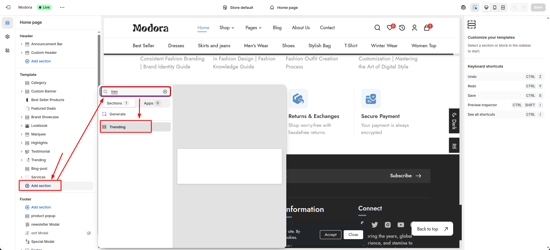
Supported Blocks
- Click Add block and choose "Product Box" according to your requirement.
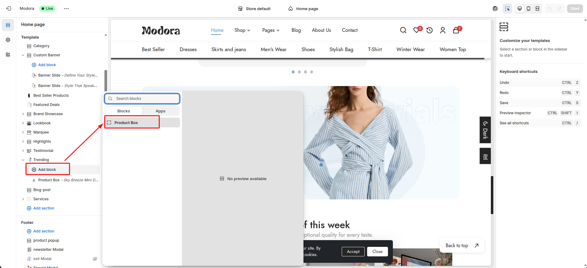
Block Settings
| Setting | Type | Description | Visibility |
|---|---|---|---|
| Select Product | product | Select a product to display in the block on hover of the circle. | Always Visible |
| Position Top (%) | text | Set the top position of the circle on image. | Always Visible |
| Position Left (%) | text | Set the left position of the circle on image. | Always Visible |
Section settings
Section settings make it easy to control how content appears on your store pages. Update text, images, and layout directly from the Theme Editor. Adjust spacing, colors, and alignment to match your brand style. Changes are applied instantly with live preview support.

| Settings | Type | Description | visibility |
|---|---|---|---|
| Background Image | image_picker | Choose the background image for trending section. | Always Visible |
| Background Image Border Radius | range(px) | Set the border radius of the background image. | Always Visible |
| Sale Text | text | Set the text for the sale label. | Always Visible |
| Sale Text Color | color_background | Choose the color for the sale text. | Always Visible |
| Sale Text Font Size | range(px) | Adjust the font size of the sale text. | Always Visible |
| Sale Text Font Weight | range | Adjust the font weight of the sale text. | Always Visible |
| Discount | text | Set the text for the discount. | Always Visible |
| Discount Color | color_background | Choose the color for the discount. | Always Visible |
| Discount Font Size | range(px) | Adjust the font size of the discount. | Always Visible |
| Discount Font Weight | range | Adjust the font weight of the discount. | Always Visible |
| Sale Text2 | text | Set the text for the another sale label. | Always Visible |
| Sale Text2 Color | color_background | Choose the color for the another sale text. | Always Visible |
| Sale Text2 Font Size | range(px) | Adjust the font size of the another sale text. | Always Visible |
| Sale Text2 Font Weight | range | Adjust the font weight of the another sale text. | Always Visible |
| Trending Title | text | Set the text for the trending title. | Always Visible |
| Title Color | color_background | Choose the color for the title. | Always Visible |
| Title Font Size | range(px) | Adjust the font size of the title. | Always Visible |
| Title Font Weight | range | Adjust the font weight of the title. | Always Visible |
| Trending Description | text | Set the text for the trending description. | Always Visible |
| Description Color | color_background | Choose the color for the description. | Always Visible |
| Description Font Size | range(px) | Adjust the font size of the description. | Always Visible |
| Description Font Weight | range | Adjust the font weight of the description. | Always Visible |
| Banner Button Text | text | Set the text for the banner button. | Always Visible |
| Banner Button Type | select | Select the type of the banner button (background / border / link). | Always Visible |
| Button Redirection Link | url | Select the redirection link for the banner button. | Always Visible |
12Blog Post
- From your Shopify admin, go to Themes -> Edit Theme.
- Click Add section and choose "Blog Post".
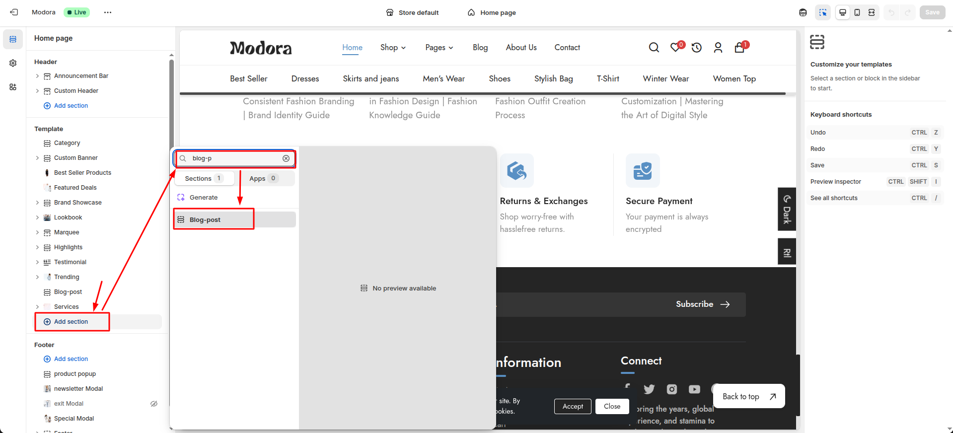
Section settings
Section settings make it easy to control how content appears on your store pages. Update text, images, and layout directly from the Theme Editor. Adjust spacing, colors, and alignment to match your brand style. Changes are applied instantly with live preview support.
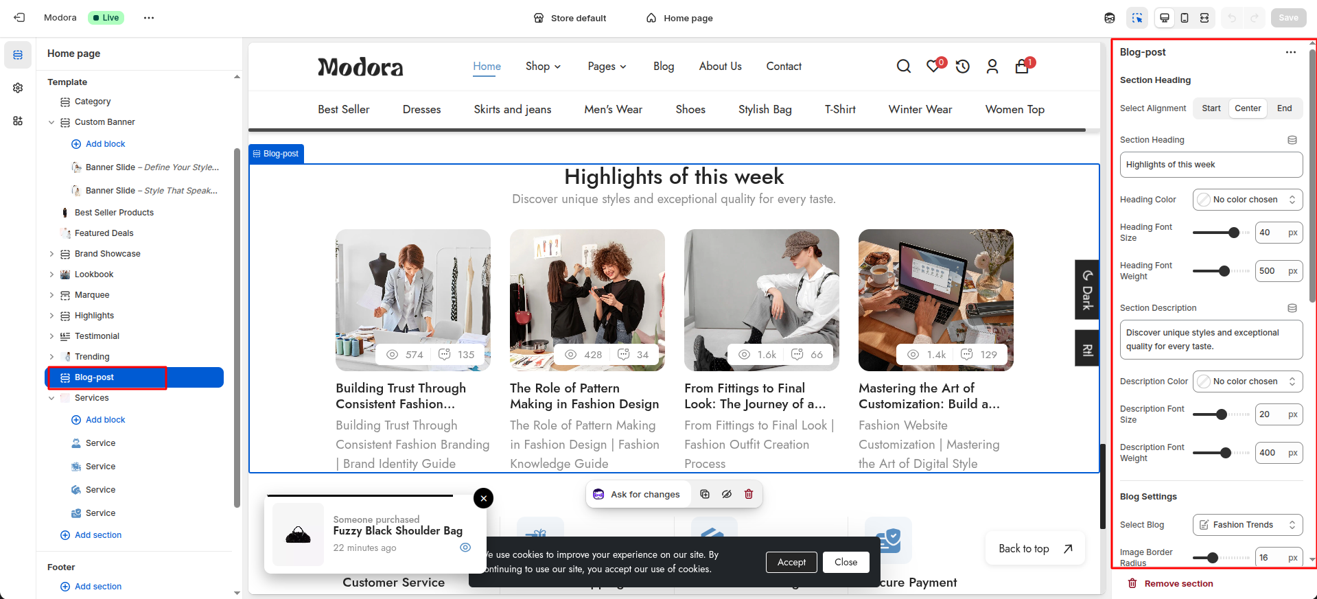
| Settings | Type | Description | visibility |
|---|---|---|---|
| Select Alignment | select | Select the alignment of the section heading. | Always Visible |
| Section Heading | text | Set the text for the section heading. | Always Visible |
| Heading Color | color_background | Choose the color of the section heading. | Always Visible |
| Heading Font Size | range(px) | Adjust the font size of the section heading. | Always Visible |
| Heading Font Weight | range | Adjust the font weight of the section heading. | Always Visible |
| Section Description | text | Set the text for the section description. | Always Visible |
| Description Color | color_background | Choose the color of the section description. | Always Visible |
| Description Font Size | range(px) | Adjust the font size of the section description. | Always Visible |
| Description Font Weight | range | Adjust the font weight of the section description. | Always Visible |
| Select Blog | blog | Select the blog to display it's posts. | Always Visible |
| Image Border Radius | range(px) | Adjust the border radius of the blog image. | Always Visible |
| Title Color | color_background | Choose the color of the blog title. | Always Visible |
| Title Font Size | range(px) | Adjust the font size of the blog title. | Always Visible |
| Title Font Weight | range | Adjust the font weight of the blog title. | Always Visible |
| Description Color | color_background | Choose the color of the blog description. | Always Visible |
| Description Font Size | range(px) | Adjust the font size of the blog description. | Always Visible |
| Description Font Weight | range | Adjust the font weight of the blog description. | Always Visible |
| Comment Position | select | Select the position of the blog comments and views. | Always Visible |
| Activate Meta Bar | checkbox | When enabled, the comments and views will be visible. | Always Visible |
| Activate Views Count | Checkbox | When enabled, the views count will be visible. | Visible when Activate Meta Bar is tue. |
| Activate Comment Count | checkbox | When enabled, the comments count will be visible. | Visible when Activate Meta Bar is true. |
| Count Color | color_background | Choose the color of the comment and views count. | Visible when Activate Meta Bar is true. |
| Count Font Size | range(px) | Adjust the font size of the comment and views count. | Visible when Activate Meta Bar is true. |
| Count Font Weight | range | Adjust the font weight of the comment and views count. | Visible when Activate Meta Bar is true. |
13Services
- From your Shopify admin, go to Themes -> Edit Theme.
- Click Add section and choose "Services".
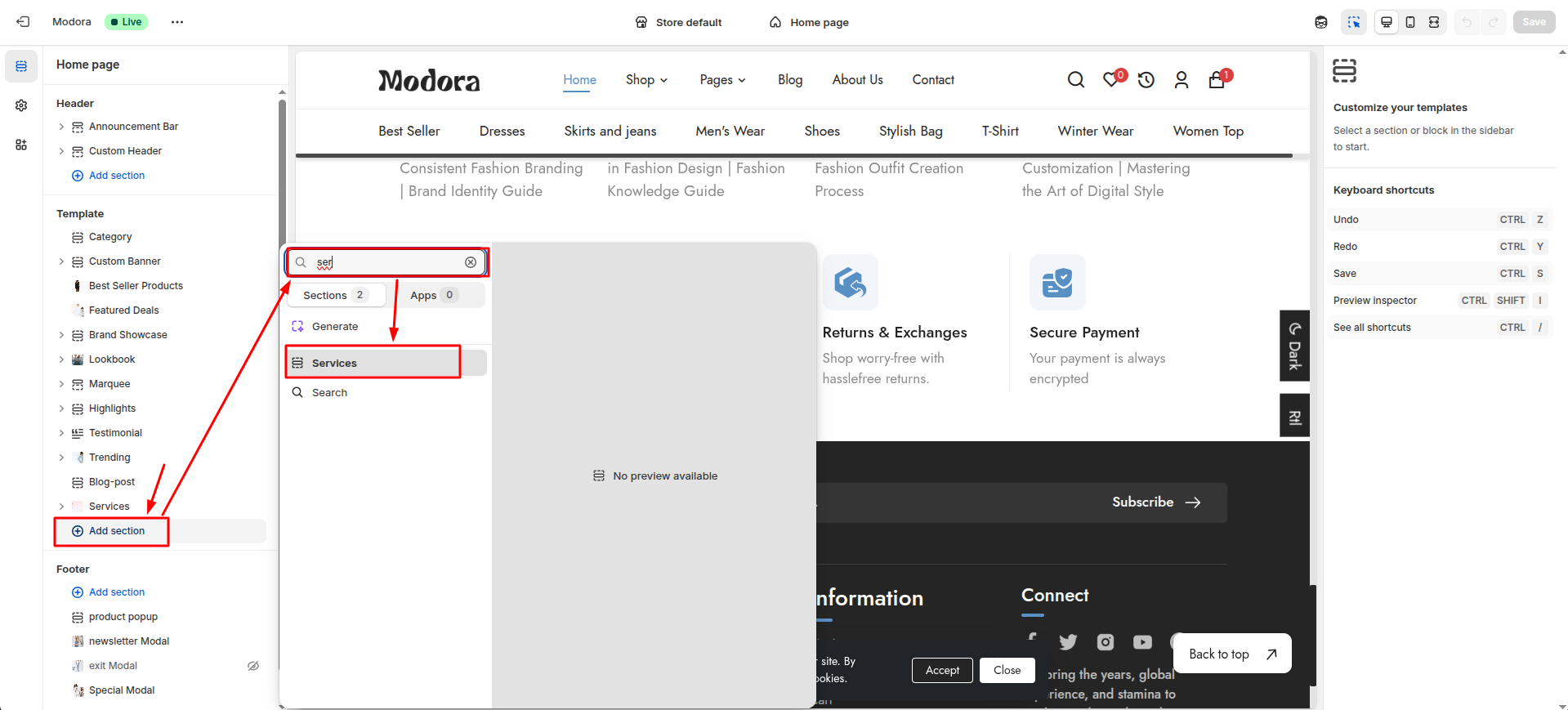
Supported Blocks
- Click Add block and choose "Service" according to your requirement.
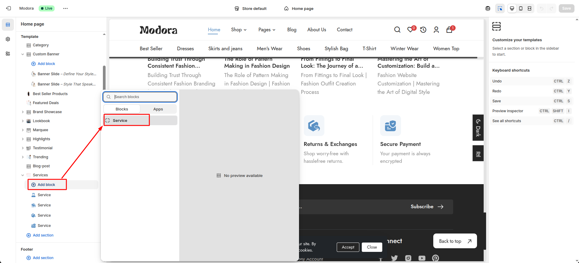
Block Settings
| Setting | Type | Description | Visibility |
|---|---|---|---|
| Service Icon | image_picker | Upload the icon for the service. | Always Visible |
| Service Icon Background | color_background | Choose the background color for the service icon. | Always Visible |
| Service Icon Width | range(px) | Adjust the width of the service icon. | Always Visible |
| Service Icon Height | range(px) | Adjust the height of the service icon. | Always Visible |
| Service Icon Border Radius | range(px) | Adjust the border radius of the service icon. | Always Visible |
| Service Border Color | color_background | Choose the color for the service border. | Always Visible |
| Service Name | text | Set the name of the service. | Always Visible |
| Service Name Color | color_background | Choose the color for the service name. | Always Visible |
| Service Name Font Size | range(px) | Adjust the font size of the service name. | Always Visible |
| Service Name Font Weight | range | Adjust the font weight of the service name. | Always Visible |
| Service Description | text | Set the description of the service. | Always Visible |
| Service Description Color | color_background | Choose the color for the service description. | Always Visible |
| Service Description Font Size | range(px) | Adjust the font size of the service description. | Always Visible |
| Service Description Font Weight | range | Adjust the font weight of the service description. | Always Visible |
Section settings
Section settings make it easy to control how content appears on your store pages. Update text, images, and layout directly from the Theme Editor. Adjust spacing, colors, and alignment to match your brand style. Changes are applied instantly with live preview support.

| Settings | Type | Description | visibility |
|---|---|---|---|
| Service Type | select | select the type of service to display. | Always Visible |
| Enable Gift Card | checkbox | When enabled, the gift card service will be displayed. | Always Visible |
| Gift Card Image | image_picker | Upload the gift card image. | Visible when Enable Gift Card is true. |
| Gift Card Border Radius | range(px) | Adjust the border radius of the gift card image. | Visible when Enable Gift Card is true. |
| Gift Card Title | text | Set the title of the gift card. | Visible when Enable Gift Card is true. |
| Title Color | color_background | Choose the color for the gift card title. | Visible when Enable Gift Card is true. |
| Title Font Size | range(px) | Adjust the font size of the gift card title. | Visible when Enable Gift Card is true. |
| Title Font Weight | range | Adjust the font weight of the gift card title. | Visible when Enable Gift Card is true. |
| Gift Card Description | text | Set the description of the gift card. | Visible when Enable Gift Card is true. |
| Gift Card Description Color | color_background | Choose the color for the gift card description. | Visible when Enable Gift Card is true. |
| Gift Card Description Font Size | range(px) | Adjust the font size of the gift card description. | Visible when Enable Gift Card is true. |
| Gift Card Description Font Weight | range | Adjust the font weight of the gift card description. | Visible when Enable Gift Card is true. |
| Gift Card Button Text | text | Set the button text for the gift card. | Visible when Enable Gift Card is true. |
| Button Text Color | color_background | Choose the color for the gift card button text. | Visible when Enable Gift Card is true. |
| Button Text Font Size | range(px) | Adjust the font size of the gift card button text. | Visible when Enable Gift Card is true. |
| Button Text Font Weight | range | Adjust the font weight of the gift card button text. | Visible when Enable Gift Card is true. |
| Service Position | select | select the position of the service box content. | Always Visible |
Collections pages
1Create Collection
- Go to Admin Panel -> Products.
- Find and Select Collections.
- Click Add Collections.
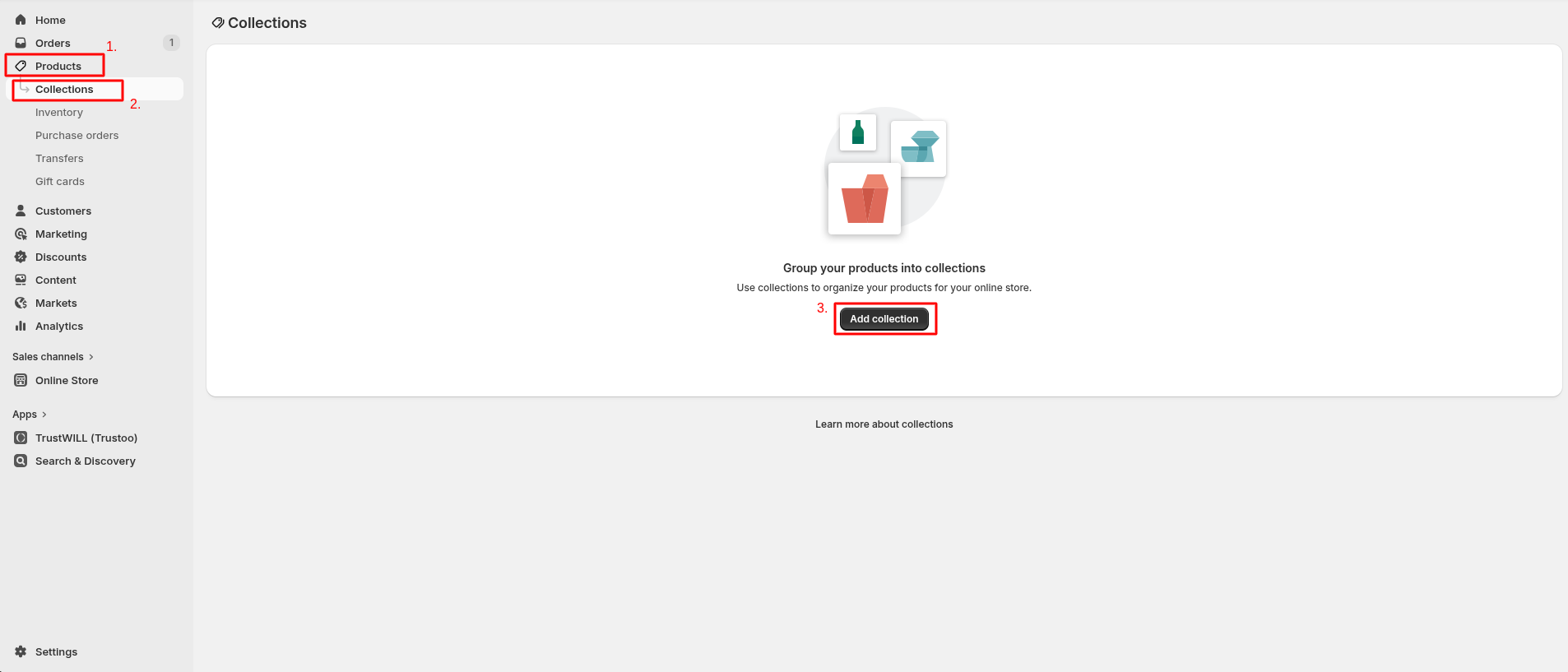
- After that redirect to the Add collection.
Add Collection
- Add collection title.
- Upload the image.
- Select template for which page you want to create.
- Choose the Collection Type for add products.
- If Choose Manual the Click on Browse. After that Select the products and Add products.
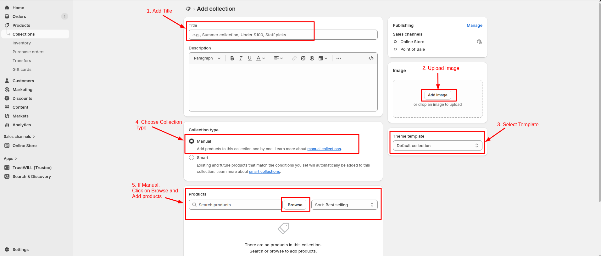
If Choose Smart then products are added based on specified Condition.
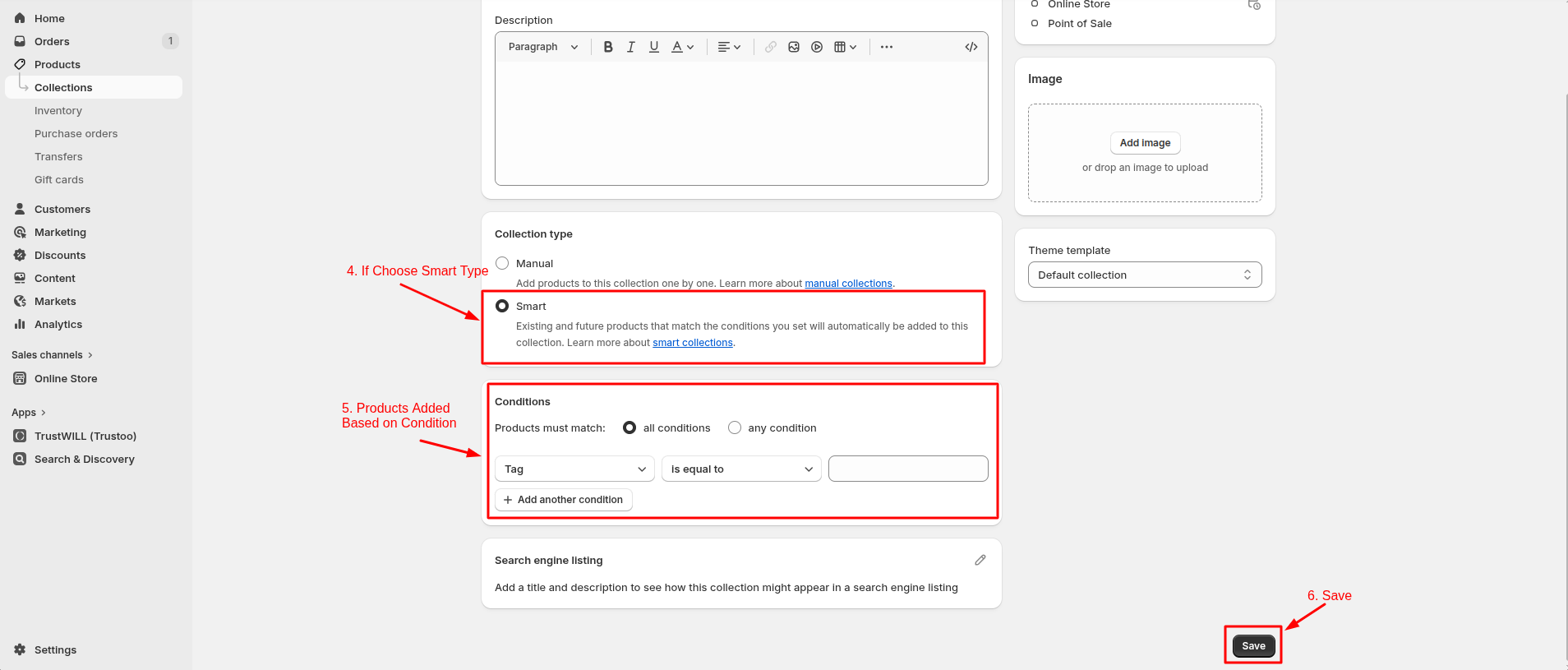
- Click Save.
2Collection List Settings
- Click the file name to open and download the corresponding JSON layout in a new tab.(list-collections.json)
- SELECT ALL and COPY.
- From your Shopify admin, go to Themes -> Actions -> Edit Code.
- Find folder templates -> Open file list-collections.json -> SELECT ALL and DELETE. PASTE the copied preset from the external file.

- From your Shopify admin, go to Themes -> Edit Theme.
- Choose Collection list from the dropdown window.

- After that, Click Add section and choose "All Collection".
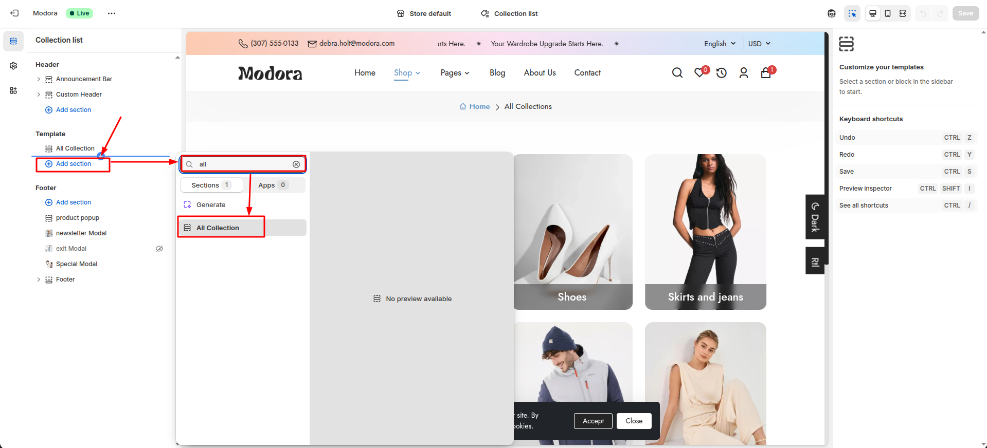
Section settings
Section settings make it easy to control how content appears on your store pages. Update text, images, and layout directly from the Theme Editor. Adjust spacing, colors, and alignment to match your brand style. Changes are applied instantly with live preview support.

| Settings | Type | Description | visibility |
|---|---|---|---|
| Select Collections | collection_list | Choose which collections appear in this section. | Always Visible |
3Collection Settings
- Click the file name to open and download the corresponding JSON layout in a new tab.(collection.json)
- SELECT ALL and COPY.
- From your Shopify admin, go to Themes -> Actions -> Edit Code.
- Find folder templates -> Open file collection.json -> SELECT ALL and DELETE. PASTE the copied preset from the external file.

- From your Shopify admin, go to Themes -> Edit Theme.
- Choose Collections from the dropdown window.
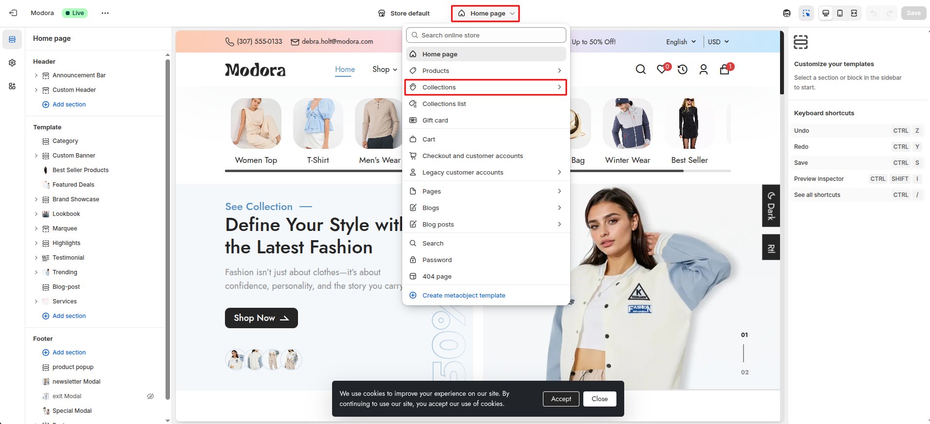
- After that, choose Default Collection.
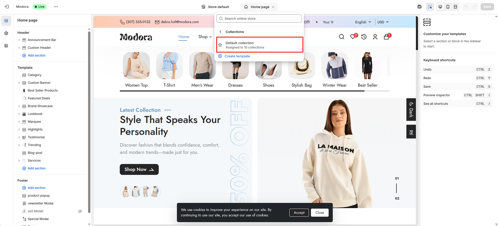
- Click Add section and choose "Main Collection Grid".
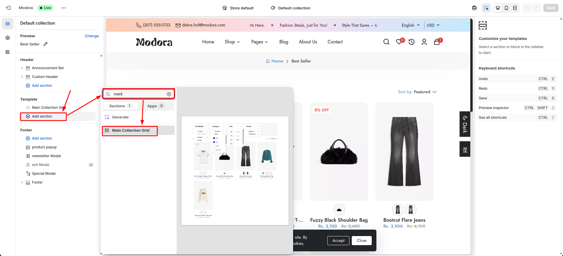
Section settings
Section settings make it easy to control how content appears on your store pages. Update text, images, and layout directly from the Theme Editor. Adjust spacing, colors, and alignment to match your brand style. Changes are applied instantly with live preview support.
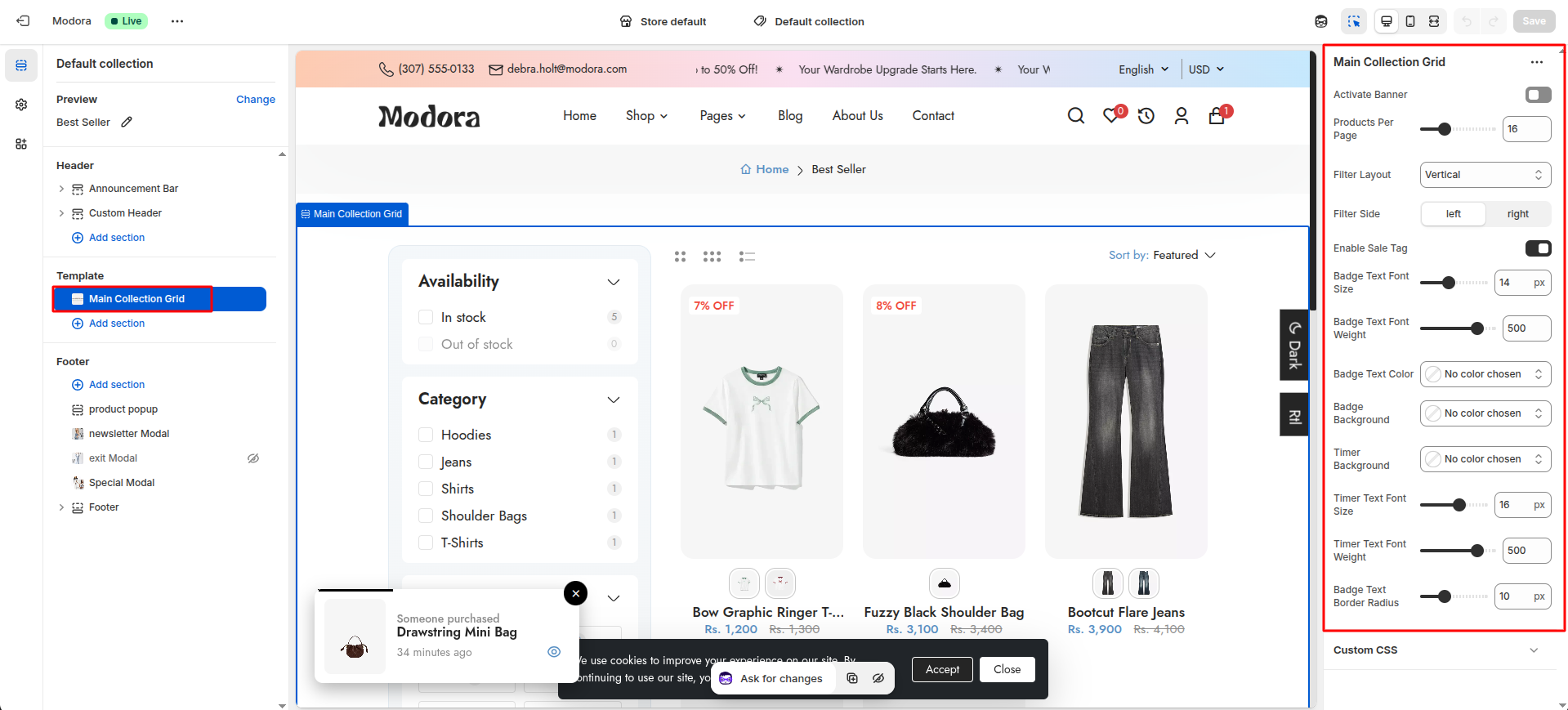
| Settings | Type | Description | visibility |
|---|---|---|---|
| Activate Banner | checkbox | When enabled, the banner will be visible on the page. | Always Visible |
| Select Sale Banner Image | image_picker | Upload an image for the banner. | Visible when Activate Banner is true. |
| Products Per Page | range | Select the number of products to display per page. | Always Visible |
| Filter Layout | select | Select the layout for the product filters (vertical / horizontal / drawer). | Always Visible |
| Filter Side | select | Select the side for the product filters (left / right). | Visible when Filter Layout is vertical. |
| Enable Sale Tag | checkbox | When enabled, the sale tag will be visible on the product. | Always Visible |
| Badge Text Font Size | range(px) | Adjust the font size of the badge text. | Visible when Enable Sale Tag is true. |
| Badge Text Font Weight | range | Adjust the font weight of the badge text. | Visible when Enable Sale Tag is true. |
| Badge Text Color | color_background | Choose the color of the badge text. | Visible when Enable Sale Tag is true. |
| Badge Background | color_background | Choose the background color of the badge. | Visible when Enable Sale Tag is true. |
| Timer Background | color_background | Choose the background color of the timer. | Always Visible |
| Timer Text Font Size | range(px) | Adjust the font size of the timer text. | Always Visible |
| Timer Text Font Weight | range | Adjust the font weight of the timer text. | Always Visible |
| Badge Text Border Radius | range(px) | Adjust the border radius of the badge text. | Always Visible |
Filter Layout - Vertical Left

Filter Layout - Vertical Right
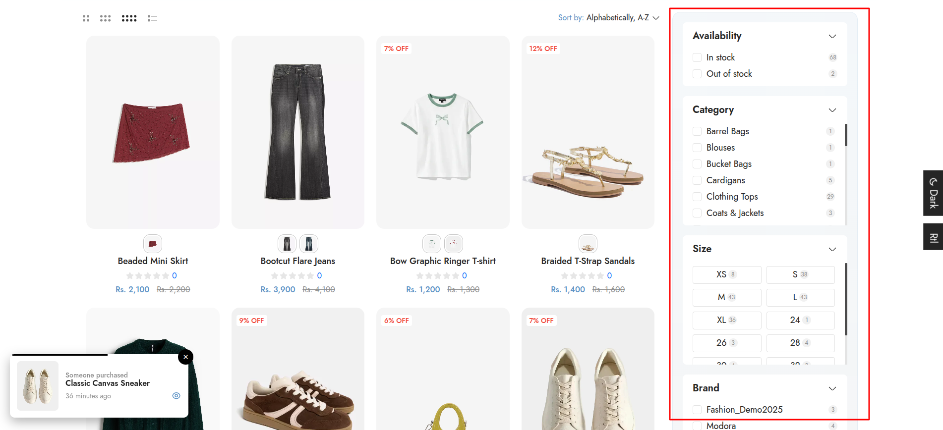
Filter Layout - Horizontal

Filter Layout - Drawer

4Filter
- Go to Admin Panel -> Apps.
- Find and Select Search & Discovery.
- After that, Select Filters.
This page displays all currently active filters, and allows you to edit or remove them as needed. To edit or remove a filter, click on the filter label. If you want to add new filter then click on Add Filter.

Product Pages
1Create Product
- Go to Admin Panel -> Products.
- Click Add product.

- After that redirect to the Add Product.
Add Product
- Enter a clear and descriptive product title in the Title field.
- Use the description editor to explain your product in detail.
- Upload visual content in the Media section.
- Choose a product category from the dropdown.
- Enter a Product Type to group similar products.
- Specify the Vendor or brand name.
- Assign the product to one or more Collections.
- Add tags to describe your product..
- Choose a Theme template for the product.
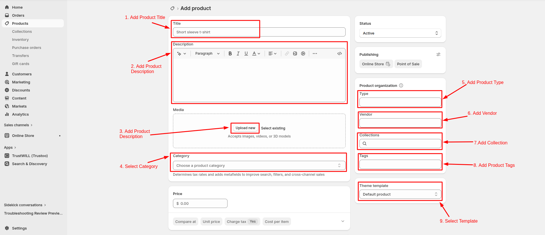
- Enter the selling price of the product in the Price field.
- Use the Compare-at price to show a discounted offer.
- Enable Inventory tracked to let Shopify manage stock automatically.
Then enter the Quantity available for the product at your shop location.
-
Enable Physical product if the item requires shipping.
Then configure the Package by selecting or defining the box dimensions, and set the Product weight, which is required for accurate shipping rates.
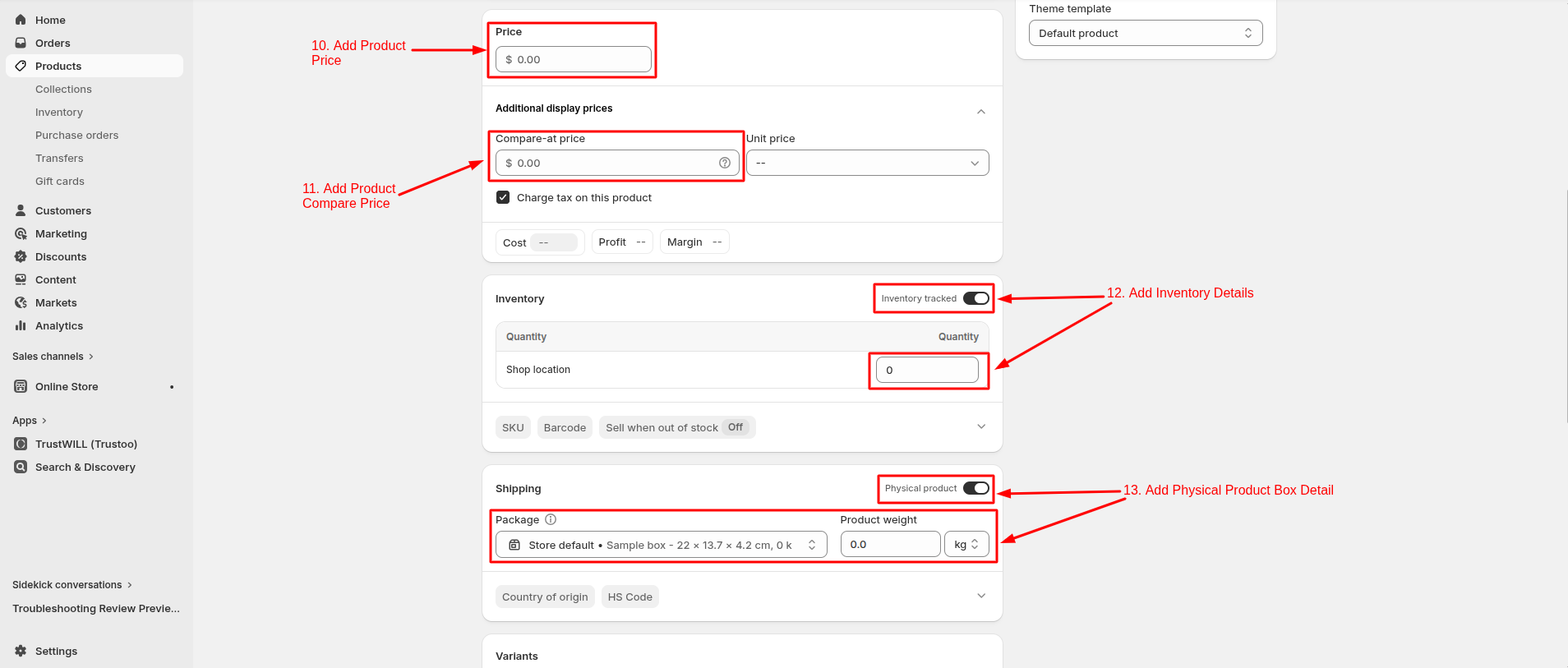
- Create variants if your product comes in different options such as size, color, Material.
- Metafields allow you to store additional custom product information that is not available in standard Shopify fields.
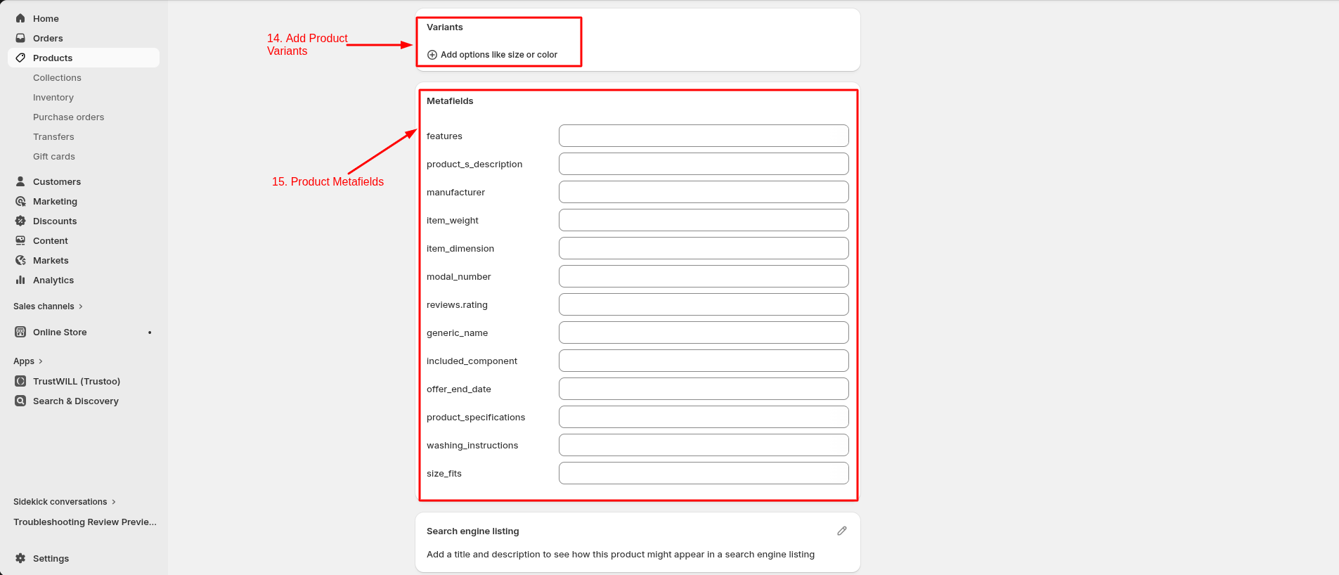
- Click Save.
3Product Page Layout
- Click the file name to open and download the corresponding JSON layout in a new tab.(product.json)
- SELECT ALL and COPY.
- From your Shopify admin, go to Themes -> Actions -> Edit Code.
- Find folder templates -> Open file product.json -> SELECT ALL and DELETE. PASTE the copied preset from the external file.

- From your Shopify admin, go to Themes -> Edit Theme.
- Choose Products from the dropdown window.
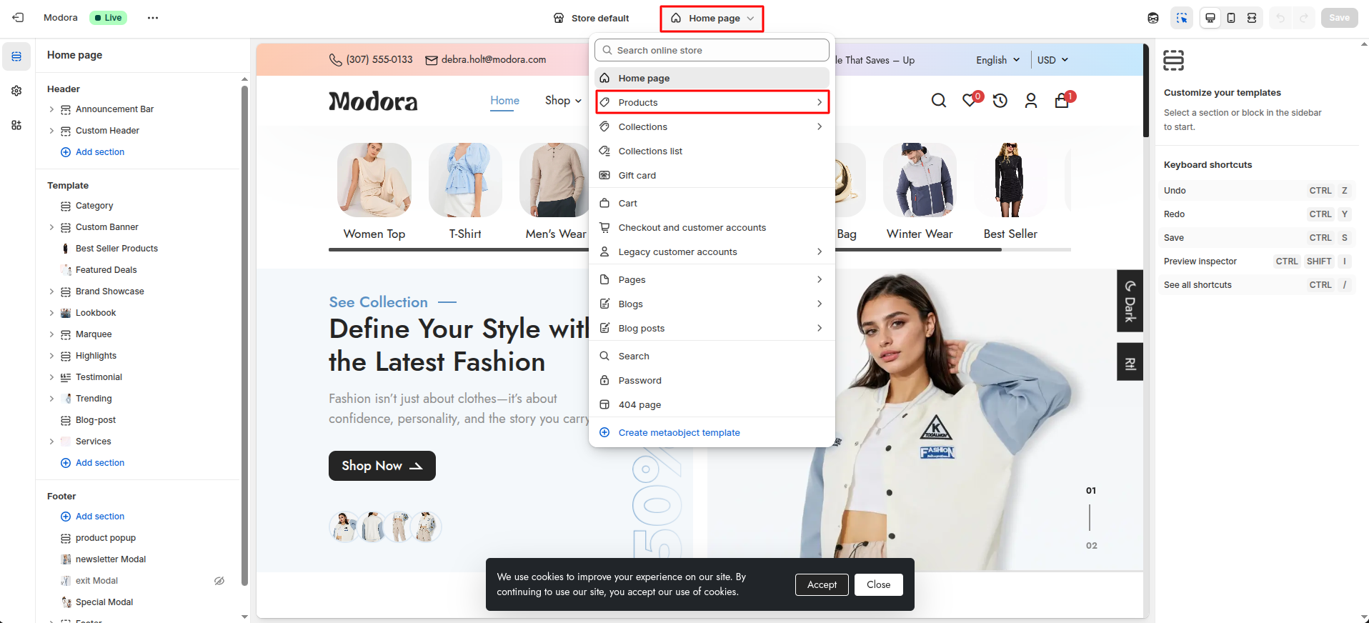
- After that, choose Default product.

4Custom Product Detail
- Choose Products -> default product from the dropdown window.
- In theTemplates -> Add section and choose "Custom Product Detail".
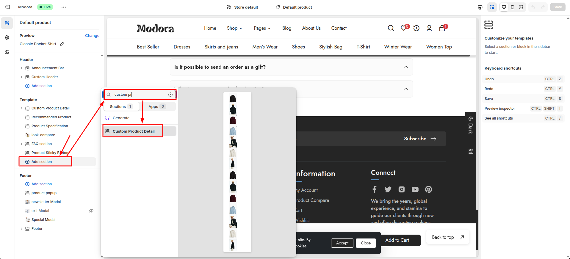
Supported Blocks
- Click Add block and choose multiple blocks according to your requirement.

| Block | Description |
|---|---|
| Product Title | Displays the product title along with social sharing options. |
| Product Description | Shows the product description with detailed information. |
| Product Price | Displays the product price, compare-at price, and discount details. |
| Variant Selector | Allows customers to select available product variants such as size or color. |
| Stock | Shows the remaining inventory or stock availability of the product. |
| Customize Photo Upload | Allows customers to upload or customize images for personalized products. |
| Discount | Displays active product discounts or promotional offers. |
| Quantity Selector | Allows customers to select the quantity before adding the product to the cart. |
| Buttons | Displays action buttons such as Add to Cart, Buy Now, or Wishlist. |
| Product Features | Highlights key features or benefits of the product |
| Product Bundle | Displays bundled products or special combo offers. |
| Size and Shipping | Shows the product Shipping and Delivery information. |
Product Title Block Settings
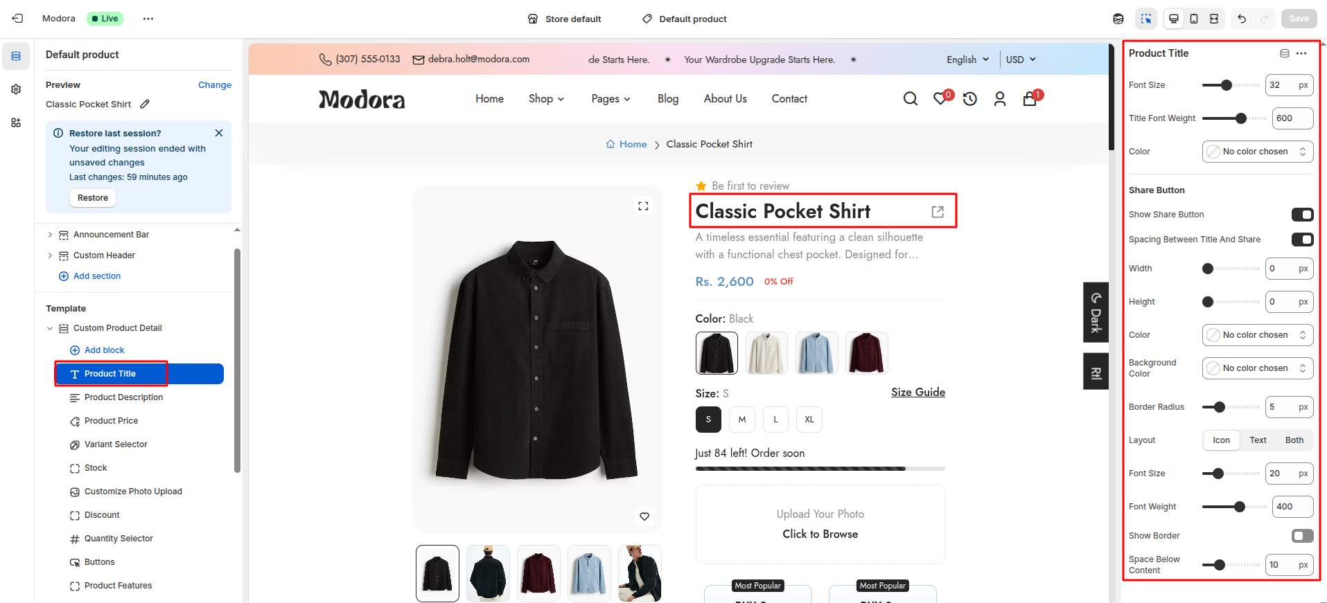
| Setting | Type | Description | Visibility |
|---|---|---|---|
| Font Size | range(px) | Adjust the font size of the product title. | Always Visible |
| Title Font Weight | range | Adjust the font weight of the product title. | Always Visible |
| Color | color_background | Choose the color for the product title. | Always Visible |
| Show Share Button | checkbox | When enabled, the share button will be displayed on the product page. | Always Visible |
| Spacing Between Title And Share | checkbox | When enabled, the share button and the product title will be separated by a space. | Visible when Show Share Button is true. |
| Width | range(px) | Adjust the width of the share button. | Visible when Show Share Button is true. |
| Height | range(px) | Adjust the height of the share button. | Visible when Show Share Button is true. |
| Color | color_background | Choose the color for the share button. | Visible when Show Share Button is true. |
| Background Color | color_background | Choose the background color for the share button. | Visible when Show Share Button is true. |
| Border Radius | range(px) | Adjust the border radius of the share button. | Visible when Show Share Button is true. |
| Layout | select | Select the layout for the share button (icon / text / both). | Visible when Show Share Button is true. |
| Text | text | Set the text for the share button. | Visible when Show Share Button is true and Layout is text. |
| Font Size | range(px) | Adjust the font size of the share button text and icon. | Visible when Show Share Button is true. |
| Font Weight | range | Adjust the font weight of the share button text and icon. | Visible when Show Share Button is true. |
| Show Border | checkbox | When enabled, the share button will have a border. | Visible when Show Share Button is true. |
| Border Width | range(px) | Adjust the border width of the share button. | Visible when Show Border is true. |
| Border Color | color_background | Adjust the border color of the share button. | Visible when Show Border is true. |
| Space Below Content | range(px) | Adjust the space beloe the share button and the content. | Always Visible |
Product Description Block Settings
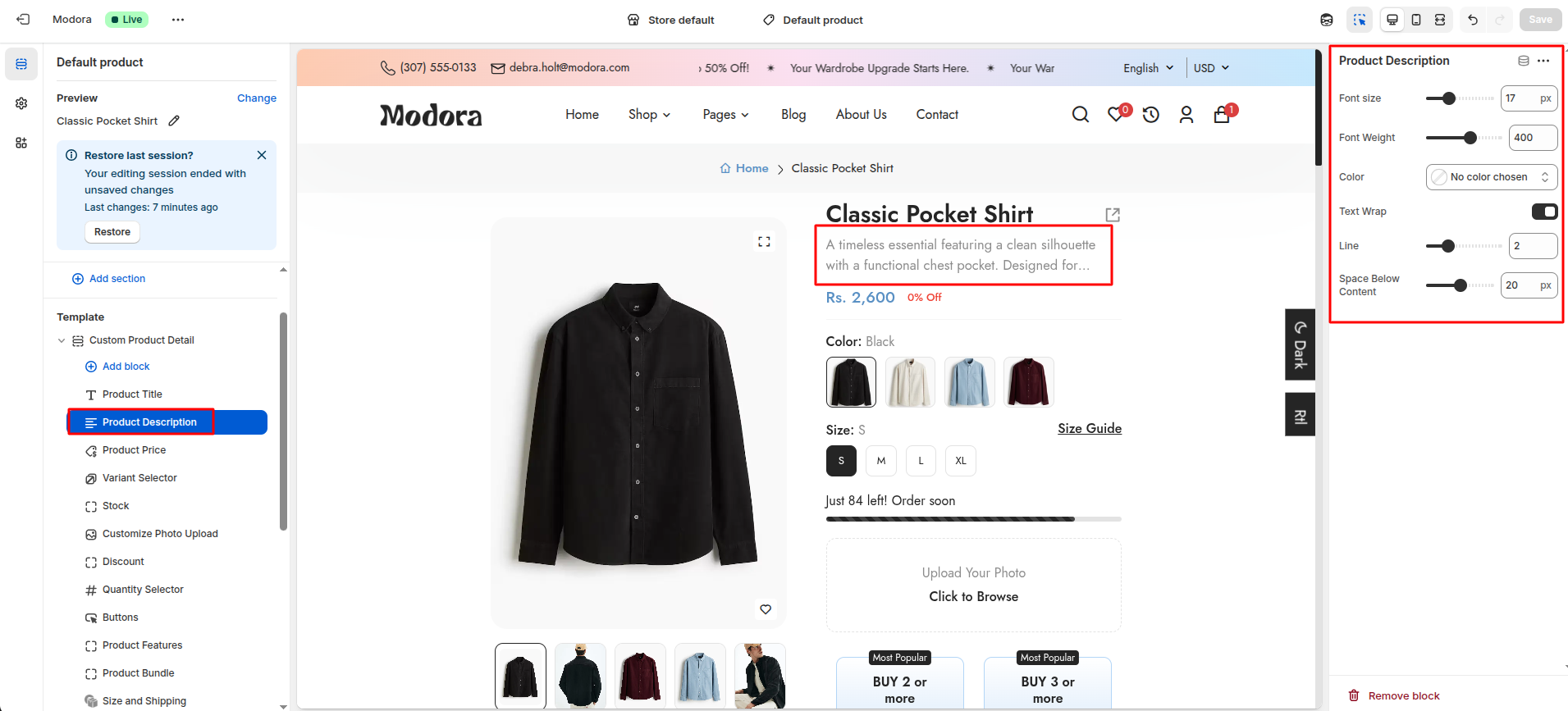
| Setting | Type | Description | Visibility |
|---|---|---|---|
| Font Size | range(px) | Adjust the font size of the product description. | Always Visible |
| Font Weight | range | Adjust the font weight of the product description. | Always Visible |
| Color | color_background | Choose the color for the product description. | Always Visible |
| Text Wrap | checkbox | When enabled, the product description will wrap. | Always Visible |
| Line | range(px) | Adjust the line of the product description. | Visible when Text Wrap is true. |
| Space Below Content | range(px) | Adjust the space below the product description content. | Always Visible |
Product Price Block Settings
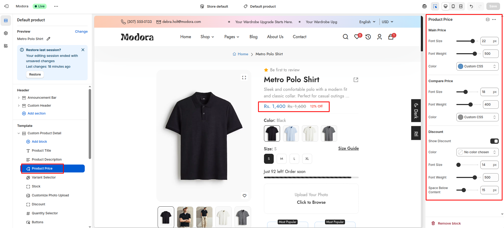
| Setting | Type | Description | Visibility |
|---|---|---|---|
| Font Size | range(px) | Adjust the font size of the product price. | Always Visible |
| Font Weight | range | Adjust the font weight of the product price. | Always Visible |
| Color | color_background | Choose the color for the product price. | Always Visible |
| Font Size | range(px) | Adjust the font size of the product compare price. | Always Visible |
| Font Weight | range | Adjust the font weight of the product compare price. | Always Visible |
| Color | color_background | Choose the color for the product compare price. | Always Visible |
| Show Discount | checkbox | When enabled, the product price will show discount. | Always Visible |
| Color | color_background | Choose the color for the product discount. | Visible when Show Discount is true. |
| Font Size | range(px) | Adjust the font size of the product discount. | Visible when Show Discount is true. |
| Font Weight | range | Adjust the font weight of the product discount. | Visible when Show Discount is true. |
| Space Below Content | range(px) | Adjust the space below the product price. | Always Visible |
Variant Selector Block Settings
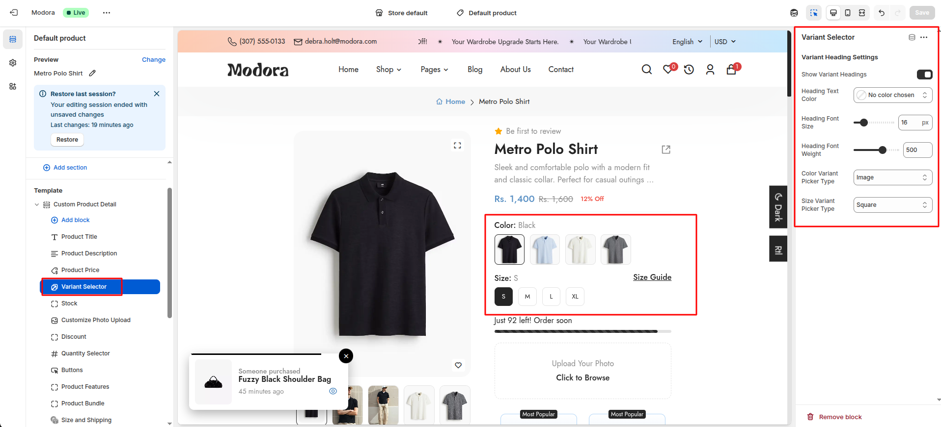
| Setting | Type | Description | Visibility |
|---|---|---|---|
| Show Variant Headings | checkbox | When enabled, the product variant headings will show. | Always Visible |
| Heading Text Color | color_background | Choose the color for the product variant headings. | Visible when Show Variant Headings is true. |
| Heading Font Size | range(px) | Adjust the font size of the product variant headings. | Visible when Show Variant Headings is true. |
| Heading Font Weight | range | Adjust the font weight of the product variant headings. | Visible when Show Variant Headings is true. |
| Color Variant Picker Type | select | Select the color variant picker type (dropdown / images / square / pills). | Always Visible |
| Size Variant Picker Type | select | Selct the size variant picker type (dropdown / images / square / pills). | Always Visible |
Stock Block Settings
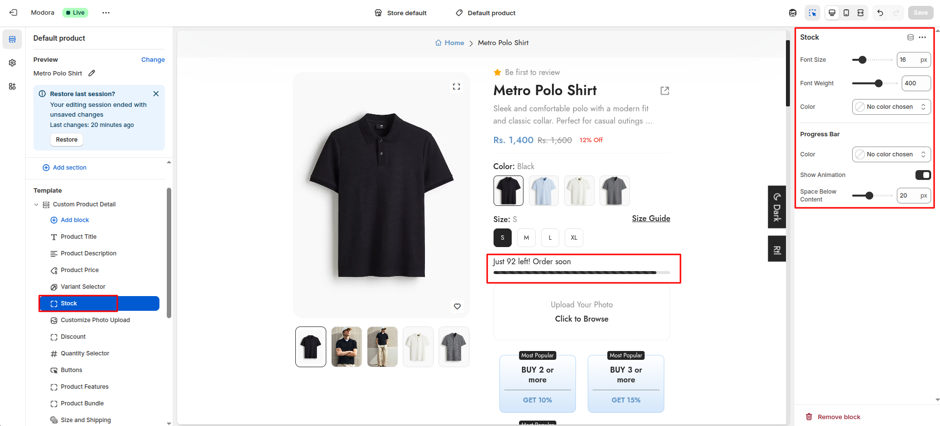
| Setting | Type | Description | Visibility |
|---|---|---|---|
| Font Size | range(px) | Adjust the font size of the product stock text. | Always Visible |
| Font Weight | range | Adjust the font weight of the product stock text. | Always Visible |
| Color | color_background | Choose the color for the product stock text. | Always Visible |
| Color | color_background | Choose the color for the progress bar. | Always Visible |
| Show Animation | checkbox | When enabled, the progress bar will animate. | Always Visible |
| Space Below Content | range(px) | Adjust the space below the product stock block. | Always Visible |
Quantity Selector Block Settings
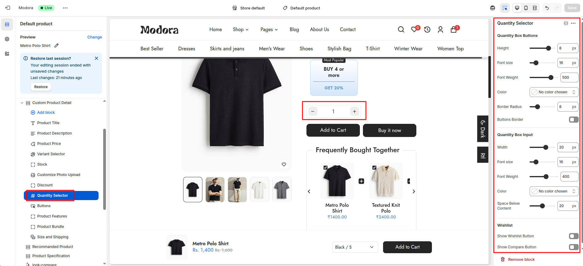
| Setting | Type | Description | Visibility |
|---|---|---|---|
| Height | range(px) | Adjust the height of the quantity box buttons. | Always Visible |
| Font size | range(px) | Adjust the font size of the quantity box buttons. | Always Visible |
| Font Weight | range | Adjust the font weight of the quantity box buttons. | Always Visible |
| Color | color_background | Choose the color for the product stock text. | Always Visible |
| Border Radius | range(px) | Adjust the border radius of the quantity box buttons. | Always Visible |
| Buttons Border | checkbox | When enabled, the quantity box buttons will have a border. | Always Visible |
| Border Color | color_background | Choose the color for the quantity box buttons border. | Visible when Buttons Border is true. |
| Border width | range(px) | Adjust the border width of the quantity box buttons. | Visible when Buttons Border is true. |
| Width | range(px) | Adjust the width of the quantity box input. | Always Visible |
| Font size | range(px) | Adjust the font size of the quantity box input. | Always Visible |
| Font Weight | range | Adjust the font weight of the quantity box input. | Always Visible |
| Color | color_background | Choose the color for the quantity box input. | Always Visible |
| Space Below Content | range(px) | Adjust the space below the quantity box. | Always Visible |
| Show Wishlist Button | checkbox | When enabled, the wishlist button will be visible. | Always Visible |
| Show Compare Button | checkbox | When enabled, the compare button will be visible. | Always Visible |
| Width | range(px) | Adjust the width of the wishlist and compare buttons. | Visible when Show Wishlist Button or Show Compare Button is true. |
| Background Color | color_background | Choose the background color for the wishlist and compare buttons. | Visible when Show Wishlist Button or Show Compare Button is true. |
| Select Layout | select | Select the layout for the wishlist and compare buttons (icon / text / both). | Visible when Show Wishlist Button or Show Compare Button is true. |
| Color | color_background | Choose the color for the wishlist and compare buttons. | Visible when Show Wishlist Button or Show Compare Button is true. |
| Border Radius | range(px) | Adjust the border radius of the wishlist and compare buttons. | Visible when Show Wishlist Button or Show Compare Button is true. |
| Border | checkbox | When enabled, the wishlist and compare buttons will have a border. | Visible when Show Wishlist Button or Show Compare Button is true. |
| Border Color | color_background | Choose the color for the wishlist and compare buttons border. | Visible when Border is true. |
| Border width | range(px) | Adjust the border width of the wishlist and compare buttons. | Visible when Border is true. |
Buttons Block Settings

| Setting | Type | Description | Visibility |
|---|---|---|---|
| Add to Cart Button | checkbox | When enabled, the add to cart button will be visible. | Always Visible |
| Width | range(px) | Adjust the width of the add to cart button. | Visible when Add to Cart Button is true. |
| Height | range(px) | Adjust the height of the add to cart button. | Visible when Add to Cart Button is true. |
| Background Color | color_background | Choose the background color for the add to cart button. | Visible when Add to Cart Button is true. |
| Color | color_background | Choose the color for the add to cart button text. | Visible when Add to Cart Button is true. |
| Font size | range(px) | Adjust the font size of the add to cart button text. | Visible when Add to Cart Button is true. |
| Font Weight | range | Adjust the font weight of the add to cart button text. | Visible when Add to Cart Button is true. |
| Border Radius | range(px) | Adjust the border radius of the add to cart button. | Visible when Add to Cart Button is true. |
| Border | checkbox | When enabled, the add to cart button border will be visible. | Visible when Add to Cart Button is true. |
| Border Color | color_background | Choose the color for the add to cart button border. | Visible when Border is true. |
| Border width | range(px) | Adjust the border width of the add to cart button. | Visible when Border is true. |
| Buy Now Button | checkbox | When enabled, the buy now button will be visible. | Always Visible |
| Width | range(px) | Adjust the width of the buy now button. | Visible when Buy Now Button is true. |
| Height | range(px) | Adjust the height of the buy now button. | Visible when Buy Now Button is true. |
| Background Color | color_background | Choose the background color for the buy now button. | Visible when Buy Now Button is true. |
| Text | text | Set the text for the buy now button. | Visible when Buy Now Button is true. |
| Color | color_background | Choose the color for the buy now button text. | Visible when Buy Now Button is true. |
| Font size | range(px) | Adjust the font size of the buy now button. | Visible when Buy Now Button is true. |
| Font Weight | range | Adjust the font weight of the buy now button. | Visible when Buy Now Button is true. |
| Border Radius | range(px) | Adjust the border radius of the buy now button. | Visible when Buy Now Button is true. |
| Buy Button Border | checkbox | When enabled, the buy button border will be visible. | Visible when Buy Now Button is true. |
| Border Color | color_background | Choose the color for the buy button border. | Visible when Buy Button Border is true. |
| Border width | range(px) | Adjust the border width of the buy button. | Visible when Buy Button Border is true. |
Product Features Block Settings

| Setting | Type | Description | Visibility |
|---|---|---|---|
| Font Size | range(px) | Adjust the font size of the icon. | Always Visible |
| Font Weight | range | Adjust the font weight of the icon. | Always Visible |
| Color | color_background | Choose the color for the icon. | Always Visible |
| Show Text | checkbox | When enabled, the text will be visible. | Always Visible |
| Font size | range(px) | Adjust the font size of the feature text. | Visible when Show Text is true. |
| Font Weight | range | Adjust the font weight of the feature text. | Visible when Show Text is true. |
| Color | color_background | Choose the color for the feature text. | Visible when Show Text is true. |
Product Bundle Block Settings
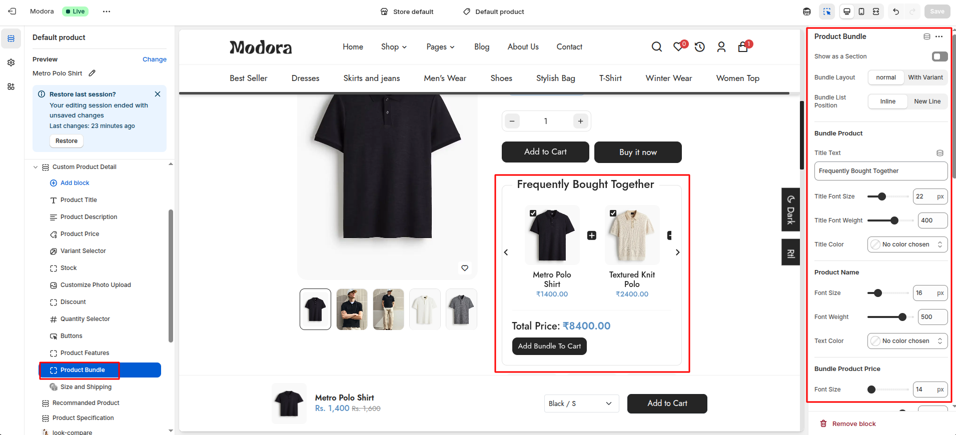
| Setting | Type | Description | Visibility |
|---|---|---|---|
| Show as a Section | checkbox | When enabled, the product bundle block will be visible as a section. | Always Visible |
| Bundle Layout | select | Select the layout for the product bundle's product (normal / with variant). | Always Visible |
| Title Text | text | Set the text for the product bundle title. | Always Visible |
| Title Font Size | range(px) | Adjust the font size of the product bundle title. | Always Visible |
| Title Font Weight | range | Adjust the font weight of the product bundle title. | Always Visible |
| Title Color | color_background | Choose the color for the product bundle title. | Always Visible |
| Font size | range(px) | Adjust the font size of the product title. | Always Visible. |
| Font Weight | range | Adjust the font weight of the product title. | Always Visible |
| Color | color_background | Choose the color for the product title. | Always Visible |
| Font size | range(px) | Adjust the font size of the product price. | Always Visible. |
| Font Weight | range | Adjust the font weight of the product price. | Always Visible |
| Color | color_background | Choose the color for the product price. | Always Visible |
| Text | text | Set the text for the bundle total. | Always Visible |
| Font size | range(px) | Adjust the font size of the bundle total. | Always Visible. |
| Font Weight | range | Adjust the font weight of the bundle total. | Always Visible |
| Text Color | color_background | Choose the color for the bundle total. | Always Visible |
| Price Font Size | range(px) | Adjust the font size of the bundle total price. | Always Visible. |
| Price Font Weight | range | Adjust the font weight of the bundle total price. | Always Visible |
| Text Color | color_background | Choose the color for the bundle total price. | Always Visible |
| Background Color | color_background | Choose the background color for the bundle button. | Always Visible |
| Color | color_background | Choose the color for the bundle button. | Always Visible |
| Font size | range(px) | Adjust the font size of the bundle button. | Always Visible |
| Font Weight | range | Adjust the font weight of the bundle button. | Always Visible |
| Border Radius | range(px) | Adjust the border radius of the bundle button. | Always Visible |
Size and Shipping Block Settings
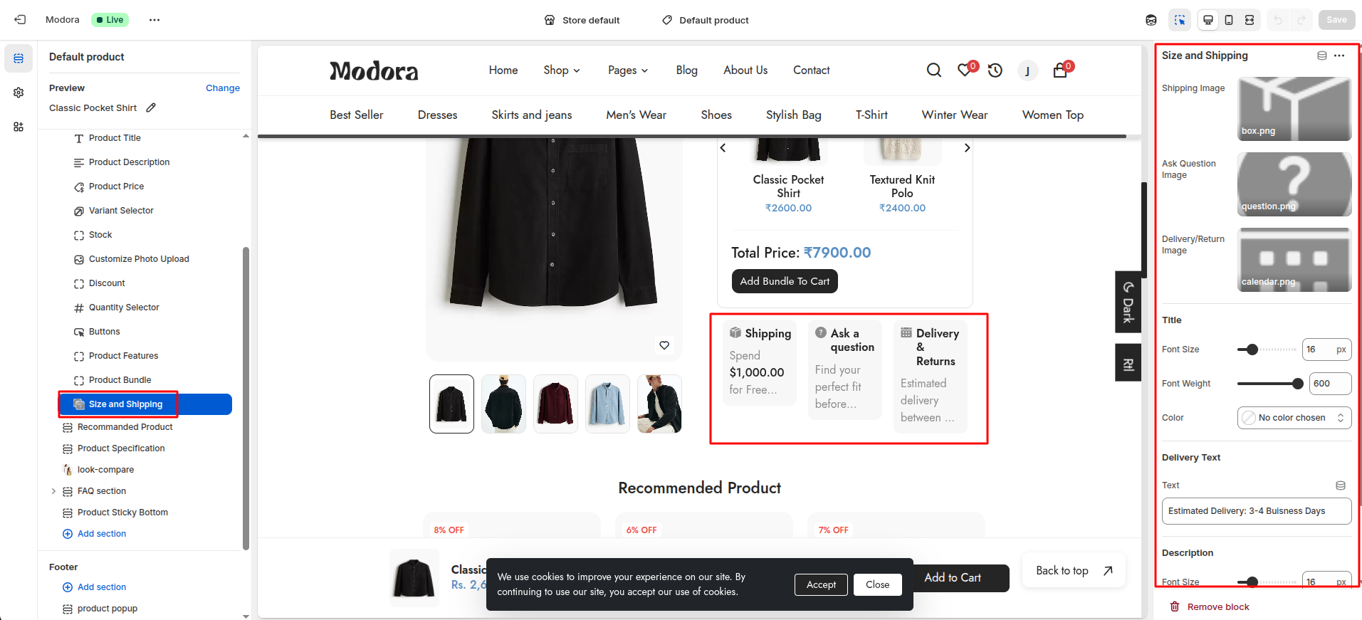
| Setting | Type | Description | Visibility |
|---|---|---|---|
| Shipping Image | image_picker | Upload the image for the Shipping. | Always Visible |
| Ask Question Image | image_picker | Upload the image for the Ask Question. | Always Visible |
| Delivery/Return Image | image_picker | Upload the image for the Delivery/Return. | Always Visible |
| Font Size | range(px) | Adjust the font size of the title. | Always Visible |
| Font Weight | range | Adjust the font weight of the title. | Always Visible |
| Color | color_background | Choose the color for the title. | Always Visible |
| Text | text | Set the text for the Delivery content | Always Visible |
| Font size | range(px) | Adjust the font size of the description. | Always Visible. |
| Font Weight | range | Adjust the font weight of the description. | Always Visible |
| Color | color_background | Choose the color for the description. | Always Visible |
Section settings
Section settings make it easy to control how content appears on your store pages. Update text, images, and layout directly from the Theme Editor. Adjust spacing, colors, and alignment to match your brand style. Changes are applied instantly with live preview support.
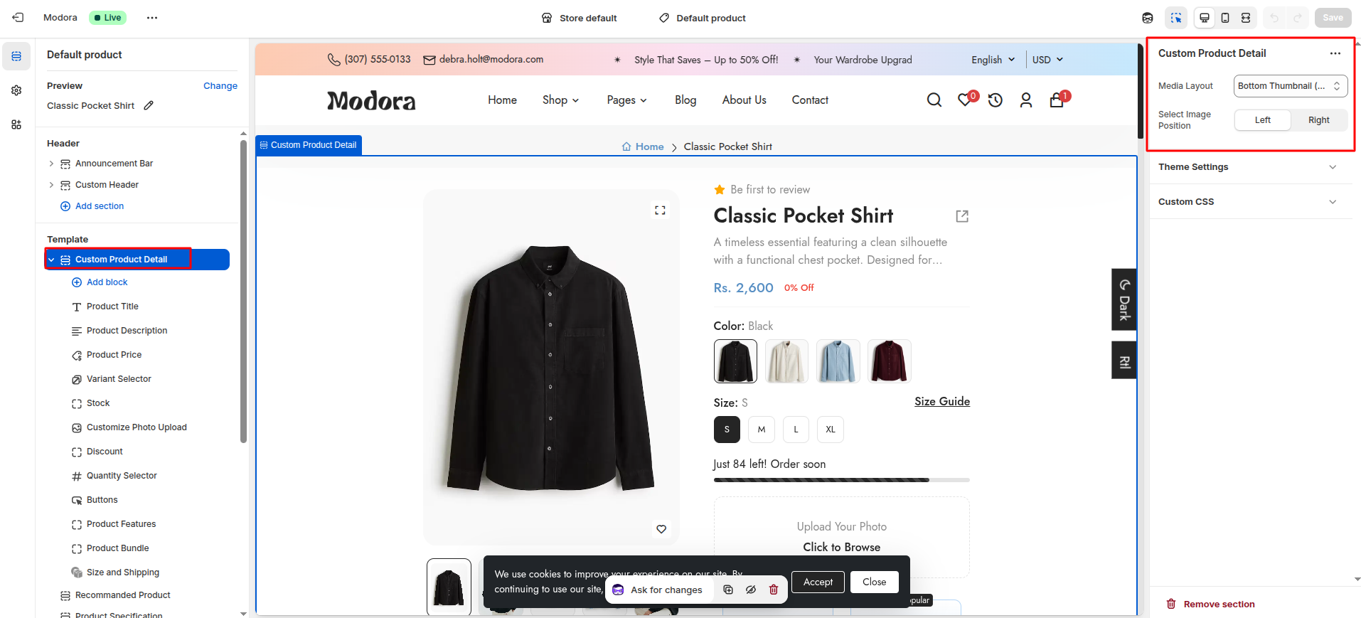
| Settings | Type | Description |
|---|---|---|
| Media Layout | select | Select the layout of the product images. Bottom Thumbnail(Classic) - Display the product images with a bottom thumbnail. Left Thumbnail - Display the product images with a left thumbnail. No Thumbnail(Slider) - Display the product images without a thumbnail slider. Full Width(Sticky) - Display the product images with a sticky slider. Only Image(Grid) - Display the product images in a grid layout. Media With Video - Display the product images with a video. |
| Select Image Position | select | Select the position of the product images (left / right). |
Media Layout - Bottom Thumbnail(Classic)
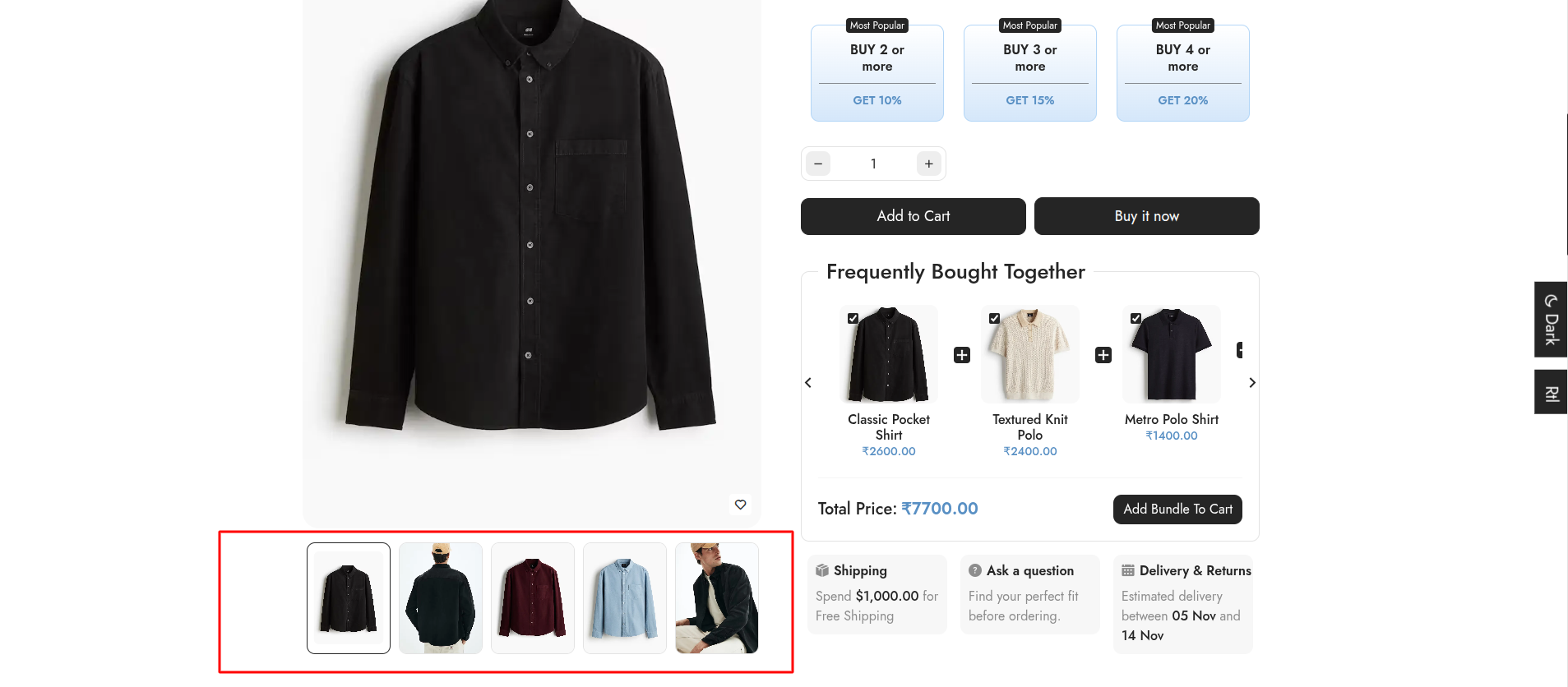
Media Layout - Left Thumbnail

Media Layout - No Thumbnail(Slider)
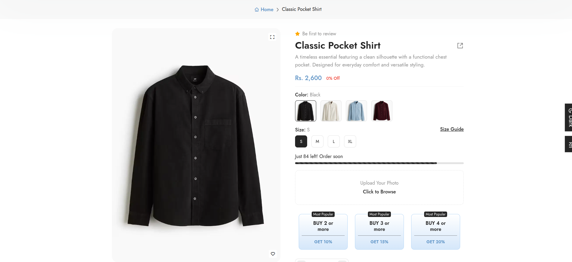
Media Layout - Full Width(Sticky)
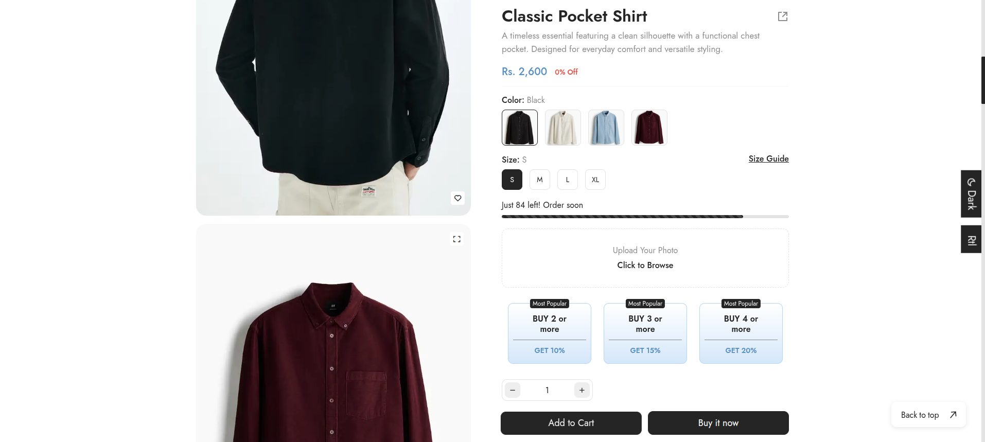
Media Layout - Only Image(Grid)
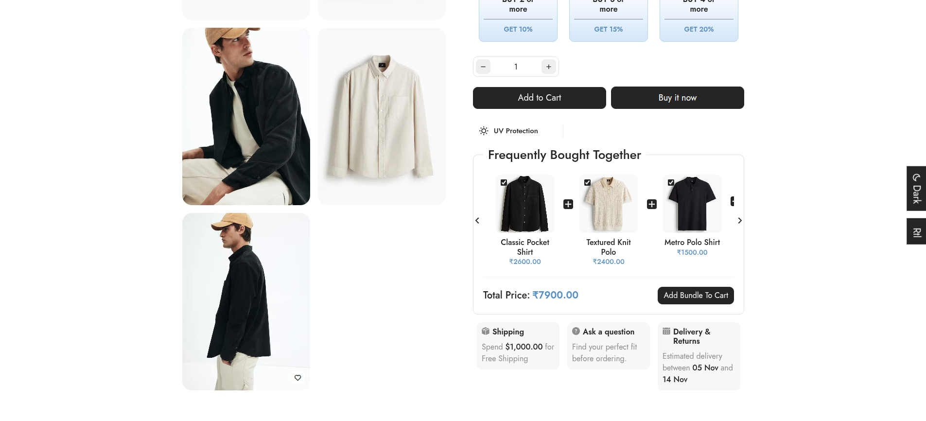
5Recommanded Products
- Choose Products -> default product from the dropdown window.
- In theTemplates -> Add section and choose "Recommanded Product".
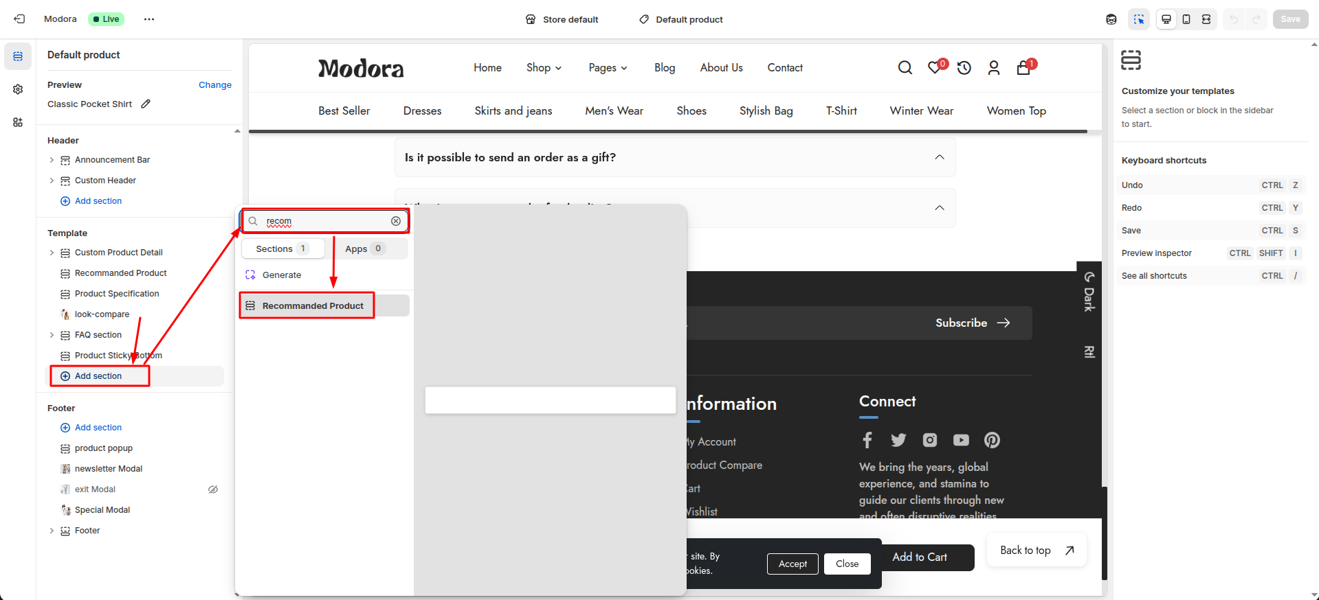
Section settings
Section settings make it easy to control how content appears on your store pages. Update text, images, and layout directly from the Theme Editor. Adjust spacing, colors, and alignment to match your brand style. Changes are applied instantly with live preview support.
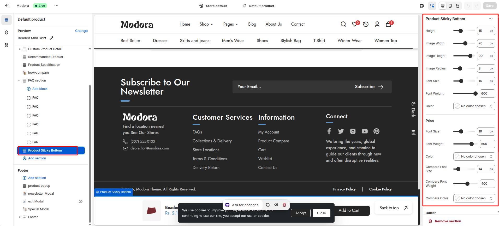
| Settings | Type | Description | visibility |
|---|---|---|---|
| Title Text | text | Set the text for the Section title. | Always Visible |
| Title Font Size | range(px) | Adjust the font size of the section title. | Always Visible |
| Title Font Weight | range | Adjust the font weight of the section title. | Always Visible |
| Title Color | color_background | Choose the color of the section title. | Always Visible |
| Font Size | range(px) | Adjust the font size of the product title. | Always Visible |
| Font Weight | range | Adjust the font weight of the product title. | Always Visible |
| Color | color_background | Choose the color of the product title. | Always Visible |
| Font Size | range(px) | Adjust the font size of the product price. | Always Visible |
| Font Weight | range | Adjust the font weight of the product price. | Always Visible |
| Color | color_background | Choose the color of the product price. | Always Visible |
6Product Specification
- Choose Products -> default product from the dropdown window.
- In theTemplates -> Add section and choose "Product Specification".

Section settings
Section settings make it easy to control how content appears on your store pages. Update text, images, and layout directly from the Theme Editor. Adjust spacing, colors, and alignment to match your brand style. Changes are applied instantly with live preview support.
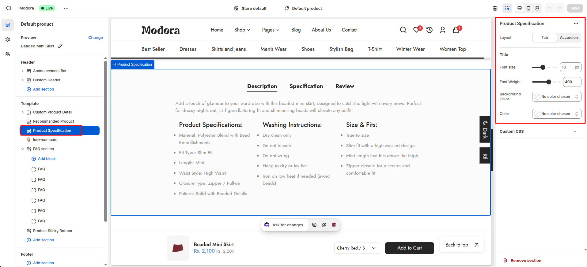
| Settings | Type | Description | visibility |
|---|---|---|---|
| Layout | select | Select the layout of the product specification (tab / accordion). | Always Visible |
| Font Size | range(px) | Adjust the font size of the content title. | Always Visible |
| Font Weight | range | Adjust the font weight of the content title. | Always Visible |
| Background Color | color_background | Choose the background color of the content title. | Always Visible |
| Color | color_background | Choose the color of the content title. | Always Visible |
| Font Size | range(px) | Adjust the font size of the active link. | Visible when specification layout is tab. |
| Font Weight | range | Adjust the font weight of the active link. | Visible when specification layout is tab. |
| Background Color | color_background | Choose the background color of the active link. | Visible when specification layout is tab. |
| Color | color_background | Choose the color of the active link. | Visible when specification layout is tab. |
7Look Compare
- Choose Products -> default product from the dropdown window.
- In theTemplates -> Add section and choose "look-compare".

Section settings
Section settings make it easy to control how content appears on your store pages. Update text, images, and layout directly from the Theme Editor. Adjust spacing, colors, and alignment to match your brand style. Changes are applied instantly with live preview support.

| Settings | Type | Description | visibility |
|---|---|---|---|
| First Image | image_picker | upload an first image to visually compare two products. | Always Visible |
| Second Image | image_picker | upload an second image to visually compare two products. | Always Visible |
| Text | text | Set the text of the subtitle. | Always Visible |
| Font Size | range(px) | Adjust the font size of the subtitle. | Always Visible |
| Font Weight | range | Adjust the font weight of the subtitle. | Always Visible |
| Color | color_background | Choose the color of the subtitle. | Always Visible |
| Space Below Content | range(px) | Adjust the space below the subtitle. | Always Visible |
| Text | text | Set the text of the title. | Always Visible |
| Font Size | range(px) | Adjust the font size of the title. | Always Visible |
| Font Weight | range | Adjust the font weight of the title. | Always Visible |
| Color | color_background | Choose the color of the title. | Always Visible |
| Space Below Content | range(px) | Adjust the space below the title. | Always Visible |
| Text | text | Set the text of the description. | Always Visible |
| Font Size | range(px) | Adjust the font size of the desciption. | Always Visible |
| Font Weight | range | Adjust the font weight of the description. | Always Visible |
| Color | color_background | Choose the color of the description. | Always Visible |
| Space Below Content | range(px) | Adjust the space below the description. | Always Visible |
| Text | text | Set the text of the button. | Always Visible |
| Button Redirection Link | url | Set the link of the button redirection. | Always Visible |
| Width | range(px) | Adjust the width of the button. | Always Visible |
| Height | range(px) | Adjust the height of the button. | Always Visible |
| Font Size | range(px) | Adjust the font size of the button. | Always Visible |
| Font Weight | range | Adjust the font weight of the button. | Always Visible |
| Background Color | color_background | Choose the background color of the button. | Always Visible |
| Color | color_background | Choose the color of the button text. | Always Visible |
8FAQ Section
- Choose Products -> default product from the dropdown window.
- In theTemplates -> Add section and choose "FAQ Section".

Supported Blocks
- Click Add block and choose "FAQ" according to your requirement.

Block Settings
Each FAQ block includes two text fields—one for the question and one for the answer—allowing you to add multiple question-and-answer pairs easily.
| Settings | Type | Description | Visibility |
|---|---|---|---|
| FAQ Question | text | Enter the question you want to display in the FAQ. | Always Visible |
| FAQ Answer | text | Enter the answer corresponding to the FAQ question. | Always Visible |
Section settings
Section settings make it easy to control how content appears on your store pages. Update text, images, and layout directly from the Theme Editor. Adjust spacing, colors, and alignment to match your brand style. Changes are applied instantly with live preview support.
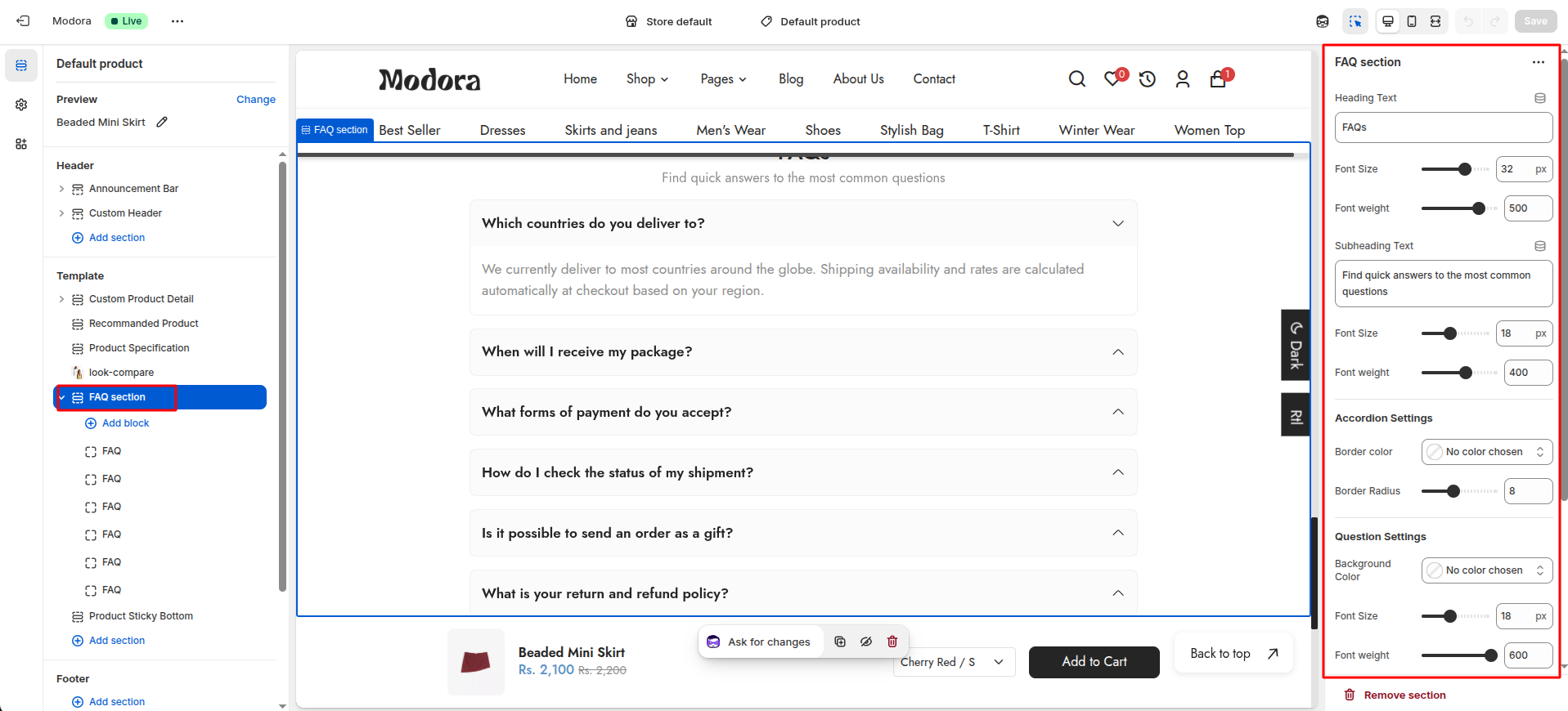
| Settings | Type | Description | visibility |
|---|---|---|---|
| Heading Text | text | Set the text for the section heading. | Always Visible |
| Font Size | range(px) | Adjust the font size of the heading text. | Always Visible |
| Font weight | range | Adjust the font weight of the heading text. | Always Visible |
| Subheading Text | text | Set the text for the section subheading. | Always Visible |
| Font Size | range(px) | Adjust the font size of the subheading text. | Always Visible |
| Font weight | range | Adjust the font weight of the subheading text. | Always Visible |
| Border color | color_background | Choose the color of the accordion border. | Always Visible |
| Border Radius | range(px) | Adjust the border radius of the accordion. | Always Visible |
| Background Color | color_background | Choose the background color of the questions. | Always Visible |
| Font Size | range(px) | Adjust the font size of the questions. | Always Visible |
| Font weight | range | Adjust the font weight of the questions. | Always Visible |
| Background Color | color_background | Choose the background color of the answers. | Always Visible |
| Font Size | range(px) | Adjust the font size of the answers. | Always Visible |
| Font weight | range | Adjust the font weight of the answers. | Always Visible |
9Product Bottom Sticky
- Choose Products -> default product from the dropdown window.
- In theTemplates -> Add section and choose "Product Sticky Bottom".
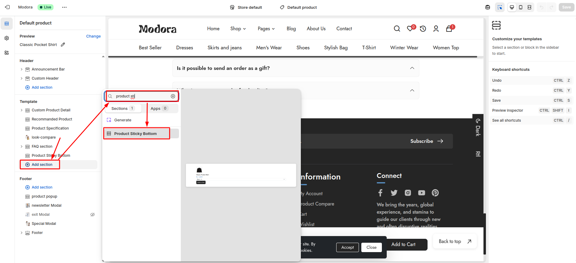
Section settings
Section settings make it easy to control how content appears on your store pages. Update text, images, and layout directly from the Theme Editor. Adjust spacing, colors, and alignment to match your brand style. Changes are applied instantly with live preview support.
| Settings | Type | Description | visibility |
|---|---|---|---|
| Height | range(px) | Adjust the height of the section. | Always Visible |
| Image Width | range(px) | Adjust the width of the bottom product image. | Always Visible |
| Image Height | range(px) | Adjust the height of the bottom product image. | Always Visible |
| Image Radius | range(px) | Adjust the radius of the bottom product image. | Always Visible |
| Font Size | range(px) | Adjust the font size of the bottom product title text. | Always Visible |
| Font Weight | range | Adjust the font weight of the bottom product title text. | Always Visible |
| Color | color_background | Choose the color of the bottom product title text. | Always Visible |
| Font Size | range(px) | Adjust the font size of the bottom product price text. | Always Visible |
| Font Weight | range | Adjust the font weight of the bottom product price text. | Always Visible |
| Color | color_background | Choose the color of the bottom product price text. | Always Visible |
| Compare Font Size | range(px) | Adjust the font size of the bottom product compare price text. | Always Visible |
| Compare Font Weight | range | Adjust the font weight of the bottom product compare price text. | Always Visible |
| Compare Color | color_background | Choose the color of the bottom product compare price text. | Always Visible |
| Background Color | color_background | Choose the background color of the bottom product button. | Always Visible |
| Color | color_background | Choose the color of the bottom product button text. | Always Visible |
| Font Size | range(px) | Adjust the font size of the bottom product button text. | Always Visible |
| Font Weight | range | Adjust the font weight of the bottom product button text. | Always Visible |
| Border Radius | range(px) | Adjust the border radius of the bottom product button. | Always Visible |
Cart Pages
1Install Layout
- Click the file name to open and download the corresponding JSON layout in a new tab.(cart.json)
- SELECT ALL and COPY.
- From your Shopify admin, go to Themes -> Actions -> Edit Code.
- Find folder templates -> Open file cart.json -> SELECT ALL and DELETE. PASTE the copied preset from the external file.

- From your Shopify admin, go to Themes -> Edit Theme.
- Choose Cart from the dropdown window.
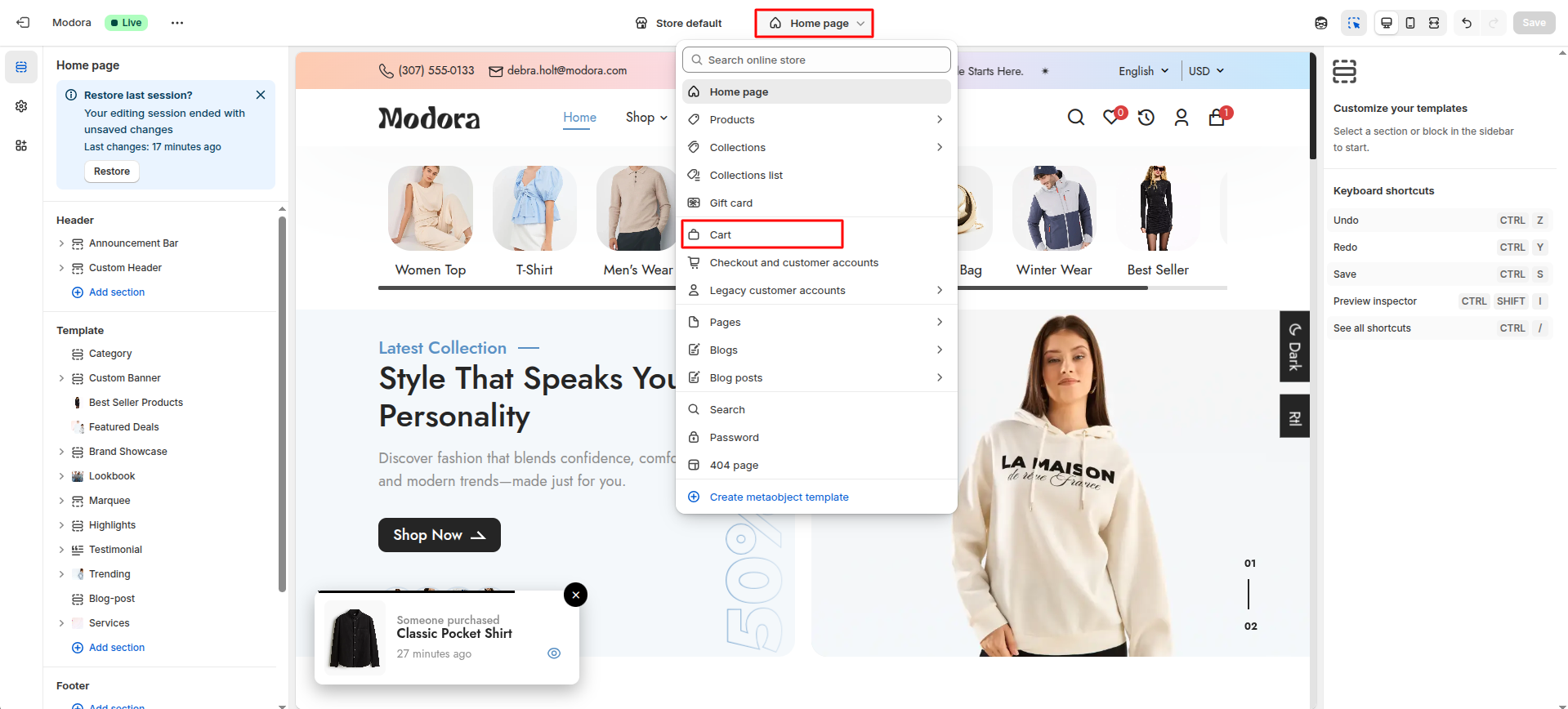
- After that, Click Add section and choose "Cart".
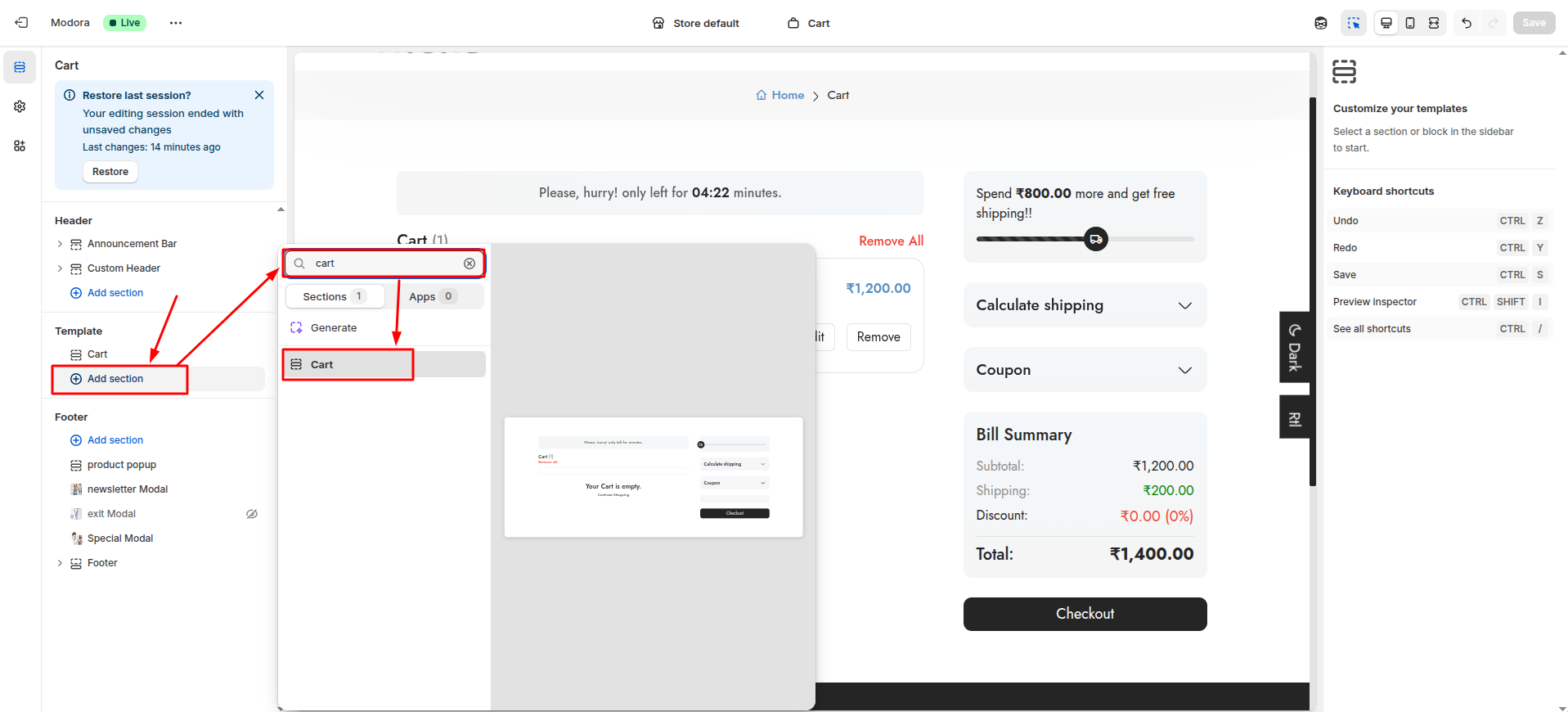
2Cart Timer
- From your Shopify admin, go to Themes -> Edit Theme.
- After that , Theme setting in Find Cart Settings.
- Then , Cart Page Countdown in add Cart Timer Text and Cart Countdown Time in Seconds.
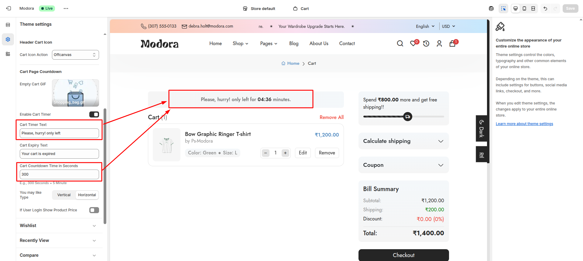
Blog Settings
1Create Blog
- Go to Admin Panel -> Content.
- Find and Select Blog Posts.
- Click Manage blogs.
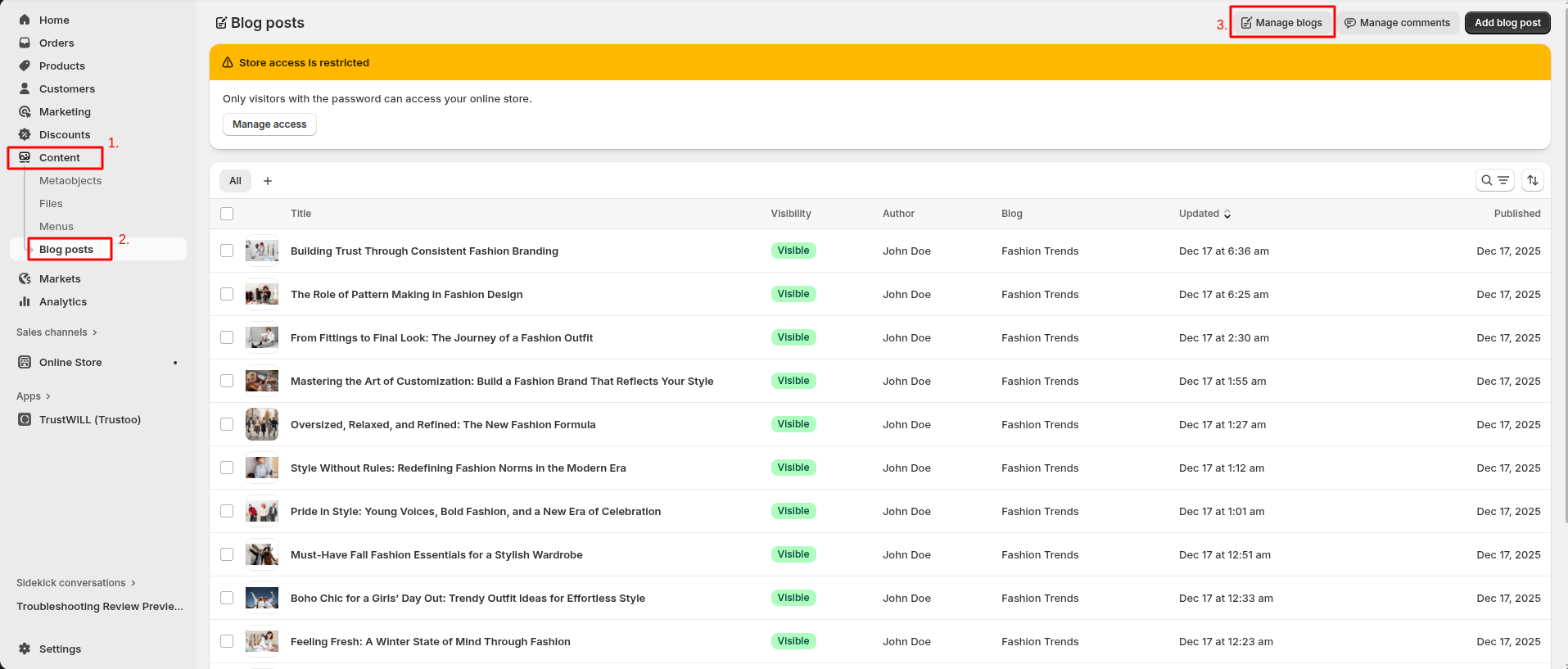
- After that, click Add Blog.
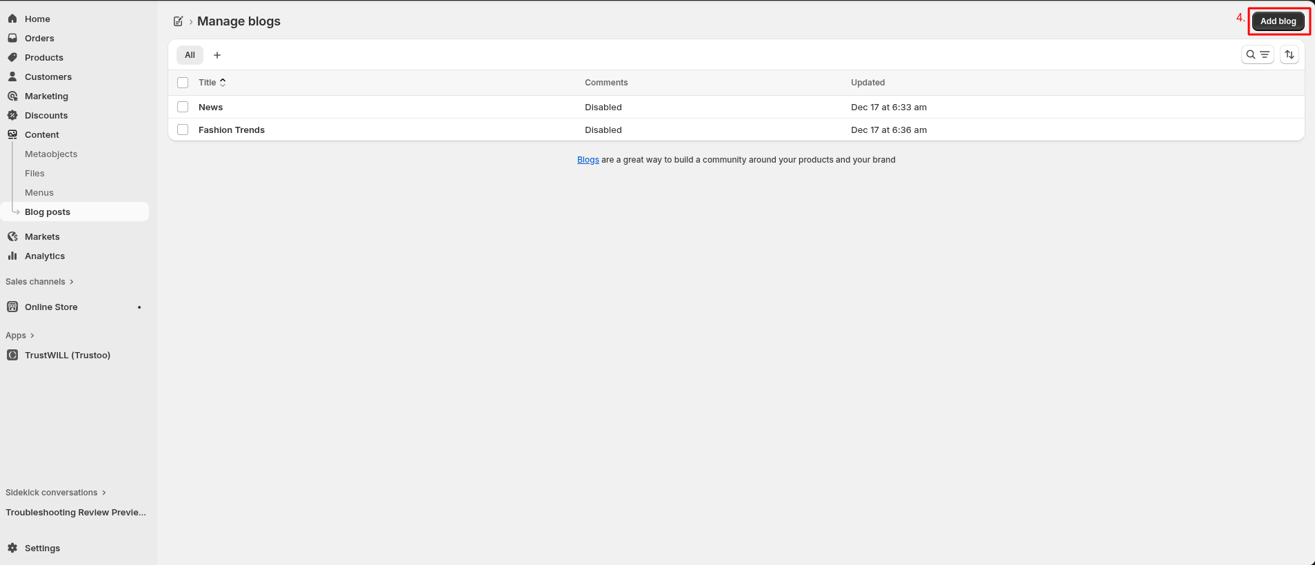
- Enter a Title the blog.
- Click Save.
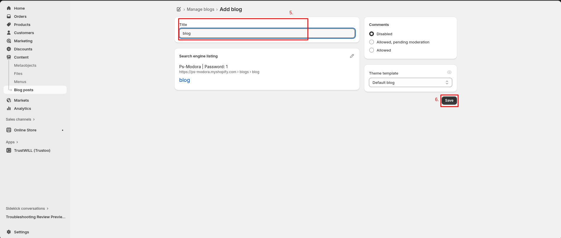
2Blog Settings
- Click the file name to open and download the corresponding JSON layout in a new tab.(blog.json)
- SELECT ALL and COPY.
- From your Shopify admin, go to Themes -> Actions -> Edit Code.
- Find folder templates -> Open file blog.json -> SELECT ALL and DELETE. PASTE the copied preset from the external file.
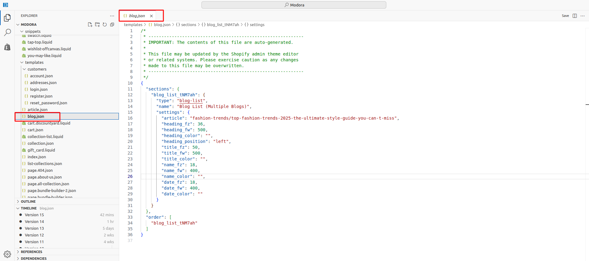
- From your Shopify admin, go to Themes -> Edit Theme.
- Choose Blogs from the dropdown window.

- After that, choose Default Blog.
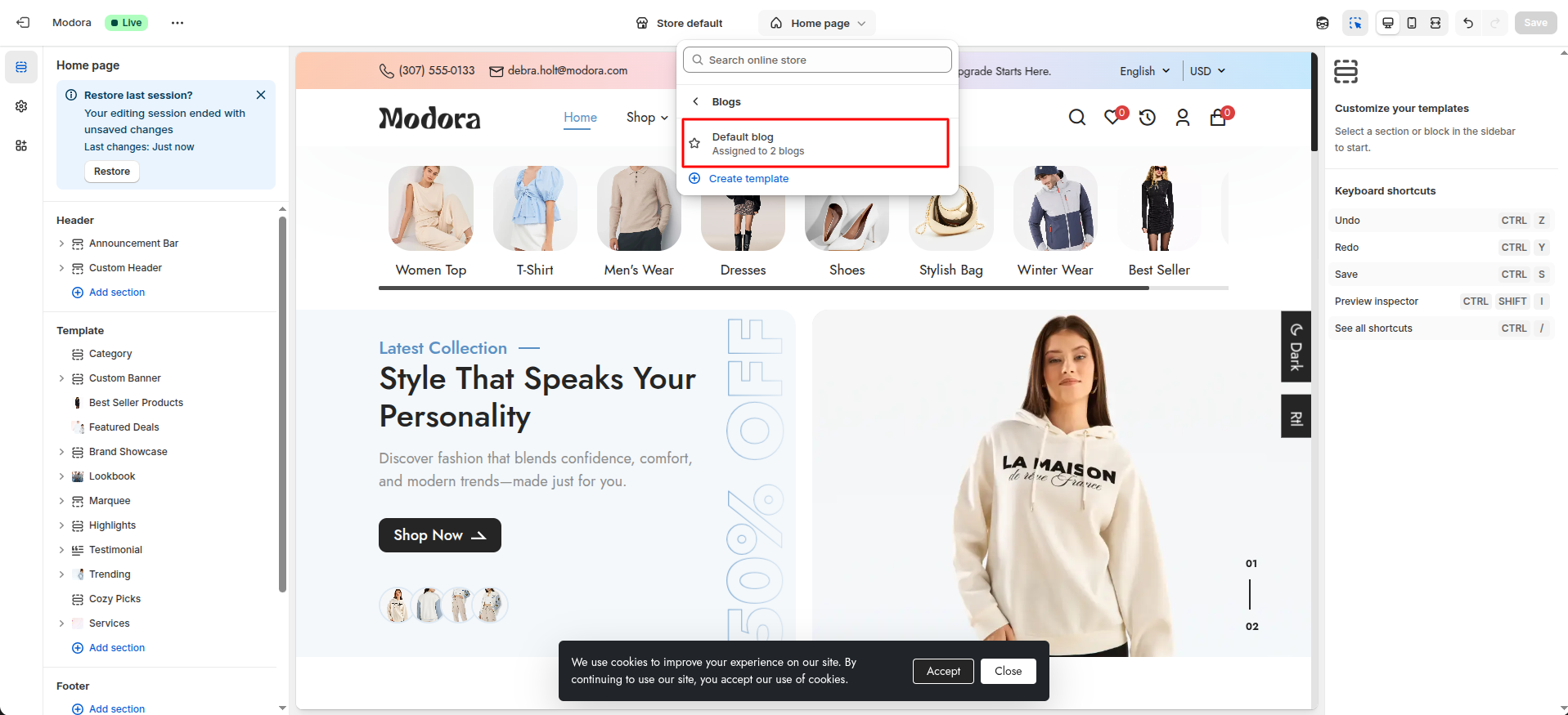
- Click Add section and choose "Blog List(Multiple Blogs)".
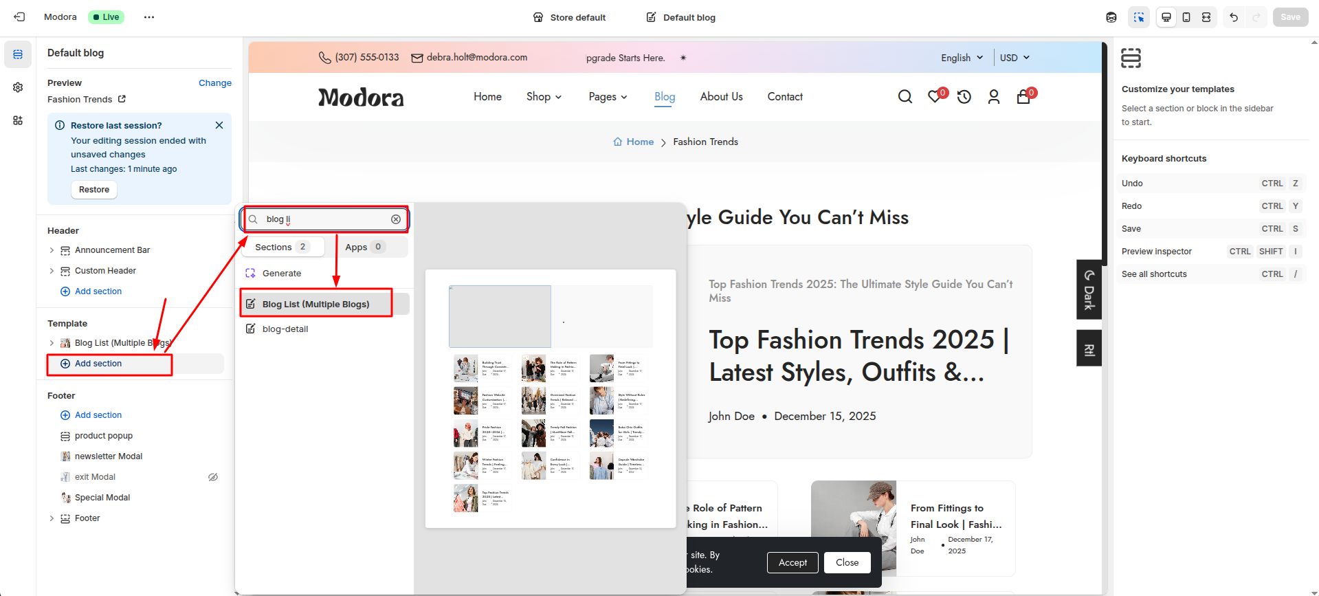
Section settings
Section settings make it easy to control how content appears on your store pages. Update text, images, and layout directly from the Theme Editor. Adjust spacing, colors, and alignment to match your brand style. Changes are applied instantly with live preview support.

| Settings | Type | Description | visibility |
|---|---|---|---|
| Select Article | article | Choose an article to display in this section. | Always Visible |
| Font Size | range(px) | Adjust the font size of the heading text. | Always Visible |
| Font Weight | range | Adjust the font weight of the heading text. | Always Visible |
| Color | color_background | Choose the color of the heading text. | Always Visible |
| Heading Alignment | text_alignment | Adjust the alignment of the heading text. | Always Visible |
| Font Size | range(px) | Adjust the font size of the article title. | Always Visible |
| Font Weight | range | Adjust the font weight of the article title. | Always Visible |
| Color | color_background | Choose the color of the article title. | Always Visible |
| Font Size | range(px) | Adjust the font size of the author name. | Always Visible |
| Font Weight | range | Adjust the font weight of the author name. | Always Visible |
| Color | color_background | Choose the color of the author name. | Always Visible |
| Font Size | range(px) | Adjust the font size of the publish blog date. | Always Visible |
| Font Weight | range | Adjust the font weight of the publish blog date. | Always Visible |
| Color | color_background | Choose the color of the publish blog date. | Always Visible |
3Create Blog Post
- Go to Admin Panel -> Content.
- Find and Select Blog Posts.
- Click Add blog post.
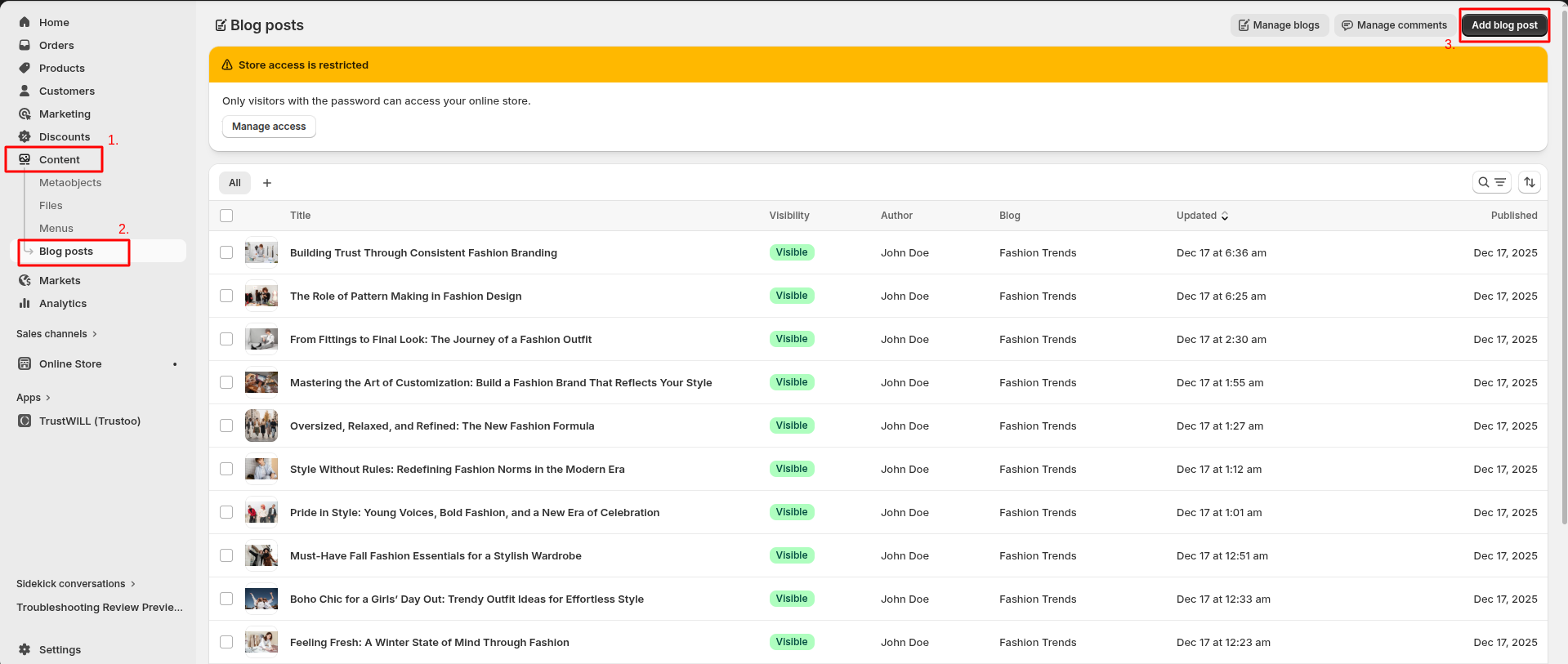
Add Blog post Details
- Enter the Title of the blog post.
- Set Visibility to control whether the post is shown on the storefront.
- Upload a Image for the blog post.
- Select the appropriate Blog to group the post.
- Choose a Template for the blog layout.
- Click Save to publish the blog post.

Add detailed content in the Content section. To display a short summary on the home page or blog listing, enter a brief description in the Excerpt field.
4Blog Post Settings
- Click the file name to open and download the corresponding JSON layout in a new tab.(article.json)
- SELECT ALL and COPY.
- From your Shopify admin, go to Themes -> Actions -> Edit Code.
- Find folder templates -> Open file article.json -> SELECT ALL and DELETE. PASTE the copied preset from the external file.

- From your Shopify admin, go to Themes -> Edit Theme.
- Choose Blog posts from the dropdown window.

- After that, choose Default Blog post.
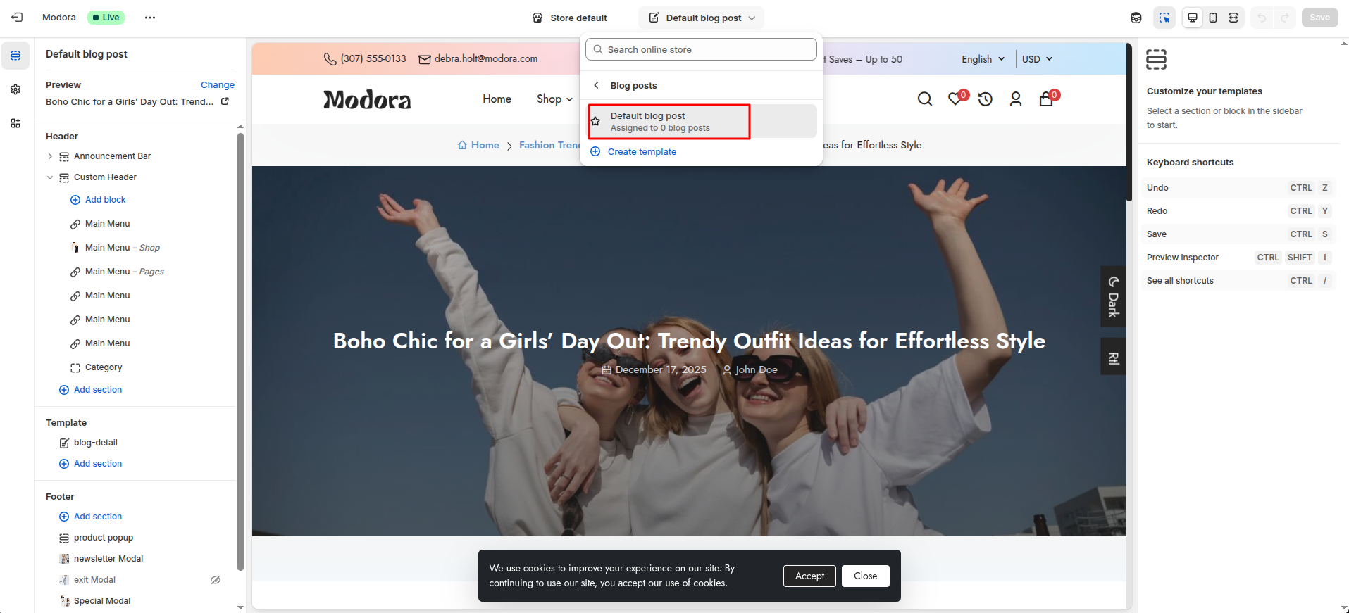
- Click Add section and choose "Blog Detail".

Section settings
Section settings make it easy to control how content appears on your store pages. Update text, images, and layout directly from the Theme Editor. Adjust spacing, colors, and alignment to match your brand style. Changes are applied instantly with live preview support.
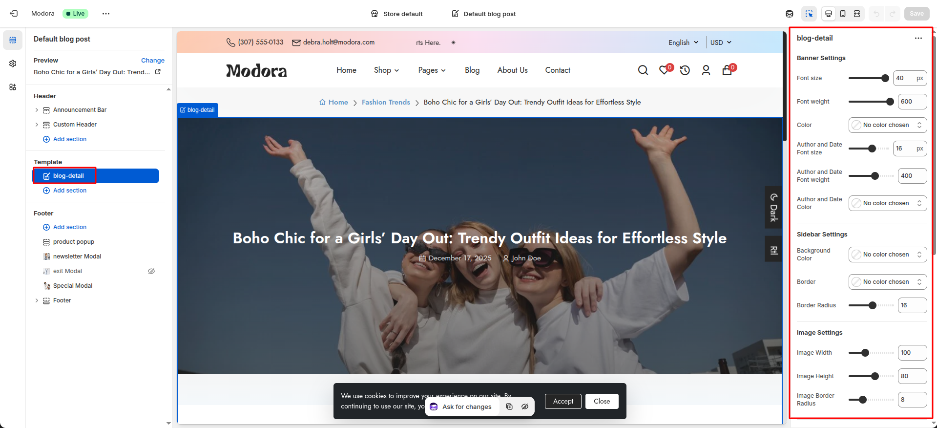
| Settings | Type | Description | visibility |
|---|---|---|---|
| Font Size | range(px) | Adjust the font size of the banner heading text. | Always Visible |
| Font Weight | range | Adjust the font weight of the banner heading text. | Always Visible |
| Color | color_background | Choose the color of the banner heading text. | Always Visible |
| Author and Date Font size | range(px) | Adjust the font size of the author and date text. | Always Visible |
| Author and Date Font weight | range | Adjust the font weight of the author and date text. | Always Visible |
| Author and Date Color | color_background | Choose the color of the author and date text. | Always Visible |
| Background Color | color_background | Choose the background color of the sidebar. | Always Visible |
| Border | color_background | Choose the border color of the sidebar. | Always Visible |
| Border Radius | range(px) | Adjust the border radius of the sidebar. | Always Visible |
| Image Width | range(px) | Adjust the width of the sidebar image. | Always Visible |
| Image Height | range(px) | Adjust the height of the sidebar image. | Always Visible |
| Image Border Radius | range(px) | Adjust the border radius of the sidebar image. | Always Visible |
| Background Color | color_background | Choose the background color of the sidebar tags. | Always Visible |
| Text Color | color_background | Choose the text color of the sidebar tags. | Always Visible |
| Font Size | range(px) | Adjust the font size of the sidebar tags. | Always Visible |
| Font Weight | range | Adjust the font weight of the sidebar tags. | Always Visible |
| Border | color_background | Choose the border color of the sidebar tags. | Always Visible |
| Border Radius | range(px) | Adjust the border radius of the sidebar tags. | Always Visible |
| Active Background Color | color_background | Choose the background color of the active tag. | Always Visible |
| Active Text Color | color_background | Choose the text color of the active tag. | Always Visible |
| Active Border | color_background | Choose the border color of the active tag. | Always Visible |
Theme Features
Blazing Fast
SEO-optimized for Lighthouse & Core Web Vitals.
Mobile First
Seamless shopping across all mobile devices.
Visual Builder
Build and customize your store visually.
Multi-language
Sell globally with multi-language support.
Products Bundle
Create and sell product bundles easily.
Smart Cart
Smart AJAX cart with upsells and shipping.
Mega Menus
Navigation menus with images, banners, and icons
Quick View
Instant product peek without leaving the page.
Reviews
To Build trust and social proof instantly.
Products Comparing
Side-by-side clarity for smarter choices.
Filters
Powerful Shopify filters to find products effortlessly.
Lookbook
Inspire shoppers with a stunning lookbook.
Lazy Loading
Load images only when needed for speed.
Dark Mode
Stylish dark mode for a modern shopping experience.
Troubleshooting
1Color
- Locate the Text Color field. Click on the color input (shows No color chosen).
- Inside the color picker By default, preset Gradient will appear.
- In the Gradient panel, click CSS.

- The CSS Code input field will become visible.Paste your CSS value into the CSS Code field or write your own CSS code.
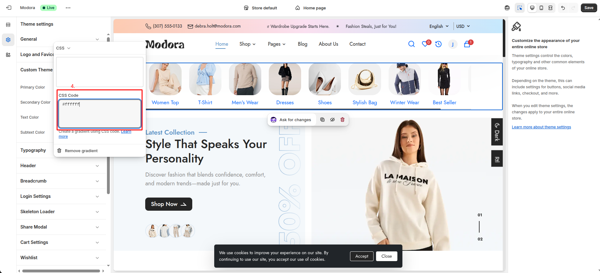
2Product Badge
To display a Discount badge on a specific product, follow the steps below:
- Go to Admin Panel -> products.
- Select the product that you want to edit.
- In the Pricing section, enter the original price in the Compare at price field and the discounted price in the Price field.
- The Discount badge will be displayed automatically when the difference between the Compare at price and the Price is 5% or more.
Change Log
Version 1.0.0 – Initial Release (April 2026)
1Initial Release
- First official release of the theme.
- Fully responsive and modern design.
- Optimized for performance and speed.
2Features
- Multiple homepage sections and flexible layouts.
- Product page with variant options (dropdown, swatch, image).
- Advanced product media support (image, video, 360° view).
- Collection page with filters (size, color, price, rating).
- Quick view and smooth navigation.
- Mobile-friendly and cross-browser compatible.
3Highlights
- Clean and minimal UI inspired by modern eCommerce trends.
- Easy customization through Shopify theme editor.
- SEO-friendly structure and fast loading.