
Advance UI Elements
Scrollable Offical link Preview link
npm i vue3-perfect-scrollbarIn your main.ts file all the following code:
import PerfectScrollbar from 'vue3-perfect-scrollbar'
  import 'vue3-perfect-scrollbar/dist/vue3-perfect-scrollbar.css'
  .use(PerfectScrollbar)
Inside Your template tags add
<perfect-scrollbar class="vertical-scroll scroll-demo" :settings="settings4">
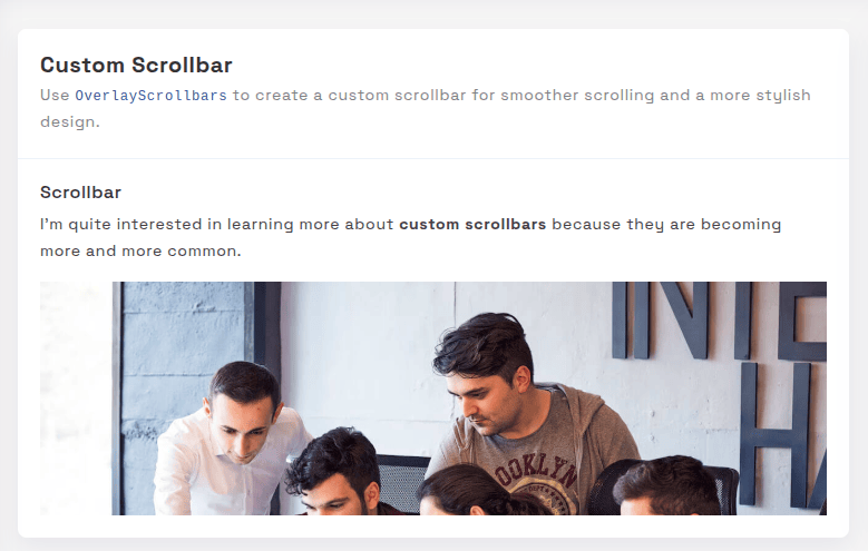
<h5 class="pb-2">Custom Scrollbar </h5>
<p>I'm quite interested in learning more about <em class="txt-danger">custom scrollbars</em> because
they are becoming more and more common.</p>
<div class="scrollbar-images"><img class="img-fluid" src="@/assets/images/banner/1.jpg" alt="banner">
</div>
<p>
There are various justifications for customizing a scrollbar. For instance, the default scrollbar
can cause an app's user interface to look inconsistent across various operating systems. In this
case, having a single style is helpful.</p>
<p>
I never had the opportunity to learn about CSS scrollbar customization, but I have always been
interested in doing so. I'll take the chance to learn more about them and share my trip in this
essay.</p>
<p>
One crucial point to remember is that, depending on the design, a scrollbar may operate either <em
class="txt-danger">horizontally or vertically</em> . Additionally, it might alter when you work
on a website that is global and operates in both left-to-right and right-to-left orientations.</p>
</perfect-scrollbar>Inside Your script tags add
const settings4 = {
   maxScrollbarLength: 60,
   suppressScrollY: true,
   suppressScrollX: false
  }
Tree Preview link
npm i vue3-treeviewInside Your template tags add
<treeview :nodes="nodes" :config="config"/>Inside Your script tags add
import treeview from "vue3-treeview";
   import "vue3-treeview/dist/style.css";
   import { defineAsyncComponent, ref } from 'vue'
   const Card3 = defineAsyncComponent(() => import("@/components/common/card/CardData3.vue"))
   let desc = ref<string>("Use the dynamic tree view with checkboxes.")
     interface Node {
       text: string;
       children?: string[];
   }

   interface Nodes {
       [key: string]: Node;
   }
   let nodes = ref<Nodes>({
       id1: {
           text: "Admin",
           children: ["id11", "id12"],
       },
       id11: {
           text: "Assets",
           children: ["id113", "id118"],
       },
       id12: {
           text: "Default",
           children: ["id131", "id122"],
       },
       id111: {
           text: "CSS",
           children: ["id114", "id115"],
       },
       id114: {
           text: "Css One",
       },
       id115: {
           text: "Css Two",
       },
       id113: {
           text: "Js",
           children: ["id116", "id117"],
       },
       id116: {
           text: "Js One"
       },
       id117: {
           text: "Js Two"
       },
       id118: {
           text: "Scss",
           children: ["id119"]
       },
       id119: {
           text: "Sub Child",
           children: ["id120", "id121"]
       },
       id120: {
           text: "Sub File"
       },
       id121: {
           text: "Sub File"
       },
       id131: {
           text: "Dashboard"
       },
       id122: {
           text: "Typography"
       },
       id2: {
           text: "index file",
       },
   });

   let config = ref({
       roots: ["id1", "id2"],

   });
Toast Offical link Preview link
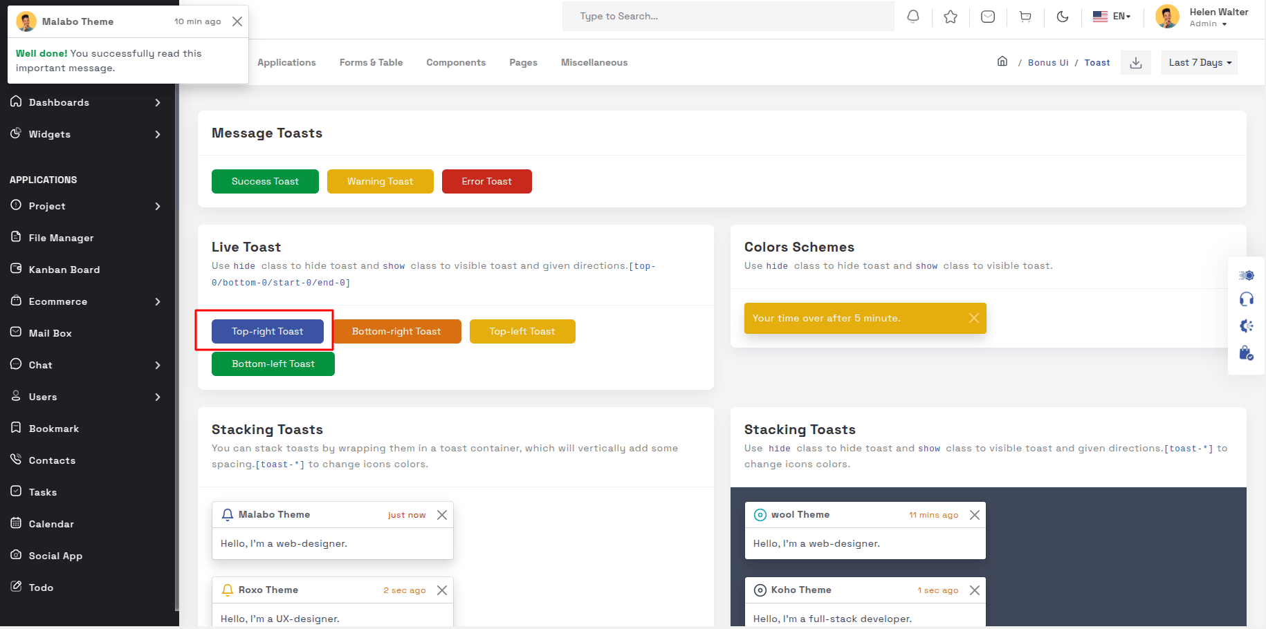
npm i vue3-toastifyInside Your template tags add
<class="btn btn-success " type="button" @click="success" variant="success">Success</Button>
Inside Your script tags add
import { toast } from 'vue3-toastify';
   import 'vue3-toastify/dist/index.css';
   function success() {
    toast.success(' New order has been placed ', {
        hideProgressBar: true, autoClose: 2000, theme: 'colored', position: 'top-right'
    });
  }
Rating Offical link Preview link
npm i vue-rateIn your main.ts file all the following code:
import rate from 'vue-rate'
  import 'vue-rate/dist/vue-rate.css'
  .use(rate)
Inside Your template tags add
  <div class="rating-container">
       <rate :length="5" :value="2" :disabled="true" />
  </div>
Dropzone Offical link Preview link
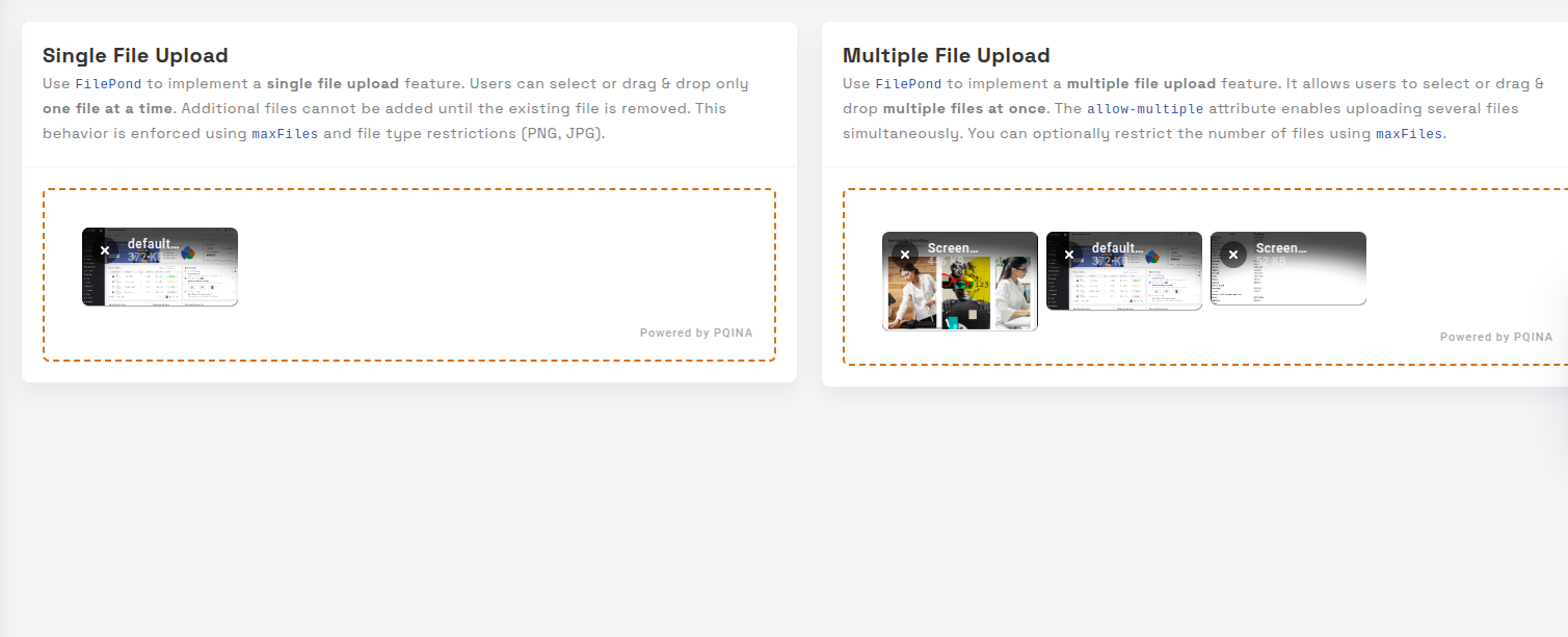
npm i dropzone-vuenpm i filepond-plugin-file-validate-typenpm i filepond-plugin-image-previewInside Your template tags add
 <form class="dropzone dropzone-secondary">
      <FilePond name="file" :label-idle="innerHTML"
        :accepted-file-types="['image/png', 'image/jpeg']"
     />
   </form>
Inside Your script tags add
import DropZone from "dropzone-vue";
import FilePondPluginFileValidateType from "filepond-plugin-file-validate-type";
import FilePondPluginImagePreview from "filepond-plugin-image-preview";

const FilePond = vueFilePond(
  FilePondPluginImagePreview,
  FilePondPluginFileValidateType
) as DefineComponent


app.use(DropZone)
                   ;
Inside Your style tags add
@import 'dropzone-vue/dist/dropzone-vue.common.css';
@import "filepond/dist/filepond.min.css";
@import "filepond-plugin-image-preview/dist/filepond-plugin-image-preview.css";
Tour Preview link

npm i v-onboardingInside Your template tags add
<img img class="img-fluid" alt="" src="@/assets/images/user/7.jpg" data-intro="This is Profile image">
  <router-link class="icon-wrapper" id="update-profile-tour" to="/users/edit">
      <i class="icofont icofont-pencil-alt-5" data-intro="Change Profile image here"  id="update-profile-tour" ></i>
  </router-link>
  <VOnboardingWrapper ref="wrapper" :steps="steps" class="tour-visit"/>
Inside Your script tags add
import { VOnboardingWrapper, useVOnboarding } from 'v-onboarding'
   import 'v-onboarding/dist/style.css'
   const { start, goToStep, finish } = useVOnboarding(wrapper)
   let steps = [
       {
           attachTo: { element: '#profiletour' }, content: { title: "This is malabo profile" }
       },
       {
           attachTo: { element: '#update-profile-tour' }, content: { title: "Change malabo profile image here" }
       }
   ]

   onMounted(() => {
       start()
   });
Sweetalert Offical link Preview link
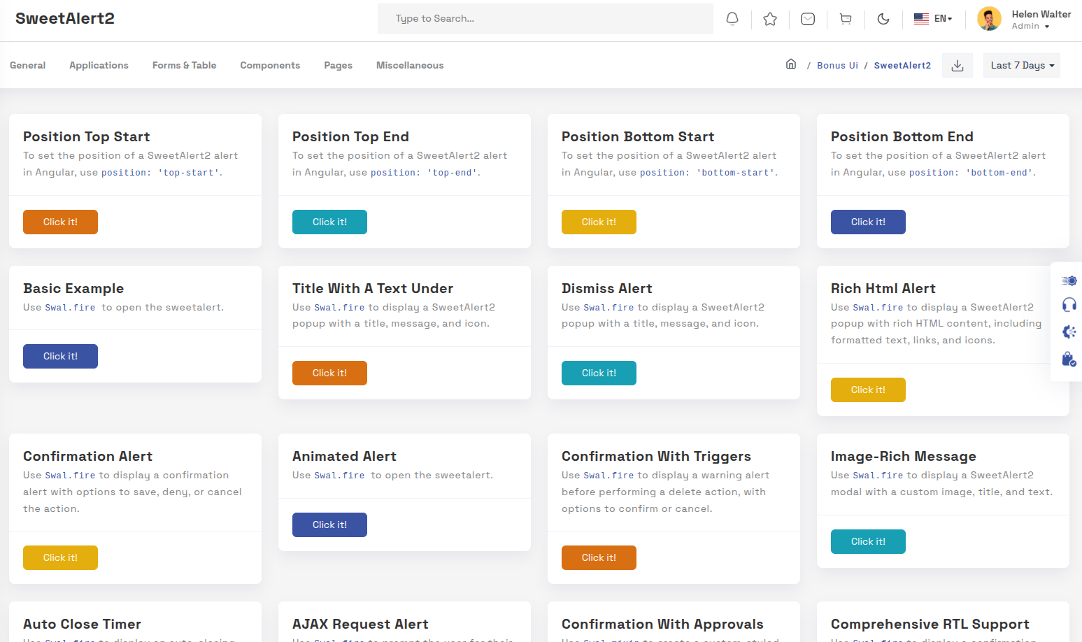
npm i sweetalert2Inside Your template tags add
<button class="btn btn-danger sweet-5" type="button" @click="basic()" >Warning alert</button>Inside Your script tags add
import Swal from 'sweetalert2'
function basic() {
  Swal.fire({
    icon: 'warning',
    title: "Are you sure?",
    text: 'Once deleted, you will not be able to recover this imaginary file!',
    showCancelButton: true,
    confirmButtonText: 'Ok',
    confirmButtonColor: '#3e5fce',
    cancelButtonText: 'Cancel',
    cancelButtonColor: '#efefef',
  }).then((result) => {
  if (result.value) {
    Swal.fire({
      icon: 'success',
      text: 'Poof! Your imaginary file has been deleted!',
      confirmButtonColor: '#3e5fce',
    });
  } else {
  Swal.fire({
      text: 'Your imaginary file is safe!',
      confirmButtonColor: '#3e5fce',
      });
     }
   });
  }
Range slider Offical link Preview link
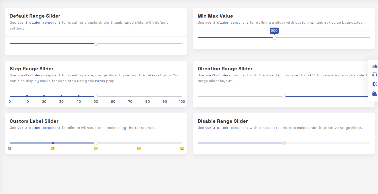
npm i vue-slider-componentInside Your template tags add
<VueSlider v-model="one.value" :data="one.data" :tooltip="'always'" :tooltip-placement="'top'" ></VueSlider>Inside Your script tags add
import VueSlider from 'vue-slider-component'
   import 'vue-slider-component/theme/antd.css'
   import { ref } from "vue"
   const one = ref({
       value: 10,
       data: [10, 100]
   })
Image cropper Offical link Preview link
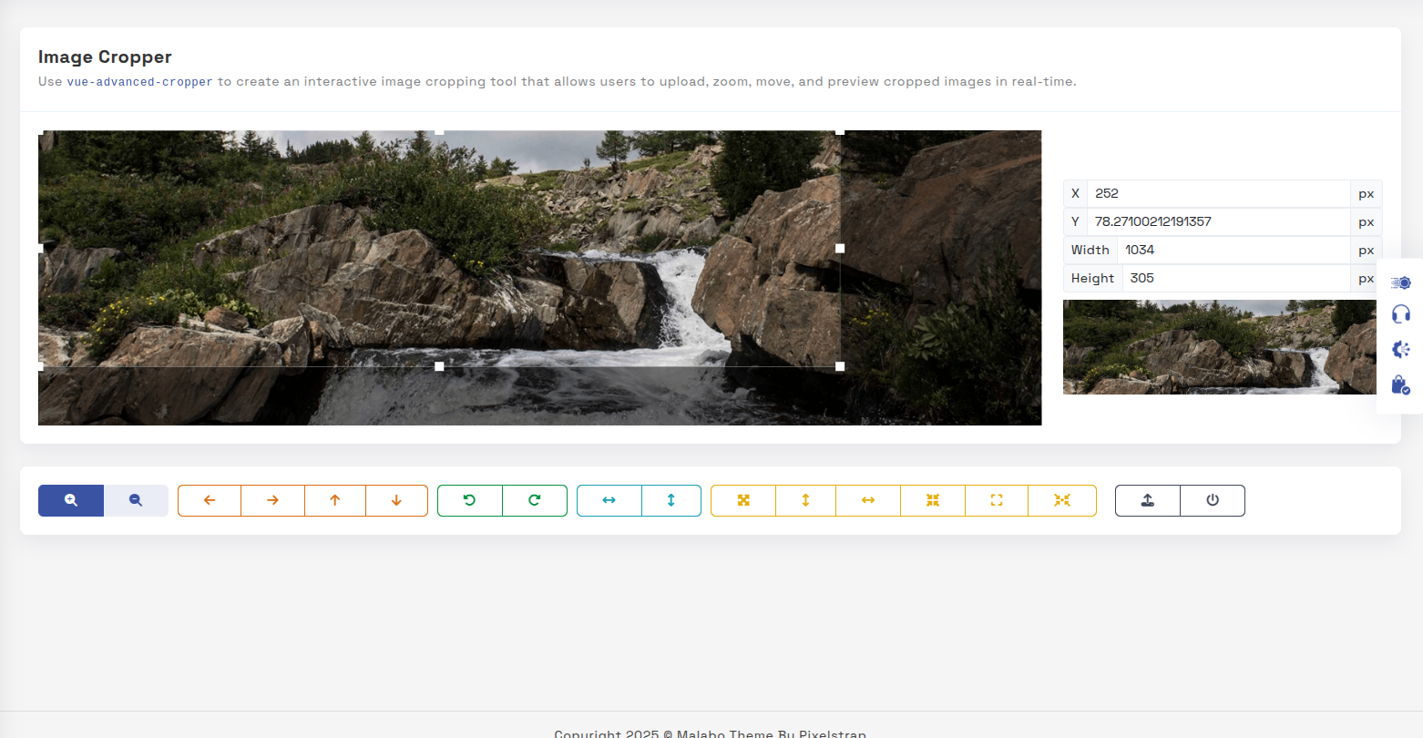
npm i vue-cropperjsInside Your template tags add
<vue-cropper
  vue-cropper ref="cropper"
  :guides="true"
  :view-mode="viewmodeselected"
  drag-mode="crop"
  :aspectRatio="aspectRatioselected"
  :auto-crop-area="0.5"
  :min-container-width="250"
  :min-container-height="180"
  :background="true"
  :rotatable="true"
  :movable="true"
  :src="getImgUrl(myimgSrc)"
   alt="Source Image"
  :ready="ready"
  :crop="cropImage"
  img-preview=".img-preview"
  :img-style="{ width: '800px', height: '500px' }">
  </vue-cropper>
Inside Your script tags add
import VueCropper from 'vue-cropperjs';
  import 'cropperjs/dist/cropper.css';
  import { Tooltip } from "bootstrap";
  import { getImgUrl } from "@/composables/commen/imgMixin"
  import { ref, onMounted } from "vue"
  let myimgSrc = ref<string>('other-images/img-cropper.jpg')
  let imageData = ref<any>({})
  let containerData = ref<string>('')
  let putData = ref<string>('')
  let viewmodeselected = ref<number>(0)
  let cropImg = ref<string>('')
  let aspectRatioselected = ref<number>(1.7777777777777777)
  let cropper = ref()
  let convertNumber = (num?: number) => num != null ? Math.round(num) : undefined
  function ready() {
     containerData.value = cropper.value.getContainerData();
  }
  function cropImage() {
    cropImg.value = cropper.value.getCroppedCanvas().toDataURL();
  }
  onMounted(() => {
      new Tooltip(document.body, {
      selector: "[data-bs-toggle='tooltip']",
    })
  })