
Component
Basic UI Elements
Buttons Preview link
import { Button } from "reactstrap";

<Button color="primary">Primary Button</Button>
<Button color="secondary">Secondary Button</Button>
<Button color="success">Success Button</Button>
<Button color="info">Info Button</Button>
<Button color="warning">Warning Button</Button>
<Button color="danger">Danger Button</Button>
<Button color="light">Light Button</Button>
Tag & pills Preview link
import { Badge } from "reactstrap";

<Badge color="primary">Primary</Badge>
<Badge color="secondary">Secondary</Badge>
<Badge color="success">Success</Badge>
<Badge color="info">Info</Badge>
<Badge color="warning text-dark">Warning</Badge>
<Badge color="danger">Danger</Badge>
<Badge color="light text-dark">Light</Badge>
<Badge color="dark tag-pills-sm-mb">Dark</Badge>
Progressbar Preview link
import { Progress } from 'reactstrap'

<Progress value={0}/>
<Progress color="primary" value={25}/>
<Progress color="secondary" value={50}/>
<Progress color="success" value={75}/>
<Progress color="info" value={100}/>
Alert Preview link
import { Alert } from 'reactstrap'

<Alert color="primary">This is a primary alert—check it out!</Alert>
<Alert color="secondary">This is a secondary alert—check it out!</Alert>
<Alert color="success">This is a success alert—check it out!</Alert>
<Alert color="info">This is a info alert—check it out!</Alert>
<Alert color="warning">This is a warning alert—check it out!</Alert>
<Alert color="danger">This is a danger alert—check it out!</Alert>
<Alert color="light">This is a light alert—check it out!</Alert>
<Alert color="dark">This is a dark alert—check it out!</Alert>
Popover Preview link
import { Button, Popover, PopoverBody, PopoverHeader } from "reactstrap";

const [basicPopover, setBasicPopover] = useState(false);
const basicToggle = () => setBasicPopover(!basicPopover);

<Button id="Popover-1" color="primary" className="example-popover mr-1" onClick={basicToggle}>Click to toggle popover</Button>
<Popover placement="left" isOpen={basicToggle} target="Popover-1" toggle={basicToggle}>
    <PopoverHeader> Basic Popover </PopoverHeader>
    <PopoverBody> If the package restore doesn't help, you can look at the Output window in the Visual Studio.</PopoverBody>
</Popover>
Tooltip Preview link
import { Button, Tooltip } from 'reactstrap'

const [basictooltip, setbasictooltip] = useState(false);
const toggle = () => setbasictooltip(!basictooltip);

<Button color="primary" className="example-popover" id="Tooltip-1">Hover Me</Button>
<Tooltip target="Tooltip-1" placement="top" isOpen={basictooltip} toggle={toggle}>tooltip</Tooltip>
Dropdown Preview link
import { Dropdown, DropdownItem, DropdownMenu, DropdownToggle } from "reactstrap";

const [open, setOpen] = useState(false);
const toggle = () => setOpen(!open);

<div className="dropdown-basic">
    <Dropdown isOpen={open} toggle={toggle}>
    <DropdownToggle caret color="primary"/>
    <DropdownMenu className="dropdown-content">
        <DropdownItem href="#javascript">Action</DropdownItem>
        <DropdownItem href="#javascript">Another Action</DropdownItem>
        <DropdownItem href="#javascript">Something Else Here</DropdownItem>
    </DropdownMenu>
    </div>
</div>
Tab Preview link
Lorem Ipsum is simply dummy text of the printing and typesetting industry. Lorem Ipsum has been the industry's standard dummy text ever since the 1500s, when an unknown printer took a galley of type and scrambled it to make a type specimen book. It has survived not only five centuries, but also the leap into electronic typesetting,remaining essentially unchanged. It was popularised in the 1960s with the release of Letraset sheets containing Lorem Ipsum passages,and more recently with desktop publishing software like Aldus PageMaker including versions of Lorem Ipsum
Lorem Ipsum is simply dummy text of the printing and typesetting industry. Lorem Ipsum has been the industry's standard dummy text ever since the 1500s, when an unknown printer took a galley of type and scrambled it to make a type specimen book. It has survived not only five centuries, but also the leap into electronic typesetting, remaining essentially unchanged. It was popularised in the 1960s with the release of Letraset sheets containing Lorem Ipsum passages, and more recently with desktop publishing software like Aldus PageMaker including versions of Lorem Ipsum
Lorem Ipsum is simply dummy text of the printing and typesetting industry. Lorem Ipsum has been the industry's standard dummy text ever since the 1500s, when an unknown printer took a galley of type and scrambled it to make a type specimen book. It has survived not only five centuries, but also the leap into electronic typesetting,remaining essentially unchanged. It was popularised in the 1960s with the release of Letraset sheets containing Lorem Ipsum passages,and more recently with desktop publishing software like Aldus PageMaker including versions of Lorem Ipsum
import { Nav, NavItem, NavLink, TabContent, TabPane } from "reactstrap";
const [basicTab, setBasicTab] = useState("1");

<Nav tabs>
    <NavItem>
    <NavLink className={`txt-primary ${basicTab === "1" ? "active" : ""}`} onClick={() => setBasicTab("1")}>Home</NavLink>
    </NavItem>
    <NavItem>
    <NavLink className={`txt-primary ${basicTab === "2" ? "active" : ""}`} onClick={() => setBasicTab("2")}>Profile</NavLink>
    </NavItem>
    <NavItem>
    <NavLink className={`txt-primary ${basicTab === "3" ? "active" : ""}`} onClick={() => setBasicTab("3")}>Contact</NavLink>
    </NavItem>
</Nav>
<TabContent activeTab={basicTab}>
    <TabPane tabId="1">
    <P>Home</P>
    <TabPane/>
    <TabPane tabId="2">
    <P>Profile</P>
    <TabPane/>
    <TabPane tabId="3">
    <P>Contact</P>
    <TabPane/>
</TabContent>
Accordion Preview link
import { Accordion, AccordionBody, AccordionHeader, AccordionItem } from "reactstrap";

const [open, setOpen] = useState("1");
const toggle = (id: string) => (open === id ? setOpen('') : setOpen(id));

<Accordion open={open} toggle={toggle} class="default-according">
    <AccordionItem>
    <AccordionHeader>
        <span className="text-primary">Accordian Item-1
        <ChevronDown className="svg-color text-primary"/>
        </span>
    </AccordionHeader>
    <AccordionBody accordionId="1">
        <P>Anim pariatur cliche reprehenderit, enim eiusmod high life accusamus terry richardson ad squid.</P>
    </AccordionBody>
    </AccordionItem>
    <AccordionItem>
    <AccordionHeader>
    <span className="text-primary">Accordian Item-2
        <ChevronDown className="svg-color text-primary"/>
    </span>
    </AccordionHeader>
    <AccordionBody accordionId="2">
    <P>Anim pariatur cliche reprehenderit, enim eiusmod high life accusamus terry richardson ad squid.</P>
    </AccordionBody>
    </AccordionItem>
    <AccordionItem>
    <AccordionHeader>
    <span className="text-primary">Accordian Item-3
        <ChevronDown className="svg-color text-primary"/>
    </span>
    </AccordionHeader>
    <AccordionBody accordionId="3">
    <P>Anim pariatur cliche reprehenderit, enim eiusmod high life accusamus terry richardson ad squid.</P>
    </AccordionBody>
    </AccordionItem>
</Accordion>
Advance UI Element
Scrollable Offical link Preview link

npm i react-perfect-scrollbar
import ScrollBar from "react-perfect-scrollbar";
import { Card, CardBody, Col, ListGroup, ListGroupItem } from "reactstrap";
import { DynamicScrollableContent } from "./DynamicScrollableContent";
import CommonCardHeader from "@/CommonComponents/CommonCardHeader";
import { Href, ImagePath, ScrollableContents } from "@/Constants";
import { ScrollableContentData } from "@/Data/BonusUi/Scrollable";
import Image from "next/image";

const ScrollableContent = () => {
  return (
    <Col xxl="4" md="12">
      <Card className="title-line">
        <CommonCardHeader title={ScrollableContents} subTitle={ScrollableContentData} />
        <CardBody>
          <ScrollBar className="scroll-demo scroll-b-none" style={{ width: "100%", height: "300px" }}>
            <ListGroup className="main-lists-content">
              <ListGroupItem tag="a" className="list-group-item-action active list-hover-primary" href={Href}>
                <div className="list-wrapper gap-0">
                  <Image width={55} height={55} className="list-img" src={`${ImagePath}/user/9.jpg`} alt="profile" />
                  <div className="list-content">
                    <h6>Molly Boake</h6>
                    <p>MollyBoake@rhyta.com</p><small>5 days ago</small></div>
                </div>
              </ListGroupItem>
              <DynamicScrollableContent />
            </ListGroup>
          </ScrollBar>
        </CardBody>
      </Card>
    </Col>
  );
};

export default ScrollableContent;
Remove package from project
npm remove react-perfect-scrollbarTree Offical link Preview link

npm i react-accessible-treeviewimport TreeView, { flattenTree } from "react-accessible-treeview";
import { IoMdArrowDropright } from "react-icons/io";
import { FaSquare, FaCheckSquare, FaMinusSquare } from "react-icons/fa";
export const ArrowIcon = ({ isOpen, className }: ArrowIconProps) => {
const baseClass = "arrow";
const classes = cx(baseClass, { [`${baseClass}--closed`]: !isOpen }, { [`${baseClass}--open`]: isOpen }, className);
return <IoMdArrowDropright className={classes} />;
};
export const CheckBoxIcon = ({ variant, onClick, ...rest }: CheckBoxIconProps) => {
switch (variant) {
case "all": return (<span onClick={onClick}> <FaCheckSquare {...rest} /> </span>);
case "none": return (<span onClick={onClick}> <FaSquare {...rest} /> </span>);
case "some": return (<span onClick={onClick}> <FaMinusSquare {...rest} /> </span>);
default: return null;
}
};
const BasicTrees = () => {
const treeData = flattenTree(<!-- Your JSON Data -->);
return (
<Card>
<CardBody>
<TreeView data={treeData} aria-label="Checkbox tree" multiSelect propagateSelect propagateSelectUpwards togglableSelect expandedIds={[1,2,6,10]}
nodeRenderer={({ element, isBranch, isExpanded, isSelected, isHalfSelected, getNodeProps, level, handleSelect, handleExpand }) => {
return (
<div {...getNodeProps({ onClick: handleExpand })} style={{ marginLeft: 40 * (level - 1),marginTop:5 }} className="d-flex align-items-center">
{isBranch && <ArrowIcon isOpen={isExpanded} />}
<CheckBoxIcon className="checkbox-icon" onClick={(e) => { handleSelect(e); e.stopPropagation(); }} variant={isHalfSelected ? "some" : isSelected ? "all" : "none"} />
<span className="name">{element.name}</span></div>
);
}}/>
</CardBody>
</Card>
)}
Remove package from project
npm remove react-accessible-treeviewToaster Offical link Preview link

import { Toast, ToastBody,ToastHeader } from "reactstrap";

const TopRightToast = () => {
  const [open, setOpen] = useState(false);
  const toggle = () => {
    setOpen(true);
    setTimeout(() => {
      setOpen(false);
    }, 3000);
  };

  return (
    <>
       <Button color="primary" onClick={toggle}>{TopRightToasts}</Button>
       <div className="toast-container position-fixed top-0 end-0 p-3 toast-index toast-rtl">
         <Toast fade isOpen={open}>
           <ToastHeader className="toast-img" toggle={toggle}>
             <strong className="me-auto">Dunzo theme</strong>
             <small>5 min ago</small>
           </ToastHeader>
           <ToastBody className="toast-dark">Hello, I'm a web-designer.</ToastBody>
         </Toast>
       </div>
     </>
 )}
Rating Offical link Preview link
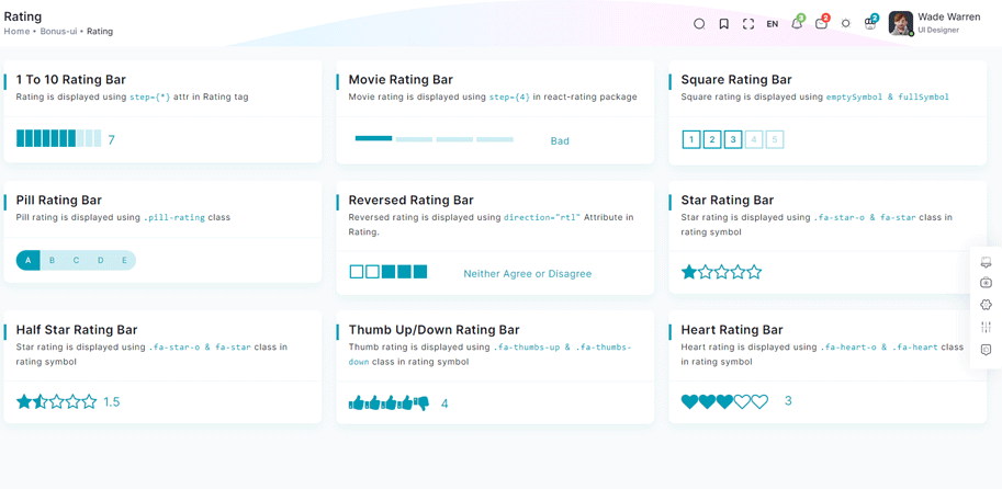
npm i react-ratingimport Rating from 'react-rating';
const OneToTenRatingBar = () => {
const [rating, setRating] = useState(7);
const handleRatingChange = (newRating: number) => {
setRating(newRating);
};
return (
<Card>
<CardBody>
<div className="rating-container">
<Rating start={0} stop={10} initialRating={rating} onChange={handleRatingChange} />
<p className="current-rating">Selected Rating: {rating}</P>
</Scrollbars>
</CardBody>
</Card>
)}
Remove package from project
npm remove react-ratingDropzone Offical link Preview link
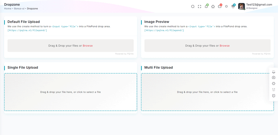
npm i react-dropzone<!-- Dropzone css -->
import RatioImage from "@/CommonComponents/RatioImage";
import React, { Fragment, useState } from "react";
import Dropzone from "react-dropzone";
const CommonFileUpload: React.FC<{ multiple?: boolean }> = ({ multiple }) => {
const [uploadedFiles, setUploadedFiles] = useState<File[]>([]);
const onDrop = (acceptedFiles: File[]) => {
setUploadedFiles((prevFiles) => [...prevFiles, ...acceptedFiles]);
};
const removeFile = (indexToRemove: number) => {
setUploadedFiles((prevFiles) => prevFiles.filter((_, index) => index !== indexToRemove));
};
return (
<Fragment>
{/* Dropzone visible only if no files are uploaded */}
{uploadedFiles.length === 0 ? (
<Dropzone onDrop={onDrop}>
{({ getRootProps, getInputProps }) => (
<div {...getRootProps()} className="dropzone-container">
<input {...getInputProps()} />
<p>Drag & drop your file here, or click to select a file</p>
</div>
)}
</Dropzone>
) : (
<Fragment>
{/* Dropzone for adding more files */}
{multiple && (
<Dropzone onDrop={onDrop}>
{({ getRootProps, getInputProps }) => (
<div {...getRootProps()} className="add-more-files-zone">
<input {...getInputProps()} />
<p>Click or drag more files to add</p>
</div>
)}
</Dropzone>
)}
{/* Display uploaded files */}
<div className="uploaded-files">
{uploadedFiles.map((file, index) => (
<div key={index} className="file-card">
{file.type.startsWith("image/") ? <RatioImage src={URL.createObjectURL(file)} alt={file.name} className="file-thumbnail" /> : <div className="file-placeholder">{file.name.split(".").pop()?.toUpperCase()} File</div>}
<p className="file-name">{file.name}</p>
<p className="file-size">{(file.size / 1024).toFixed(2)} KB</p>
<button onClick={() => removeFile(index)} className="remove-button" title="Remove file">
×
</button>
</div>
))}
</div>
</Fragment>
)}
</Fragment>
);
};
export default CommonFileUpload;
Remove package from project
npm remove react-dropzoneTour Offical link Preview link

npm i @sjmc11/tourguidejsimport { TourSteps } from "@/Data/BonusUi/Tour";
import { TourGuideClient } from "@sjmc11/tourguidejs";
import TourMain from "./TourMain";
import { useEffect, useRef, useState } from "react";
import { toast } from "react-toastify";
const TourContainer = () => {
const tourRef = useRef<any | null>(null);
const [isTourOpen, setIsTourOpen] = useState(false);
useEffect(() => {
try {
tourRef.current = new TourGuideClient({ steps: TourSteps });
} catch (error) {
toast.error("Error initializing TourGuideClient:" + error);
}
return () => tourRef.current?.destroy?.();
}, []);
useEffect(() => {
const timer = setTimeout(() => setIsTourOpen(true), 1000);
return () => clearTimeout(timer);
}, []);
useEffect(() => {
if (isTourOpen) tourRef.current?.start?.();
}, [isTourOpen]);
return (
<>
<TourMain />
</>
);
};
export default TourContainer;
Remove package from project
npm remove @sjmc11/tourguidejsSweetalert Offical link Preview link

npm i sweetalert2import SweetAlert from "sweetalert2";
const BasicExample = () => {
const displayAlert = () => {
SweetAlert.fire("Welcome! to the Yuri theme");
};
return (
<Card className="height-equal">
<CardBody className="btn-showcase">
<Button color="primary" className="sweet-1" onClick={displayAlert}>{ClickIt}</Button>
</CardBody>
</Card>
);
};
Remove package from project
npm remove sweetalert2Carousel Offical link Preview link

npm i swiperimport CommonCardHeader from "@/CommonComponents/CommonCardHeader";
import RatioImage from "@/CommonComponents/RatioImage";
import { ImagePath, SlideOnly } from "@/Constants";
import { SliesOnlyData, SliesOnlyDataList } from "@/Data/BonusUi/OwlCarousel";
import { Card, CardBody, Col } from "reactstrap";
import { Autoplay } from "swiper/modules";
import { Swiper, SwiperSlide } from "swiper/react";
const SlidesOnly = () => {
return (
<Col xl="6" xs="12">
<Card className="title-line">
<CommonCardHeader title={SlideOnly} subTitle={SliesOnlyData} />
<CardBody>
<Swiper modules={[Autoplay]} spaceBetween={10} slidesPerView={1} loop={true} autoplay={{ delay: 2000 }}>
{SliesOnlyDataList?.map((item, index) => (
<SwiperSlide key={index}>
<RatioImage className="d-block w-100" src={`${ImagePath}/${item.image}`} alt="drawing-room" />
</SwiperSlide>
))}
</Swiper>
</CardBody>
</Card>
</Col>
);
};
export default SlidesOnly;
Remove package from project
npm remove swiperRange slider Offical link Preview link

npm i react-rangeimport { Range, getTrackBackground } from "react-range";
export const DefaultRangeSliderForm = () => {
const [values, setValues] = useState([10]);
return (
<Form className="theme-form range-slider">
<FormGroup>
<Row className="py-1">
<Col md="12">
<div className="range-container">
<Range values={values} step={1} min={100} max={1000} onChange={(values) => setValues(values)} renderTrack={({ props, children }) => (
<div onMouseDown={props.onMouseDown} onTouchStart={props.onTouchStart} className="range-track">
<output className="range-output">0</output>
<div ref={props.ref} className="range-track-bar" style={{ background: getTrackBackground({ values: values, colors: ["#33BFBF", "#ccc"], min: 100, max: 1000 })}}>
{children}
</div>
<output className="range-output">20</output>
</div>
)}
renderThumb={({ props.isDragged }) => (
<div {...props} className="range-thumb">
<div className={`range-thumb-bar ${isDragged ? 'range-thumb-bar-dragged' : ''}`} />
</div>
)}
/>
<output id="output" className="range-output">{values[0]}</output>
</div>
</Col>
</Row>
</FormGroup>
</Form>
);
};
Remove package from project
npm remove react-rangeImage cropper Offical link Preview link

npm i react-image-crop<!--Image cropper css-->
import 'react-image-crop/dist/ReactCrop.css';
import ReactCrop, { centerCrop, makeAspectCrop, Crop, PixelCrop } from "react-image-crop";
export default function ImageCropperBody() {
const [imgSrc, setImgSrc] = useState("");
const previewCanvasRef = useRef<HTMLCanvasElement>(null);
const imgRef = useRef<HTMLImageElement>(null);
const [crop, setCrop] = useState<Crop>();
const [completedCrop, setCompletedCrop] = useState<PixelCrop>();
const [scale, setScale] = useState(1);
const [rotate, setRotate] = useState(0);
const [aspect, setAspect] = useState<number | undefined>(16 / 9);
const onSelectFile = (e: React.ChangeEvent<HTMLInputElement>) => {
if (e.target.files && e.target.files.length > 0) {
setCrop(undefined); // Makes crop preview update between images.
const reader = new FileReader();
reader.addEventListener("load", () => setImgSrc(reader.result?.toString() || ""));
reader.readAsDataURL(e.target.files[0]);
}
};
const centerAspectCrop = (mediaWidth: number, mediaHeight: number, aspect: number) => {
return centerCrop(makeAspectCrop({ unit: "%", width: 90 }, aspect, mediaWidth, mediaHeight), mediaWidth, mediaHeight);
};
const onImageLoad = (e: React.SyntheticEvent<HTMLImageElement>) => {
if (aspect) {
const { width, height } = e.currentTarget;
setCrop(centerAspectCrop(width, height, aspect));
}
};
useDebounceEffect( async () => {
if (completedCrop?.width && completedCrop?.height && imgRef.current && previewCanvasRef.current)
// We use canvasPreview as it's much faster than imgPreview.
canvasPreview(imgRef.current, previewCanvasRef.current, completedCrop, scale, rotate);
},
100, [completedCrop, scale, rotate]
);
return (
<div>
<Input type="file" accept="image/*" onChange={onSelectFile} />
<Label htmlFor="scale-input">{'Scale: '}</Label>
<Input
id="scale-input"
type="number"
step="0.1"
value={scale}
disabled={!imageSrc}
onChange={(e) => setScale(Number(e.target.value))}
/>
<Label htmlFor="rotate-input">{'Rotate: '}</Label>
<Input
id="rotate-input"
type="number"
value={rotate}
disabled={!imageSrc}
onChange={(e) =>
setRotate(Math.min(180, Math.max(-180, Number(e.target.value))))
}
/>
{!!imageSrc && (
<ReactCrop crop={crop} onChange={(_, percentCrop) => setCrop(percentCrop)} onComplete={(c) => setCompletedCrop(c)} aspect={aspect}>
<img ref={imageRef} alt="Crop me" src={imageSrc} onLoad={onImageLoad} className="crop-image" />
</ReactCrop>
)}
<div>
{!!completedCrop && (
<canvas
ref={previewCanvasRef}
className="preview-canvas"
style={{ width: completedCrop.width, height: completedCrop.height, }}
/>
)}
</div>
</div>
);
};
Remove package from project
npm remove react-image-cropIcons
Flag Icons Offical link Preview link
You have to add the following style and add flag-icon folder in your fonts folder
<!-- flag icon css -->
import "~flag-icons/css/flag-icons.min.css"
<!-- some icon display for demo -->
<i className="flag-icon flag-icon-in mx-1"></i>
<i className="flag-icon flag-icon-ad mx-1"></i>
<i className="flag-icon flag-icon-ae mx-1"></i>
<i className="flag-icon flag-icon-af mx-1"></i>
Font awesome Offical link Preview link
You have to add the following style and add font-awesome folder in your fonts folder
<!-- font awesome css -->
import "font-awesome/scss/font-awesome.scss"
<!-- some icon display for demo -->
<i className="fa fa-bluetooth mx-1"></i>
<i className="fa fa-bitcoin mx-1"></i>
<i className="fa fa-anchor mx-1"></i>
<i className="fa fa-text-height mx-1"></i>
Ico icon Offical link Preview link
You have to add the following style and add ico folder in your fonts folder
<!-- ico icon css -->
import "/public/assets/scss/icoicon/_icons.scss"
<!-- some icon display for demo -->
<i className="icofont icofont-bow mx-1"></i>
<i className="icofont icofont-animal-dolphin mx-1"></i>
<i className="icofont icofont-brand-apple mx-1"></i>
<i className="icofont icofont-bank-alt mx-1"></i>
Themify Offical link Preview link
You have to add the following style and add themify folder in your fonts folder
<!-- themify icon css -->
import "./themify.scss";
<!-- some icon display for demo -->
<i className="icon-fullscreen mx-1"></i>
<i className="icon-save-alt mx-1"></i>
<i className="icon-volume mx-1"></i>
<i className="icon-instagram mx-1"></i>
Feather icon Offical link Preview link
You have to add the following style and add feather folder in your fonts folder
npm i react-feather<!-- some icon display for demo -->
import { Heart, Camera } from "react-feather";
<Heart color="red" size={48}/>
<Camera color="green" size={28}/>
<Search size={38}/>
Remove package from project
npm remove react-featherCards
Basic cards Preview link
Basic Card
Lorem Ipsum is simply dummy text of the printing and typesetting industry. Lorem Ipsum has been the industry's standard dummy text ever since the 1500s, when an unknown printer took a galley of type and scrambled. Lorem Ipsum is simply dummy text of the printing and typesetting industry. Lorem Ipsum has been the industry's standard dummy text ever since the 1500s, when an unknown printer took a galley of type and scrambled.
import { Card, CardHeader, CardBody } from "reactstrap"

<Card>
    <CardHeader>
        <h5>Basic Card</h5>
    </CardHeader>
    <CardBody>
        <p className="mb-0"> Lorem Ipsum is simply dummy text of the printing and typesetting industry. Lorem Ipsum has been the industry's standard dummy text ever since the 1500s, when an unknown printer took a galley of type and scrambled. Lorem Ipsum is simply dummy text of the printing and typesetting industry. Lorem Ipsum has been the industry's standard dummy text ever since the 1500s, when an unknown printer took a galley of type and scrambled. </p>
    </CardBody>
</Card>
Theme card Preview link
Basic Card
Lorem Ipsum is simply dummy text of the printing and typesetting industry. Lorem Ipsum has been the industry's standard dummy text ever since the 1500s, when an unknown printer took a galley of type and scrambled. Lorem Ipsum is simply dummy text of the printing and typesetting industry. Lorem Ipsum has been the industry's standard dummy text ever since the 1500s, when an unknown printer took a galley of type and scrambled.
import { Card, CardHeader, CardBody } from "reactstrap"

<Card>
  <CardHeader class="b-l-primary">
    <h5>Basic Card</h5>
  </CardHeader>
  <CardBody>
    <p class="mb-0"> Lorem Ipsum is simply dummy text of the printing and typesetting industry. Lorem Ipsum has been the industry's standard dummy text ever since the 1500s, when an unknown printer took a galley of type and scrambled. Lorem Ipsum is simply dummy text of the printing and typesetting industry. Lorem Ipsum has been the industry's standard dummy text ever since the 1500s, when an unknown printer took a galley of type and scrambled. </p>
  </CardBody>
</Card>
Charts
Google charts Offical link Preview link
npm i react-google-chartsimport { Chart } from "react-google-charts";
const BAR_ONE_CHART_DATA = [
[
"Element",
"Density",
{
role: "style",
},
{
sourceColumn: 0,
role: "annotation",
type: "string",
calc: "stringify",
},
],
["Copper", 10, "#a927f9", 10],
["Silver", 12, "#f8d62b", 12],
["Gold", 14, "#f73164", 14],
["Platinum", 16, "color: #7366ff", 14],
];
const BAR_ONE_CHART_OPTION: any = {
title: "Density of Precious Metals, in g/cm^3",
width: "100%",
height: 400,
bar: {
groupWidth: "95%",
},
legend: {
position: "none",
},
};
const BarChart = () => {
return (
<Card>
<CardBody className="chart-block">
<div className="chart-overflow" id="bar-chart2">
<Chart chartType="BarChart" width="100%" height="400px" data={BAR_ONE_CHART_DATA} options={BAR_ONE_CHART_OPTION} />
</div>
</CardBody>
</Card>
);
};Remove package from project
npm remove react-google-chartsChartjs charts Offical link Preview link
npm i react-chartjs-2import { Radar } from "react-chartjs-2";
const RADAR_GRAPH_CHART = {
labels: ["Ford", "Chevy", "Toyota", "Honda", "Mazda"],
datasets: [
{
label: "My First Dataset",
data: [12, 3, 5, 18, 7],
fill: true,
backgroundColor: "rgba(115, 102 ,255, 0.4)",
borderColor: primary,
borderWidth: 1,
pointColor: primary,
},
],
options: {
responsive: true,
maintainAspectRatio: false,
elements: {
line: {
borderWidth: 2,
},
},
plugins: {
datalabels: {
display: false,
},
legend: {
display: false,
},
},
},
};
const RadarGraph = () => {
return (
<Card>
<CardBody className="chart-block">
<Radar id="myRadarGraph" data={RADAR_GRAPH_CHART} options={RADAR_GRAPH_CHART.options} width={778} height={400} />
</CardBody>
</Card>
);
};Remove package from project
npm remove react-chartjs-2Apex charts Offical link Preview link
npm i react-apexchartsimport Chart from 'react-apexcharts';
const BasicAreaChart = () => {
const BASIC_AREA_CHART: ApexOptions = {
chart: {
height: 350,
type: "area",
zoom: {
enabled: false,
},
toolbar: {
show: false,
},
},
dataLabels: {
enabled: false,
},
stroke: {
curve: "straight",
},
series: [
{
name: "STOCK ABC",
data: series.monthDataSeries1.prices,
},
],
title: {
text: "Fundamental Analysis of Stocks",
align: "left",
},
subtitle: {
text: "Price Movements",
align: "left",
},
labels: series.monthDataSeries1.dates,
xaxis: {
type: "datetime",
},
yaxis: {
opposite: true,
},
legend: {
horizontalAlign: "left",
},
colors: [primary],
};
return (
<Card>
<CardBody>
<div id="basic-apex">
<Chart options={BASIC_AREA_CHART} series={BASIC_AREA_CHART.series} type="area" height={350} />
</div>
</CardBody>
</Card>
);
};
Remove package from project
npm remove react-apexchartsMaps
Google Maps Offical link Preview link
npm i @react-google-maps/apiimport { GoogleMap, useJsApiLoader } from "@react-google-maps/api";
const BasicMap = () => {
const BasicContainerStyle = {
height: "500px",
};
const BasicCenter = {
lat: -3.745,
lng: -38.523,
};
const { isLoaded } = useJsApiLoader({
id: "google-map-script",
googleMapsApiKey: "https://maps.googleapis.com/maps/api/js?key=AIzaSyAjeJEPREBQFvAIqDSZliF0WjQrCld-Mh0",
});
return (
<Card>
<CardBody>
<div className="map-js-height">
<div id="gmap-simple" className="map-block">
{isLoaded ? <GoogleMap mapContainerStyle={BasicContainerStyle} center={BasicCenter} zoom={10} /> : "Loading"}
</div>
</div>
</CardBody>
</Card>
);
};Remove package from project
npm remove @react-google-maps/apiLeaflet Map Offical link Preview link
npm i react-leafletimport { MapContainer, TileLayer } from "react-leaflet";
const WorldMap = () => {
const USA_POSITION = { lat: 50, lng: 10 };
return (
<Card>
<CardBody>
<MapContainer style={{ height: 389 }} easeLinearity={0.35} attributionControl={true} center={USA_POSITION} zoom={13} scrollWheelZoom={true} className="z-0 jvector-map-height">
<TileLayer url="https://{s}.tile.openstreetmap.org/{z}/{x}/{y}.png" />
</MapContainer>
</CardBody>
</Card>
);
};Remove package from project
npm remove react-leafletEditors
Ace code Offical link Preview link

npm i prism-react-rendererimport { Card, CardBody, Col } from "reactstrap";
import { Highlight, themes } from "prism-react-renderer";
import { CSSModeHeading } from "@/Constants";
import CommonCardHeader from "@/CommonComponents/CommonCardHeader";
import { CssData } from "@/Data/Miscellaneous/Editors";
const CssMode = () => {
return (
<Col xl="6">
<Card>
<CommonCardHeader title={CSSModeHeading} />
<CardBody>
<Highlight theme={themes.vsDark} code={CssData} language="css">
{({ style, tokens, getLineProps, getTokenProps }) => (
<pre style={style}>
{tokens.map((line, i) => (
<div key={i} {...getLineProps({ line })}>
{line.map((token, key) => (
<span key={key} {...getTokenProps({ token })} />
))}
</div>
))}
</pre>
)}
</Highlight>
</CardBody>
</Card>
</Col>
);
};
export default CssMode;
Remove package from project
npm remove prism-react-rendererCK Editor Offical link Preview link
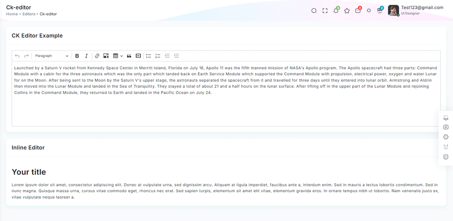
npm i @ckeditor/ckeditor5-reactnpm i @ckeditor/ckeditor5-build-classicimport { CKEditorExample } from "@/Constants";
import { Card, CardBody, Col } from "reactstrap";
import ClassicEditor from '@ckeditor/ckeditor5-build-classic';
import { CKEditor } from '@ckeditor/ckeditor5-react';
import CommonCardHeader from "@/CommonComponents/CommonCardHeader";
const Editor = () => {
const content = `Launched by a Saturn V rocket from Kennedy Space Center in Merritt Island, Florida on July 16, Apollo 11 was the fifth manned mission of NASA's Apollo program. The Apollo spacecraft had three parts: Command Module with a cabin for the three astronauts which was the only part which landed back on Earth Service Module which supported the Command Module with propulsion, electrical power, oxygen and water Lunar for on the Moon. After being sent to the Moon by the Saturn V's upper stage, the astronauts separated the spacecraft from it and travelled for three days until they entered into lunar orbit. Armstrong and Aldrin then moved into the Lunar Module and landed in the Sea of Tranquility. They stayed a total of about 21 and a half hours on the lunar surface. After lifting off in the upper part of the Lunar Module and rejoining Collins in the Command Module, they returned to Earth and landed in the Pacific Ocean on July 24.
`
return (
<Col sm="12">
<Card>
<CommonCardHeader title={CKEditorExample} />
<CardBody>
<CKEditor editor={ClassicEditor} data={content} />
</CardBody>
</Card>
</Col>
);
};
export default Editor;Remove package from project
npm remove @ckeditor/ckeditor5-reactnpm remove @ckeditor/ckeditor5-build-classic