
Component
Basic UI Elements
Buttons Preview link
import { Btn } from "./AbstractElements";
<Btn color="primary">Primary Button</Btn>
<Btn color="secondary">Secondary Button</Btn>
<Btn color="success">Success Button</Btn>
<Btn color="info">Info Button</Btn>
<Btn color="warning">Warning Button</Btn>
<Btn color="danger">Danger Button</Btn>
<Btn color="light">Light Button</Btn>
Tag & pills Preview link
import { Badges } from "./AbstractElements";
<Badges color="primary">Primary</Badges>
<Badges color="secondary">Secondary</Badges>
<Badges color="success">Success</Badges>
<Badges color="info">Info</Badges>
<Badges color="warning text-dark">Warning</Badges>
<Badges color="danger">Danger</Badges>
<Badges color="light text-dark">Light</Badges>
<Badges color="dark tag-pills-sm-mb">Dark</Badges>
Progressbar Preview link
import { ProgressBar } from './AbstractElements'
<ProgressBar value={0}/>
<ProgressBar color="primary" value={25}/>
<ProgressBar color="secondary" value={50}/>
<ProgressBar color="success" value={75}/>
<ProgressBar color="info" value={100}/>
Alert Preview link
import { Alerts } from './AbstractElements'
<Alerts color="primary">This is a primary alert—check it out!</Alerts>
<Alerts color="secondary">This is a secondary alert—check it out!</Alerts>
<Alerts color="success">This is a success alert—check it out!</Alerts>
<Alerts color="info">This is a info alert—check it out!</Alerts>
<Alerts color="warning">This is a warning alert—check it out!</Alerts>
<Alerts color="danger">This is a danger alert—check it out!</Alerts>
<Alerts color="light">This is a light alert—check it out!</Alerts>
<Alerts color="dark">This is a dark alert—check it out!</Alerts>
Popover Preview link
import { Btn } from './AbstractElements'
import { Popover, PopoverBody, PopoverHeader } from "reactstrap";

const [basicPopover, setBasicPopover] = useState(false);
const basicToggle = () => setBasicPopover(!basicPopover);

<Btn id="Popover-1" color="primary" className="example-popover mr-1" onClick={basicToggle}>Click to toggle popover</Btn>
<Popover placement="left" isOpen={basicToggle} target="Popover-1" toggle={basicToggle}>
    <PopoverHeader> Basic Popover </PopoverHeader>
    <PopoverBody> If the package restore doesn't help, you can look at the Output window in the Visual Studio.</PopoverBody>
</Popover>
Tooltip Preview link
import { Btn, ToolTip } from './AbstractElements'

const [basictooltip, setbasictooltip] = useState(false);
const toggle = () => setbasictooltip(!basictooltip);

<Btn color="primary" className="example-popover" id="Tooltip-1">Hover Me</Btn>
<ToolTip target="Tooltip-1" placement="top" isOpen={basictooltip} toggle={toggle}>tooltip</ToolTip>
Dropdown Preview link
import { Dropdown, DropdownItem, DropdownMenu, DropdownToggle } from "reactstrap";

const [open, setOpen] = useState(false);
const toggle = () => setOpen(!open);

<div className="dropdown-basic">
    <Dropdown isOpen={open} toggle={toggle}>
    <DropdownToggle caret color="primary"/>
    <DropdownMenu className="dropdown-content">
        <DropdownItem href="#javascript">Action</DropdownItem>
        <DropdownItem href="#javascript">Another Action</DropdownItem>
        <DropdownItem href="#javascript">Something Else Here</DropdownItem>
    </DropdownMenu>
    </div>
</div>
Tab Preview link
Lorem Ipsum is simply dummy text of the printing and typesetting industry. Lorem Ipsum has been the industry's standard dummy text ever since the 1500s, when an unknown printer took a galley of type and scrambled it to make a type specimen book. It has survived not only five centuries, but also the leap into electronic typesetting,remaining essentially unchanged. It was popularised in the 1960s with the release of Letraset sheets containing Lorem Ipsum passages,and more recently with desktop publishing software like Aldus PageMaker including versions of Lorem Ipsum
Lorem Ipsum is simply dummy text of the printing and typesetting industry. Lorem Ipsum has been the industry's standard dummy text ever since the 1500s, when an unknown printer took a galley of type and scrambled it to make a type specimen book. It has survived not only five centuries, but also the leap into electronic typesetting, remaining essentially unchanged. It was popularised in the 1960s with the release of Letraset sheets containing Lorem Ipsum passages, and more recently with desktop publishing software like Aldus PageMaker including versions of Lorem Ipsum
Lorem Ipsum is simply dummy text of the printing and typesetting industry. Lorem Ipsum has been the industry's standard dummy text ever since the 1500s, when an unknown printer took a galley of type and scrambled it to make a type specimen book. It has survived not only five centuries, but also the leap into electronic typesetting,remaining essentially unchanged. It was popularised in the 1960s with the release of Letraset sheets containing Lorem Ipsum passages,and more recently with desktop publishing software like Aldus PageMaker including versions of Lorem Ipsum
import { Nav, NavItem, NavLink, TabContent, TabPane } from "reactstrap";
const [basicTab, setBasicTab] = useState("1");

<Nav tabs>
    <NavItem>
    <NavLink className={`txt-primary ${basicTab === "1" ? "active" : ""}`} onClick={() => setBasicTab("1")}>Home</NavLink>
    </NavItem>
    <NavItem>
    <NavLink className={`txt-primary ${basicTab === "2" ? "active" : ""}`} onClick={() => setBasicTab("2")}>Profile</NavLink>
    </NavItem>
    <NavItem>
    <NavLink className={`txt-primary ${basicTab === "3" ? "active" : ""}`} onClick={() => setBasicTab("3")}>Contact</NavLink>
    </NavItem>
</Nav>
<TabContent activeTab={basicTab}>
    <TabPane tabId="1">
    <P>Home</P>
    <TabPane/>
    <TabPane tabId="2">
    <P>Profile</P>
    <TabPane/>
    <TabPane tabId="3">
    <P>Contact</P>
    <TabPane/>
</TabContent>
Accordion Preview link
import { Accordion, AccordionBody, AccordionHeader, AccordionItem } from "reactstrap";

const [open, setOpen] = useState("1");
const toggle = (id: string) => (open === id ? setOpen('') : setOpen(id));

<Accordion open={open} toggle={toggle} class="default-according">
    <AccordionItem>
    <AccordionHeader>
        <span className="text-primary">Accordian Item-1
        <ChevronDown className="svg-color text-primary"/>
        </span>
    </AccordionHeader>
    <AccordionBody accordionId="1">
        <P>Anim pariatur cliche reprehenderit, enim eiusmod high life accusamus terry richardson ad squid.</P>
    </AccordionBody>
    </AccordionItem>
    <AccordionItem>
    <AccordionHeader>
    <span className="text-primary">Accordian Item-2
        <ChevronDown className="svg-color text-primary"/>
    </span>
    </AccordionHeader>
    <AccordionBody accordionId="2">
    <P>Anim pariatur cliche reprehenderit, enim eiusmod high life accusamus terry richardson ad squid.</P>
    </AccordionBody>
    </AccordionItem>
    <AccordionItem>
    <AccordionHeader>
    <span className="text-primary">Accordian Item-3
        <ChevronDown className="svg-color text-primary"/>
    </span>
    </AccordionHeader>
    <AccordionBody accordionId="3">
    <P>Anim pariatur cliche reprehenderit, enim eiusmod high life accusamus terry richardson ad squid.</P>
    </AccordionBody>
    </AccordionItem>
</Accordion>
Advance UI Element
Scrollable Offical link Preview link

npm i react-perfect-scrollbarimport ScrollBar from "react-perfect-scrollbar";
const CustomScrollbar = () => {
return (
<Card>
<CardBody>
<ScrollBar style={{ width: "100%", height: "300px" }} className="scroll-demo">
<H5>Custom Scrollbar</H5>
<P>Custom Scrollbar</P>
</ScrollBar>
</CardBody>
</Card>
)}
Remove package from project
npm remove react-perfect-scrollbarTree Offical link Preview link

npm i @progress/kendo-react-treeviewimport { handleTreeViewCheckChange, processTreeViewItems, TreeView, TreeViewCheckDescriptor, TreeViewExpandChangeEvent } from "@progress/kendo-react-treeview";
import { useState } from "react";
import { Card, CardBody, Col } from "reactstrap";
import { basicTreeSubTitle, SimpleTreeviewData } from "../../../../Data/BonusUi/TreeView";
import CommonCardHeader from "../../../../Utils/CommonComponents/CommonCardHeader";
import { BasicTreeTitle } from "../../../../Utils/Constants";
export default function BasicTree() {
const checkField = "checked";
interface TreeState {
check: TreeViewCheckDescriptor;
items: typeof SimpleTreeviewData;
}
const [treeState, setTreeState] = useState<TreeState>({
check: { idField: "text", applyCheckIndeterminate: true, ids: [] },
items: SimpleTreeviewData,
});
const onCheckChange = (event: any) => {
const settings = { checkChildren: true, checkParents: true };
const newCheck = handleTreeViewCheckChange(event, treeState.check, treeState.items, settings) as TreeViewCheckDescriptor;
setTreeState((prevState) => ({
...prevState,
check: { ...prevState.check, ...newCheck },
}));
};
const onExpandChange = (event: TreeViewExpandChangeEvent) => {
event.item.expanded = !event.item.expanded;
setTreeState((prevState) => ({
...prevState,
items: [...prevState.items],
}));
};
return (
<Col md={6}>
<Card className="title-line">
<CommonCardHeader title={BasicTreeTitle} subTitle={basicTreeSubTitle} />
<CardBody>
<TreeView
data={processTreeViewItems(treeState.items, {
check: treeState.check,
})}
checkField={checkField}
checkboxes={true}
onCheckChange={onCheckChange}
expandIcons={true}
onExpandChange={onExpandChange}
/>
</CardBody>
</Card>
</Col>
);
}Remove package from project
npm remove @progress/kendo-react-treeviewToaster Offical link Preview link

import { Toast, ToastBody,ToastHeader } from "reactstrap";

const TopRightToast = () => {
  const [open, setOpen] = useState(false);
  const toggle = () => {
    setOpen(true);
    setTimeout(() => {
      setOpen(false);
    }, 3000);
  };

 return (
   <>
      <Btn color="primary" onClick={toggle}>{TopRightToasts}</Btn>
      <div className="toast-container position-fixed top-0 end-0 p-3 toast-index toast-rtl">
        <Toast fade isOpen={open}>
          <ToastHeader className="toast-img" toggle={toggle}>
            <strong className="me-auto">Dunzo theme</strong>
            <small>5 min ago</small>
          </ToastHeader>
          <ToastBody className="toast-dark">Hello, I'm a web-designer.</ToastBody>
        </Toast>
      </div>
    </>
)}
Rating Offical link Preview link
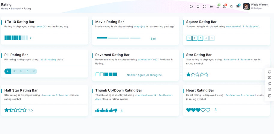
npm i react-ratingimport Rating from 'react-rating';
const OneToTenRatingBar = () => {
const [rating, setRating] = useState(7);
const handleRatingChange = (newRating: number) => {
setRating(newRating);
};
return (
<Card>
<CardBody>
<div className="rating-container">
<Rating start={0} stop={10} initialRating={rating} onChange={handleRatingChange} />
<P className="current-rating">Selected Rating: {rating}</P>
</Scrollbars>
</CardBody>
</Card>
)}
Remove package from project
npm remove react-ratingDropzone Offical link Preview link
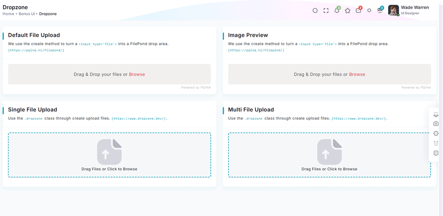
npm i react-dropzoneimport { FC, Fragment, useState } from "react";
import Dropzone from "react-dropzone";
import SvgIcon from "./CommonIcons/CommonSvgIcons";
import { H5, P } from "../../AbstractElements";
const CommonFileUpload: FC<{ multiple?: boolean }> = ({ multiple }) => {
const [uploadedFiles, setUploadedFiles] = useState<File[]>([]);
const onDrop = (acceptedFiles: File[]) => setUploadedFiles((prevFiles) => [...prevFiles, ...acceptedFiles]);
const removeFile = (indexToRemove: number) => setUploadedFiles((prevFiles) => prevFiles.filter((_, index) => index !== indexToRemove));
return (
<Fragment>
{uploadedFiles.length === 0 ? (
<Dropzone onDrop={onDrop}>
{({ getRootProps, getInputProps }) => (
<div {...getRootProps()} className="dropzone-container">
<input {...getInputProps()} />
<div className="dz-message needsclick">
<SvgIcon iconId="file-upload1" />
<H5>Drag Files or Click to Browse</H5>
</div>
</div>
)}
</Dropzone>
) : (
<Fragment>
{multiple && (
<Dropzone onDrop={onDrop}>
{({ getRootProps, getInputProps }) => (
<div {...getRootProps()} className="add-more-files-zone">
<input {...getInputProps()} />
<P>Click or drag more files to add</P>
</div>
)}
</Dropzone>
)}
<div className="uploaded-files">
{uploadedFiles.map((file, index) => (
<div key={index} className="file-card">
{file.type.startsWith("image/") ? <img src={URL.createObjectURL(file)} alt={file.name} className="file-thumbnail" /> : <div className="file-placeholder">{file.name.split(".").pop()?.toUpperCase()} File</div>}
<P className="file-name">{file.name}</P>
<P className="file-size">{(file.size / 1024).toFixed(2)} KB</P>
<button onClick={() => removeFile(index)} className="remove-button" title="Remove file">
×
</button>
</div>
))}
</div>
</Fragment>
)}
</Fragment>
);
};
export default CommonFileUpload;Remove package from project
npm remove react-dropzoneTour Offical link Preview link
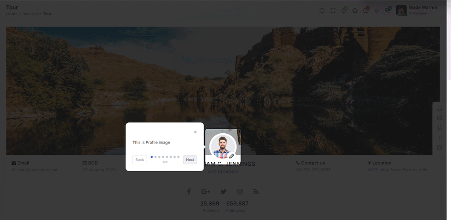
npm i @sjmc11/tourguidejsimport { TourGuideClient } from "@sjmc11/tourguidejs";
import { useEffect, useRef, useState } from "react";
import { toast } from "react-toastify";
import { Container, Row } from "reactstrap";
import { toursteps } from "../../../Data/BonusUi/Tour";
import TourMain from "./TourMain";
export default function TourContainer() {
const tourRef = useRef<any | null>(null);
const [isTourOpen, setIsTourOpen] = useState(false);
useEffect(() => {
try {
tourRef.current = new TourGuideClient({ steps: toursteps });
} catch (error) {
toast.error("Error initializing TourGuideClient:" + error);
}
return () => tourRef.current?.destroy?.();
}, []);
useEffect(() => {
const timer = setTimeout(() => setIsTourOpen(true), 1000);
return () => clearTimeout(timer);
}, []);
useEffect(() => {
if (isTourOpen) tourRef.current?.start?.();
}, [isTourOpen]);
return (
<Container fluid>
<div className="user-profile">
<Row>
<TourMain />
</Row>
</div>
</Container>
);
}Remove package from project
npm remove @sjmc11/tourguidejsSweetalert Offical link Preview link

npm i sweetalert2import SweetAlert from "sweetalert2";
const BasicExample = () => {
const displayAlert = () => {
SweetAlert.fire("Welcome! to the Yuri theme");
};
return (
<Card className="height-equal">
<CardBody className="btn-showcase">
<Btn color="primary" className="sweet-1" type="button" onClick={displayAlert}>{ClickIt}</Btn>
</CardBody>
</Card>
);
};
Remove package from project
npm remove sweetalert2Range slider Offical link Preview link

npm i react-rangeimport { Range, getTrackBackground } from "react-range";
export const DefaultRangeSliderForm = () => {
const [values, setValues] = useState([10]);
return (
<Form className="theme-form range-slider">
<FormGroup>
<Row className="py-1">
<Col md="12">
<div className="range-container">
<Range values={values} step={1} min={100} max={1000} onChange={(values) => setValues(values)} renderTrack={({ props, children }) => (
<div onMouseDown={props.onMouseDown} onTouchStart={props.onTouchStart} className="range-track">
<output className="range-output">0</output>
<div ref={props.ref} className="range-track-bar" style={{ background: getTrackBackground({ values: values, colors: ["#33BFBF", "#ccc"], min: 100, max: 1000 })}}>
{children}
</div>
<output className="range-output">20</output>
</div>
)}
renderThumb={({ props.isDragged }) => (
<div {...props} className="range-thumb">
<div className={`range-thumb-bar ${isDragged ? 'range-thumb-bar-dragged' : ''}`} />
</div>
)}
/>
<output id="output" className="range-output">{values[0]}</output>
</div>
</Col>
</Row>
</FormGroup>
</Form>
);
};
Remove package from project
npm remove react-rangeImage cropper Offical link Preview link

npm i react-image-crop<!--Image cropper css-->
import 'react-image-crop/dist/ReactCrop.css';
import ReactCrop, { centerCrop, makeAspectCrop, Crop, PixelCrop } from "react-image-crop";
export default function ImageCropperBody() {
const [imgSrc, setImgSrc] = useState("");
const previewCanvasRef = useRef<HTMLCanvasElement>(null);
const imgRef = useRef<HTMLImageElement>(null);
const [crop, setCrop] = useState<Crop>();
const [completedCrop, setCompletedCrop] = useState<PixelCrop>();
const [scale, setScale] = useState(1);
const [rotate, setRotate] = useState(0);
const [aspect, setAspect] = useState<number | undefined>(16 / 9);
const onSelectFile = (e: React.ChangeEvent<HTMLInputElement>) => {
if (e.target.files && e.target.files.length > 0) {
setCrop(undefined); // Makes crop preview update between images.
const reader = new FileReader();
reader.addEventListener("load", () => setImgSrc(reader.result?.toString() || ""));
reader.readAsDataURL(e.target.files[0]);
}
};
const centerAspectCrop = (mediaWidth: number, mediaHeight: number, aspect: number) => {
return centerCrop(makeAspectCrop({ unit: "%", width: 90 }, aspect, mediaWidth, mediaHeight), mediaWidth, mediaHeight);
};
const onImageLoad = (e: React.SyntheticEvent<HTMLImageElement>) => {
if (aspect) {
const { width, height } = e.currentTarget;
setCrop(centerAspectCrop(width, height, aspect));
}
};
useDebounceEffect( async () => {
if (completedCrop?.width && completedCrop?.height && imgRef.current && previewCanvasRef.current)
// We use canvasPreview as it's much faster than imgPreview.
canvasPreview(imgRef.current, previewCanvasRef.current, completedCrop, scale, rotate);
},
100, [completedCrop, scale, rotate]
);
return (
<div>
<Input type="file" accept="image/*" onChange={onSelectFile} />
<Label htmlFor="scale-input">{'Scale: '}</Label>
<Input
id="scale-input"
type="number"
step="0.1"
value={scale}
disabled={!imageSrc}
onChange={(e) => setScale(Number(e.target.value))}
/>
<Label htmlFor="rotate-input">{'Rotate: '}</Label>
<Input
id="rotate-input"
type="number"
value={rotate}
disabled={!imageSrc}
onChange={(e) =>
setRotate(Math.min(180, Math.max(-180, Number(e.target.value))))
}
/>
{!!imageSrc && (
<ReactCrop crop={crop} onChange={(_, percentCrop) => setCrop(percentCrop)} onComplete={(c) => setCompletedCrop(c)} aspect={aspect}>
<img ref={imageRef} alt="Crop me" src={imageSrc} onLoad={onImageLoad} className="crop-image" />
</ReactCrop>
)}
<div>
{!!completedCrop && (
<canvas
ref={previewCanvasRef}
className="preview-canvas"
style={{ width: completedCrop.width, height: completedCrop.height, }}
/>
)}
</div>
</div>
);
};
Remove package from project
npm remove react-image-cropIcons
Flag Icons Offical link Preview link
You have to add the following style and add flag-icon folder in your fonts folder
<!-- flag icon css -->
import "~flag-icons/css/flag-icons.min.css"
<!-- some icon display for demo -->
<i className="flag-icon flag-icon-in mx-1"></i>
<i className="flag-icon flag-icon-ad mx-1"></i>
<i className="flag-icon flag-icon-ae mx-1"></i>
<i className="flag-icon flag-icon-af mx-1"></i>
Font awesome Offical link Preview link
You have to add the following style and add font-awesome folder in your fonts folder
<!-- font awesome css -->
import "font-awesome/scss/font-awesome.scss"
<!-- some icon display for demo -->
<i className="fa fa-bluetooth mx-1"></i>
<i className="fa fa-bitcoin mx-1"></i>
<i className="fa fa-anchor mx-1"></i>
<i className="fa fa-text-height mx-1"></i>
Ico icon Offical link Preview link
You have to add the following style and add ico folder in your fonts folder
<!-- ico icon css -->
import "/public/assets/scss/icoicon/_icons.scss"
<!-- some icon display for demo -->
<i className="icofont icofont-bow mx-1"></i>
<i className="icofont icofont-animal-dolphin mx-1"></i>
<i className="icofont icofont-brand-apple mx-1"></i>
<i className="icofont icofont-bank-alt mx-1"></i>
Themify Offical link Preview link
You have to add the following style and add themify folder in your fonts folder
<!-- themify icon css -->
import "../public/assets/scss/themify.scss"
<!-- some icon display for demo -->
<i className="icon-fullscreen mx-1"></i>
<i className="icon-save-alt mx-1"></i>
<i className="icon-volume mx-1"></i>
<i className="icon-instagram mx-1"></i>
Feather icon Offical link Preview link
You have to add the following style and add feather folder in your fonts folder
npm i react-feather<!-- some icon display for demo -->
import { Heart, Camera } from "react-feather";
<Heart color="red" size={48}/>
<Camera color="green" size={28}/>
<Search size={38}/>
Remove package from project
npm remove react-featherCards
Basic cards Preview link
Basic Card
Lorem Ipsum is simply dummy text of the printing and typesetting industry. Lorem Ipsum has been the industry's standard dummy text ever since the 1500s, when an unknown printer took a galley of type and scrambled. Lorem Ipsum is simply dummy text of the printing and typesetting industry. Lorem Ipsum has been the industry's standard dummy text ever since the 1500s, when an unknown printer took a galley of type and scrambled.
import { Card, CardHeader, CardBody } from "reactstrap"

<Card>
    <CardHeader>
        <H5>Basic Card</H5>
    </CardHeader>
    <CardBody>
        <P className="mb-0"> Lorem Ipsum is simply dummy text of the printing and typesetting industry. Lorem Ipsum has been the industry's standard dummy text ever since the 1500s, when an unknown printer took a galley of type and scrambled. Lorem Ipsum is simply dummy text of the printing and typesetting industry. Lorem Ipsum has been the industry's standard dummy text ever since the 1500s, when an unknown printer took a galley of type and scrambled. </P>
    </CardBody>
</Card>
Theme card Preview link
Basic Card
Lorem Ipsum is simply dummy text of the printing and typesetting industry. Lorem Ipsum has been the industry's standard dummy text ever since the 1500s, when an unknown printer took a galley of type and scrambled. Lorem Ipsum is simply dummy text of the printing and typesetting industry. Lorem Ipsum has been the industry's standard dummy text ever since the 1500s, when an unknown printer took a galley of type and scrambled.
import { Card, CardHeader, CardBody } from "reactstrap"

<Card>
    <CardHeader class="b-l-primary">
    <H5>Basic Card</H5>
    </CardHeader>
    <CardBody>
    <P class="mb-0"> Lorem Ipsum is simply dummy text of the printing and typesetting industry. Lorem Ipsum has been the industry's standard dummy text ever since the 1500s, when an unknown printer took a galley of type and scrambled. Lorem Ipsum is simply dummy text of the printing and typesetting industry. Lorem Ipsum has been the industry's standard dummy text ever since the 1500s, when an unknown printer took a galley of type and scrambled. </P>
    </CardBody>
</Card>
Charts
Google charts Offical link Preview link
npm i react-google-chartsimport { Chart } from "react-google-charts";
const BAR_ONE_CHART_DATA = [
[
"Element",
"Density",
{
role: "style",
},
{
sourceColumn: 0,
role: "annotation",
type: "string",
calc: "stringify",
},
],
["Copper", 10, "#a927f9", 10],
["Silver", 12, "#f8d62b", 12],
["Gold", 14, "#f73164", 14],
["Platinum", 16, "color: #7366ff", 14],
];
const BAR_ONE_CHART_OPTION: any = {
title: "Density of Precious Metals, in g/cm^3",
width: "100%",
height: 400,
bar: {
groupWidth: "95%",
},
legend: {
position: "none",
},
};
const BarChart = () => {
return (
<Card>
<CardBody className="chart-block">
<div className="chart-overflow" id="bar-chart2">
<Chart chartType="BarChart" width="100%" height="400px" data={BAR_ONE_CHART_DATA} options={BAR_ONE_CHART_OPTION} />
</div>
</CardBody>
</Card>
);
};Remove package from project
npm remove react-google-chartsChartjs charts Offical link Preview link
npm i react-chartjs-2import { Radar } from "react-chartjs-2";
const RADAR_GRAPH_CHART = {
labels: ["Ford", "Chevy", "Toyota", "Honda", "Mazda"],
datasets: [
{
label: "My First Dataset",
data: [12, 3, 5, 18, 7],
fill: true,
backgroundColor: "rgba(115, 102 ,255, 0.4)",
borderColor: primary,
borderWidth: 1,
pointColor: primary,
},
],
options: {
responsive: true,
maintainAspectRatio: false,
elements: {
line: {
borderWidth: 2,
},
},
plugins: {
datalabels: {
display: false,
},
legend: {
display: false,
},
},
},
};
const RadarGraph = () => {
return (
<Card>
<CardBody className="chart-block">
<Radar id="myRadarGraph" data={RADAR_GRAPH_CHART} options={RADAR_GRAPH_CHART.options} width={778} height={400} />
</CardBody>
</Card>
);
};Remove package from project
npm remove react-chartjs-2Apex charts Offical link Preview link
npm i react-apexchartsimport Chart from 'react-apexcharts';
const BasicAreaChart = () => {
const BASIC_AREA_CHART: ApexOptions = {
chart: {
height: 350,
type: "area",
zoom: {
enabled: false,
},
toolbar: {
show: false,
},
},
dataLabels: {
enabled: false,
},
stroke: {
curve: "straight",
},
series: [
{
name: "STOCK ABC",
data: series.monthDataSeries1.prices,
},
],
title: {
text: "Fundamental Analysis of Stocks",
align: "left",
},
subtitle: {
text: "Price Movements",
align: "left",
},
labels: series.monthDataSeries1.dates,
xaxis: {
type: "datetime",
},
yaxis: {
opposite: true,
},
legend: {
horizontalAlign: "left",
},
colors: [primary],
};
return (
<Card>
<CardBody>
<div id="basic-apex">
<Chart options={BASIC_AREA_CHART} series={BASIC_AREA_CHART.series} type="area" height={350} />
</div>
</CardBody>
</Card>
);
};
Remove package from project
npm remove react-apexchartsMaps
Google Maps Offical link Preview link
npm i @react-google-maps/apiimport { GoogleMap, useJsApiLoader } from "@react-google-maps/api";
const BasicMap = () => {
const BasicContainerStyle = {
height: "500px",
};
const BasicCenter = {
lat: -3.745,
lng: -38.523,
};
const { isLoaded } = useJsApiLoader({
id: "google-map-script",
googleMapsApiKey: "https://maps.googleapis.com/maps/api/js?key=AIzaSyAjeJEPREBQFvAIqDSZliF0WjQrCld-Mh0",
});
return (
<Card>
<CardBody>
<div className="map-js-height">
<div id="gmap-simple" className="map-block">
{isLoaded ? <GoogleMap mapContainerStyle={BasicContainerStyle} center={BasicCenter} zoom={10} /> : "Loading"}
</div>
</div>
</CardBody>
</Card>
);
};Remove package from project
npm remove @react-google-maps/apiLeaflet Map Offical link Preview link
npm i react-leafletimport { MapContainer, TileLayer } from "react-leaflet";
const WorldMap = () => {
const USA_POSITION = { lat: 50, lng: 10 };
return (
<Card>
<CardBody>
<MapContainer style={{ height: 389 }} easeLinearity={0.35} attributionControl={true} center={USA_POSITION} zoom={13} scrollWheelZoom={true} className="z-0 jvector-map-height">
<TileLayer url="https://{s}.tile.openstreetmap.org/{z}/{x}/{y}.png" />
</MapContainer>
</CardBody>
</Card>
);
};Remove package from project
npm remove react-leafletEditors
Ace code Offical link Preview link

npm i prism-react-rendererimport { Highlight, themes } from "prism-react-renderer";
import { Card, CardBody, Col } from "reactstrap";
import { CssData } from "../../../../Data/Miscellaneous/Editor";
import CommonCardHeader from "../../../../Utils/CommonComponents/CommonCardHeader";
import { CssModeTitle } from "../../../../Utils/Constants";
export default function CssMode() {
return (
<Col xl={6}>
<Card>
<CommonCardHeader title={CssModeTitle} />
<CardBody>
<Highlight theme={themes.vsDark} code={CssData} language="css">
{({ style, tokens, getLineProps, getTokenProps }) => (
<pre style={style}>
{tokens.map((line, i) => (
<div key={i} {...getLineProps({ line })}>
{line.map((token, key) => (
<span key={key} {...getTokenProps({ token })} />
))}
</div>
))}
</pre>
)}
</Highlight>
</CardBody>
</Card>
</Col>
);
}Remove package from project
npm remove prism-react-rendererQuill Editor Offical link Preview link

npm i react-quill-newimport ReactQuill from 'react-quill-new';
const SnowTheme = () => {
const snowThemeContent: string = "<p>Lorem ipsum dolor sit amet, consectetur adipiscing elit. Donec at vulputate urna, sed dignissim arcu. Aliquam at ligula imperdiet, faucibus ante a, interdum enim. Sed in mauris a lectus lobortis condimentum. Sed in nunc magna. Quisque massa urna, cursus vitae commodo eget, rhoncus nec erat. Sed sapien turpis, elementum sit amet elit vitae, elementum gravida eros. In ornare tempus nibh ut lobortis. Nam venenatis justo ex, vitae vulputate neque laoreet a.</p>";
const [value, setValue] = useState(snowThemeContent);
return (
<Card>
<CardBody>
<ReactQuill theme='snow' value={value} onChange={setValue} />
</CardBody>
</Card>
);
};Remove package from project
npm remove react-quill-new