
Component
Basic UI Elements
Buttons Preview link
Inside Your template tags add
<button class="btn " data-bs-toggle="tooltip" :title="'btn ' + item.classes" :class="item.classes" v-for="(item, index) in button" :key="index" type="button">{{item.title}}</button>
Inside Your script tags add
import { button } from "~/core/data/buttons"Inside ts add
interface drop {
                               classes: string,
                               title: string
                              }
                              export const button: drop[]= [
                                  {
                                      classes: "btn-primary",
                                      title: "Primary Button"
                                  },
                                  {
                                      classes: "btn-secondary",
                                      title: "Secondary Button"
                                  },
                                  {
                                      classes: "btn-success",
                                      title: "Success Button"
                                  },
                                  {
                                      classes: "btn-info",
                                      title: "Info Button"
                                  },
                                  {
                                      classes: "btn-warning",
                                      title: "Warning Button"
                                  },
                                  {
                                      classes: "btn-danger",
                                      title: "Danger Button"
                                  },
                                  {
                                      classes: "btn-light",
                                      title: "Light Button"
                                  }
                                  ]
Tag & pills Preview link
Inside Your template tags add
<span class="badge " :class="item.class" v-for="(item, index) in badges" :key="index">{{item.title}}</span>
Inside Your script tags add
import { badges } from "~/core/data/uikits"Inside ts add
interface subs {
                               class?: string,
                               title: string
                              }
                                   export const badges: subs[] = [
                                   {
                                       class: "badge-primary",
                                       title: "Primary"
                                   },
                                   {
                                       class: "badge-secondary",
                                       title: "Secondary"
                                   },
                                   {
                                       class: "badge-success",
                                       title: "Success"
                                   },
                                   {
                                       class: "badge-info",
                                       title: "Info"
                                   },
                                   {
                                       class: "badge-warning text-dark",
                                       title: "Warning"
                                   },
                                   {
                                       class: "badge-danger",
                                       title: "Danger"
                                   },
                                   {
                                       class: "badge-light text-dark",
                                       title: "Light"
                                   },
                                   {
                                       class: "badge-dark tag-pills-sm-mb",
                                       title: "Dark"
                                   }
                                  ]
Progressbar Preview link
Inside Your template tags add
<div v-for="(item, index) in basic" :key="index">
                                    <div class="progress-bar " :class="item.class" role="progressbar" :style="{ 'width': item.width }"
                                    aria-valuenow="25" aria-valuemin="0" aria-valuemax="100">{{item.width}}</div>
                                  </div>
Inside Your script tags add
import { basic } from "~/core/data/uikits"Inside json add
interface progress {
                                width: string,
                                class: string
                              }
                              export const basic: progress[] = [
                                  {
                                      width: " 25%",
                                      class: "bg-primary"
                                  },
                                  {
                                      width: "50%",
                                      class: "bg-secondary"
                                  },
                                  {
                                      width: "75%",
                                      class: "bg-success"
                                  },
                                  {
                                      width: "100%",
                                      class: "bg-info"
                                  }
                                  ]
Alert Preview link
                                  <Alerts color="primary">This is a primary alert—check it out!</Alerts>
                                  <Alerts color="secondary">This is a secondary alert—check it out!</Alerts>
                                  <Alerts color="success">This is a success alert—check it out!</Alerts>
                                  <Alerts color="info">This is a info alert—check it out!</Alerts>
                                  <Alerts color="warning">This is a warning alert—check it out!</Alerts>
                                  <Alerts color="danger">This is a danger alert—check it out!</Alerts>
                                  <Alerts color="light">This is a light alert—check it out!</Alerts>
                                  <Alerts color="dark">This is a dark alert—check it out!</Alerts>
Popover Preview link
npm i vue3-popperInside Your template tags add
 <Popper placement="right" arrow disableClickAway>
                                                    <button class="btn btn-primary example-popover mb-0 me-0"> Hurry
                                                        Up! </button>
                                                    <template #content>
                                                        <div class="popover bs-popover-auto">
                                                            <h3 class="popover-header">Basic Popover</h3>
                                                            <div class="popover-body">If the package restore doesn't help, you can look at the Output window in the
                                                                Visual Studio.</div>
                                                        </div>

                                                    </template>
                                                </Popper>
Inside Your script tags add
import Popper from "vue3-popper";Tooltip Preview link
Inside Your template tags add
<button class="example-popover btn btn-primary mb-0 me-0" type="button" data-container="body"
                                                        data-bs-toggle="tooltip" data-bs-placement="top" v-tooltip="'Surprise!!! Thank you for hovering...'"
                                                        title="" >Hover Me</button>
Inside Your nuxt.config add
export default defineNuxtConfig({
                                                        modules: [ 'floating-vue/nuxt'],
                                                      })
Dropdown Preview link
Inside Your template tags add
<div class="btn-group" v-for="(item, index) in dropdown" :key="index">
                                    <button class="btn  dropdown-toggle" :class="item.class" type="button" data-bs-toggle="dropdown"
                                        aria-expanded="false">{{ item.title }}</button>
                                    <ul class="dropdown-menu dropdown-block">
                                        <li v-for="(items, index) in item.children" :key="index"><a class="dropdown-item" href="#">{{
                                            items.title }}</a></li>
                                    </ul>
                                  </div>
Inside Your script tags add
import { dropdown } from "~/core/data/uikits"Inside json add
interface basicdropdown {
                               class: string,
                               title: string,
                               children: subss[]
                              }

                              interface subss {
                               title: string
                              }
                              export const dropdown: basicdropdown[] = [
                                   {
                                       class: "btn-primary",
                                       title: "Dashboard",
                                       children: [
                                           {
                                               title: "Project"
                                           },
                                           {
                                               title: "Ecommerce"
                                           },
                                           {
                                               title: "Crypto"
                                           }
                                       ]
                                   },
                                   {
                                       class: "btn-secondary",
                                       title: "Ecommerce",
                                       children: [
                                           {
                                               title: "Product"
                                           },
                                           {
                                               title: "Product details"
                                           },
                                           {
                                               title: "Cart"
                                           }
                                       ]
                                   },
                                   {
                                       class: "btn-warning text-black",
                                       title: "Ui kits",
                                       children: [
                                           {
                                               title: "Typography"
                                           },
                                           {
                                               title: "Avatars"
                                           },
                                           {
                                               title: "Grid"
                                           }
                                       ]
                                   },
                                   {
                                       class: "btn-danger",
                                       title: "Error page",
                                       children: [
                                           {
                                               title: "Error 400"
                                           },
                                           {
                                               title: "Error 403"
                                           },
                                           {
                                               title: "Error 500"
                                           }
                                       ]
                                   }
                                  ]
Tab Preview link
Lorem Ipsum is simply dummy text of the printing and typesetting industry. Lorem Ipsum has been the industry's standard dummy text ever since the 1500s, when an unknown printer took a galley of type and scrambled it to make a type specimen book. It has survived not only five centuries, but also the leap into electronic typesetting,remaining essentially unchanged. It was popularised in the 1960s with the release of Letraset sheets containing Lorem Ipsum passages,and more recently with desktop publishing software like Aldus PageMaker including versions of Lorem Ipsum
Lorem Ipsum is simply dummy text of the printing and typesetting industry. Lorem Ipsum has been the industry's standard dummy text ever since the 1500s, when an unknown printer took a galley of type and scrambled it to make a type specimen book. It has survived not only five centuries, but also the leap into electronic typesetting, remaining essentially unchanged. It was popularised in the 1960s with the release of Letraset sheets containing Lorem Ipsum passages, and more recently with desktop publishing software like Aldus PageMaker including versions of Lorem Ipsum
Lorem Ipsum is simply dummy text of the printing and typesetting industry. Lorem Ipsum has been the industry's standard dummy text ever since the 1500s, when an unknown printer took a galley of type and scrambled it to make a type specimen book. It has survived not only five centuries, but also the leap into electronic typesetting,remaining essentially unchanged. It was popularised in the 1960s with the release of Letraset sheets containing Lorem Ipsum passages,and more recently with desktop publishing software like Aldus PageMaker including versions of Lorem Ipsum
Inside Your template tags add
 <ul class="nav nav-tabs" id="myTab" role="tablist">
                                  <li class="nav-item"><a class="nav-link active" id="home-tab" data-bs-toggle="tab" href="#home" role="tab" aria-controls="home" aria-selected="true">Home</a></li>
                                  <li class="nav-item dropdown"><a class="nav-link dropdown-toggle bg-transparent border-none" data-bs-toggle="dropdown" href="#" role="button" aria-haspopup="true" aria-expanded="false"  @click="open()">Dropdown</a>
                                    <div class="dropdown-menu" :class="filter ? 'show' : ''"><a class="dropdown-item" id="profile-tab" data-bs-toggle="tab" href="#profile" role="tab" aria-controls="profile" aria-selected="false">Action</a><a class="dropdown-item" href="#">Another action</a><a class="dropdown-item" href="#">Something else here</a><a class="dropdown-item" href="#">Separated link</a></div>
                                  </li>
                                  <li class="nav-item"><a class="nav-link" id="profile-tabs" data-bs-toggle="tab" href="#profile" role="tab" aria-controls="profile" aria-selected="false">Profile</a></li>
                                  <li class="nav-item"><a class="nav-link" id="contact-tab" data-bs-toggle="tab" href="#contact" role="tab" aria-controls="contact" aria-selected="false">Contact</a></li>
                                  </ul>
                                  <div class="tab-content" id="myTabContent">
                                  <div class="tab-pane fade show active" id="home" role="tabpanel" aria-labelledby="home-tab">
                                    <p class="mb-0 m-t-30">{{desc}}</p>
                                  </div>
                                  <div class="tab-pane fade" id="profile" role="tabpanel" aria-labelledby="profile-tab">
                                    <p class="mb-0 m-t-30">{{desc}}</p>
                                  </div>
                                  <div class="tab-pane fade" id="contact" role="tabpanel" aria-labelledby="contact-tab">
                                    <p class="mb-0 m-t-30">{{desc}}</p>
                                  </div>
                                  </div>
Inside Your script tags add
import { ref } from 'vue';
                                   const filter = ref(false)
                                   const desc = ref <string >("Lorem Ipsum is simply dummy text of the printing and typesetting industry. Lorem Ipsum has been the industry's standard dummy text ever since the 1500s, when an unknown printer took a galley of type and scrambled it to make a type specimen book. It has survived not only five centuries, but also the leap into electronic typesetting, remaining essentially unchanged. It was popularised in the 1960s with the release of Letraset sheets containing Lorem Ipsum passages, and more recently with desktop publishing software like Aldus PageMaker including versions of Lorem Ipsum")
                                   function open() {
                                       filter.value = !filter.value
                                   }
Accordion Preview link
Inside Your template tags add
<div class="accordion dark-accordion" id="simpleaccordion">
                                    <div class="accordion-item" v-for="(item, index) in simple" :key="index">
                                        <h2 class="accordion-header" :id="item.hederid">
                                            <button class="accordion-button  bg-light-primary font-primary " @click="toggleAccordion(index)"
                                                type="button" :data-bs-target="item.id" aria-expanded="true" :aria-controls="item.ids">{{ item.title
                                                }}<vue-feather class="svg-color" type="chevron-down"></vue-feather> </button>
                                        </h2>
                                        <div class="accordion-collapse " v-if="item.isActive" :id="item.ids" :aria-labelledby="item.hederid"
                                            data-bs-parent="#simpleaccordion">
                                            <div class="accordion-body">
                                                <div v-for="(items, index) in item.childern" :key="index">
                                                    <p v-html="items.desc" v-if="item.one">
                                                    </p>
                                                </div>
                                                <div v-for="(items, index) in item.childern" :key="index">
                                                    <p class="mb-3" v-html="items.desc" v-if="item.two">
                                                    </p>
                                                </div>
                                                <p v-if="item.three">
                                                    The web design process allows designers to adjust to any preferences and provide effective
                                                    solutions. There are many standard components of every web design, including:</p>
                                                <div v-for="(items, index) in item.childern" :key="index">

                                                    <ul class="d-flex flex-column gap-2 accordions-content" v-if="item.three">
                                                        <li> {{ items.title }}</li>
                                                    </ul>
                                                </div>
                                            </div>
                                        </div>
                                    </div>
                                  </div>
Inside Your script tags add
import { ref, defineAsyncComponent } from 'vue'
                                   import { useCommonStore } from "~/stores/common"
                                   let store = useCommonStore()
                                   let simple = store.data
                                   const toggleAccordion = (index: number) => {
                                       simple[index].isActive = !simple[index].isActive;
                                       closeOtherAccordions(index);
                                   };

                                   const closeOtherAccordions = (currentIndex: number) => {
                                       simple.forEach((item, index) => {
                                           if (index !== currentIndex) {
                                               item.isActive = false;
                                           }
                                       });
                                   };
Inside Your store add
import { defineStore } from 'pinia'
                                   import { ref } from 'vue'
                                   import { computed } from 'vue'
                                   import { simple} from "~/core/data/uikits"

                                   export const useCommonStore = defineStore('Common', () => {

                                       let data = ref(simple)


                                       return {
                                           data,

                                       }
                                   })
Inside json add
interface simpleaccordion {
                               hederid: string;
                               id: string;
                               ids?: string;
                               title: string;
                               one?: boolean;
                               two?: boolean;
                               three?: boolean;
                               isActive: boolean,
                               childern?: Child[];
                              }
                              interface Child {
                                  desc?: string;
                                  title?: string;
                              }
                              export const simple: simpleaccordion[] = [
                                  {
                                      hederid: "headingOne",
                                      id: "#collapseOne",
                                      ids: "collapseOne",
                                      title: "What do web designers do?",
                                      one: true,
                                      isActive: true,
                                      childern: [
                                          {
                                              desc: " Web design <em class='txt-danger'> identifies the goals </em> of a website or webpage and promotes accessibility for all potential users. This process involves organizing content and images across a series of pages and integrating applications and other interactive elements."
                                          }
                                      ]
                                  },
                                  {
                                      hederid: "headingTwo",
                                      id: "#collapseTwo",
                                      ids: "collapseTwo",
                                      title: "What is the use of web design?",
                                      two: true,
                                      isActive: false,
                                      childern: [
                                          {
                                              desc: " <strong> Search engine optimization:  </strong> Search engine optimization (SEO) is a method for improving the chances for a website to be found by search engines. Web design codes information in a way that search engines can read it. It can boost business because the site shows up on the top search result pages, helping people to find it."
                                          },
                                          {
                                              desc: " <strong> Mobile responsiveness: </strong> Mobile responsiveness is the feature of a website that allows it to display on a mobile device and adapt its layout and proportions to be legible. Web design ensures sites are easy to view and navigate from mobile devices. When a website is well-designed and mobile-responsive, customers can reach the business with ease."
                                          },
                                          {
                                              desc: "  <strong> Improved sales: </strong>Increasing the number of items sold or acquiring more active customers are objectives of a compelling website. As web design reaches targeted customers and search engines, it helps the business make conversions on their site and improve its sales."
                                          }
                                      ]
                                  },
                                  {
                                      hederid: "headingThree",
                                      id: "#collapseThree",
                                      ids: "collapseThree",
                                      title: "What are the elements of web design?",
                                      three: true,
                                      isActive: false,
                                      childern: [
                                          {
                                              title: "Layout"
                                          },
                                          {
                                              title: "Images"
                                          },
                                          {
                                              title: "Visual hierarchy"
                                          },
                                          {
                                              title: "Color scheme"
                                          },
                                          {
                                              title: "Typography"
                                          },
                                          {
                                              title: "Navigation"
                                          },
                                          {
                                              title: "Readability"
                                          },
                                          {
                                              title: "Content"
                                          }
                                      ]
                                  }
                              ]
Advance UI Element
Scrollable Offical link Preview link
Inside Your template tags add
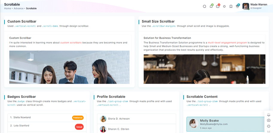
<div class="vertical-scroll scroll-demo custom-scrollbar">
 <h5 class="pb-2">Custom Scrollbar </h5>
 <p>I'm quite interested in learning more about <em class="txt-danger">custom scrollbars</em> because
     they are becoming more and more common.</p>
 <div class="scrollbar-images"><img class="img-fluid" src="/images/banner/1.jpg" alt="banner">
 </div>
 <p v-for="(item, index) in custom" :key="index" v-html="item.desc">
 </p>
</div>
Inside Your script tags add
import { custom } from "~/core/data/scrollable"Inside ts add
interface customs {
      desc: string
  }
 export const custom: customs[] = [
 {
     desc: " There are various justifications for customizing a scrollbar. For instance, the default scrollbar can cause an app's user interface to look inconsistent across various operating systems. In this case, having a single style is helpful."
 },
 {
     desc: "I never had the opportunity to learn about CSS scrollbar customization, but I have always been interested in doing so. I'll take the chance to learn more about them and share my trip in this essay."
 },
 {
     desc: "One crucial point to remember is that, depending on the design, a scrollbar may operate either horizontally or vertically . Additionally, it might alter when you work on a website that is global and operates in both left-to-right and right-to-left orientations. "
 }
 ]
Tree Offical link Preview link

npm i vue3-treeviewInside Your template tags add
<treeview :nodes="nodes" :config="config"/>
Inside Your script tags add
import treeview from "vue3-treeview";
                                                            import "vue3-treeview/dist/style.css";
                                                            import { nodes, config } from "~/composables/common/treeView"
Inside ts add
interface Node {
                                            text: string;
                                            children?: string[];
                                        }

                                        interface Nodes {
                                            [key: string]: Node;
                                        }
                                        export let nodes = ref({
                                            id1: {
                                                text: "Admin",
                                                children: ["id11", "id12"],
                                            },
                                            id11: {
                                                text: "Assets",
                                                children: ["id113", "id118"],
                                            },
                                            id12: {
                                                text: "Default",
                                                children: ["id131", "id122"],
                                            },
                                            id111: {
                                                text: "CSS",
                                                children: ["id114", "id115"],
                                            },
                                            id114: {
                                                text: "Css One",
                                            },
                                            id115: {
                                                text: "Css Two",
                                            },
                                            id113: {
                                                text: "Js",
                                                children: ["id116", "id117"],
                                            },
                                            id116: {
                                                text: "Js One"
                                            },
                                            id117: {
                                                text: "Js Two"
                                            },
                                            id118: {
                                                text: "Scss",
                                                children: ["id119"]
                                            },
                                            id119: {
                                                text: "Sub Child",
                                                children: ["id120", "id121"]
                                            },
                                            id120: {
                                                text: "Sub File"
                                            },
                                            id121: {
                                                text: "Sub File"
                                            },
                                            id131: {
                                                text: "Dashboard"
                                            },
                                            id122: {
                                                text: "Typography"
                                            },
                                            id2: {
                                                text: "index file",
                                            },
                                        });

                                        export let config = ref({
                                            roots: ["id1", "id2"],

                                        });
Toast Offical link Preview link

npm i vue3-toastifyInside Your template tags add
<class="btn btn-success " type="button" @click="success" variant="success">Success</Button>
Inside Your script tags add
let toast = inject('toast')
                                       function success() {
                                        toast.success(' New order has been placed ', {
                                            hideProgressBar: true, autoClose: 2000, theme: 'colored', position: 'top-right'
                                        });
                                      }
Inside plugins.ts add
import { defineNuxtPlugin } from '#app'
                                                        import { toast } from 'vue3-toastify';
                                                        import 'vue3-toastify/dist/index.css';
                                                        export default defineNuxtPlugin(nuxtApp => {
                                                          if (process.client) {
                                                          nuxtApp.vueApp.provide("toast", toast);
                                                          }
                                                        })
Dropzone Offical link Preview link
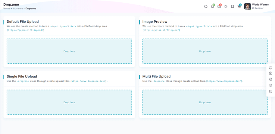
npm i dropzone-vueInside Your template tags add
<DropZone
                                      :maxFileSize="Number(60000000)"
                                      :uploadOnDrop="true"
                                      :dropzoneMessageClassName="customClass" :maxFiles="1">
                                      </DropZone>
Inside Your script tags add
import DropZone from "dropzone-vue";
Inside Your style tags add
@import 'dropzone-vue/dist/dropzone-vue.common.css';
Tour Offical link Preview link
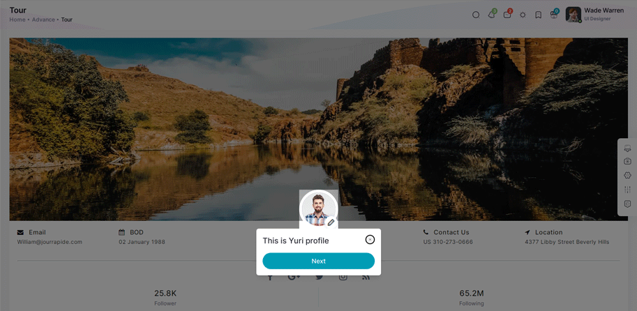
npm i v-onboardingInside Your template tags add
<img img class="img-fluid" alt="" src="/images/user/7.jpg" data-intro="This is Profile image">
                                      <nuxt-link class="icon-wrapper" id="update-profile-tour" to="/users/edit">
                                      <i class="icofont icofont-pencil-alt-5" data-intro="Change Profile image here"  id="update-profile-tour" ></i>
                                      </nuxt-link>
                                      <VOnboardingWrapper ref="wrapper" :steps="steps" class="tour-visit"/>
Inside Your script tags add
import { VOnboardingWrapper, useVOnboarding } from 'v-onboarding'
                                       import 'v-onboarding/dist/style.css'
                                       const { start, goToStep, finish } = useVOnboarding(wrapper)
                                       let steps = [
                                           {
                                               attachTo: { element: '#profiletour' }, content: { title: "This is Cion profile" }
                                           },
                                           {
                                               attachTo: { element: '#update-profile-tour' }, content: { title: "Change Cion profile image here" }
                                           }
                                       ]

                                       onMounted(() => {
                                           start()
});Sweetalert Offical link Preview link
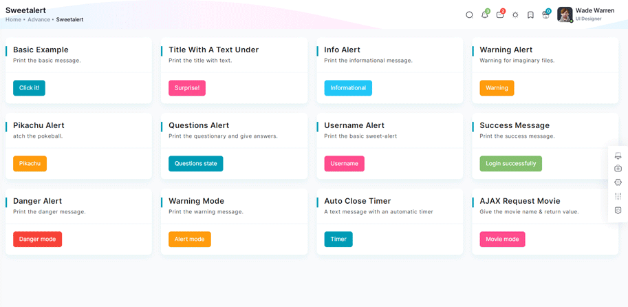
npm i sweetalert2Inside Your template tags add
<button class="btn btn-danger sweet-5" type="button" v-on:click="basic_warning_alert" >Warning alert</button>Inside Your script tags add
const swal = inject("$swal")
                                      function basic_warning_alert() {
                                      Swal.fire({
                                      icon: 'warning',
                                      title: "Are you sure?",
                                      text: 'Once deleted, you will not be able to recover this imaginary file!',
                                      showCancelButton: true,
                                      confirmButtonText: 'Ok',
                                      confirmButtonColor: '#3e5fce',
                                      cancelButtonText: 'Cancel',
                                      cancelButtonColor: '#efefef',
                                      }).then((result) => {
                                      if (result.value) {
                                      Swal.fire({
                                      icon: 'success',
                                      text: 'Poof! Your imaginary file has been deleted!',
                                      confirmButtonColor: '#3e5fce',
                                      });
                                      } else {
                                      Swal.fire({
                                      text: 'Your imaginary file is safe!',
                                      confirmButtonColor: '#3e5fce',
                                      });
                                      }
                                      });
                                      }
Inside plugins.ts add
import { defineNuxtPlugin } from '#app'
                                                        import Swal from "sweetalert2";

                                                        export default defineNuxtPlugin(nuxtApp => {
                                                          if (process.client) {
                                                            nuxtApp.provide('Swal', Swal)
                                                          }
                                                        })
Range slider Offical link Preview link

npm i vue-slider-componentInside Your template tags add
<VueSlider v-model="one.value" :data="one.data" :tooltip="'always'" :tooltip-placement="'top'" ></VueSlider>Inside Your script tags add
import VueSlider from 'vue-slider-component'
                                       import 'vue-slider-component/theme/antd.css'
                                       import { ref } from "vue"
                                       const one = ref({
                                           value: 10,
                                           data: [10, 100]
                                       })
Image cropper Offical link Preview link
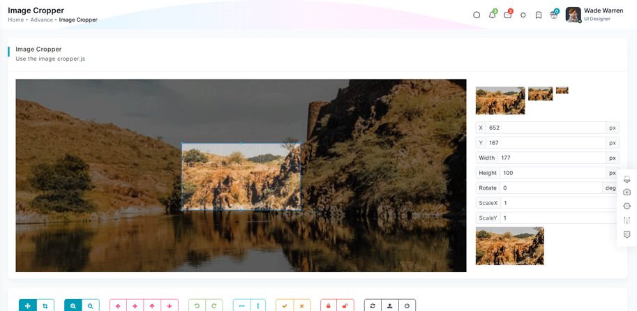
npm i vue-cropperjsInside Your template tags add
<vue-cropper
                                      vue-cropper ref="cropper"
                                      :guides="true"
                                      :view-mode="viewmodeselected"
                                      drag-mode="crop"
                                      :aspectRatio="aspectRatioselected"
                                      :auto-crop-area="0.5"
                                      :min-container-width="250"
                                      :min-container-height="180"
                                      :background="true"
                                      :rotatable="true"
                                      :movable="true"
                                      :src="getImgUrl(myimgSrc)"
                                      alt="Source Image"
                                      :ready="ready"
                                      :crop="cropImage"
                                      img-preview=".img-preview"
                                      :img-style="{ width: '800px', height: '500px' }">
                                      </vue-cropper>
Inside Your script tags add
import VueCropper from 'vue-cropperjs';
 import 'cropperjs/dist/cropper.css';
 import { getImages } from "~/composables/common/getImages"
 let myimgSrc = ref('other-images/bg-profile.png')
 let imageData = ref()
 let containerData = ref('')
 let putData = ref('')
 let viewmodeselected = ref(0)
 let cropImg = ref('')
 let aspectRatioselected = ref(1.7777777777777777)
 let cropper = ref()
 let convertNumber = (num?: number) => num != null ? Math.round(num) : undefined
 function ready() {
     containerData.value = cropper.value.getContainerData();
 }
 function cropImage() {
     if (cropper.value) {
         imageData.value = cropper.value.getData();
         cropImg.value = cropper.value.getCroppedCanvas().toDataURL();
     }
 }
Timeline Preview link
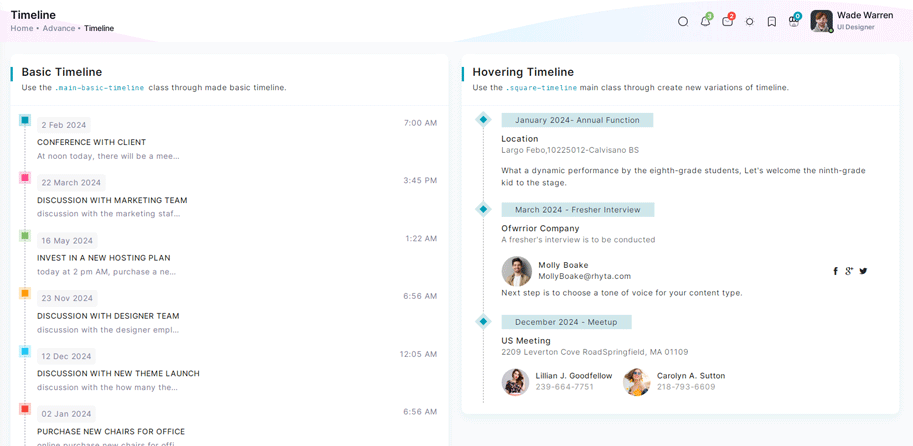
Inside Your template tags add
<div class="col-xl-6 box-col-6 notification main-timeline">
<div class="card height-equal title-line">
<div class="card-header"><h2 class="">Basic Timeline</h2><p class="f-m-light mt-1">Use the <code>.main-basic-timeline </code>class through made basic timeline.</p></div>
<div class="card-body dark-timeline">
  <ul class="timeline-lists">
    <li class="d-flex" v-for="(item, index) in basictimeline" :key="index">
        <div :class="item.dotClass"></div>
        <div class="w-100 ms-3">
            <p class="d-flex justify-content-between mb-2"><span class="date-content light-background">{{ item.date
            }}</span><span>{{ item.time }}</span></p>
            <h6>{{ item.title }}<span class="dot-notification"></span></h6>
            <p class="f-light">{{ item.desc }}</p>
        </div>
    </li>
</ul>
</div>
</div>
</div>
Inside Your script tags add
import { basictimeline } from "~/core/data/advance"Inside ts add
interface Timeline {
 dotClass: string;
 date: string;
 time: string;
 title: string;
 desc: string;
}
  export const basictimeline: Timeline[] = [
    {
        dotClass: "timeline-dot-primary",
        date: "2 Feb 2024",
        time: "7:00 AM",
        title: "CONFERENCE WITH CLIENT",
        desc: "At noon today, there will be a meeting with a UK client."
    },
    {
        dotClass: "timeline-dot-secondary",
        date: "22 March 2024",
        time: "3:45 PM",
        title: "DISCUSSION WITH MARKETING TEAM",
        desc: "discussion with the marketing staff on the success of the most recent project"
    },
    {
        dotClass: "timeline-dot-success",
        date: "16 May 2024",
        time: "1:22 AM",
        title: "INVEST IN A NEW HOSTING PLAN",
        desc: "today at 2 pm AM, purchase a new hosting package as agreed upon with the management team."
    },
    {
        dotClass: "timeline-dot-warning",
        date: "23 Nov 2024",
        time: "6:56 AM",
        title: "DISCUSSION WITH DESIGNER TEAM",
        desc: "discussion with the designer employee on the success of the most recent project."
    },
    {
        dotClass: "timeline-dot-info",
        date: "12 Dec 2024",
        time: "12:05 AM",
        title: "DISCUSSION WITH NEW THEME LAUNCH",
        desc: "discussion with the how many themes made in our portfolio."
    },
    {
        dotClass: "timeline-dot-danger",
        date: "02 Jan 2024",
        time: "6:56 AM",
        title: "PURCHASE NEW CHAIRS FOR OFFICE ",
        desc: "online purchase new chairs for office"
    }
]
Icons
Flag Icons Offical link Preview link
You have to add the following style and add flag-icon folder in your fonts folder
<!-- flag icon scss -->
                                       @import "./vendors/flag-icon.scss";
<!-- some icon display for demo -->
<i class="flag-icon flag-icon-in mx-1"></i>
<i class="flag-icon flag-icon-ad mx-1"></i>
<i class="flag-icon flag-icon-ae mx-1"></i>
<i class="flag-icon flag-icon-af mx-1"></i>Font awesome Offical link Preview link
You have to add the following style and add font-awesome folder in your fonts folder
<!-- font awesome scss -->
                                       @import "./vendors/font-awesome.scss";
<!-- some icon display for demo -->
<i class="fa fa-bluetooth mx-1"></i>
<i class="fa fa-bitcoin mx-1"></i>
<i class="fa fa-anchor mx-1"></i>
<i class="fa fa-text-height mx-1"></i>Ico icon Offical link Preview link
You have to add the following style and add ico folder in your fonts folder
<!-- ico icon scss -->
                                      @import "./vendors/icofont.scss";
<!-- some icon display for demo -->
<i class="icofont icofont-bow mx-1"></i>
<i class="icofont icofont-animal-dolphin mx-1"></i>
<i class="icofont icofont-brand-apple mx-1"></i>
<i class="icofont icofont-bank-alt mx-1"></i>Themify Offical link Preview link
You have to add the following style and add themify folder in your fonts folder
<!-- themify icon scss -->
                                       @import "./vendors/themify.scss";
<!-- some icon display for demo -->
<i class="icon-fullscreen mx-1"></i>
<i class="icon-save-alt mx-1"></i>
<i class="icon-volume mx-1"></i>
<i class="icon-instagram mx-1"></i>Nuxt icon Offical link Preview link
npm install --save-dev nuxt-iconexport default defineNuxtConfig({
modules: ['nuxt-icon']
})
<!-- some icon display for demo -->
                                        <Icon name="material-symbols:browse-activity-rounded" class="mx-1"></vue-feather>
                                        <Icon name="material-symbols:broken-image-outline" class="mx-1"></Icon>
                                        <Icon name="lucide:phone-forwarded" class="mx-1"></Icon>
                                        <Icon name="ph:wind-bold" class="mx-1"></Icon>
Cards
Basic cards Preview link
Basic Card
Lorem Ipsum is simply dummy text of the printing and typesetting industry. Lorem Ipsum has been the industry's standard dummy text ever since the 1500s, when an unknown printer took a galley of type and scrambled. Lorem Ipsum is simply dummy text of the printing and typesetting industry. Lorem Ipsum has been the industry's standard dummy text ever since the 1500s, when an unknown printer took a galley of type and scrambled.
Inside Your template tags add
<div v-for="(item, index) in data" :key="index" :title="item.title" :desc="item.desc";>
                                                          <p class="mb-0" v-html="item.body"></p>
                                            </div>
Inside Your script tags add
import { card } from "~/core/data/advance"
Inside Your json tags add
 interface Card {
                                             title: string;
                                             desc: string;
                                             body: string;
                                             card?: string
                                            }
                                            export const card: Card[] = [
                                            {
                                             title: "Basic Card",
                                             desc: "This is a simple basic card using anywhere.",
                                             body: "Tabs have long been used to show alternative views of the same group of information tabs in software. Known as“module tabs” , these are still used today in web sites. For instance, airline companies such as Ryanair, easyJet and AirMalta use module tabs to enable the user to switch between bookings for flights, hotels and car hire."
                                            },
                                            {
                                             title: "Flat Card",
                                             card: "b-r-0",
                                             desc: "For flat cards, make the.b-r-0[border-radius:0]used class.",
                                             body: "A navigation bar is a particularly important feature because it allows visitors to quickly and easily find important pages on your website , like your blog, product pages, pricing, contact info, and documentation. This improves the chances of visitors browsing your site longer, which can boost your page views and reduce your bounce rate."
                                            }
                                            ]
Theme card Preview link
Basic Card
Lorem Ipsum is simply dummy text of the printing and typesetting industry. Lorem Ipsum has been the industry's standard dummy text ever since the 1500s, when an unknown printer took a galley of type and scrambled. Lorem Ipsum is simply dummy text of the printing and typesetting industry. Lorem Ipsum has been the industry's standard dummy text ever since the 1500s, when an unknown printer took a galley of type and scrambled.
Inside Your template tags add
 <div v-for="(item, index) in positioncard" :key="index"
                                                          :title="item.heading" :desc="item.desc">
                                                          <p :class="item.bodyTextClass">{{ item.bodyText }}</p>
                                                          <p v-if="item.id == 1">Us Technology offers web & mobile development solutions for all industry
                                                              verticals.Include a short form
                                                              using fields that'll help your business understand who's contacting them.<br><strong>Visit Us: </strong>
                                                              2600 Hollywood Blvd,Florida, United States- 33020<br><strong>Mail
                                                                  Us:</strong>contact@us@gmail.com<br><strong>Contact Number: </strong>(954) 357-7760</p>
                                                          <form v-else-if="item.id == 2">
                                                              <label class="form-label" for="exampleFormControlInput1">Email address</label>
                                                              <input class="form-control" id="exampleFormControlInput1" type="email" placeholder="youremail@gmail.com">
                                                          </form>
                                                          </div>
Inside Your script tags add
import { positioncard } from "~/core/data/advance"
Inside Your json tags add
interface Positioncard {
                                              id: number;
                                              borderClass: string;
                                              heading: string;
                                              desc: string;
                                              bodyTextClass?: string;
                                              bodyText?: string;
                                            }
                                            export const positioncard: Positioncard[]  = [
                                            {
                                             id: 1,
                                             borderClass: "pb-0 border-l-primary",
                                             heading: "Border Left",
                                             desc: "Use the class of.b-l-* for left border.",
                                             bodyTextClass: ""
                                            },
                                            {
                                             id: 2,
                                             borderClass: "pb-0 border-r-secondary",
                                             heading: "Border Right",
                                             desc: "Use the class of.b-r-* for right border.",
                                             bodyTextClass: "",
                                             bodyText: "Us Technology offers web & mobile development solutions for all industry verticals.Include a short form using fields that'll help your business understand who's contacting them."
                                            },
                                            {
                                             id: 3,
                                             borderClass: "pb-0 border-t-danger",
                                             heading: "Border Top",
                                             desc: "Use the class of.b-t-* for top border.",
                                             bodyTextClass: "mb-0",
                                             bodyText: "Tabs have long been used to show alternative views of the same group of information tabs in software. Known as“module tabs” , these are still used today in web sites. For instance, airline companies such as Ryanair, easyJet and AirMalta use module tabs to enable the user to switch between bookings for flights, hotels and car hire."
                                            },
                                            {
                                             id: 4,
                                             borderClass: "border-b-info",
                                             heading: "Border Bottom",
                                             desc: "Use the class of.b-b-* for bottom border.",
                                             bodyTextClass: "mb-0",
                                             bodyText: "A navigation bar is a particularly important feature because it allows visitors to quickly and easily find important pages on your website , like your blog, product pages, pricing, contact info, and documentation. This improves the chances of visitors browsing your site longer, which can boost your page views and reduce your bounce rate."
                                            }
                                            ]
Charts
Google charts Offical link Preview link
npm i vue-google-chartsInside Your template tags add
<GChart
                                      class="chart-overflow"
                                      id="bar-chart2" type="BarChart"
                                      :data="bar_chart.chartData_1"
                                      :options="bar_chart.options_1" />
Inside Your script tags add
 import { GChart } from "vue-google-charts";
                                       import { bar_chart,  } from "@/core/data/google-chart"
Inside Your google-chart.ts tags add
var secondary = localStorage.getItem('secondary_color') || '#FF6150';
                                       var primary = localStorage.getItem('primary_color') || '#009DB5';
                                       {
                                       export const bar_chart = {
                                        chartData_1: [
                                        ["Element", "Density", {
                                            role: "style"
                                        }],
                                        ["Copper", 10, "#a927f9"],
                                        ["Silver", 12, "#f8d62b"],
                                        ["Gold", 14, "#48A3D7"],
                                        ["Platinum", 16, "color: #7A70BA"],
                                      ],
                                      options_1: {
                                        title: 'Density of Precious Metals, in g/cm^3',
                                        width: '100%',
                                        height: 400,
                                        bar: { groupWidth: '95%' },
                                        legend: { position: 'none' },
                                      }
                                       }
Apex charts Offical link Preview link
npm i vue3-apexchartsIn your apexcharts.client.ts file all the following code:
import VueApexCharts from "vue3-apexcharts";
                                                            export default defineNuxtPlugin((nuxtApp) => {
                                                              nuxtApp.vueApp.use(VueApexCharts);
                                          })
Inside Your template tags add
<apexchart
                                      type="area" height="350"
                                      ref="chart"
                                      :options="chartOptions"
                                      :series="series">
                                      <apexchart>
Inside Your script tags add
import { series,chartOptions } from "~/core/data/charts"
Inside Your chart-data.ts tags add
export const monthDataSeries = [{
                                                        prices: [
                                                            8107.85, 8128.0, 8122.9, 8165.5, 8340.7, 8423.7, 8423.5, 8514.3, 8481.85,
                                                            8487.7, 8506.9, 8626.2, 8668.95, 8602.3, 8607.55, 8512.9, 8496.25,
                                                            8600.65, 8881.1, 9340.85,
                                                        ],
                                                        dates: [
                                                            "13 Nov 2017",
                                                            "14 Nov 2017",
                                                            "15 Nov 2017",
                                                            "16 Nov 2017",
                                                            "17 Nov 2017",
                                                            "20 Nov 2017",
                                                            "21 Nov 2017",
                                                            "22 Nov 2017",
                                                            "23 Nov 2017",
                                                            "24 Nov 2017",
                                                            "27 Nov 2017",
                                                            "28 Nov 2017",
                                                            "29 Nov 2017",
                                                            "30 Nov 2017",
                                                            "01 Dec 2017",
                                                            "04 Dec 2017",
                                                            "05 Dec 2017",
                                                            "06 Dec 2017",
                                                            "07 Dec 2017",
                                                            "08 Dec 2017",
                                                        ],
                                                    }]
Inside Your google-chart.ts tags add
import { monthDataSeries } from "~/core/data/chart-data"
                                                            var secondary = localStorage.getItem('secondary_color') || '#FF6150';
                                                            var primary = localStorage.getItem('primary_color') || '#009DB5';
                                                        export const series = [
                                                        {
                                                            name: "STOCK ABC",
                                                            data: monthDataSeries[0].prices,
                                                        },
                                                    ]
                                                    export const chartOptions = {
                                                      chart: {
                                                          height: 350,
                                                          type: "area",
                                                          zoom: {
                                                              enabled: false,
                                                          },
                                                          toolbar: {
                                                              show: false,
                                                          },
                                                      },
                                                      dataLabels: {
                                                          enabled: false,
                                                      },
                                                      stroke: {
                                                          curve: "straight",
                                                      },
                                                      title: {
                                                          text: "Fundamental Analysis of Stocks",
                                                          align: "left",
                                                      },
                                                      subtitle: {
                                                          text: "Price Movements",
                                                          align: "left",
                                                      },
                                                      labels: monthDataSeries[0].dates,
                                                      xaxis: {
                                                          type: "datetime",
                                                      },
                                                      yaxis: {
                                                          opposite: true,
                                                      },
                                                      legend: {
                                                          horizontalAlign: "left",
                                                      },
                                                      colors: [primary],
                                                  }
Maps
Google Maps Offical link Preview link
npm i vue3-google-mapInside Your template tags add
<GoogleMap :center="{lat:20.5937, lng:78.9629}" :zoom="12" style="width: auto; height: 500px"><GoogleMap>
In your plugins.ts file all the following code:
import { defineNuxtPlugin } from '#app'
                                                                import { GoogleMap, Marker, Polyline } from "vue3-google-map";
                                                                export default defineNuxtPlugin(nuxtApp => {
                                                                  nuxtApp.vueApp.component("Polyline", Polyline);
                                                                  nuxtApp.vueApp.component("GoogleMap", GoogleMap);
                                                                  nuxtApp.vueApp.component("Marker", Marker);
                                                                })
Leaflet Map Offical link Preview link
npm i @vue-leaflet/vue-leafletInside Your template tags add
<client-only>
                                                            <l-map :zoom="simple.zoom" global-leaflet="false" :center="simple.center" :useGlobalLeaflet="false"
                                                            style="height: 500px">
                                      <l-tile-layer :url="simple.url"><l-tile-layer>
                                      <l-map>
                                      </client-only>
Inside Your script tags add
                                      const simple =ref( {
                                      zoom: 5,
                                      center: [49.439557, 234.558105],
                                      url: 'http://{s}.tile.osm.org/{z}/{x}/{y}.png',
                                      })
In your plugins.ts file all the following code:
import { defineNuxtPlugin } from '#app'
                                                            import {
                                                                LIcon,
                                                                LMap,
                                                                LMarker,
                                                                LPopup,
                                                                LPolygon,
                                                                LTileLayer,
                                                            } from "@vue-leaflet/vue-leaflet";
                                                            export default defineNuxtPlugin(nuxtApp => {
nuxtApp.vueApp.component("LPolygon", LPolygon);
nuxtApp.vueApp.component("LMap", LMap);
nuxtApp.vueApp.component("LTileLayer", LTileLayer);
nuxtApp.vueApp.component("LMarker", LMarker);
nuxtApp.vueApp.component("LIcon", LIcon);
nuxtApp.vueApp.component("LPopup", LPopup);
                                                            })
Editors
CKeditor Offical link Preview link

npm i @ckeditor/ckeditor5-vueIn your plugins.ts file all the following code:
import { defineNuxtPlugin } from '#app'
                                                                import CKEditor from '@ckeditor/ckeditor5-vue';
                                                                import ClassicEditor from '@ckeditor/ckeditor5-build-classic';
                                              export default defineNuxtPlugin(nuxtApp => {
                                                nuxtApp.vueApp.provide("ClassicEditor", ClassicEditor);
                                                      nuxtApp.vueApp.component("ckeditor", CKEditor.component);
                                              })
Inside Your template tags add:
<ClientOnly>
                                                            <ckeditor :editor="editor" v-model="editorData">
                                                            </ckeditor>
                                                        </ClientOnly>
Inside Your script tags add:
let ClassicEditor = inject('ClassicEditor')
 const editor = ClassicEditor
 const editorData = ref<string>('<p>Lorem Ipsum is simply dummy text of the printing and typesetting industry. Lorem Ipsum has been the industry\'s standard dummy text ever since the 1500s, when an unknown printer took a galley of type and scrambled it to make a type specimen book. It has survived not only five centuries, but also the leap into electronic typesetting, remaining essentially unchanged. It was popularised in the 1960s with the release of Letraset sheets containing Lorem Ipsum passages, and more recently with desktop publishing software like Aldus PageMaker including versions of Lorem Ipsum.</p>')